Great television is one of the blessings of the television age. With so many great shows, marketing teams need to develop great logos that fans can remember and recognize. These 12 great television logos are memorable, effective, and creative.
The best logos communicate the ideas behind a television show and seamlessly integrate them into the television show itself. Great logos also depict the themes, symbols, and concepts throughout a television show itself.
Unique for their own reasons, some of these logos are simple and others are complicated, but they are all memorable and take the logo game to the next level.
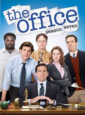
The Office
The logo for the funny, quirky workplace comedy The Office is relatively simple. In all lowercase letters, regardless of the their appropriate capitalization, this logo appears as though it has been typed on a typewriter. This, of course, is an appropriate look for a show that takes place in an office space.
The other benefit of this logo is that it is easily transferable. The letters can be any color marketing teams need because the lettering and logo are so simple. This, too, makes sense for a show with a sweet, simple idea.
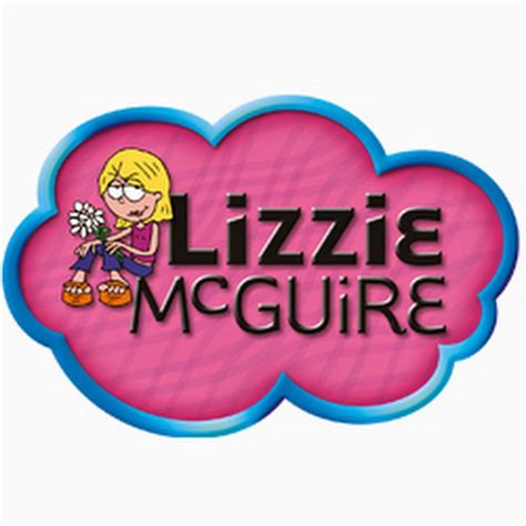
Lizzie McGuire
Lizzie McGuire is a coming-of-age show that follows the titular heroine, Lizzie McGuire, as she navigates her middle school years. Alongside her adventures, as a cartoon reflection, viewers meet the cartoon version of Lizzie.
In the Lizzie McGuire logo, this cartoon version appears alongside a fun and funky font with the show’s name. Between the bright colors and the youthful font, this logo screams childlike fun and joy, two qualities the show represents.
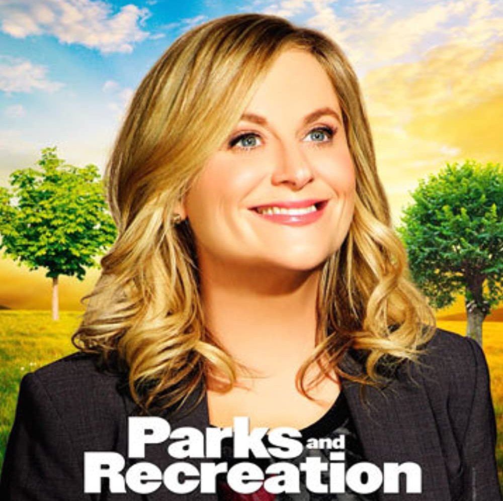
Parks and Recreation
Like The Office logo, the Parks and Recreation logo is nothing too fancy. Instead, it simply reflects the show’s main action, which surrounds a park department in a small town.
The main character, Leslie Knope, is committed to making her small town the best place it can be and is absolutely in love with public service. Most people consider such a passion dull and exhausting, but Leslie is the complete opposite. Therefore, the logo for this show acts in opposition to the type of character Leslie is.
The juxtaposition between the excitable, passionate Leslie and the rather dull logo for the television show is what makes this logo so interesting.
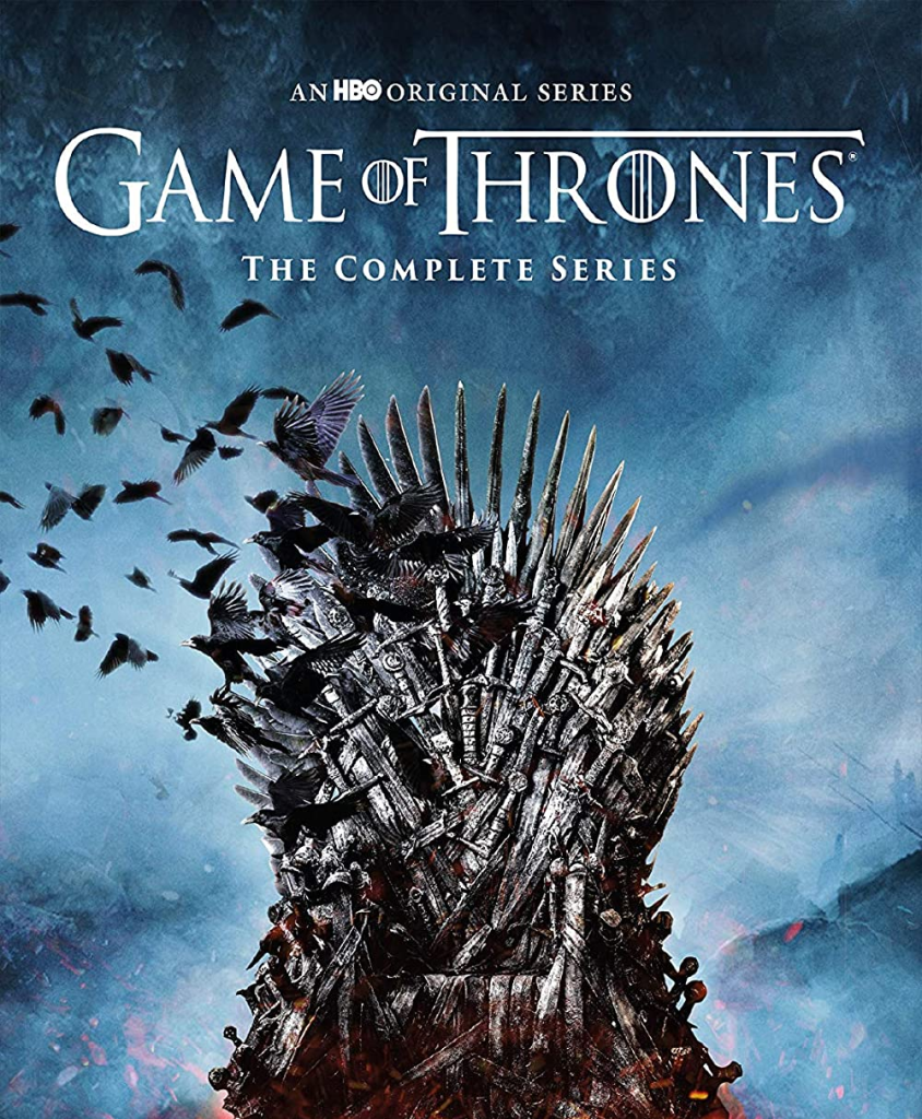
Game of Thrones
The Game of Thrones television show is rich with imagery and invokes intense feelings for viewers. The logo is quite similar. The text for the logo appears to be quite regal, and with the towering T, pieces of it even feel intimidating.
Like the iron throne, a prominent symbol in the show and its marketing, these letters also feel sturdy and heavy, perhaps even ancient.
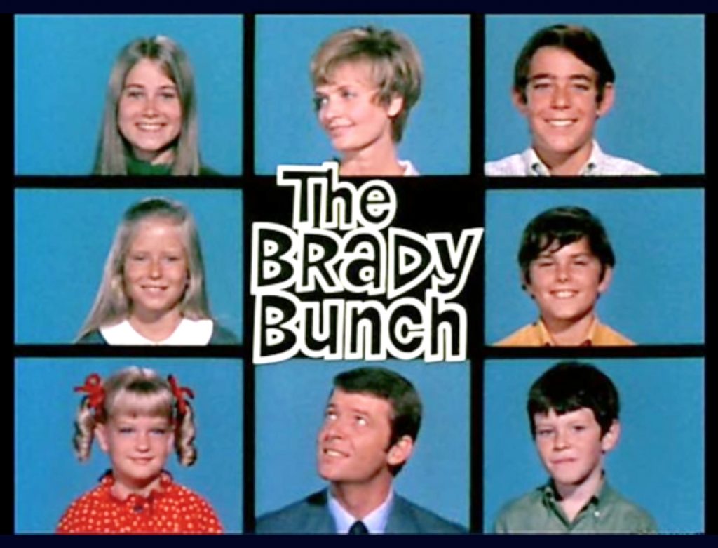
The Brady Bunch
The Brady Bunch is the story of two people who bring their respective children together to form a large family. Together, they become “The Brady Bunch.” The whole family is featured in the opening sequence, which was so popular that it is widely considered the logo for the television show.
In the center of these squares, viewers see a funky bit of writing that gives the show’s title. This font is absolute perfection for the time period portrayed in the show.
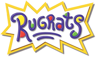
Rugrats
There’s almost nothing more iconically 90’s kid than a love for the Rugrats logo. Simple in its idea, the logo reflects the playful and imaginative stories of the show’s main characters.
Primarily purple font, the splotches of yellow, red, and green throughout represent the silliness (and often messy nature) of childhood play.
Friends
Written in all uppercase letters, the Friends logo is iconic because it is memorable and unique. Like the Rugrats logo, it features blue, red, and yellow dots, but these dots do not represent childlike play for this show.
Instead, they represent the vibrancy of the slow itself. Known for its colorful sets and exciting characters, this imperfectly perfect logo expresses the joys and frustrations of becoming an adult in the city.

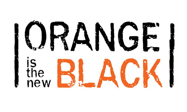
Orange Is the New Black
Orange Is the New Black follows a straight-laced character who finds herself in jail for a crime she committed many years before. The sentence throws her into a life she thought she had left and interrupts her new life, and the logo represents this intersection of her new life and what life was like before.
The bright orange word that spells out “Black” represents Piper, as someone who stands out from the crowd. The black bars on either side of the logo represent the literal bars of the jail in which the characters are kept. The letters are all unfinished to show the growth that all humans go through, whether they are in jail or on the outside.
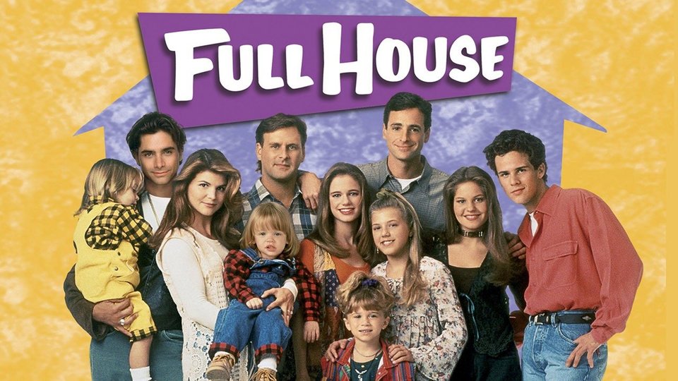
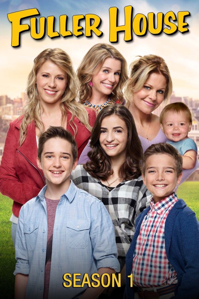
Full House
Like Rugrats, the sitcom Full House Is an absolute mainstay of the 90s. The logo for this one is quite simple, appearing in all uppercase lettering, but written in a handwriting font to appear more wholesome. This font style is so synonymous with the show and its characters that the spinoff, Fuller House, used the same font for its logo.
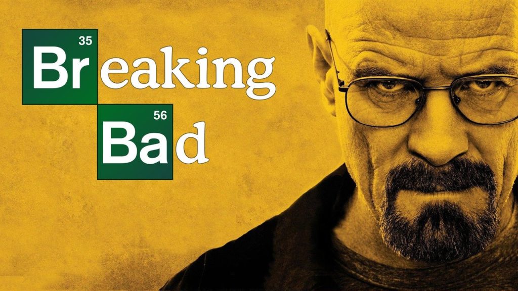
Breaking Bad
This gritty, intense, exciting, and disturbing show follows a chemistry teacher who becomes a methamphetamine dealer to help pay for his cancer treatment.
This logo highlights the importance Chemistry plays in the show by highlighting the elements of bromine and barium (respectively, Br and Ba) in the television show’s title. It’s memorable for the chemical element and how it is featured in the title.
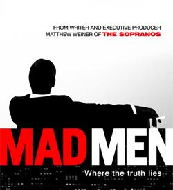
Mad Men
The iconic logo for Man Men is the silhouette of a man’s back as he smokes a cigarette. It is a callback to the era of advertising that glorified smoking and Joe Camel. Besides that, the logo feels very tight and orderly, which is the very image the main character, Don Draper, aims to project to the world.
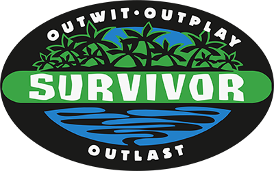
Survivor
As the only reality show on this list, the Survivor logo is truly iconic because it changes with every season to reflect the new contestants and location. One thing that does remain the same, however, is the Survivor name in the middle of the logo.
Always designed with an eye to graphic design, these logos always feature a font that is imperfect and a little jagged, meant to represent the type of places contestants compete.
The best logos communicate the ideas behind a television show and seamlessly integrate them into the television show itself. Great logos also depict the themes, symbols, and concepts throughout a television show itself.
Unique for their own reasons, some of these logos are simple and others are complicated, but they are all memorable and take the logo game to the next level.
From the studio
Want this done for you?
One dedicated team. 140+ creative services. Real humans doing the work.