We see circles a lot in branding. Why is this? Circles are a symbol of trust and unity, while squares symbolize rigidity and structure. When starting a new company, logos can be a key factor in its success. Here we will look at 15 circular logos, from both large and small companies, and see why they work for marketing.
Green Giant
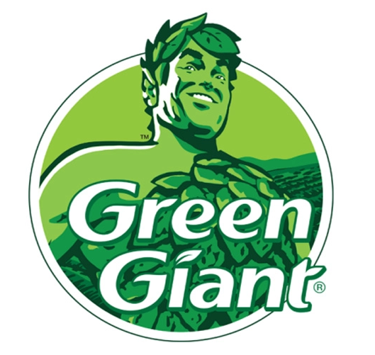
Why this works: The Green Giant stood out above other food brands when it first appeared in 1925 because of its unique mascot.
Fun fact: Is bigger better? Part of the company’s fame came after they grew a particularly large pea variety, hence the name and the green giant’s deep voice when he says “ho ho ho”.
Chrome
Why this works: Given that circles tend to be perceived as trustworthy, it’s no coincidence that some of Chrome’s biggest competitors: Apple Safari and Mozilla Firefox, also have circles for their logos. Internet browsers take users’ information to better their platforms, so users want to know that their information is being used responsibly.
The interesting note is that internet explorer, which hasn’t done as well in the market recently, emulates a circle but is not a circle. Got to be something to it!
Fun fact: Chrome services more than 2.65 billion internet users.
Grammarly
Why this works: Grammarly is a great software for professional and student writers. The software helps you edit as you work and streamlines the final drafting process. By making their logo look like the first letter of the word and keeping a distinct shade of green, they were able to stand out with minimalism.
Fun fact: When you download Grammarly for free, the arrow spins every time you fix an error in your paper which creates a great dopamine reward for writers during an otherwise tedious process.
Starbucks
Why this works: This gorgeous female mascot is almost perfectly symmetrical.
Fun fact: Starbucks sources their coffee from Arabica coffee beans in Brazil.
Trubify
Why this works: Just 3 elements: a music note, a sound wave, and a circle. This is a smaller company but with a catchy name similar to its competitor Spotify and fairer rules for musicians, it looks like it’s going to gain more traction in the future.
Fun fact: According to their biography on the Appstore, Trubify lets artists earn 2 cents per viewer when they go live for concerts, which is a lot more than what Spotify can give artists per stream on their platform, even after artists have paid them to showcase their music.
NASA
Why this works: This logo ventures a little outside the lines, which is something astronomers have to do all the time to make new advancements in technology. With few edits, this image has stood the test of time.
Fun fact: When John F. Kennedy ordered NASA to send a man to the moon, his intentions weren’t just about dreams and honor. At the time, Russia was also sending men into space and Kennedy wanted to beat them out. Thus, it was a lot more of a political agenda than initially thought by the public.
Ubisoft
Why this works: The contrast between dark and light makes this especially appealing for gamers at night.
Usually, in their ads, the screen will be dark and the logo dramatically fades into view for an awakening effect. If it’s fitting for your brand, you can use this strategy in your advertisement videos.
Fun fact: Known for producing fantastic PlayStation games from the masculine Assassin’s Creed to feminine Just Dance 2022, this company never misses a beat in that you can easily find games for the whole family.
Target
Why this works: Target’s logo matches its motto very well. A simple marketing term, targeting refers to learning more about your customers so you can give them what they need.
Fun Fact: Something a friend and I noticed recently was that Target is having competitively low prices but generally has higher quality clothing that lasts longer than the clothes at Walmart.
The department store doesn’t have the most organized vibe but during the change of seasons, they get a lot of new stock and new deals that are worth a look.
AT & T
Why this works: This circle utilizes a 3D optical illusion to make it appear like a sphere to represent the brand’s global reach.
Fun Fact: For the pre-paid plans, there is no credit check and free shipping.
BMW
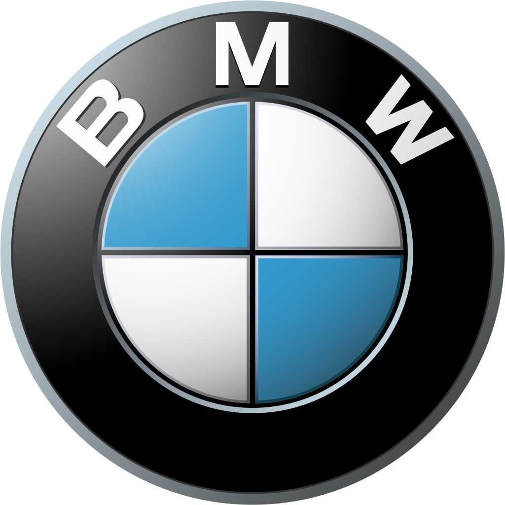
Why this works: The iconic checkerboard pattern is reminiscent of 50s diners. In their dealerships, you see this cool style decorated throughout the showrooms. It gives a fun identity for a car brand.
Fun Fact: Known for their Mini Coopers in addition to more expensive models, their used cars can go for under $10,000 while still giving you top-notch service you would normally get with a luxury car.
Mobil
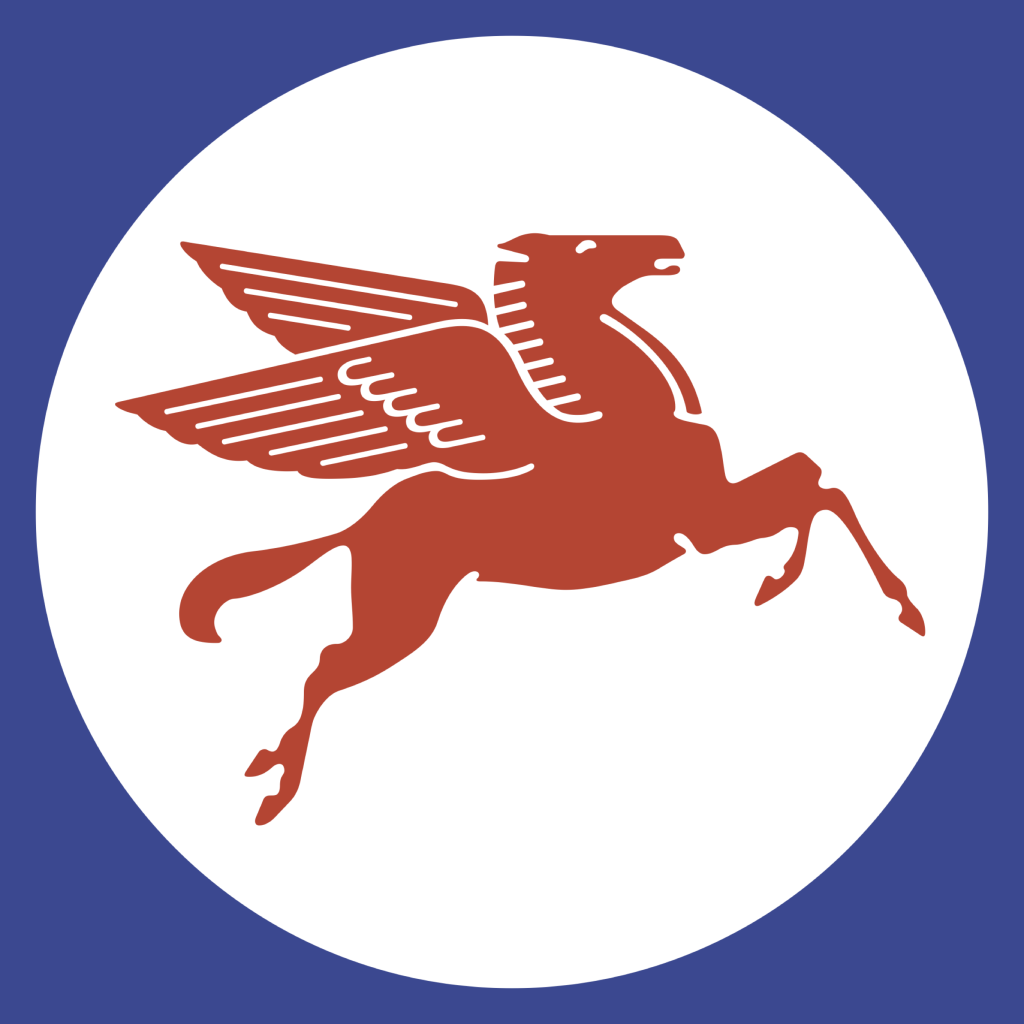
Why this works: The Pegasus is a unique mystical animal and isn’t typically shown in red, white, and blue. What nontraditional colors look good on your logo?
Fun fact: Mobil has been updating this image on their website to not include the circle, but their gas stations still showcase this older version on the side of the buildings.
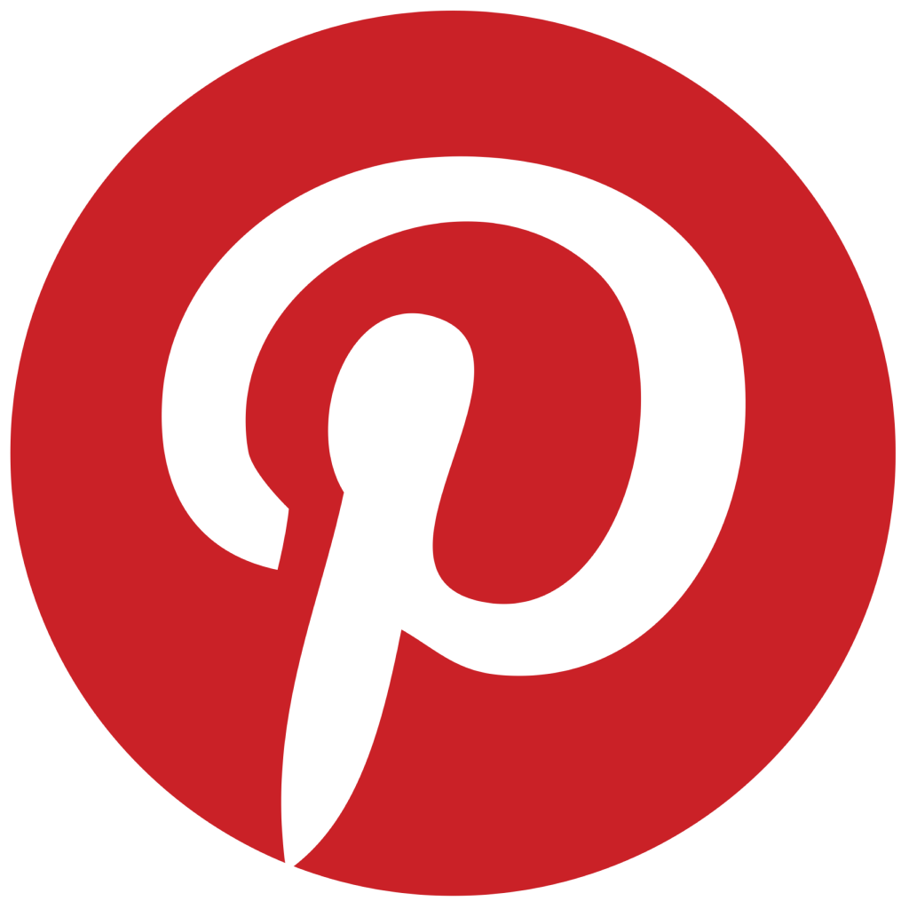
Why this works: Similar to the Target and Grammarly logos, Pinterest uses a red and white color scheme with just the capital letter for the company.
Fun fact: Just over 77% of Pinterest audiences are female, but ages range pretty evenly between ages 18-64.
Shazam
Why this works: This also contains the capital letter of the brand but it’s turned on its side.
Fun fact: This logo has an interactive spinning animation when you press record to identify a song.
Unicef
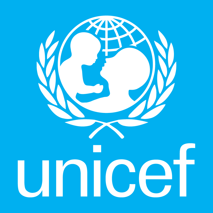
Why this works: This graphic is family-oriented so it caters to Unicef’s target audience.
Fun fact: This nonprofit is currently sending support to children and families in Ukraine.
CBS
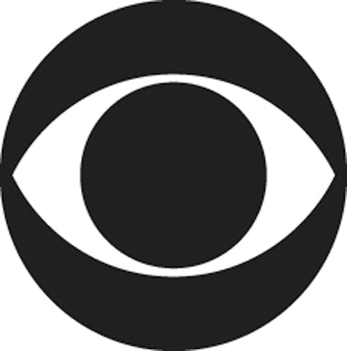
Why it works: In studies, eye symbols have been shown to attract attention due to a biological response in humans. It’s fitting for a TV network.
Fun fact: CBS is currently showcasing the comedic Late Late Show with James Corden.
From the studio
Want this done for you?
One dedicated team. 140+ creative services. Real humans doing the work.