Of the major social media platforms, few have had the same logo for nearly 10 years. Twitter stands out as a tech giant with a consistent brand. Perhaps that’s because the small blue bird is instantly recognizable, with little to no indication of what company it represents. When you solidify your logo that well, there’s little need to make changes.
The Early Version

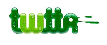
The company debuted in 2006 as a microblogging platform, “twtter.” Initially, its logo was a wordmark, and a rather gross one at that. With shades of green and a wet appearance, it was reportedly meant to look fun and youthful, but instead had a distinctively early-00s look — and not in a good way.
2006: The Pretty Wordmark

Graphic designer Linda Gavin reportedly had a single day to reinvent the green logo for the official launch of the platform. Gavin created a pleasant blue wordmark in an open, friendly font. The founders loved it and kept it until 2010.
2010: The Twitter Bird

In 2010, Twitter decided to develop a mascot. They were already using the term “tweet,” so a bird was a natural choice. The bird is meant to represent both the short “chirps” of information shared on the platform and the flights of conversation among its users. The resulting design, nicknamed Larry after the Boston Celtics’ Larry Bird, became an established part of the platform’s logo.
2012: Larry Breaks Free

Eventually, Twitter was ready to abandon their name— at least in their logo. They hired a novice graphic designer, Martin Grasser, to reinvent Larry the Bird. Grasser incorporated circles into his initial rendering to represent the democratization of the platform. These gave the bird an even, friendly appearance. Larry could now stand alone as a symbol of the platform.
Today
Now, the Twitter Bird is instantly recognizable around the world. As more people interact with the platform on their phones, it’s been important to create a logo that’s instantly recognizable, no matter how small. Thanks to a bit of nature-inspired whimsy, Twitter has been able to do just that.

