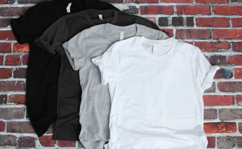
If you have not been using t-shirts to boost your brand, you may want to consider this: the demand for custom t-shirts is increasing daily with expected sales of $10 billion by 2025.
Now that marketers realize the power of this growing trend, more are using them to promote their brands.
What’s your message? Put it on a t-shirt and watch your message sore. While custom-designed t-shirts are the newest trend, as with anything in marketing, you still need to be strategic about it.
Boost your marketing with 12 design tips to make your t-shirts pop:
1. Appeal To Your Audience

Remember this is part of your marketing plan, so the first thing you want to consider is who would buy your t-shirt. Think about your current audience. Would a t-shirt appeal to all of them or just a segment of them? Would the shirt be for youth, adults, men, women? The list goes on. Once you know who you’re designing for, the design concept will be easier to grasp.
2. Conceptualize Your Design
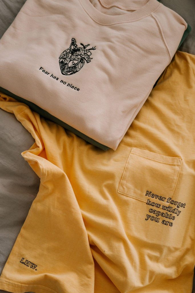
This is a process you don’t want to rush. The design will be what sells the t-shirt. People love to wear t-shirts, but they wear them for a reason, to convey a message.
So first, make sure the message resonates with the market you’ve selected. Second, make sure the design is cool and trendy. That way, people will want to wear it to show it off.
Flocksy has some of the best designers. From illustrator to typography, you tell us what you want to create and we will see it through. That frees you up to work on other marketing aspects. Leave the design to us.
Focus On Five Specific Areas
This isn’t just a t-shirt, this is your brand promotion, so every little detail about the shirt is a big deal. Your specifics will focus on five things: borders, colors, fabric, fonts, scale and size.
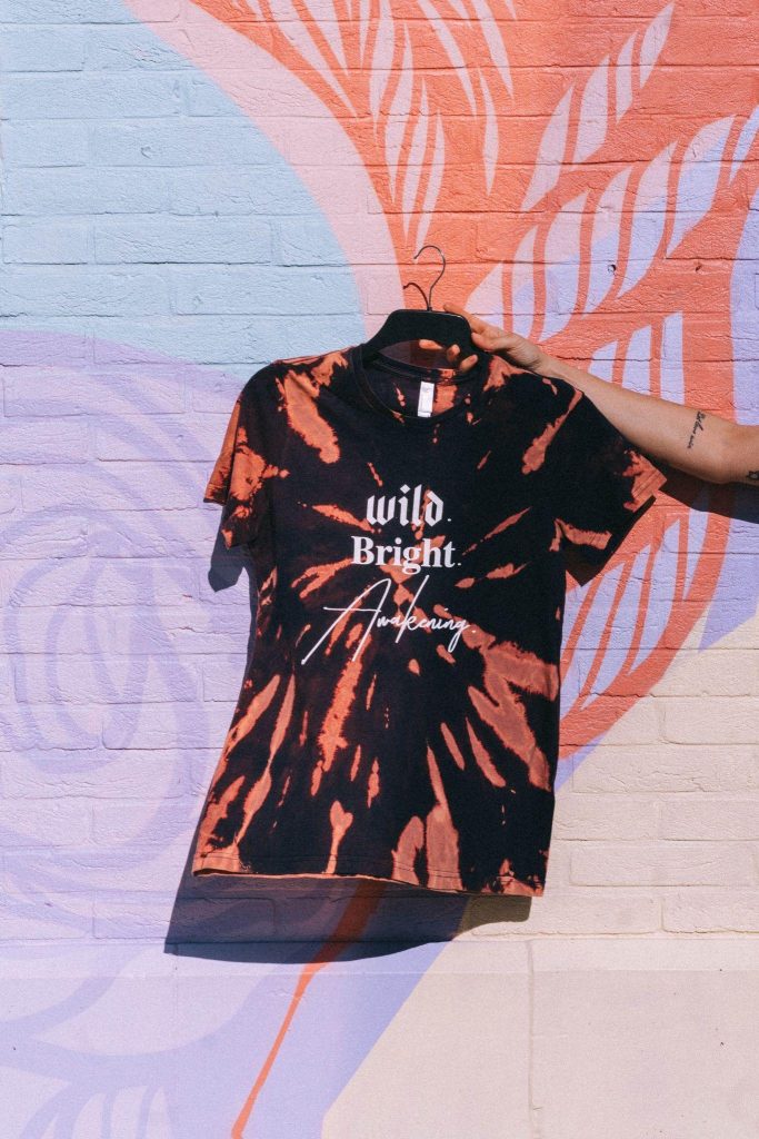
3. Border and Design
Will your t-shirt have borders or is the design free-flowing without the edges? Most modern-day designs no long have borders. But sometimes invisible borders do show up. So be cautious of this technical aspect when printing.
4. Color Scheme
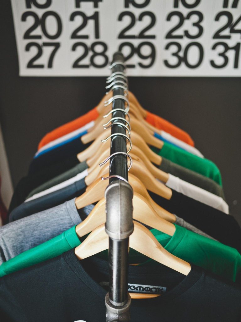
What will the color(s) be? How many colors will it have? Better yet, how many ink colors are available for the imprint? Choosing the right shade for the shirt and the font, helps to bring the shirt to life.
5. Fabric
What type of fabric should the shirt be? The fabric has an impact on the ink. If the fabric is too thin, the ink may not lay well on the finished product. And what type of fabric would appeal to your audience?
If they’re athletes would they prefer a performance-wicking fabric? Where do they live? If it’s mostly a cooler climate, would they prefer a heavier fabric, fleece or a sweatshirt? Or should there be a gender-specific cut?
6. Font
Regardless of the design, if the fonts aren’t right, the message will not come across well. The perfect font(s) will make your shirt pop each time. Considering the message and the audience, what size should the font be?
Do you want a more traditional look or a modern one? For example, Serif fonts will give your design a more traditional and formal look while San-serif fonts will give a modern look to your design.
7. Scale and Size
You may have the design and specific details worked out, but you’ll never know if the shirt is just right until you have the scale and size just right. Does the scale of the design work? Does it feel balanced?
Remember, the scale of the design can change based on the size of your shirt. So, you’ll want to make sure the design is scaled to fit perfectly for all sizes of your shirt.
While getting all the specific details worked out takes time, your Flocksy design team can help with all of it. Our designers will work with you from start to finish to ensure you have the perfect design for your promotional t-shirt.
8. Placement Is Everything
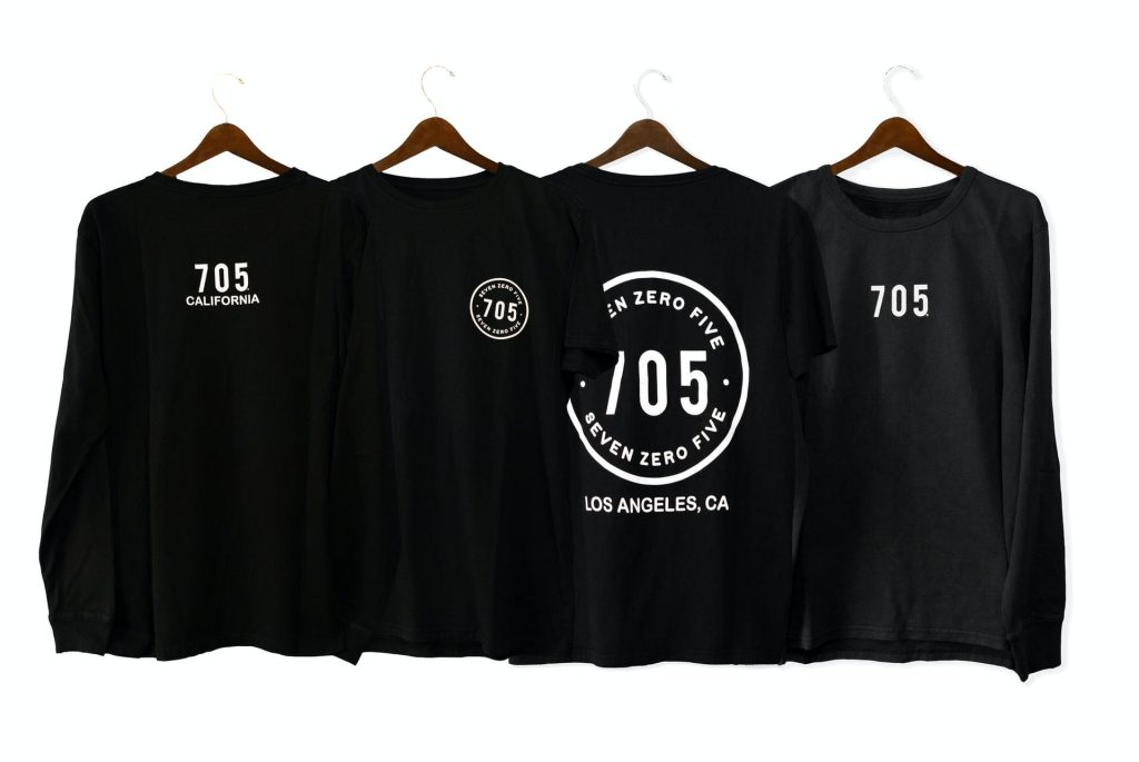
As you were conceptualizing that design, I’m sure you had a vision for its placement. The most common placements for graphic design on shirts are the front pocket (usually small print), the front center, the sleeve, back center, and top back center.
But will there be other branding or logos on the shirt? Because that will also play a part in the placement of the actual design. Don’t just assume you know where to place the design. Play around with this to ensure the optimal look for your shirt.
Consider Your Four Print Options
You now have everything you need to complete your vision for your promotional t-shirt. All you have to do now is get it printed. But wait, do you know your print options?
If you don’t you’ll want to take a minute to study this since printing options have come so far. Printing is a significant element in t-shirt design, so you’ll at least want to know your four options:
9. Direct to Garment (DTG) Printing
DTG Printing makes your shirt soft to the touch with no extra thick layers on the t-shirt.
10. Heat Press Printing
Heat press printing is good for printing in small quantities and is the most economical way to print. However, it’s not recommended for darker fabrics.
11. Screen Printing

Screen printing is good for printing premium t-shirt designs to give your shirt an impressive, unique look. However, if you have multiple color designs you may want to go with a different print method.
12. Dye Sublimation Printing
Dye sublimation printing is a good method to use if you have polyester cream fabrics. This method will make the shirt more durable, which may mean an up in cost, but it will look professional.
Your Flocksy design team will ensure your design file is in the correct format for printing your unique design. Hire your own creative team at Flocksy.

