Blog · Logo Design
10 of the Best Restaurant Logos To Inspire You And Some Great Tips For Designing Yours.
By Flocksy
September 26, 2021 · 4 min read
Customers return to the restaurant scene after a whole year off due to the pandemic in record numbers. As the business in restaurants increases across the country, it could be time to also revisit your logo.
A restaurant logo is responsible for the first impression you give your customers. Does yours invoke the right emotions? Does it represent your brand in the right way?
All of these are crucial questions you need to ask yourself when designing a restaurant logo. As the dining experience returns to normal, you wouldn’t want to miss out on customers because of an outdated or lackluster logo. Below are some general tips when designing yours and ten killer examples.
Tips For Designing Your Restaurant Logo.
Do not feel intimidated by the design process for your logo. All the choices you have can feel overwhelming at first. You should try to find enjoyment in the process. Picking the image to represent your business should be exciting! The design process is also not finite.
You can always go back to square one if you don’t like where you end up.
However, tip number one is mapping out a plan. You need to include several things. First, who are your clients? What do they like or appreciate? These are the people you want to attract to your restaurant. They are your target audience. By identifying them and becoming an expert in their interests, you can create a logo that appeals to them.
Secondly, identifying your target audience will help you know how you want to present yourself. Are you a classy joint? A family establishment? Or a relaxed hipster vibe? Choosing your logo should appeal to your target audience and represent who you are as a restaurant.
The easiest way to articulate the feeling you want to give is to envision what emotions you want to feel when you walk into your restaurant.
Thirdly, keep in mind how your targeted audience physically sees your restaurant. If your business is a more fast-food type, you’ll want an easily recognizable logo from the street while your customers walk or drive by.
Once you have a plan for your new logo set in place, you then should get designing. You can hire a designer or take it upon yourself. Neither one is right nor wrong. You should pick the one that fits your circumstances the best.
Take the path that feels like it is going to generate the most professional and representative logo.
Learn From Some Of The Best Out There.
There’s no better inspiration for your logo than looking at some killer examples. Below are ten restaurant logos that used theirs to accentuate their customers and brand.
City Bird Tenders – Ohio and Illinois.
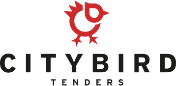
City Bird Tenders is a restaurant that serves high-quality chicken tenders, sandwiches, and other fast-food items. Their logo embodies their brand perfectly. The lettering is clear and tells new customers exactly what to expect. Additionally, the iconic chicken-shaped logo is easily recognizable while driving or walking.
Little Goat Diner - Chicago, Illinois
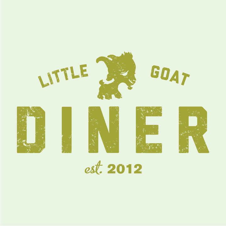
Little Goat Diner is a quirky brunch spot in Chicago. Located in the famous Fulton Market, the logo is doing everything it needs to for the restaurant. It gives customers a quirky and fun feeling with the cartoon smiling goat. Additionally, by encompassing the word “diner,” customers know what type of food to expect.
Big Kids - Chicago, Illinois
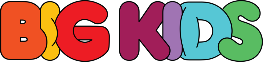
Big Kids is a restaurant that capitalizes on nostalgia, and its logo captures that feeling perfectly. It serves childhood-inspired meals and cocktails like artisan PB&Js and tang-flavored margaritas. The logo tells the customer exactly what to expect while the bright colors and lettering catch the eye. This logo demonstrates how to capture the feeling of your restaurant’s brand.
Oriole - Chicago, Illinois

Oriole is a fine dining restaurant that embodies the word classy. Their logo naturally invokes a high level of prestige. The simplistic but elegant lettering tells the customer, they can only expect high-quality at this establishment.
Columbia - Tampa Bay, Florida
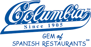
Columbia is one of Tampa Bay’s oldest restaurants, and the font of their logo gives off a feeling of timelessness. Plus, using the original logo is crucial because of its longevity. As a staple in the area, they kept the familiar logo. Why rebrand something everyone already recognizes?
Jollibee -International
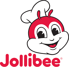
Jollibee is an international fast-food restaurant that serves fried chicken, spaghetti, burgers, and chicken sandwiches. The logo is an example of utilizing a cartoon character. The character is a play on their name. It’s a happy bee. Also, it captures the attention of their targeted audience: families.
Nation - Cincinnati, Ohio
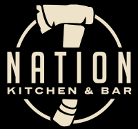
Nation is a burger and bar joint in Cincinnati, Ohio, that pulls a little local history into the logo. You won’t know the full story about the hatchet in the logo until you dine there. However, the mystery of the logo draws customers in and becomes a cool callback once they learn the history. It also demonstrates how mystery can be a device to intrigue potential customers.
Starbucks - International
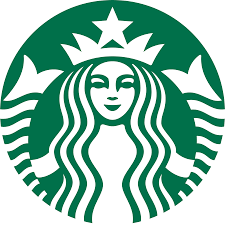
The logo we all recognize. Despite its universal branding, the logo is a great example of iconic symbolism. Simple and unique, the logo became something everyone knows. Your restaurant’s logo may never achieve the universal recognition, but you can still get inspired from the one-of-a-kind appeal of the Starbuck’s logo.
Seaspice - Miami, Florida.

Seaspice is a seaside restaurant serving high-quality seafood and ocean views. The restaurant’s logo tells this exact story. The elegant lettering tells you it is fancy, and the octopus gives away the establishment’s food specialty.
Chipotle - International
Chipotle is another international fast-food eatery that specializes in Mexican. The logo uses the iconic chipotle pepper in the center. The color scheme embodies the flavor profile of the restaurant’s food: heat, earthy flavors, and spicy flavors.
From the studio
Want this done for you?
One dedicated team. 140+ creative services. Real humans doing the work.