Blog · Logo Design
20 Famous Corporate Logos And What You Can Learn From Them
By Rachel Wayne
September 28, 2021 · 8 min read

Ever wondered what makes a perfect logo? Recognizability is obviously important: your logo is a crucial tool for developing your brand. But what makes a logo recognizable? It’s usually a blend of design simplicity, compelling visuals, and iconography that aligns with your brand values.
The best way to understand the art of logo design, and to find the perfect visual identity for your own business, is to review the world’s best corporate logos. These are the designs that have endured in the public imagination, which means they’re ideal study material for developing your own memorable logo.
Nike
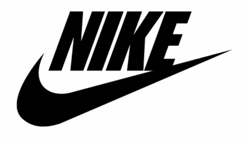
Nike’s famous “swoosh” expertly communicates the brand’s core values: dynamism, accomplishment, and simplicity. Designer Carolyn Davidson was inspired by the company’s namesake Nike, the Greek goddess of victory. The eye pleasing design makes excellent use of the golden ratio (1.618:1).
The swoosh’s curve corresponds to a Fibonacci spiral, a shape that grows by a factor of 1.168 with each quarter turn. A final upward stroke evokes feelings of movement and motivation, yet aligns perfectly with the initial point of the curve.
This highly recognizable logo has been hailed as one of the world’s best, and it’s indeed an achievement in stellar design!
Amazon
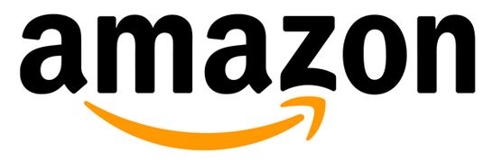
Amazon’s famous logo combines its name with the “smile,” which doubles as an arrow pointing from the “a” o the “z.” The message is clear: Amazon has everything from A to Z. The arrow also connotes speed and innovation, both of which are crucial to the Amazon brand promise. And of course, the “smile” reflects the satisfaction and entertainment that Amazon customers can enjoy.
Disney
According to legend, the iconic Disney font seen in its wordmark is based on Walt Disney’s handwriting. It also has a whimsical and dynamic vibe ideal for the world’s leading animation company. Disney’s logo is recognizable both in the full wordmark and the abbreviated “D” lettermark.
The “D” comprises a distinctive swirl with a wandlike vertical stroke, an homage to the seminal short film “The Sorcerer’s Apprentice” in the Disney classic Fantasia. Many versions of the logo also contain Cinderella’s castle from Disneyland to reflect the brand’s dominance in theme parks and immersive entertainment.
Unilever
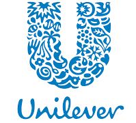
Plenty of companies earn brand recognition with lettermarks, but Unilever’s logo takes it a step further. Look closely at their “U” and you’ll see leaves, fruits, trees, starbursts, bees, hearts, and more … all symbols of their commitment to nutrition, natural wellness, and beauty. This collage of icons gives Unilever’s logo a whimsical vibe, yet the overall image is a simple, professional feel.
Evernote
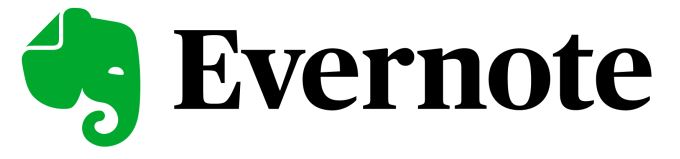
Based on the idea that “an elephant never forgets,” note taking app Evernote promises to help you remember everything. The visually pleasing and adorable logo features a simple green elephant head.
But look closer and you’ll see that the elephant’s ear is folded as you would fold a page in the book. This subtle yet clever design choice signifies the wisdom of the elephant and the purpose of the Evernote app.
Dropbox
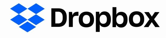
Dropbox’s logo depicts an open box. While this may seem like an obvious image, the logo is actually quite clever. If you look closely, you see that the “box” is composed of five identical diamonds. Four of them are arranged in a square, with a diamond shaped negative space in the middle.
The fifth diamond makes the shape of the box and is dropped exactly below the open space. The resulting illusion is of an open box, but the logo’s symmetrical design and strategic spacing also perfectly illustrate this digital syncing service.
Starbucks
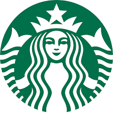
Inspired by the legends of Seattle’s seaside culture, Starbucks made a bold choice with its logo. Rather than going the obvious route with imagery of coffee beans and cups, they created the mythical and enticing siren.
The image not only taps into Seattle’s history as a port of call but also evokes ideas of magic, temptation, and wonder, all of which reflect the brand’s commitment to premium coffee and innovative recipes.
Chanel
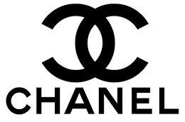
Two interlocking C’s, each a mirror image of the other, is the perfect way to symbolize coordination and balance. This makes it an ideal logo for the leading fashion brand Chanel. It’s technically a letter mark for “CC,” the initials of founder Coco Chanel. However, it’s also a simple and elegant logo that affirms the company’s sophistication as well as its historic roots.
Volkswagen
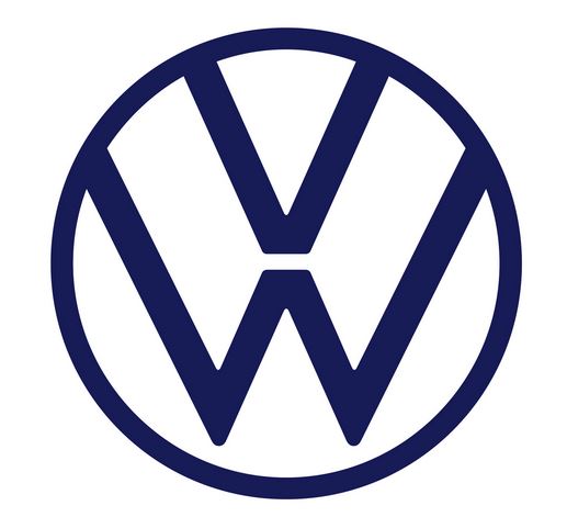
While automobile logos all tend to look alike after a while, it’s easy to recognize Volkswagen’s. After recovering from a dark period in which Hitler’s Germany required them to use the swastika, Volkswagen rebranded to focus on its initials.
However, their “VW” lettermark subverts convention with a vertical orientation. The “V” is positioned above the “W,” with the middle point of the latter directly supporting the bottom point of the former. The “W”‘s upward strokes run parallel to the “V’s,” providing a dynamic yet synchronous design that illustrates the brand’s progressive and streamlined engineering.
PlayStation
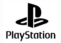
Electronics logos are more than a recognizable shape to print on the devices. They symbolize the subculture that emerges around the experience of using those electronics. (Just look at Apple’s famous logo, also on this list!) One of the best known logos in the gaming world is that of PlayStation.
Composed of an interlocking “P” and “S,” this unique design has the illusion of being 3D. The curve of the “P” flows seamlessly into the top of the “S”, evoking the circuitry that makes the gaming console work. It also has a playful vibe, which aligns perfectly with PlayStation’s subculture.
Pepsi
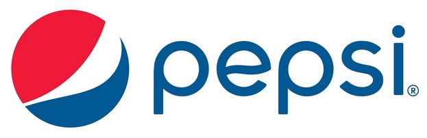
With a dynamic design, bright colors, and simple shapes, Pepsi’s logo connotes happiness, community, and effervescence. This is the perfect visual complement to the soda brand’s “Pop Fizz Ahh” slogan.
The round logo comprises a large red semicircle, a swooping white shape, and a blue wave. Together, they evoke both the physical experience of opening a can of Pepsi and the patriotic, dynamic vibe of the brand.
FedEx
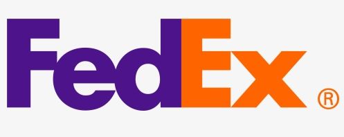
Did you know that FedEx’s logo has a hidden arrow? Once you see it, you can’t unsee it! At first glance, it appears to be a standard wordmark with the company name. However, the negative space between the E and the X creates an arrow that symbolizes the company’s commitment to fast shipping and forward thinking. Plus, the unique combination of adjacent secondary colors (purple and orange) adds a dynamic yet balanced feel.
Caterpillar
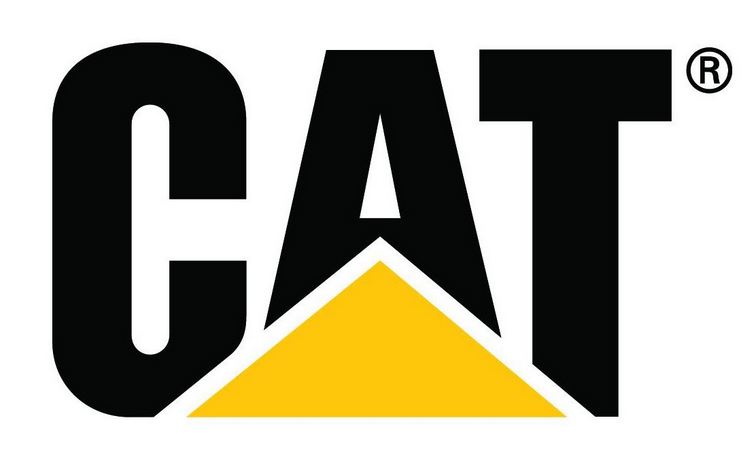
Abbreviated to “Cat,” Caterpillar’s wordmark is the epitome of double valence in logos. The black, tall lettering expresses power and dominance, while the yellow triangle suggests either a mound or a highway. Either way, this logo signifies construction, progress, and authority.
The striking contrast of black and yellow is unique to logos: it perfectly expresses the energetic potential of construction while evoking the strong, sturdy foundation of the company.
Apple
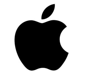
The Apple logo is so recognizable that it doesn’t even need to appear alongside the company name. Inspired by the classic story of Sir Isaac Newton theorizing the law of gravity when an apple fell, the logo evokes feelings of insight and progress.
Early versions of the now famous design included a rainbow pattern to symbolize inspiration and discovery. Today, the logo is minimalistic, but with its gentle curves and the distinctive “bite,” it’s the perfect icon for this seminal electronics company.
Netflix
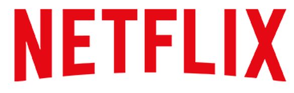
Netflix’s wordmark is quite simple. But look closely and you’ll see the streaming giant’s brand values captured in the design. With tall, dominant letters and moderate kerning, the typeface hints at Netflix’s role in the streaming revolution, as well as its seamless experience.
The words are also curved slightly downward from a center point, giving the wordmark the illusion of expanding. The platform’s animated logo enforces this idea.
McDonald’s
A letter mark that also reflects the iconic “golden arches” used in early restaurant design, McDonald’s logo is now a globally recognized symbol of happiness. The vibrant yellow, simple strokes, and whimsical vibe capture the brand’s core values: satisfaction and playtime. It’s also a nicely open and symmetrical design that makes it very appealing to young people, especially!
NBC
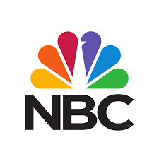
A rainbow peacock doesn’t exactly seem like a suitable logo for a broadcasting company, but NBC’s enduring and highly recognizable logo has proven that assumption wrong. As a leading provider of color TV programming, NBC wanted to feature vivid colors in its logo.
Today, each of the colors represents one of NBC’s core departments. The peacock is looking toward the right to signify forward thinking, while the teardrop shaped “feathers” evoke imagery of flower petals and lens shutters. The messaging is simple: NBC promotes growth through innovative visual media.
Shell
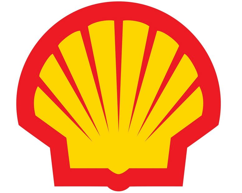
Shell began as a seashell export company that eventually moved into oil extraction and refined. Its famous “pecten” logo illustrates both its history and its current role as a global supplier of fossil fuels. Composed of a simple scallop image with bold red and yellow colors, Shell’s logos definitely stand out on the roadside.
The thick outer trace gives the design a fresh energy, while the subtle tapered strokes evoke elegance. Interestingly, the shell’s bottom is square, with only a small caret to suggest a real world scallop. This subtle design choice connotes reliability and durability while hinting at the company’s drilling expertise.
Home Depot
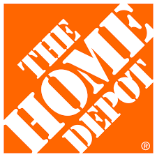
With a bright orange hue, angled layout, and a dramatic typeface, Home Depot’s logo is the cornerstone of their visual presence. The font is cleverly modeled after stencils, with just enough space in between to suggest there’s still work to be done.
Meanwhile, the sharp 45 degree angle of the words evokes feelings of hard work and determination. Notice also that the “H” and “E” in “HOME” and the “D” and “T” in “DEPOT” extend just beyond the orange square. This is a perfect illustration of “thinking outside the box” if we ever saw one.
Mountain Dew
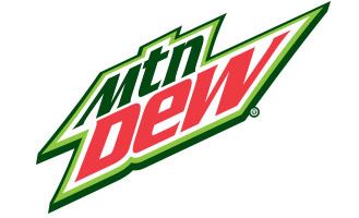
Abbreviated to “Mtn Dew,” this famous logo has become a cultural icon of a beloved beverage. This distinctive and zany design features the product name in complementary colors (green and red). Yet despite looking like a Christmas logo, the Mountain Dew logo evokes feelings of energy, athleticism, and youth culture.
The words are arranged at 45 degree angles, with the “M” and “W” distorted to stretch slightly beyond the core shape. Tight kerning and leading give the logo an urgent and dynamic feel.
Wrapping Up
What did you learn from these logos? Which do you think are the most enticing and effective?
From the studio
Want this done for you?
One dedicated team. 140+ creative services. Real humans doing the work.