Blog · Logo Design
12 Famous Record Label Logos To Inspire You
By Flocksy
March 18, 2022 · Updated July 6, 2025 · 4 min read
The nominees for the 2022 class of the Rock and Roll Hall of Fame are out so now is a great time to explore the world of inspiration that comes from the music industry.
This industry has not only inspired its own members to create masterpieces. It’s also inspired authors, artists, and, yes, even graphic designers.
One place you can see this inspiration is in the logos of record companies. A logo is a very important piece of branding.
It needs to be instantly recognizable, small enough to not detract from cover art or other band materials, and tell something about the company at the same time.
It’s a difficult feat but these twelve record companies nailed it when it comes to creating a powerful logo.
DFA
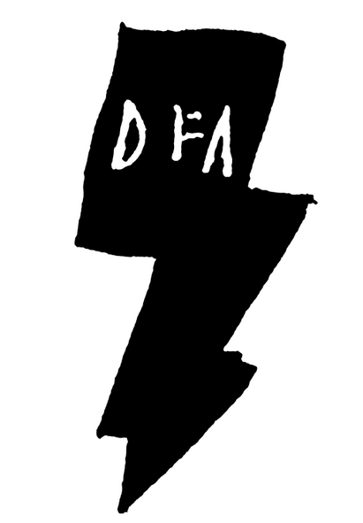
This first logo shows that you don’t need something smooth and slick to make an impact.
DFA was a label right in the middle of the New York dance punk scene and that vibe is carried right on through the logo with its stick-and-poke tattoo design.
Death Row Records
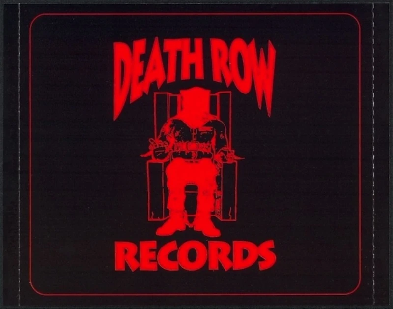
All the eighties and nineties kids out there will remember the many dramas and controversies that surrounded Death Row records in the early to mid-nineties and beyond.
Suge Knight and his stable of artists were as known for their criminal records as they were for their music.
Their choice of font, color, and image of a man in an electric chair clearly communicates the aggressive and violent mentality surrounding the music and artists.
Zarcorp
Zarcorp was a label that catered to the obscure and alternative. They only produced vinyl records and focused on mostly obscure bands in the electronic and alternative scenes.
Their logo embraces the weirdness and obscurity of the label with its nod to optical illusions that buries the company’s “z” behind overlapping circles.
Blue Note
This seminal jazz record company’s logo (in use from 1939-69) is so iconic that it has come to define the whole genre of jazz music. As simple as it is powerful, the logo calls to mind not only musical notes, but scores as well.
The logo’s simplicity would go on to inspire other record label logos, such as Sub Pop (see #9 on this list).
Def Jam Recordings

Def Jam was one of the first record labels to focus on producing and promoting hip hop music in the early 1980s.
The beauty of their logo was that it calls attention to, not only the first letters of the label’s name, but also highlights the importance of DJs to the early hip hop groups and music.
While the label expanded its stable of artists to include those beyond hip hop, their logo remained an icon of the early 1980s hip hop scene.
Factory Records
It’s rare that a logo becomes as iconic as the brand itself but that’s the case for Manchester, UK-based record label Factory Records.
Rather than trying to create a generic label logo that could encompass many places and genres or trying to create a logo that captures the feeling of a specific genre of music, Factory Records chose to pay homage to their hometown of Manchester.
The stylized cityscape is based on the cityscape of Manchester itself.
Island Records
Sometimes, a logo manages to encapsulate not just the genre represented by their artists, but also the hometown of the label. Island Records is a great example of that kind of label.
The label was founded in Jamaica and rose to prominence with their first big artist, Bob Marley.
The simple palm tree captures the island feeling both, while also being unique enough in its monochromatic color scheme that you know it’s an Island Records logo you’re looking at.
Motown
Many long running labels go through a series of evolving logos throughout their history with each one capturing a moment in time in the history of the label.
Motown has had many logos over the years but none as iconic as the logo from the mid-1960s that became synonymous with the Motown sound.
This logo became such an iconic part of Motown history that the label has gone back to using it in this modern era.
Sub Pop
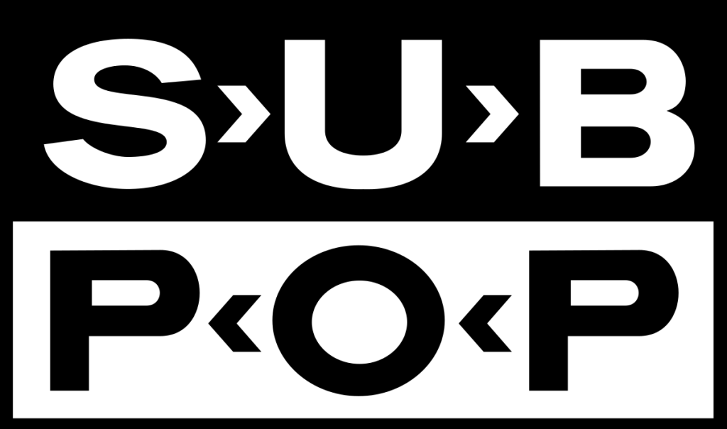
The stark, bold black and white logo for this Seattle-based record label is one of the reasons this label has become an icon in the music industry over the past three decades.
The bold nature of this logo, and the compact design, was intentional so that it could be used on the front and back of album covers.
Ghostly
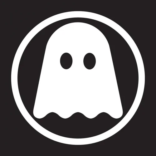
You know a logo is a pinnacle of sleek graphic design when some use it to cover the Apple logo on their MacBooks. Ghostly International’s logo is just that kind of design.
Ghostly specializes in blissful electronic music and, in addition to being an impactful design in and of itself, also captures the dreamy, modern feel of the music they are known for.
Earache Records

Going beyond the name, the Earache Records logo lets you know that you’re in for some loud, hard music when you pick up one of their records.
The splatter paint background combined with the harsh-looking font very effectively conveys the label’s hard metal roots and current indie-metal focus.
Warp
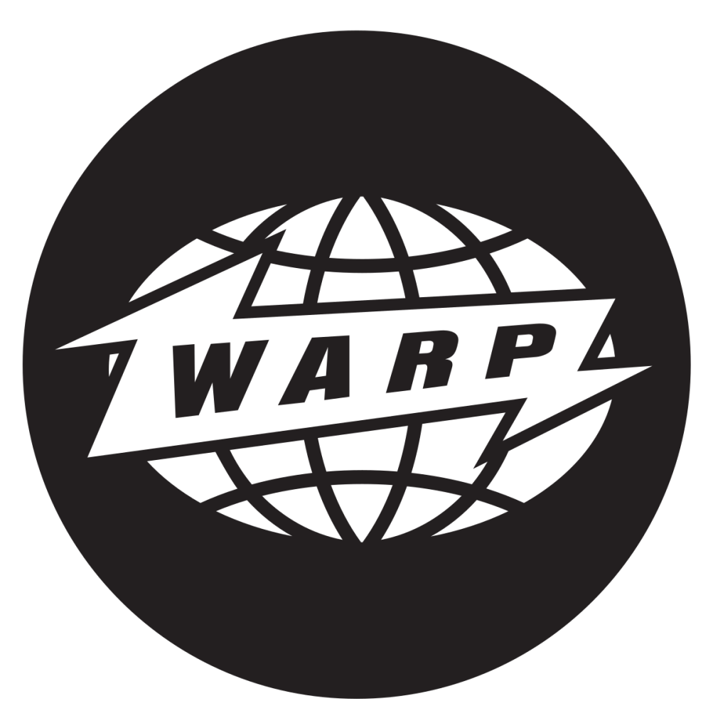
Other than a color change, the Warp Records logo has remained constant since the label’s founding.
The logo was designed in 1989 by Ian Anderson of The Design Group and captures the international edginess that has become synonymous with Warp.
Enjoy our content? Your review makes a difference.
From the studio
Want this done for you?
One dedicated team. 140+ creative services. Real humans doing the work.