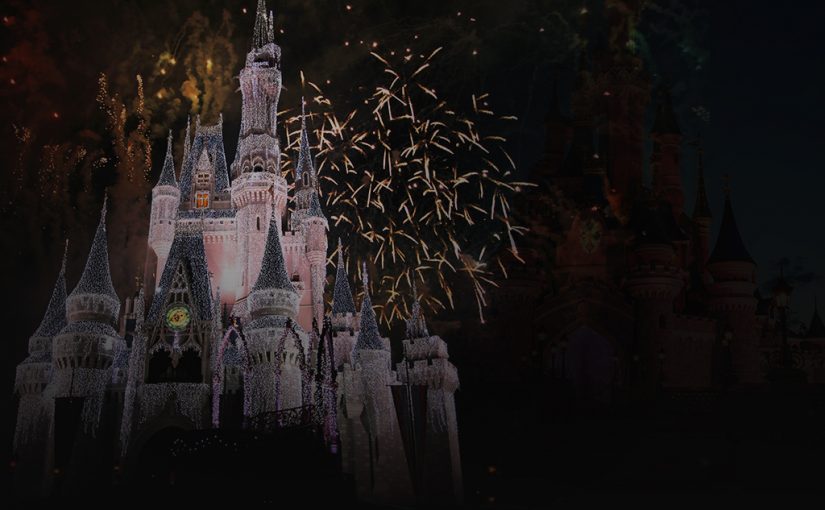
Few logos can put a smile on people’s faces like Disney’s can. Whether it’s nostalgia for adults or excitement for kids, Disney offers the promise of magical entertainment. Its logo is a big part of that, combining a distinctive font with a castle that evokes one of its classic films.
The Early Years
From Steamboat Willie’s debut to the mid-1980s, Disney was fairly minimalist in its branding. The name Disney carried a lot of weight, and Steamboat Willie (later Mickey Mouse) was enough to provide brand recognition. A later version featured an animated profile of Mickey to show the company’s innovative approach.
The Castle
In 1985, The Walt Disney Company decided to refine its branding. They introduced the distinctive Disney font and used an iconic image from one of their best known films: the castle from Cinderella. The logo was a simple white design on a blue background, and throughout its Disney Renaissance, the castle logo reigned supreme.
The Improved Castle
In 1995, Disney released Pixar Animation Studios’ new film, Toy Story. The CGI film required a new, computer-animated logo, and for years, Disney kept this branding as it transitioned its production from hand-drawn to CGI animation.
The Lush Castle
Over the past few years, Disney has developed its castle logo into more complex and beautiful. Meant to represent the pinnacle of animation, the lush new logo is fully animated. The distinctive font remains the same, and Disney has now cornered the entertainment market with its impressive brand presence.

