Blog · Logo Design
Top Logo Stories - The Story Behind the Starbucks Logo
By David Alexander
March 26, 2020 · Updated December 20, 2021 · 3 min read
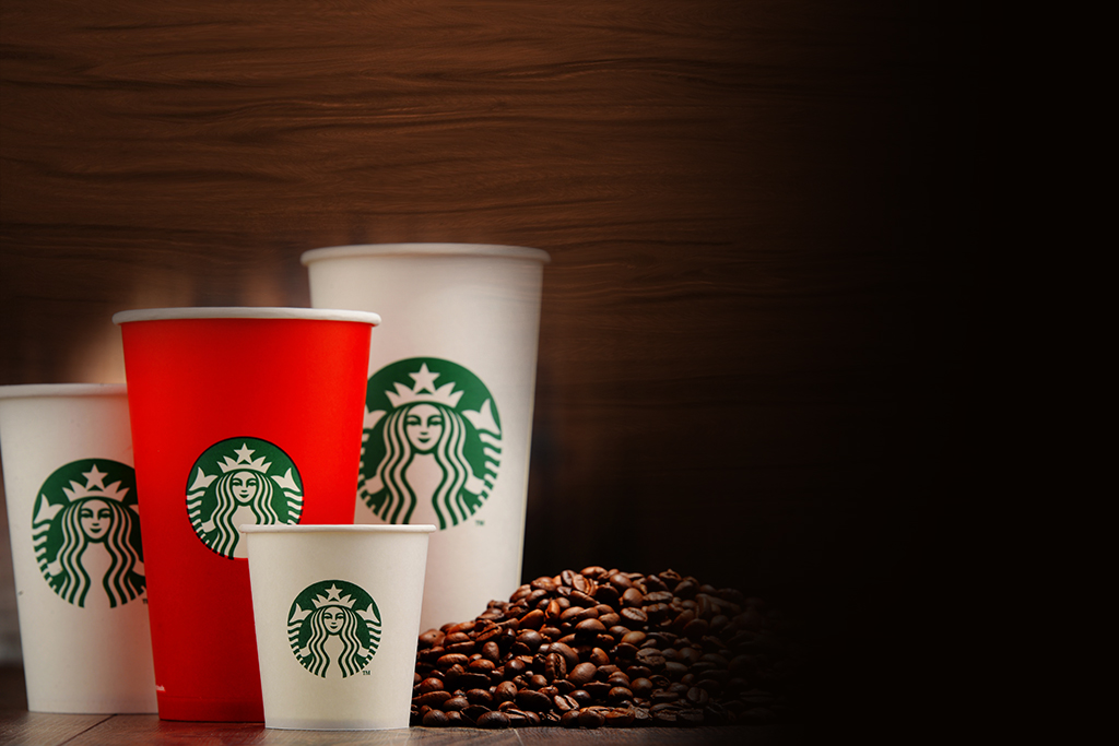
As you open the envelope and pull out the gift card, you notice the wavy hair, captivating eyes, knowing smile, twin tails, and other familiar features, and you know without having to read a word on the card that you have a Starbucks gift card, for the Starbucks logo is one of the most recognizable of all corporate logos worldwide.
If, however, you have not been a Starbucks patron for at least several years, you may be unaware that the logo has not always looked like the one on that gift card or that it has a rich history involving several transformations.
Origins
In 1971, Jerry Baldwin, Gordon Bowker, and Zev Siegel founded Starbucks Coffee, Tea, and Spice in Seattle, Washington, to sell coffee beans. Immediately, the founders knew they needed a unique, catchy logo.
Wishing to use a logo evoking coffee’s maritime history and Seattle’s own ties to the sea, the founders discovered their inspiration in one of the many old seafaring books they pored over. There, they found a Norse woodcut from the 16th century depicting a two-tailed siren.
The Greek epic The Odyssey reveals sirens as female monsters with beautiful voices whose songs lure sailors to them only to be killed and devoured. Other cultures have made sirens and mermaids virtually synonymous, with the sirens’ motives ranging from benign to sinister but always with the common thread of beauty and irresistible allure.
Did the founders wish to suggest overpowering temptation through their logo? No one but they seems to know for sure, but from that woodcut, they fashioned the original logo: a topless siren with long hair and two tails.
First Makeover
1987 brought a change of ownership (Howard Schultz), name (Starbucks Coffee), direction (selling brewed coffee and more), and logo. Simpler and more polished, the new logo still featured a full-body version of the siren/mermaid, now with the navel visible, and the company name encircling the figure (the “donut” design); new were two stars in the “donut” and a starred crown atop the mermaid’s head. In addition, to symbolize freshness and growth, the designers used a green palette with black and white present as well. Since then, the logo has undergone revision twice, but the 1991 version was far more similar to the current one than the original 1971 version was.
Second Makeover
In 1992, Starbucks became a publicly traded company, and the logo saw more changes. Perhaps most immediately significant was the close-up perspective of the mermaid; instead of showing the mermaid’s full figure, the logo showed her from the waist up, with the navel no longer shown, and with the ends of the two tails visible. Still present were the “donut” design and the wavy hair cascading sensuously over the breasts.
Today’s Version
Most recently, the logo changed in 2011. One reason for the change was to mark the company’s 40th anniversary, but there were also two “problems” the designers wanted to address.
The first was that the company had learned that the “donut” design drew so much attention to the words that overseas competitors were creating knockoff logos. To deal with this, the company abandoned the “donut” and enlarged the image of the mermaid. Gone was the company name, and that actually helped send the message that Starbucks was about more than coffee, as by then it sold other breakfast and lunch sandwiches and other foods and beverages.
The second “problem” really came about during the redesign process. With better technology, the team was able to create images in higher resolutions and which looked more realistic. As they “perfected” the mermaid’s features, they came to feel she was too perfect, almost impossibly perfect, and they felt it was due to the symmetry of her facial features. And that is why one side of the nose dips slightly lower than the other does; the designers felt that made the mermaid human and attainable enough to “work.”
A Fixture in Our World
However one perceives the Starbucks mermaid– perfect, real, benevolent, a seductress, a figure some are reading way too much into, or whatever else– there is no disputing that this logo is one of the most familiar and effective corporate symbols in the entire world.
From the studio
Want this done for you?
One dedicated team. 140+ creative services. Real humans doing the work.