ga('send', 'pageview');

12 Creative Ideas To Boost Your Marketing

Tired of the same old marketing tactics? With so much information out there, you must stand out to get noticed. It’s time to think outside the box!

Here are some innovative ways to freshen up your brand and make a memorable impact on your target audience.

1. Tease Your Audience with a Trailer

(Image source)

It works for movies, and it can work for you, too! A teaser trailer gives audiences a sneak peek of what your brand has to offer. Use one to welcome people to your YouTube channel, jazz up your landing page, or as a pinned post on Facebook or TikTok.

You can play up the cinema theme with an exciting supercut of your product, or take a more practical approach and show them around. Choose the concept that best suits your brand personality.

For example, Taco Bell has created a series of trailer-style commercials to promote its products, under the fake studio “Live Mas Productions.”

2. Launch a Social Media Challenge
(Image source)

Who doesn’t love a challenge? Choose an activity that makes sense for your target audience. Then, let your followers try it themselves. When promoted well, challenges can attract attention from other social media users. This creates a lot of potential for people to discover your brand!

Your challenge could be a physical action that people replicate (e.g. the ice bucket challenge), a problem they solve, or their twist on a theme. Think about what would entice your potential customers yet also drive them toward your product.

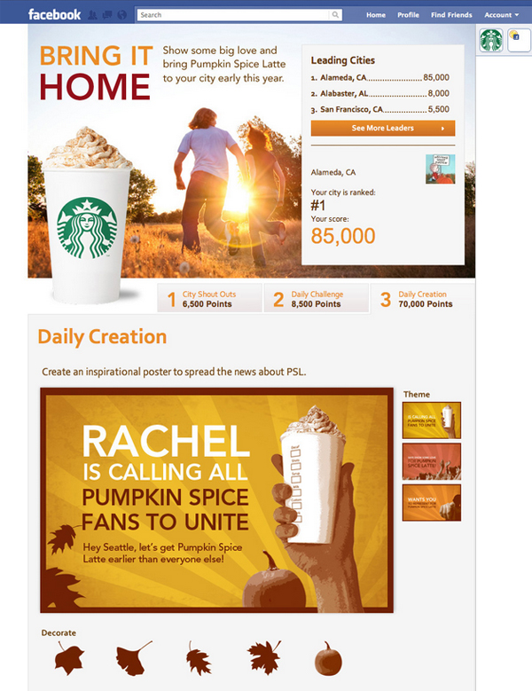
For example, Starbucks hosted a competition to see which city had the most Pumpkin Spice Latte fans. Customers were eager to share their PSL love!

3. Host Virtual Workshops

(Image source)

During the pandemic, stores such as Michaels and Jo-Ann Fabrics began offering online crafting classes. These helped them stay afloat while people were staying home.

And it turned out to be a great idea. Customers loved the opportunity to learn and have fun with crafting experts! See the full video here

What’s your brand’s area of expertise? Turn it into a virtual class or workshop. You can release sessions as an edited video or a live stream.

4. Use Guerrilla Marketing

Named for independent fighters with unconventional methods, guerrilla marketing means popping up in unexpected places.

For example, instead of posting handbills, you’d paint a mural advertising your brand. You could also do impromptu street demos or flash mobs to grab attention.

Here’s a branded crosswalk from Bic:

(Image source)

The sky’s the limit. Just be sure to get proper permits! When in doubt, stick to sidewalk chalk.

5. Make People Laugh
(Image source)

If it suits your brand identity, spice up your marketing with a bit of comedy. Insurance giants GEICO and Progressive have both become cultural icons thanks to their whimsical and absurdist commercials.

But you don’t need a huge advertising budget to make your audience laugh. Try making a humorous skit to release on your social channels. You could even poke fun at yourself if it makes sense for your brand personality.

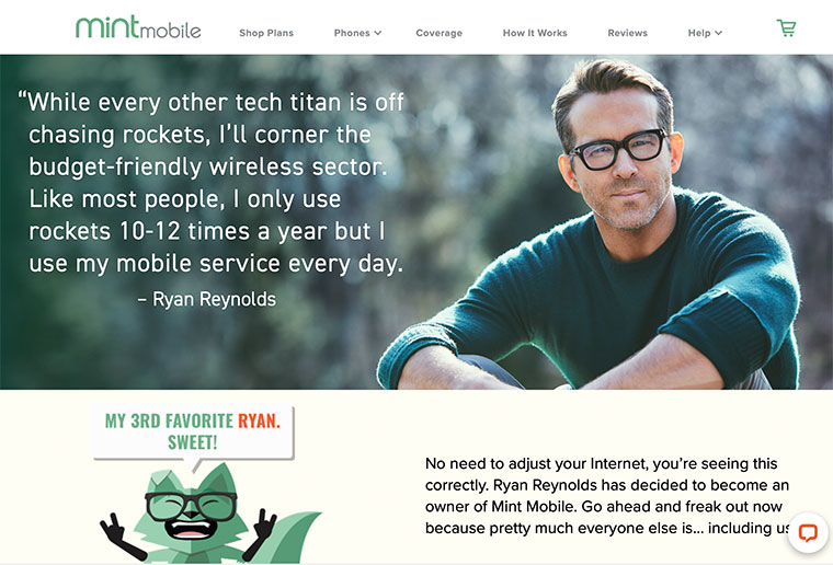
Here’s an example of how Mint Mobile owner, actor Ryan Reynolds, uses his offbeat comedy to promote the business.

Witty copywriting, the whimsical mascot, and the funny quote from Reynolds help forge Mint Mobile’s silly yet relatable brand identity.

6. Quiz Your Audience

(Image source)

Everyone likes to feel smart. Give your audience a chance to show off their trivia knowledge. A quiz could be a fun piece of social media content to boost engagement.

And don’t forget personality quizzes! These are perfect for engaging your potential customers and making them feel special. For example, you could let people find out their “hair personality,” and then drive them to your haircare products.

Above is a great example from ILoveJeans.com that encourages visitors to find their body shape before browsing the shop.

7. Rethink Your 404 Pages

Affirm your brand identity and keep wayward customers engaged with customized 404 pages. Following a broken link is frustrating. But if you get creative with your 404 page design, you turn a mistake into a marketing opportunity!

Here’s a great example that uses some humor:
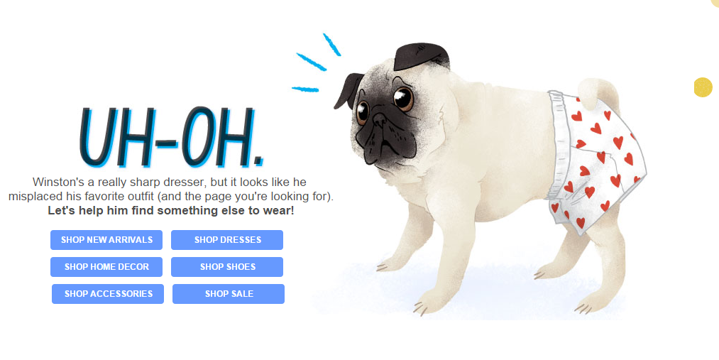
(Image source)

It also points users toward more products, so the 404 page doesn’t have to be a dead end!

8. Sponsor Another Brand
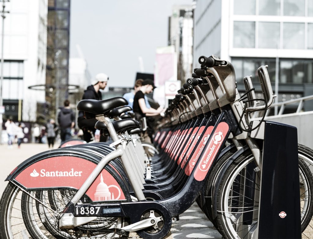
(Photo by Yomex Owo on Unsplash)

Need to expand your customer base? Try putting your name somewhere unexpected. In addition to pop up advertising (see idea #4), you could sponsor a product, organization, or event that aligns with your brand values.

For example, banking giant Santander sponsors these city bikes that residents can rent. This gets their name all around town, literally!

9. Meme Your Brand

(Image source)

Memes are the bread and butter of the internet, right up there with funny cat videos. If it makes sense for your brand, create some memes! You could poke fun at a relatable situation, portray your brand in a humorous way, or show what happens without your product.

Here’s a funny example using the popular “Distracted Boyfriend” meme format. It not only plays on the word “hot” but also jokes that people would ignore their significant other for Ruffles chips.

Before creating a meme, make sure you understand the origin of the meme format and how to use it. Otherwise, you may seem out of touch, inauthentic, or even cringey.

10. Ask for Captions
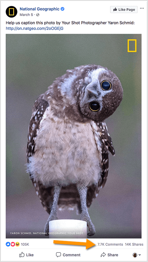
(Image source)

Invite your social media followers to caption an image. This could be an interesting photo from behind the scenes, an image of your product in action, or simply a funny image that relates to your brand.

National Geographic makes its traditionally sophisticated brand more engaging and humorous with this post.

11. Produce an Event

(Image source)

Event marketing allows consumers to immerse themselves in your brand. This is an amazing way to build recognizability.

Who could forget a fun contest, pop up fair, or food truck experience? If your brand name is on it, people associate that with their good memories.

For example, to promote the show “9-1-1 Lone Star” in New York City, Fox TV set up food trucks and handed out Texas style chili and cornbread. After all, the quickest way to someone’s brand loyalty is through their stomach!

12. Publish User Generated Content
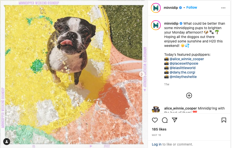
(Image source)

No time to create new social media posts? No problem. User generated content (UGC) strengthens your brand by showing off your loyal community. There are three main ways to collect UGC:

  • Run a contest, such as a photo competition, then publish the winner. Check out the #ChipotleCreator Challenge for a great example. Chipotle asked customers to compete for the best burrito combination.
  • Host a social media challenge (see idea #2) or promote a hashtag, and ask people to contribute. For example, Kodak will republish photos tagged with #MadeWithKodak, and Minnidip will round up pictures of cute dogs in their inflatable pools.
  • Monitor hashtags related to your brand and request permission to repost photos and videos. Starbucks is known to republish posts tagged with #starbucks or #starbuckscoffee.

Posting UGC on your brand channels proves that you care about your customers. Plus, it saves you tons of time!

Wrapping Up

See any ideas on this list that you like? With a bit of creativity, you can turn your marketing from mediocre to magical.

If you need some help creating designs or writing copy for your new clever marketing campaigns, sign up for Flocksy! Our diverse team of creatives is eager to bring your vision to life.

12 Design Tips For Amazing Ads And Marketing Materials

Nobody likes ads…until they do. The right ad can make your potential customers laugh, nod their heads, or come down with a case of FOMO. When done well, ads start a conversation with your audience.

So, how can you capture consumers’ attention and speak to their desires in one simple ad? It all comes down to the visuals. Design is a powerful communication tool. Here’s how to cut through the noise and make a lasting impact with just a few words!

#1 Make Your Fonts Legible

Your audience does not sit down to consume ads. They are an interruptive form of marketing, one that pops up throughout people’s daily lives. To catch their eye, you need to make your ad as legible as possible.

The first place to start is the typeface. While fancy cursive or funky headline fonts may be fine for a wedding invitation or album cover, ads’ typefaces should be clean, simple, and highly legible.

For example, this ad design features too many different typefaces, several of which are tightly kerned or heavy cursive. There is also way too much text on the design. Much of it could be illustrated visually!

#2 Limit The Text

In addition to having great copy on your ad, you must keep it short. Most people can read short snippets of text in mere seconds. But once you start putting paragraphs on your ad, you’ll quickly lose them.

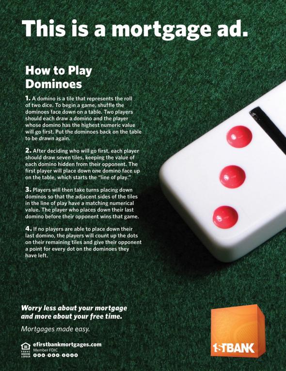
For example, this ad design started with a great concept (“we make mortgages easy so you have more free time”) but got weighed down by its long paragraphs.

Also, each bit of text should have a font size proportionate to its importance. Obviously, key heading and calls to action should be the biggest! That’s not the case in this design.

So, keep your ad copy short and sweet. It’s best to use active language and simple phrasing. Remember, you want people to read it as easily as possible. Bonus points if you can make it funny!

#3 Embrace The F Pattern

People tend to process visual information from left to right across the top, then down the left side and across. This “F pattern” describes how most viewers direct their focus.

Therefore, important elements should be at the top and left of your ad design.

#4 Mix It Up

Sameness is the enemy of attention. The more similar your ads’ visual elements, the less likely it is that viewers will parse critical information. Your most impactful graphic should outweigh the others.

Also, headings and other key messages should be significantly larger than the other text.

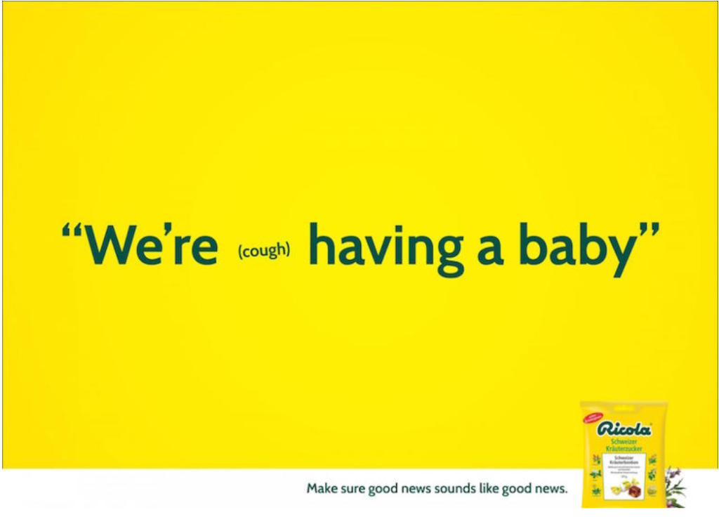
You can play with font sizes to further express your message. Consider how this Ricola ad illustrates how a small cough can intrude upon a conversation.

Also, each graphic should be sized appropriately to capture attention and balance the other elements. This is especially important if you have lots of images in your design!

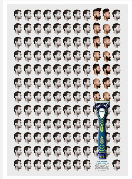
Notice how this ad design balances the size of the razor against the grid of portraits. The razor is placed in the lower third, which gives the overall layout a dynamic feel.

#5 Get Suggestive

Let’s face it: the most provocative ads are often the most effective. Tantalizing or tricking the audience definitely gets their attention!

To make this design approach work for you, consider how you can tease something taboo or uncomfortable. Then, let the viewer fill in the gaps.

#6 Optimize Your Use Of Color

Your ad’s color scheme has more of an impact than you might imagine. First, colors play a huge role in how people perceive and process your design. Intentional color choices help express your values while engaging your audience.

Second, colors can clarify your key message. See how this ad uses color contrast to draw attention to the most important visual elements.

#7 Leverage Color Psychology

Following from tip #7, consider how different colors evoke different emotions. Color psychology is a well established set of principles that guide how people perceive visuals.

For example, purple suggests power, yellow connotes friendliness, and so on.

This L.L. Bean ad uses a friendly yellow to complement its central image of an adorable golden retriever. Combined with a witty, benefit driven headline, the overall design creates feelings of comfort and happiness.

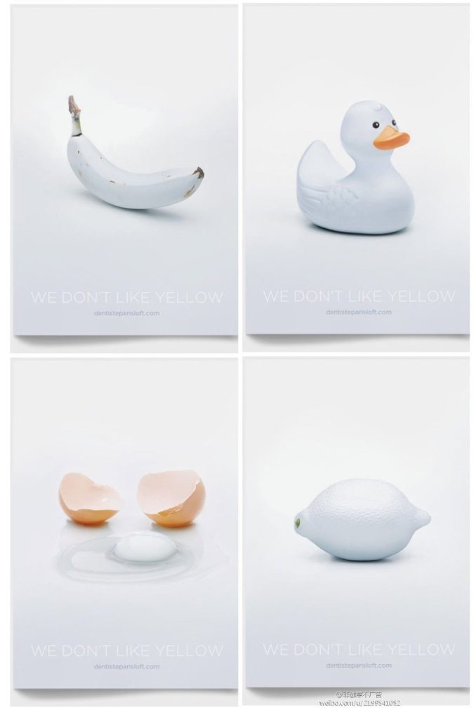
By the same token, a deliberately “wrong” color choice will turn viewers’ heads and get them to pay more attention. That’s because our brains want to reconcile any incongruous information.

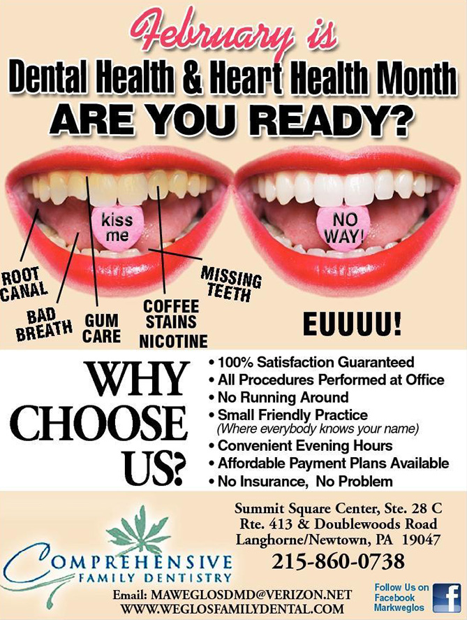
Take a look at how this series of dentist ads portrays famously yellow objects as pearly white to promote their services.

#8 Incorporate Iconic Figures And Places

Our brains are wired to pay more attention to what we already know. That’s why recognition is so critical to advertising success. You want people to instantly recognize the elements of your ad.

If they don’t recognize your brand itself, use something they will definitely find familiar.

#9 Focus On Concept, Not Content

Ad designs don’t need to be highly literal. For example, it may seem obvious to depict a lawnmower for a lawn care business. However, is that unique enough to be eye catching?

Remember, the key to effective marketing is to emphasize your benefits over your features. Try using visuals to illustrate a concept rather than merely describing what you do.

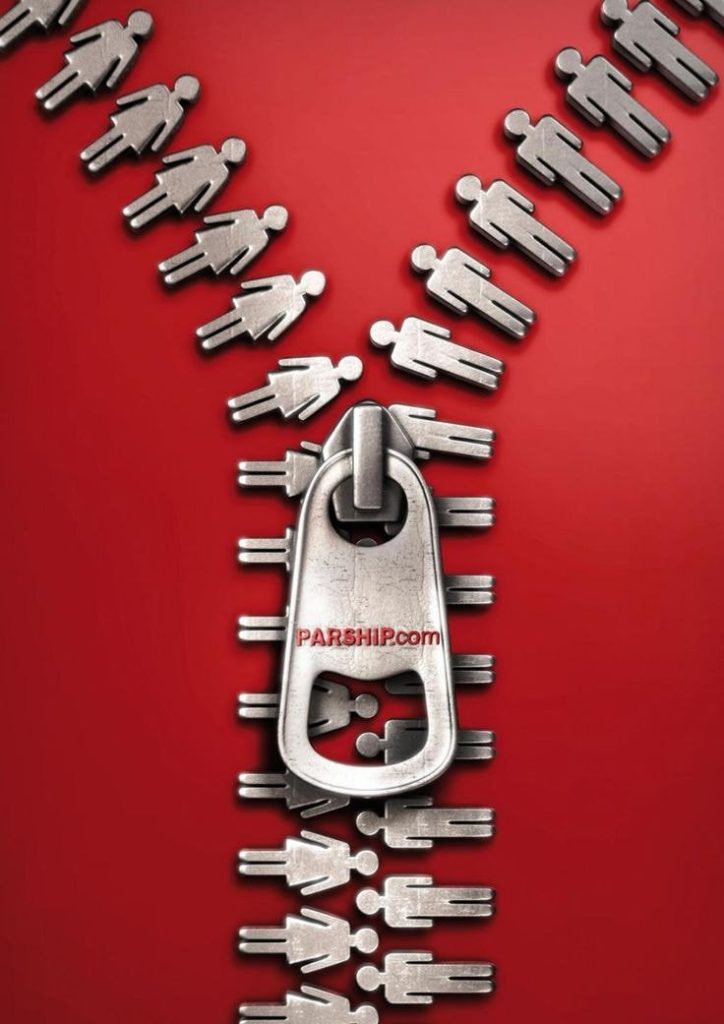
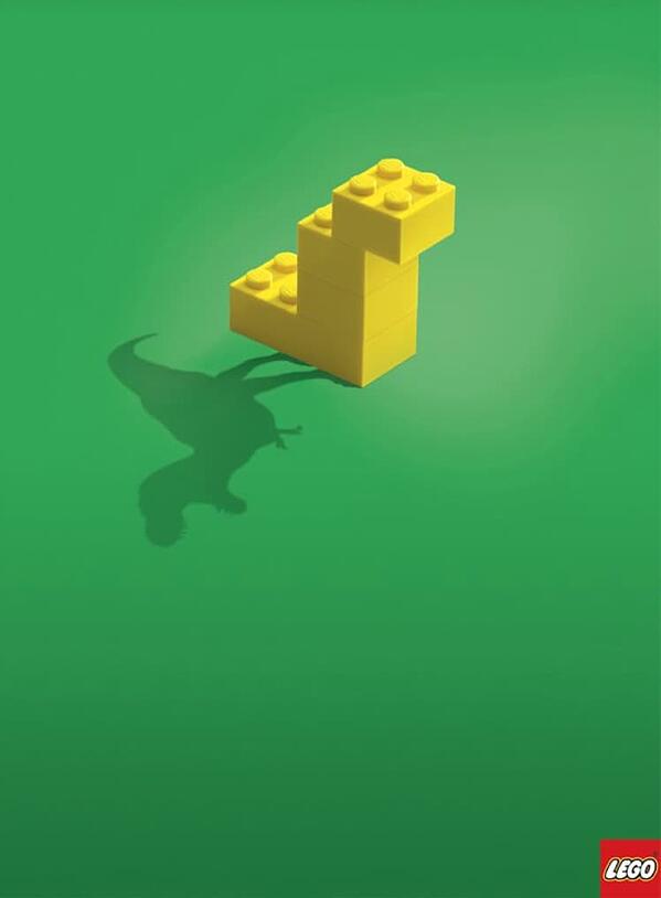
For example, can you guess what’s being advertised by this design?

If you guessed “matchmaking service,” you would be correct!

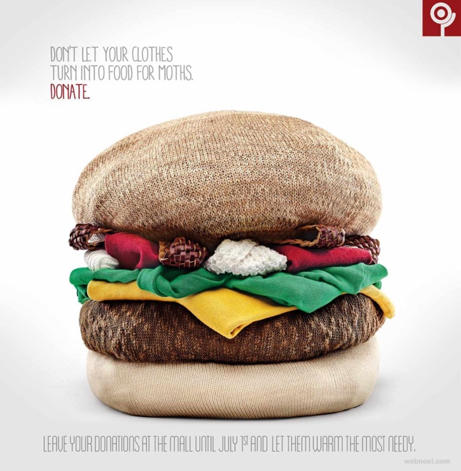
Here’s another example that illustrates the key pain point the brand wants to resolve: getting old, moth eaten clothing out of your home.

#10 Choose A Strong Image

The most impactful ads are rarely complex assortments of words and pictures. A single, compelling image grabs your viewers’ attention. If you can send a clear message with one image, do it!

As the saying goes, a picture is worth a thousand words. An iconic image for your ad might be worth a million.

#11 Use Visual Mimicry

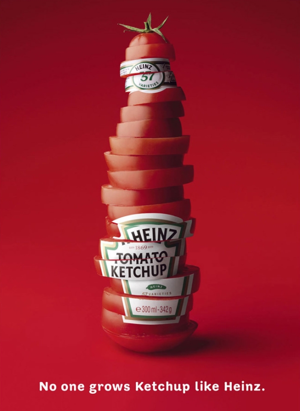
Ad design is an opportunity to get creative with your images. Rather than visually depicting your product’s benefit, illustrate it with an imitation.

Portraying a well known object as your audience’s desire (or even their pain point) engages their interest with few words.

A refreshing lime or dragonfruit infused tea? Coming right up!

When taking this approach, be sure that you differentiate the image from what it’s mimicking!

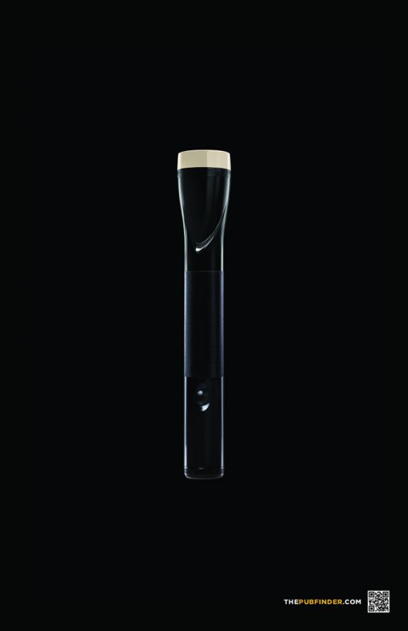
For example, this ad for PubFinder.com is comparing a flashlight to a pint of beer, but at first glance, it looks too much like the former.

#12 Lead With Symbolism

As we discussed above, shorter is better for your ad’s text content. You want to catch people’s eyes without forcing them to read too much.

But what if you could share your message without making them read at all? A symbolic design can say much more than words alone. More importantly, symbolic images resonate more strongly with audiences.

Tap into visual metaphors to express deeper themes in your ad design. These can include images with certain connotations as well as altering graphics to deliver your message.

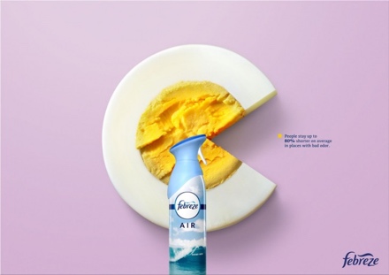
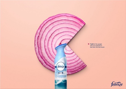
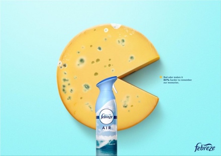
For example, check out this Febreze campaign that depicts well known smelly foods as pie graphs.

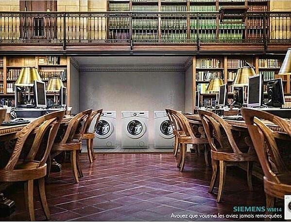
And this design portrays typically noisy objects (washing machines) in a typically quiet place (a library).

The clear message, discernible with minimal copy, is that these washers are much quieter than their competitors.

Wrapping Up

There are definitely some time honored principles for great design … but innovation is crucial for standing out in today’s information overload!

Consider your target audience’s interests, psychology, and pain points, then get creative with your visuals.

Keep the text short and sweet, and swap out copy for strong imagery whenever possible.

Remember: you have just a few seconds to captivate your potential customers. Make them count!

Top 10 Powerful Tips For Awesome Business Flyers

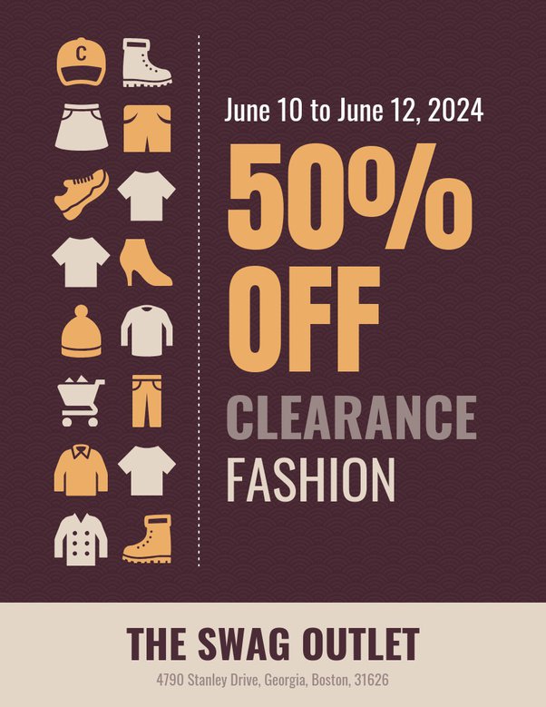
Who says print is dead? Business flyers still have a place in marketing strategies. In fact, direct mail has an open rate of 57 percent. That’s much higher than email!

Print advertisements also offer creative ways to build brand awareness and drive conversions.

Business owners can get some great mileage out of a well conceived flyer campaign, and designers can flex some new artistic muscles compared to email design!

So, what makes a print mailer or handbill most effective? If you want to truly captivate your audience, follow these 10 tips for designing a powerful business flyer.

#1 Minimize Your Copy

Everything you need to know, without a bunch of text fluff. (Image source)

The key to effective flyer design is to make it SKIMMABLE. Yes, people are more likely to peruse a print mailer than an email, but you still don’t want giant blocks of text. Focus on punchy, enticing headlines and simple sentences.

#2 Break It Up

This flyer uses a splash panel, circle graphics, and a footer section to break out and highlight key content. (Image source)

Concise, readable copy is just one part of making a flyer skimmable and enticing. Try breaking up your flyer into distinct segments. This helps draw the eye and create a flow.

Remember, people tend to read in an L pattern, i.e. across the top and down the left side. By dividing your design into sections, you help them repeat that pattern and absorb more of the information.

Your segments can be parallel, a grid of boxes, a row of circles, anything that breaks the flow and helps organize your flyer.

#3 Skip The Bells And Whistles

This flyer has a dramatic watercolor background, so the designer wisely made everything else minimal. (Image source)

Gradients, drop shadows, and clip art, oh my! With so many graphic elements and effects out there, it’s tempting to go a little overboard.

Limit the use of complex designs and cheesy effects. Current trends favor gradients, neon colors, and masking, but you’ll want to stick to one key effect.

For example, don’t use gradients in both your lettering and the background. If using a glow effect, apply it only to the primary image or text.

In short, your design should be accessible and simple, rather than an 80s throwback party!

#4 Use Relatable Images

Speaking of clip art, be sure to use it wisely. Goofy illustrations and generic icons can detract from your message. They just scream, “We threw this flyer together in 5 minutes.”

Modern business flyers benefit from a more human aesthetic. When possible, incorporate original photography or illustration.

If you must use stock images, choose ones that look more natural rather than the slick commercial portraits. Hand drawn pictures are very “in” right now and can offer a creative, inspiring aesthetic.

A charming illustration and a handwriting typeface perfectly capture the homegrown, community vibe of this event. (Image source)

#5 Stay On Brand

The flyer shares similar colors, as well as an earthy, dramatic vibe, with the website. (Image sources: flyer and website)

Always stick to the brand identity, if one exists. People should see the same colors and fonts on your flyer and your website.

If there’s no brand identity to work from, choose 1 to 3 fonts and 3 to 6 colors that will define the aesthetic. Remember, fonts are not the same as typefaces. They are variations of typefaces.

Try to use no more than 2 typefaces, and simply use the bold or “heavy” version for emphasis.

#6 Choose the Right Colors

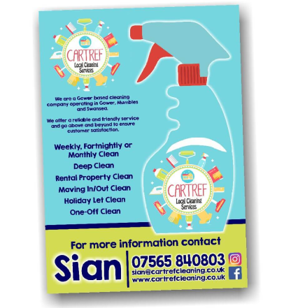
Bright blue and lime green evoke feelings of calmness, citrusy cleaners, and fresh air. (Image source)

Even if you’re using brand colors, be aware of color psychology. Certain hues trigger specific emotions or moods. These effects also depend on the fonts you use.

For example, if you want to hype up your new product, high energy colors (red, orange, etc.) and “display” typefaces are usually better. By contrast, cool blues and greens plus sans serif fonts seem more relaxed and contemplative.

#7 Benefits, Not Features

Don’t you want to dive right in? (Image source)

We’re borrowing this tip from the world of copywriting as it applies to flyers, too. When developing a business flyer, you should emphasize what customers could enjoy. What’s most enticing for them?

For example, a flyer for a new burger restaurant could lead with the text “Restaurant Opening” and list all the details below.

Recipients likely won’t care about any of that. But what if the flyer had a big, bold headline of “Hot, Juicy Burgers,” plus a dramatic photo of a hamburger and subheads about “grass fed beef” and “homemade buns”? Isn’t your mouthwatering?

Both the copy and graphics should focus on benefits rather than features. Let that key selling point steal the show.

#8 Include A Call To Action

Enticing image, simple layout, call to action directly in the pattern. (Image source)

After you’ve gotten your potential customers all excited, it’s time to tell them how to get those big, juicy benefits. One of the top mistakes in designing a business flyer is forgetting the call to action (CTA).

What should people do after they read your flyer? Should they call your business? Pay you a visit? Log onto your website? Choose ONE primary CTA and make sure it’s crystal clear.

The more options you add, the more confusing it is. Remember, your goal is to catch their attention and inspire them to take action ASAP.

#9 Leave Room To Breathe

There’s a lot of information on this flyer, but the ample white space makes it easier to parse. (Image source)

White space is everyone’s friend. It separates key design elements and helps prevent the reader from getting overwhelmed. Be sure to leave a buffer around each part of the flyer.

If white space doesn’t fit your design, it can be “negative space,” i.e. any area where there is no text or distinctive image. This is especially helpful if you have a beautiful background. Why cover it up?

#10 Keep It Simple

Benefit front and center, enticing image, simple layout = a winning flyer. (Image source)

While print design offers a bit more flexibility than an email campaign, it also has more constraints. There is limited “real estate” and the flyer must really POP to catch the eye.

That means cohesive, simple layouts are more effective than crazy collages of images.

Choose the primary message of your design, whether textual or graphic. Let that stand out while the rest of the design complements it.

Bonus Tip: Proofread, Proofread, Proofread!

We’ve all done it. When you spend a lot of time on something, you get tunnel vision. This can make it hard to see errors, even if they’re glaringly obvious to anyone else.

You definitely don’t want to spend tons of money on printing without proofreading your flyer!

It’s usually a good idea to have a new set of eyes review the flyer. Look for both copy mistakes (typos, misspelled words, incorrect grammar, factual errors) and design issues (misaligned layers, muddled colors, font legibility).

20 Famous Corporate Logos And What You Can Learn From Them

Ever wondered what makes a perfect logo? Recognizability is obviously important: your logo is a crucial tool for developing your brand. But what makes a logo recognizable? It’s usually a blend of design simplicity, compelling visuals, and iconography that aligns with your brand values.

The best way to understand the art of logo design, and to find the perfect visual identity for your own business, is to review the world’s best corporate logos. These are the designs that have endured in the public imagination, which means they’re ideal study material for developing your own memorable logo.

Nike

Nike’s famous “swoosh” expertly communicates the brand’s core values: dynamism, accomplishment, and simplicity. Designer Carolyn Davidson was inspired by the company’s namesake Nike, the Greek goddess of victory. The eye pleasing design makes excellent use of the golden ratio (1.618:1).

The swoosh’s curve corresponds to a Fibonacci spiral, a shape that grows by a factor of 1.168 with each quarter turn. A final upward stroke evokes feelings of movement and motivation, yet aligns perfectly with the initial point of the curve.

This highly recognizable logo has been hailed as one of the world’s best, and it’s indeed an achievement in stellar design!

Amazon

Amazon’s famous logo combines its name with the “smile,” which doubles as an arrow pointing from the “a” o the “z.” The message is clear: Amazon has everything from A to Z. The arrow also connotes speed and innovation, both of which are crucial to the Amazon brand promise. And of course, the “smile” reflects the satisfaction and entertainment that Amazon customers can enjoy.

Disney

According to legend, the iconic Disney font seen in its wordmark is based on Walt Disney’s handwriting. It also has a whimsical and dynamic vibe ideal for the world’s leading animation company. Disney’s logo is recognizable both in the full wordmark and the abbreviated “D” lettermark.

The “D” comprises a distinctive swirl with a wandlike vertical stroke, an homage to the seminal short film “The Sorcerer’s Apprentice” in the Disney classic Fantasia. Many versions of the logo also contain Cinderella’s castle from Disneyland to reflect the brand’s dominance in theme parks and immersive entertainment.

Unilever

Plenty of companies earn brand recognition with lettermarks, but Unilever’s logo takes it a step further. Look closely at their “U” and you’ll see leaves, fruits, trees, starbursts, bees, hearts, and more … all symbols of their commitment to nutrition, natural wellness, and beauty. This collage of icons gives Unilever’s logo a whimsical vibe, yet the overall image is a simple, professional feel.

Evernote

Based on the idea that “an elephant never forgets,” note taking app Evernote promises to help you remember everything. The visually pleasing and adorable logo features a simple green elephant head.

But look closer and you’ll see that the elephant’s ear is folded as you would fold a page in the book. This subtle yet clever design choice signifies the wisdom of the elephant and the purpose of the Evernote app.

Dropbox

Dropbox’s logo depicts an open box. While this may seem like an obvious image, the logo is actually quite clever. If you look closely, you see that the “box” is composed of five identical diamonds. Four of them are arranged in a square, with a diamond shaped negative space in the middle.

The fifth diamond makes the shape of the box and is dropped exactly below the open space. The resulting illusion is of an open box, but the logo’s symmetrical design and strategic spacing also perfectly illustrate this digital syncing service.

Starbucks

Inspired by the legends of Seattle’s seaside culture, Starbucks made a bold choice with its logo. Rather than going the obvious route with imagery of coffee beans and cups, they created the mythical and enticing siren.

The image not only taps into Seattle’s history as a port of call but also evokes ideas of magic, temptation, and wonder, all of which reflect the brand’s commitment to premium coffee and innovative recipes.

Chanel

Two interlocking C’s, each a mirror image of the other, is the perfect way to symbolize coordination and balance. This makes it an ideal logo for the leading fashion brand Chanel. It’s technically a letter mark for “CC,” the initials of founder Coco Chanel. However, it’s also a simple and elegant logo that affirms the company’s sophistication as well as its historic roots.

Volkswagen

While automobile logos all tend to look alike after a while, it’s easy to recognize Volkswagen’s. After recovering from a dark period in which Hitler’s Germany required them to use the swastika, Volkswagen rebranded to focus on its initials.

However, their “VW” lettermark subverts convention with a vertical orientation. The “V” is positioned above the “W,” with the middle point of the latter directly supporting the bottom point of the former. The “W”‘s upward strokes run parallel to the “V’s,” providing a dynamic yet synchronous design that illustrates the brand’s progressive and streamlined engineering.

PlayStation

Electronics logos are more than a recognizable shape to print on the devices. They symbolize the subculture that emerges around the experience of using those electronics. (Just look at Apple’s famous logo, also on this list!) One of the best known logos in the gaming world is that of PlayStation.

Composed of an interlocking “P” and “S,” this unique design has the illusion of being 3D. The curve of the “P” flows seamlessly into the top of the “S”, evoking the circuitry that makes the gaming console work. It also has a playful vibe, which aligns perfectly with PlayStation’s subculture.

Pepsi

With a dynamic design, bright colors, and simple shapes, Pepsi’s logo connotes happiness, community, and effervescence. This is the perfect visual complement to the soda brand’s “Pop Fizz Ahh” slogan.

The round logo comprises a large red semicircle, a swooping white shape, and a blue wave. Together, they evoke both the physical experience of opening a can of Pepsi and the patriotic, dynamic vibe of the brand.

FedEx

Did you know that FedEx’s logo has a hidden arrow? Once you see it, you can’t unsee it! At first glance, it appears to be a standard wordmark with the company name. However, the negative space between the E and the X creates an arrow that symbolizes the company’s commitment to fast shipping and forward thinking. Plus, the unique combination of adjacent secondary colors (purple and orange) adds a dynamic yet balanced feel.

Caterpillar

Abbreviated to “Cat,” Caterpillar’s wordmark is the epitome of double valence in logos. The black, tall lettering expresses power and dominance, while the yellow triangle suggests either a mound or a highway. Either way, this logo signifies construction, progress, and authority.

The striking contrast of black and yellow is unique to logos: it perfectly expresses the energetic potential of construction while evoking the strong, sturdy foundation of the company.

Apple

The Apple logo is so recognizable that it doesn’t even need to appear alongside the company name. Inspired by the classic story of Sir Isaac Newton theorizing the law of gravity when an apple fell, the logo evokes feelings of insight and progress.

Early versions of the now famous design included a rainbow pattern to symbolize inspiration and discovery. Today, the logo is minimalistic, but with its gentle curves and the distinctive “bite,” it’s the perfect icon for this seminal electronics company.

Netflix

Netflix’s wordmark is quite simple. But look closely and you’ll see the streaming giant’s brand values captured in the design. With tall, dominant letters and moderate kerning, the typeface hints at Netflix’s role in the streaming revolution, as well as its seamless experience.

The words are also curved slightly downward from a center point, giving the wordmark the illusion of expanding. The platform’s animated logo enforces this idea.

McDonald’s

A letter mark that also reflects the iconic “golden arches” used in early restaurant design, McDonald’s logo is now a globally recognized symbol of happiness. The vibrant yellow, simple strokes, and whimsical vibe capture the brand’s core values: satisfaction and playtime. It’s also a nicely open and symmetrical design that makes it very appealing to young people, especially!

NBC

A rainbow peacock doesn’t exactly seem like a suitable logo for a broadcasting company, but NBC’s enduring and highly recognizable logo has proven that assumption wrong. As a leading provider of color TV programming, NBC wanted to feature vivid colors in its logo.

Today, each of the colors represents one of NBC’s core departments. The peacock is looking toward the right to signify forward thinking, while the teardrop shaped “feathers” evoke imagery of flower petals and lens shutters. The messaging is simple: NBC promotes growth through innovative visual media.

Shell

Shell began as a seashell export company that eventually moved into oil extraction and refined. Its famous “pecten” logo illustrates both its history and its current role as a global supplier of fossil fuels. Composed of a simple scallop image with bold red and yellow colors, Shell’s logos definitely stand out on the roadside.

The thick outer trace gives the design a fresh energy, while the subtle tapered strokes evoke elegance. Interestingly, the shell’s bottom is square, with only a small caret to suggest a real world scallop. This subtle design choice connotes reliability and durability while hinting at the company’s drilling expertise.

Home Depot

With a bright orange hue, angled layout, and a dramatic typeface, Home Depot’s logo is the cornerstone of their visual presence. The font is cleverly modeled after stencils, with just enough space in between to suggest there’s still work to be done.

Meanwhile, the sharp 45 degree angle of the words evokes feelings of hard work and determination. Notice also that the “H” and “E” in “HOME” and the “D” and “T” in “DEPOT” extend just beyond the orange square. This is a perfect illustration of “thinking outside the box” if we ever saw one.

Mountain Dew

Abbreviated to “Mtn Dew,” this famous logo has become a cultural icon of a beloved beverage. This distinctive and zany design features the product name in complementary colors (green and red). Yet despite looking like a Christmas logo, the Mountain Dew logo evokes feelings of energy, athleticism, and youth culture.

The words are arranged at 45 degree angles, with the “M” and “W” distorted to stretch slightly beyond the core shape. Tight kerning and leading give the logo an urgent and dynamic feel.

Wrapping Up

What did you learn from these logos? Which do you think are the most enticing and effective?

5 Signs You’re a Workaholic: And How to Fix It

Are you a workaholic? Contrary to popular belief, there’s more to being a workaholic than simply staying late at the office. It happens when you’ve developed an unhealthy obsession with your job, to the point that your entire sense of self is based on it. This can hurt your relationships, mental health, and overall prospects for your career.

Many workaholics don’t realize they have a problem. You may consider your attitude toward work to be perfectly normal. That’s partly because our society has championed workaholism as a sign of virtue! But in the long run, it’s far better to develop a good balance between work and your other endeavors.

If you’d like to break free of this cycle, read on to learn the 5 main signs that you’re a workaholic.

5. You Pride Yourself On The Number Of Hours You Log

In our society, we’re obsessed with numbers. We look to them as a sign of objective truth. If you think of your job in terms of hours logged, you may be equating more hours with harder work… especially if you’re regularly working overtime.

Don’t fall into the trap of overworking just to feel valued. There is no shame in working a basic 40 hour week and enjoying your time off! In fact, several studies have shown that people who work fewer hours per week are actually more productive. They have time to recharge their brains and spend time on enriching activities such as family time and hobbies, which promotes their overall mental health. Pulling long hours just leads to burnout.

4. You Glamorize Hard Work

In a culture where hard work is equated with success, it’s easy to feel like work is the best use of your time. You may even derive your sense of self worth from your work … and look down on “laziness.” This approach may seem noble and lucrative. Working hard sets you apart from the people who just float through life, right?

It’s important to abandon this classist idea and stop associating back breaking work with good values. You can have a great work ethic and still take time for yourself. Remember, the world’s most successful people work smarter, not harder.

3. You Feel Ashamed When You’re Not Working

Ever feel guilty for taking some time to relax? Are you constantly checking work emails while you’re supposed to be on a break? Workaholics often feel like all their time has to be productive. So, they end up squeezing work into every waking hour.

Not only is this stressful, but it’s also hurting your productivity. Without time to rest and recharge, your brain gets fried, and that means you’ll end up getting less done. So be kind to yourself and take a true break in which you unplug and do something fun!

2. You Connect Everything To Work In Some Way

Our culture considers work to be the main source of our identity. We label people by their professions. In the media, we see successful, wealthy people and hear the phrase “hard work” associated with them. By contrast, people with low income are considered lazy or directionless. While there’s nothing wrong with considering your job a core part of your identity, it shouldn’t make up your entire identity.

Workaholics tend to equate themselves and their worth with their jobs. They are constantly looking for ways to affirm their identity through work. They’ve completely fallen for the idea that our job is our sole defining characteristic. So, they don’t allow themselves to do anything that doesn’t tie into that in some way. Going out for drinks? Make it a networking opportunity. Need to run errands? Better call those prospects while on the road. The cycle never ends.

1. Your Family And Friends Say You’re Absent Or Distant

Workaholics tend to get so preoccupied with work that they neglect social relationships. If you know more about what’s going on in your coworker’s life than your spouse’s, it’s time to rethink your priorities.

After all, overfocusing on your work isn’t just a matter of spending lots of time on it. Most of your mental energy is going toward that as well. How can you truly show up for your loved ones if your mind is stuck at work? Working endless hours is draining, and if you can’t turn off the switch when the workday is done, you’re not able to give your full attention to your family and friends. That’s not fair to them or you.

Wrapping Up: How to Stop Being A Workaholic

As with any addiction, the first step toward treatment is to know you have a problem. Hopefully, this blog has helped you do that. Next, start unlearning the ideas that your identity and success are wholly dependent on your work. You don’t need to pull long hours to be worthy! Finally, start teaching yourself to unplug. Draw a clear line between work and the rest of your life. This may mean turning off notifications once 5 p.m. rolls around, refusing to work on the weekends, or declining that happy hour invite from coworkers.

Remember, workaholism leads to burnout and low productivity. And in the long run, you’ll end up dissatisfied with your job and frustrated that it is your sole source of fulfillment. Take the steps now to break the workaholic trend. You’ll be happier and more productive in the long run.

How to Be A Resilient Business Owner During Economic Crisis

It’s no secret that 2020 was a difficult year for many business owners. Even if your business wasn’t locked down, many of your customers were likely strapped for cash and distracted by the state of the world. Also, it can be hard to keep your focus when the world is in crisis!

As a business owner, you have a lot of responsibilities and stresses. Resilience is a key part of business success. So, how can you cultivate the right attitudes and skills to deal with economic uncertainty? Read on to find out.

Embrace Creativity

Creativity stems from innovation which leads to problem-solving. When you make creativity a core part of your business, you open the door to new ideas that are crucial to resilience.

If you stay in your current processes, it’s much harder to adapt to change. How can you develop new avenues for growth if you’re set on certain ways of thinking? Creativity can help you “think outside the box” and find ways to deal with uncertainty.

So, be willing to sit down and brainstorm solutions. Or, open the door to ideas from your team. Fresh perspectives are always helpful when facing a crisis.

Prioritize Your Needs

When economic crisis strikes, it’s tempting to start hedging your bets…or getting rid of anything you’re unsure of. Many businesses make the mistake of laying off workers instead of trimming their bloated ad budget. Others start pumping money into “growth hacks” hoping to turn the tide.

In times of economic uncertainty, focus on the solid parts of your business. Then, identify the aspects that truly need attention. If the market is down, cutting your staff may not be the solution. Now, you’ve crippled your ability to reach out to potential customers.

Knowing how to prioritize your needs is essential to good business management. What do you really need to achieve, and how does your current income support that? You might find that you could cut down on your paid ads and focus on word of mouth …. or vice versa!

Embrace Technological Change

Like it or not, the world is becoming increasingly virtual. Even as things open back up post COVID, many consumers are now accustomed to digital interactions. Your business must involve with the times. That may mean offering online ordering, an eCommerce store, chat based support, and so on.

Technology can also help your team collaborate more efficiently. Do you have remote workers? Are some team members still working from home? Avoid the temptation to force everyone back to “the way things were.” Improved flexibility and communication can boost your profits and make your employees happier. Take some time to consider how tech has helped your business.

Turn A Doomsday Mindset Into One For Growth

The pandemic certainly seemed apocalyptic at times, and many business owners reacted accordingly. Some let pessimism take over their outlook. But resilient business owners either (a) adjusted their businesses to current market conditions or (b) pivoted to a new industry that would better survive the pandemic.

How? Resilience is more than putting up with poor circumstances: it’s finding new opportunities when things change. Innovative business owners made their services virtual, opened up eCommerce stores, or decentralized their operations to save money. You can learn from them: rather than dwelling on the negative, look for ways to grow your business. You might be surprised by what you discover.

Lead With Compassion

Leadership is not simply a matter of making decisions and telling others what to do. You must be able to inspire others to action and stay calm in times of crisis. Your team can perceive how you regard yourself and your business. So, how are you acting?

In addition to leading your business with a cool head, you also need to show your team support. They may be concerned about their finances, fearful of losing their job, or generally stressed about the state of the world. It’s important to make them feel empowered. When they do, they perform better, which can help your business survive the crisis.

Wrapping Up

Resilience is ultimately adaptability. You must be able to change with the tide, especially during economic uncertainty. Running a business requires you to make the best decisions for your growth, and that’s not always a matter of maintaining the status quo! Don’t be afraid to embrace change, inspire innovation, and cultivate a flexible environment for your business. And remember, your team is crucial to your growth, so be sure to give them the freedom to solve problems for you. With these best practices in mind, you can be a resilient business owner, better equipped to keep your business thriving during difficult times.

Top 5 Ways to Power Up Your Productivity and Work Smarter

Productivity advice is one of the top searched topics on the internet, and it’s no wonder. Everyone is always looking for the perfect way to get more done in less time. There are seemingly thousands of apps all promising to make this possible.

The truth is, everyone’s productivity needs are different, but you don’t need to focus on getting more done. You need to get the right things done. Here’s how to work smarter, not harder, and enjoy greater productivity every day!

1. Cut Down Your Task List

How many of your to-dos are actually necessary? How many could you cut with no harm done? Many people feel overwhelmed by their task list because they simply have unnecessary items on it. It’s hard to feel motivated when a task has no benefit to you. Subconsciously, you know this.

So take a good, hard look at your to-do list and do the following:

  • Cut anything that’s been sitting undone for weeks or months. It’s probably not important. If it is in fact important and still relevant, it’s likely an unpleasant task and you should just go ahead and get it over with.
  • Delegate tasks that someone else could do. Lean on your team! Could someone else do it better? Resist the urge to keep it on your plate just to feel accomplished.
  • Eliminate “would be nice” tasks that don’t support your goals. Perhaps you’ve been meaning to sign up for that Krav Maga class your friend recommended, and it’s been sitting in your todos for months. Learn to identify tasks that just don’t align with your life. Pro tip: If you haven’t made time for it, it’s probably not crucial to your endeavors.

  • Automate anything you can. Tedious tasks such as writing standard emails and updating CRMs suck up precious hours. Use an automation tool to do the heavy lifting for you.

2. Stop Multitasking

You may feel more productive when you’re catching up on your favorite podcast as you check your email while you make breakfast and wait for the laundry to be done. Phew, I was exhausted just writing that. Imagine how your body and mind respond when you do that.

Multitasking is not actually getting more done. If anything, you are splitting your attention and energy, causing everything to take longer. Your brain also can’t process these multiple stimuli effectively, so you end up losing focus. When working on projects, that’s the absolute worst thing for productivity!

Resist the urge to multitask. Break your day down into chunks of time, then allot each chunk to a specific task. You’ll get more done and feel less stressed.

3. Create Routines

We are creatures of habit. We like consistency and predictability. This is why the world’s most effective productivity systems such as Get Things Done focus on habits.

After you’ve broken down your day into chunks as described in Tip #2, map out a workflow. Think about a logical flow for your schedule. For example, most people check their email first thing in the day. Block out a time for that, then focus on other tasks. After 2 hours of work, you might want to take a break, then check your messages again.

By creating a predictable flow, you can stop the “daily grind” that makes you feel stressed. You’ll stop worrying about squeezing in so many tasks because you know, without a doubt, that you’ve blocked out time to do it.

4. Focus On Self Care

Speaking of routines, don’t forget to leave time for self care in your schedule. It’s so tempting to skip meals or your daily workout because you’re eager to get things done. But these “recovery” moments are crucial to your overall productivity. They will keep you from feeling like you work, work, work with no time to yourself.

Try creating a morning, afternoon, and evening routine in which you do your self care. Include your essential health tasks (eating a meal, taking medications, showering) as well as some time to yourself. This can be when you catch up on the news or do a bit of pleasure reading.

Make a short list of items you will do at these times every single day, e.g. wake up, shower, eat breakfast, and do yoga in the morning, then read, wash your face, drink tea right before bed.

5. Take A Break

It may sound counterintuitive, but when you take regular breaks, you give yourself time to recharge and therefore get more done. Our brains simply aren’t designed to sustain mental focus for hours on end. So when you are trying to get your tasks done, an endless marathon of work is the worst thing you can do. You’ll burn out fast.

Incorporate breaks into your workflow. This doesn’t mean taking a long break to watch Netflix every couple of hours, but it does mean getting up to stretch, grabbing a (healthy) snack, and forcing yourself to step away from your work to recharge. If you’re a workaholic, this can be a challenge. But once you learn to

The Pomodoro Method is an excellent way to boost productivity. You focus on a task for 45 to 60 minutes, then take a short 5 minute break. Each focus session is called a Pomo. Every few Pomos, you take a longer 15 minute break. This keeps your energy levels up and helps you feel less overwhelmed.

Wrapping Up

The greatest productivity happens not when you’re piling on tasks, but when you’re leaving space for recovery. The work you do should be important and meaningful, not an endless parade of tedious, pointless tasks. So, the more you can do to cut down your task list and care for your health, the more you will get done in the long run. Try these tips and see for yourself!

Here’s Why Creativity is the #1 Skill for Entrepreneurs

Countless business gurus and blogs have made their checklists of what it takes to be an entrepreneur: passion. Ingenuity. Good financial sense. While all these characteristics are important, entrepreneurship relies on one thing above all else. To successfully launch and manage your own business, you need to be creative and make creativity a core element of your endeavors. Here’s why.

Creativity Breeds Innovation

As the saying goes, there’s nothing new under the sun. Most industries are oversaturated as more and more people try to get in the game. Eventually, businesses face seemingly infinite competition, which drives down their value.

To stand out from the crowd, you need to innovate new solutions, and that requires creativity. This doesn’t necessarily mean inventing a new product. Rather, you need to find a way to enter the market in a unique way. Creativity is crucial to this process; it gives you ideas on how to position yourself as distinctive from your competitors.

Creativity Helps You Solve Problems

Ultimately, a business is only as successful as its ability to meet its customers’ needs. This goes beyond creating a desired product or solution; you need to provide a brand experience that supports your customers’ core interests and preferences. To tackle their problems, you often need to brainstorm solutions that don’t yet exist. This is where creativity comes in!

When you are creative, you can more easily imagine your target audience’s journey, which allows you to craft the ideal experience for them. You can empathize with their struggles and find a brand story that resonates with them. Simply putting a clever product out to market isn’t enough! Creativity gives you the tools to position yourself as the wise guide on your customers’ journey.

Creativity Promotes Courage

Starting a business is a risky endeavor. There is a lot of work involved, with only a narrow window for sustainable success. The best entrepreneurs can envision all possible scenarios and find the right path to achieve the results they want. They can imagine achieving their goals, which helps them obtain the courage they need to take risks.

This doesn’t mean entrepreneurs need to be foolish, though. Creative people are better able to think outside the box, which can help them take the right kind of risk. They can measure their ideas against their feasibility, then imagine the outcome they want. This is crucial to making the best decisions at the best time.

Creativity Leads To Collaboration

Creative people are often better able to work with others. That’s because creativity is actually a talent for connection. It allows you to think outside the box and find ways to cross barriers between various experiences. This makes you more empathetic and open minded, both of which are crucial to building strong teams and brands.

People skills are essential to business success! Creativity lends itself to collaboration by encouraging people to share and build on each other’s ideas. When you find the right mix of people, your business can grow.

Creativity Leads To An Empowered Mindset

The much touted entrepreneurial mindset is one that looks for revenue opportunity and financial success. What most people don’t tell you is that this mindset is actually creativity. When we can imagine our business’s growth and abundance, we can adopt the famous “money manifestation” attitude. Countless entrepreneurs have reported that this attitude helped them grow a thriving business.

There’s nothing mystical about the money manifestation mindset or entrepreneurial attitudes in general. It’s simply creativity, which allows us to envision our business goals and put them into action! When we know we can find the best ideas and solutions, we feel empowered to make our business a success.

Wrapping Up

If you’ve been reading this article and are worried your entrepreneurial dreams are doomed, don’t be! Contrary to popular belief, creativity is not something you either have or don’t have. While some people may have a greater affinity for creative thought, it can be cultivated in anyone.

If you wish to become more creative and unlock your potential as an entrepreneur, work on developing an innovative, positive mindset. Build connections with other people. Spend time brainstorming and imagining. These activities can help find the best solutions for your target customers’ problems and ultimately form a brand that makes a lasting impact!

Why Gratitude is Crucial to Business Success and a Strong Company Culture

The holidays are a time for thankfulness and appreciation, and that goes for your small business as well! Gratitude is more important than ever as we conclude 2020, a year that’s been difficult in many ways.

By incorporating gratitude into your daily routines and business strategies, you can grow your business and strengthen your team. Here’s how.

Take Time To Thank Your Team

Whether due to COVID, an economic downturn, or election anxiety, it’s safe to say it’s been a stressful year for most of your team. People devote a significant portion of their time and energy to their job, so a little appreciation goes a long way toward boosting morale and loyalty.

Set aside time during every meeting to give a shout out to your team members. Try not to make it a competition e.g. “Employee of the Week” or “MVP.” Instead, identify and reward your team’s successes, and encourage them to thank each other as well. Try creating a dedicated Slack channel for appreciative messages, or have people give “awards” to each other. Ultimately, your goal is to increase gratitude and cultivate a sense of mutual support.

Shine A Spotlight

Don’t feel limited to shout outs at staff meetings. Let the whole world know that you are grateful for your customers, staff, clients, sponsors, etc. You can spotlight people in your email marketing, social media posts, and even on the walls of your office.

As with general staff appreciation, don’t make this about competition or who’s “best.” Instead, highlight the person’s individual contributions, unique talents and skills, and how they support your business. Lead with gratitude, and watch morale and loyalty increase among your brand’s community!

Run A “Thank You” Sale

Most consumers are accustomed to receiving impersonal sales messages from companies. During a time when many people are on a budget, being “salesy” can backfire. Think outside the box: instead of simply running sales and encouraging people to spend needlessly, offer a special discount for your loyal customers. Frame it as a thank you gift rather than an opportunity to make money off them. (This is especially important when many consumers are strapped for cash.)

Thank Your Customers For Their Support

Generic “thank you” messages are virtually meaningless to customers, but an unexpected expression of gratitude can turn the tide on customer engagement. Think outside the box: how can you help your customers feel not only appreciated but also grateful for you?

Anything from clever illustrations to personalized thank you videos can be used to show that unlike your competitors, you truly appreciate your customers.

Let Everyone Share In The Gratitude

Gratitude gets even better when you share it with others. Invite your customers and team to share in your company’s success, and make them feel like a welcome part of your brand’s community.

Are you celebrating a major milestone? Send an email blast that thanks your customers and employees for helping you achieve it. Excited about the New Year? Include gratitude messaging in your social posts to help build a community around your brand. Did someone’s purchase benefit a struggling family or a good cause? Send them a thank you note with a photo of whom they helped!

Run A Referral Program

Referral programs aren’t just a nifty marketing tactic. They’re an ideal way to thank your customers for their loyalty, then reward them for referring others to your business. Base your referral messaging around the idea of gratitude. You can design a referral program in several different ways, but make sure that it incentivizes giving and makes people feel special for participating.

Make Gratitude A Daily Ritual

Countless studies have shown that practicing gratitude boosts your productivity, so why not make it part of your regular routine? As a manager or business owner, it’s easy to let endless to dos and the nitty gritty details overwhelm your thoughts. When all that noise occupies your brand, you can lose sight of the big picture.

For greater productivity, leadership, and overall planning, take time every day to be grateful. Make a short list of what you appreciate in your life and business. Write or say affirmations of your goals and values. This simple practice results in a powerful mindset shift that will make you a better leader.

Wrapping Up

Gratitude is more than the occasional thank you. It’s a way of life. Incorporate it into your business practices, from marketing to team management to personal reflection, and you’ll cultivate a stronger company culture and brand community. With those in place, your business can grow to new levels.
How To Tell If Procrastination Is Ruining Your Productivity

  • Productivity tools and practices can distract you from actually getting work done.
  • Procrastination happens when people feel the need to avoid feelings of failure.
  • Being more flexible and adaptable in your work can help you get more done.

Planning is crucial to productivity. At least, that’s what gurus would have you think. But all the pretty planners, color-coding, and overpriced to-do apps in the world can’t solve the problem of procrastination. Indeed, many people lean on planning as a way of avoiding the work they need to do.

After all, planning feels good and productive. Few things are more satisfying than writing a list or updating your planner. Unfortunately, experts say that spending a lot of time organizing your life can be a sign of procrastination, uncertainty, and perfectionism. Here’s how you can tell if your productivity routine is actually holding you back from getting things done.

You feel anxious while doing your planning

Experts advise that you listen to your gut as you break out that planner. Do you feel like you’re in the flow and able to tackle the tasks on your list? Or do you have a pit in your stomach and feel icky about all that you have to do? If the latter, you’re likely using your planning as a way to control the chaos and avoid the potentially unpleasant tasks you have to do.

Instead, start diving into your work whenever you feel anxious. If you feel most creative and productive in the morning, take that post-coffee jolt and save the email-checking and list-making for later. Don’t let the appeal of “getting organized” distract you from the work that needs to be done. Focus on reflecting at the end of the day: you’ll start to feel more on top of things.

You stack your schedule every day.

Do you identify just a few key priorities for the day, or do you schedule every minute of the day in order to maximize your productivity? Over planning is a sign of procrastination, and by doing so, you’re likely impairing your ability to get things done.

Let’s face it: stuff happens. Meetings run late, you get hungry, tasks take longer than you expected. When you pack your calendar full, you’re removing any capacity to accommodate change — which can cause stress — and you’re forcing yourself into an impossible situation.

Build leeway into your schedule: it may feel like you’re relinquishing control, but the opposite is true. You’ll feel more in control and more capable of tackling your work. Your life will also feel less hectic and scattered, which will make you feel more capable of tackling your to-dos rather than hiding behind your task list.

You craft your to-do list in terms of goals

Setting goals is essential to personal development and productivity — but it can also be a way to hide your feelings of insecurity or avoid the possibility of failure. Many people enjoy the process of goal-setting so much that they forget to do the actual work. You may have read some articles advising you to devote set amounts of time per day for your goals. But life doesn’t work that way. Your to-do list should be flexible enough to accommodate life’s curveballs.

That’s why experts recommend that you set goals, but think of them as guidance rather than rules. Focus on what you can accomplish each day rather than viewing your to-do list as an endless march toward your goals. Make adjustments if needed, and forgive yourself if you don’t meet an arbitrary daily quota.

You’re unwilling to take action unless things are perfect

If you’ve ever planned a project into oblivion, you were a victim of perfectionism disguised as productivity. Many people wait until everything is perfect before taking action. In the meanwhile, the momentum they already have for the project fades. As the saying goes, the ship has sailed, and you find that you spent too much time planning to actually take action.

Be willing to jump in feet-first, and trust that you’ll adapt to curve balls and new information. That’s not to say you should skip essential tasks before launching a project, but it’s okay to work on things as you’re inspired to do so. You don’t have to have the perfect to-do list to get started.

Wrapping Up

To maximize your productivity, resist the temptation to over-plan your work. Filling out planners and making to-do lists feels good, but it’s an excellent method of procrastination that distracts us from actually getting things done.

When in doubt, listen to your gut: do you feel stressed and overwhelmed, or do you feel empowered and capable? If you’re making lots of lists and still feel uncertain, you might be hiding behind your productivity scheme. Be willing to step outside your comfort zone and throw yourself into your work — even if your to-do list isn’t perfect.