Blog · Design
Choosing the Right Font: Sans Serif vs. Serif
By Mary Lee Ptacek
November 16, 2020 · Updated November 16, 2020 · 3 min read
Whether you’re developing the brand identity for a new company or you’re re-working an existing company’s brand, you have plenty of important decisions to make. Not only do you have to decide on the colors, logos, graphics, and messaging, but you also have to make a decision about one of the most important components of the brand guide, a choice that will be seen all over your website and emails: your font.
Choosing a font requires a lot of thought and attention to detail. Before you choose your specific font, take a step back and look at the big picture. There are two main categories of fonts: serif and sans serif. How do you know which one will be the right fit for the brand?
What Is A Serif?
First, you need to know what exactly a serif is. Simply put, a serif is a small, decorative curved stroke. It is added on to the end of a letter stem, either at the top, on the sides, or at the the foot of the letter
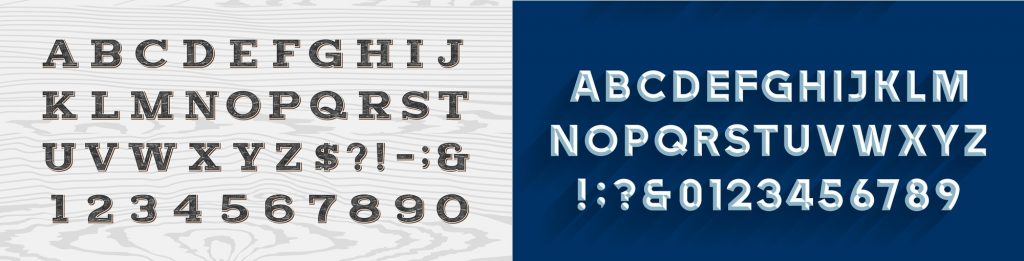
So, serif fonts have serifs, which are extra decorative lines. The word “sans” is French for “without.” A sans serif font is without, or does not have, these small extra decorative lines. (See image below, left is serif, right is san serif)
Choosing a font that has serifs will impact how customers perceive your brand.
When To Use A Serif Font
Serifs were first used in typefaces in the 1700s. Because they’ve been in use for hundreds of years, they are, first and foremost, considered traditional. Serif fonts are very useful for when a company wants to be perceived as trustworthy, reliable, and established.
Businesses that typically choose to use serif fonts in their branding include newspapers, like The New York Times, law firms, banks, and other long-established institutions who want to cultivate a sense of trust.
The most commonly-used serif font is Times New Roman. Many organizations (like the Modern Language Association, the Chicago Manual of Style, and the American Psychological Association) prefer submitted works to be formatted using Times New Roman.
Teachers and professors want to prepare their students for the high standards of these organizations, and therefore require their students to turn in papers formatted in these fonts from a young age.
Because they want to also hold themselves up to these high standards, and because they want to be perceived as trustworthy, schools and universities often use serif fonts in their branding.
Serif fonts are an excellent choice for companies and organizations who want to inspire confidence and trust. If you want a brand to be perceived this way, choose a serif font as part of the brand identity.
When To Use A Sans Serif Font
Sans serif fonts do not feature the small, decorative strokes at the end of their letters and are characterized by their absence. Sans serif fonts have become extremely popular in the last 30 years. When a company wants to be perceived as modern and accessible, they choose a serif font.
One important reason for this choice is that sans serif fonts are more readable than sans serif fonts. The way they render on a screen makes them easier to read.
Companies who want to be perceived as forward-thinking and “with it” often choose sans serif fonts for their brand identities. Google, Hulu, Netflix, and many more tech companies feature sans serif fonts across their platforms; in fact, sans serif fonts are the default for the tech industry. Adidas, Uber, and Airbnb are other companies that choose to use serif fonts.
Very popular sans serif fonts include Arial, Helvetica, Open Sans, and Proxima Nova.
If you want to establish a brand as modern, approachable, and friendly, choose a sans serif font.
To Sum It All Up
Ultimately, serif fonts send a message that the company or organization is trustworthy and well-established in their field, while serif fonts sent a message of modern approachability.
It’s up to the marketing team to determine what font best reflects the brand’s values and will make the intended impression. To do this, test out several fonts and decide which one best matches the brand’s vision.
At the end of the day, there are no hard and fast rules for what font choice will be best. Try out a serif, sans serif, or a combination of these two font styles, and survey plenty of people about how each font represents the brand before you come to a final decision.
From the studio
Want this done for you?
One dedicated team. 140+ creative services. Real humans doing the work.