A Look Into The Creativity Behind Guitar Brand Logos
Brand recognition is not a new concept and product logos are everywhere. It is likely that if tested on who a company is based solely on their logo, you will score very high. That is the point.
Why say in even a couple of words what you can feel from a cleverly designed logo? And guitars are no exception. From Fender and Gibson to the lesser-known brands, the logo is cemented in your mind. And if it isn’t, it will be soon.
Here, We will take a walk through the design of some of the most well-known, and a few not-so-well-known guitar company logos
Fender
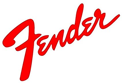
Easily one of the most recognizable logos, as well as easiest to spot guitars, Fender has been the iconic leader in high-quality, incredibly popular guitars for decades.
Everyone from Jimmy Hendrix to Kurt Cobain has jammed on a Fender and made the audience scream for more. Every aspect of the Fender logo design was carefully chosen, from the cursive writing to the bold lettering.
Gibson
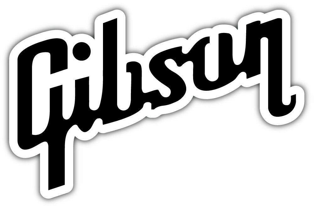
Another logo that employs cursive in the type, although with a little flourish for individuality, is the brand mark for Gibson guitars.
With its corporate headquarters in Michigan, the logo incorporates a more industrial design. Its most distinctive characteristic is the long tails on the “G” and the “n” that add a twist to the design.
Washburn
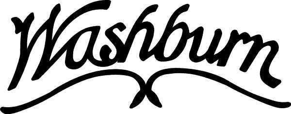
While their cursive signature look of the logo isn’t overly creative, their brand is a testament to innovation. Washburn has created stringed instruments beyond the traditional guitar, including the mandolin.
But its most well-known rock guitar is the Parallaxe, an unmistakable flying V guitar used by rock stars since the ’80s. If you see the Washburn logo, you know you are getting quality for a good price.
Ibanez

A logo designed for a different type of rocker, Ibanez is written in block letters, not the cursive of more seasoned brands.
It is always written in black, bold to stand out, and the Ibanez product line is very distinct. Even more so if you see the Ibanez mark on one of the 7-string electric guitars played by the band Korn.
Peavey
The first thing people think of when looking at the Peavey logo is how much they wish they were a rock star. Peavey’s logo features dagger-sharp lines akin to the Logo for the bank Metallica.
It is bold and spits in the eye of convention. You know exactly what you are getting when you strap on a Peavey, plug it into an amp, and jam. Peavey’s logo is its promise to its guitar owners that their product is for rockers.
BC Rich

Nothing more than a simple bolded signature, BC Rich is a pretty popular option when planning to rock someone’s face off. Its most commonly recognizable guitar, the warlock, is a departure from the mundane reality of the logo.
When looking at the name BC Rich you might think horses, but what you will get are rhinos in armor, ready to make some noise and raise the dead.
Yamaha
They make motorcycles and guitars, and both fly under the same banner. Unlike the previous logos, Yamaha not only displays its name in a standard type font but also a logo, which looks like the spindle of a bike.
If the name won’t fit, the logo circle will do the trick, and Yamaha’s legacy of brand quality over decades has cemented it in the minds of motorcyclists and guitar lovers alike. Their most popular guitars are acoustic.
DBZ

More than words, the DBZ logo is backdropped in black with lettering and the logo in gold. It features the brand name below with its initials above, shield behind, the “z” enlarged, and on it, perches an eagle.
If you aren’t impressed, you aren’t paying attention. The eagle is added to draw the attention of groups who will appreciate the music of bands using these exciting guitars, whereas the gold symbolizes rock and roll at its finest.
Liquid Evergreen Productions
Stepping away from the logos for guitars themselves, Liquid Evergreen gives lessons to promising students who want a future behind the guitar they love so much.
The LE logo is a vertical guitar that almost looks like Japanese calligraphy. It is supposed to show a level of artistry, which is a testament to the lessons taught by LE that playing music and artistic expression are intertwined, no matter what stage of learning.
Dean Guitars
While not super well-known, there are plenty of rock stars that live and die by their Dean Guitars. They likely chose it because of the interesting logo, which features unfurled wings attached to the word Dean, with Guitars below it.
Bird wings are a visual cue often in heavy metal. The words are blocky, minimalist, and hint at an underground movement hearkening back to the dark days of rock.
Bill Pierce
If you see this logo, you can feel its edge, its pure intensity, and those sensations are spot on. From the deep red artistry to the black background, it catches the eye and won’t let go.
A circle tries to trap the guitar and words within, but the neck and split tail of the guitar cut it without hesitation, breaking free of their cage. The only thing not harsh and dramatic about this logo is the simple block lettering of the brand that runs down the neck.
Breedlove
One of the softer logos, the Breedlove brand tag is uniquely typography based. All of the letters are lower case, giving it no edge or fearful imagery. There is a subtle serenity in the overall look of the logo.
The large “B”, the only capitalized letter in the logo, seems to be floating on the wings of angels as well as indicating movement or sound. These guitars are for more conservative enthusiasts.
Peter Malinoski Art Guitars
These guitars fall under the title of Art Guitars because they resemble what you might think of if someone asked you what Pablo Picasso’s guitar would look like.
They are as eclectic as they are beautiful, and if they never feel a single note strummed from their strings, they make an impressive work of art for your collection. The last name “Malinoski” is scrawled in harsh cursive above the full company name, these words in block.
Final Thoughts
From the most idiosyncratic design to an unforgettable logo that reminds you of better days, brand recognition will always play a part in the landscape of product loyalty.
If you find your favorite guitar, you have but to find its logo and smile, reminiscing about those times rocking with friends in the garage, or when you opened for Five Finger Death Punch. Memories are linked to logos. Which is your favorite and why?

