McDonald’s is one of the most well known restaurants and franchises in general around the world. The logo itself is easily recognizable and it does not take long to know what it is associated with. The McDonald’s franchise had a surprising start and a lot of major changes throughout its journey from the beginning to where they are now.
Originally called “The Airdome,” even their name had a drastic change once the McDonald brothers took over their father’s restaurant. Not many years later were the golden arches formed and the face of what once was The Airdome changed forever.
1940
Originally, McDonald’s sold more barbecue items than just their famous hamburgers and cheeseburgers. Starting out as a roadside hotdog stand, they expanded their menu with burgers and an additional 25 barbecue items. Something so simple would soon change the face of the restaurant business entirely.
1948
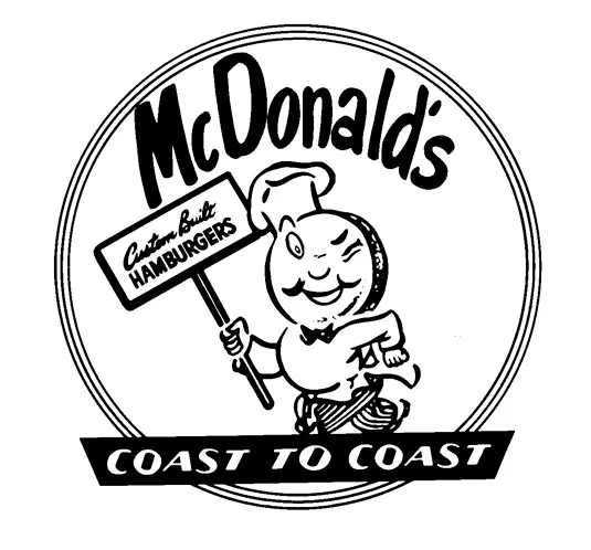
Removing barbecue items from their menu required McDonald’s to remove it from their name and sign. When it was shown that burgers were giving them more profit, it was decided to remove those from the menu thus creating the hamburgers and cheeseburgers they are so famously known for around the world. The winking cook known as “Chef Speedee” in their logo is a sign for their quick service that they were, and still are, offering.
1953
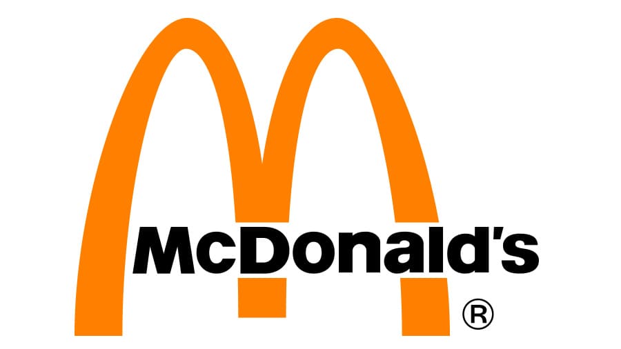
This is when they changed their name to just ‘McDonald’s’ thus needing a change in their logo. With McDonald’s not being as big of a chain as it is today, they needed a logo that was clear to read but also had some of their signature color palette. It was important to have a logo that was a clear image of what their name is and who they are as a company. The red and yellow combination are so well known today, and this was the first logo created to include one of their signature colors. In 1952, the golden arches were designed in part of their new building by Stanley Meston. Though it would not be thought to be used in a logo until 1962 by Jim Schindler.
1961
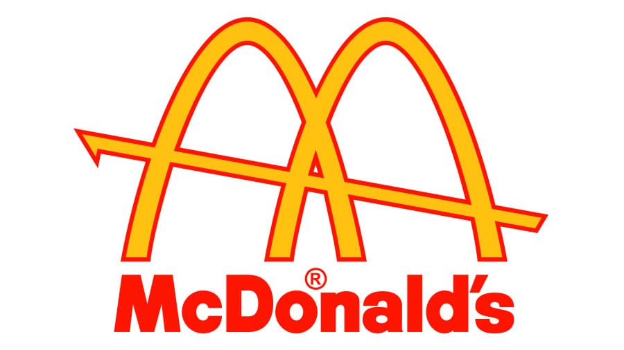
This logo is the first of the many McDonald’s logos to feature the famous golden arches. First shown in the early architecture of their buildings, McDonald’s was known for those giant yellow arches on either side of the building. Incorporating that into the logo solidified the familiarity of those arches with the McDonald’s franchise.
1968
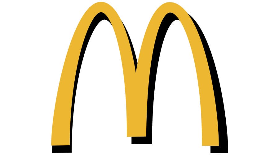
This was the first logo to turn the golden arches into an ‘M’ shape versus just the two arches with a line through. This design started what we now know today as the McDonald’s logo. Not only was this perfect to continue to incorporate the golden arches into the logo, but to also have it shaped like an ‘M’ for ‘McDonald’s’ made it known globally what franchise this logo stands for.
1993
A few minor changes to the logo happened in 1993. Taking out the word “McDonald’s” on the logo itself and instead adding a black shadow behind it allowed for a logo that would be used for almost twenty years. This is the first logo that they developed that did not have “McDonald’s” incorporated somewhere on it. The golden arches by now were mostly associated with the McDonald’s franchise that words were not even necessary to have such a successful image. Which is why it was able to be used for so long.
2003
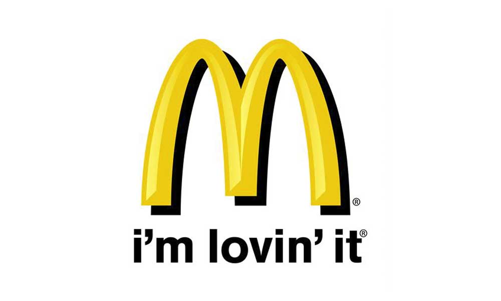
2003 is when the slogan “I’m Lovin’ It” rose to fame. The original shape and color were changed just a bit along with adding the “i’m lovin’ it” slogan at the bottom. They added some shading to give a more three dimensional aspect to the yellow part of the logo. The campaign for this slogan was so successful, it is still used today as well as the majority of society knowing who this phrase belongs to shows just how successful this campaign actually was. Even today we still see signs of this slogan in McDonald’s advertisements or commercials.
2006
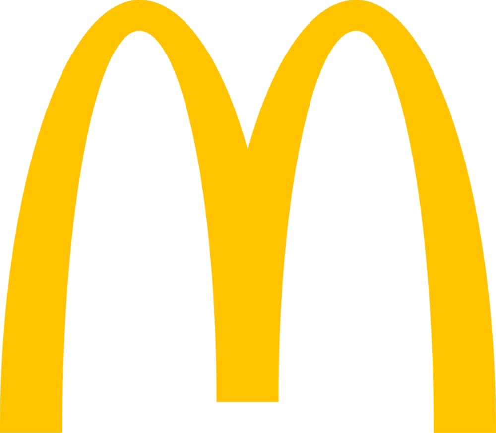
Creating a more modern and simple look, this is the logo that we are familiar with today. A slightly different shade of yellow without the black background on a plain white background gives it a chic look that McDonald’s has been using since 2006. A simplistic look that has the versatile abilities to be used for multiple marketing platforms as well as the popularity of the golden arches in today’s society allows McDonald’s to be successful with such a simple logo.
2018
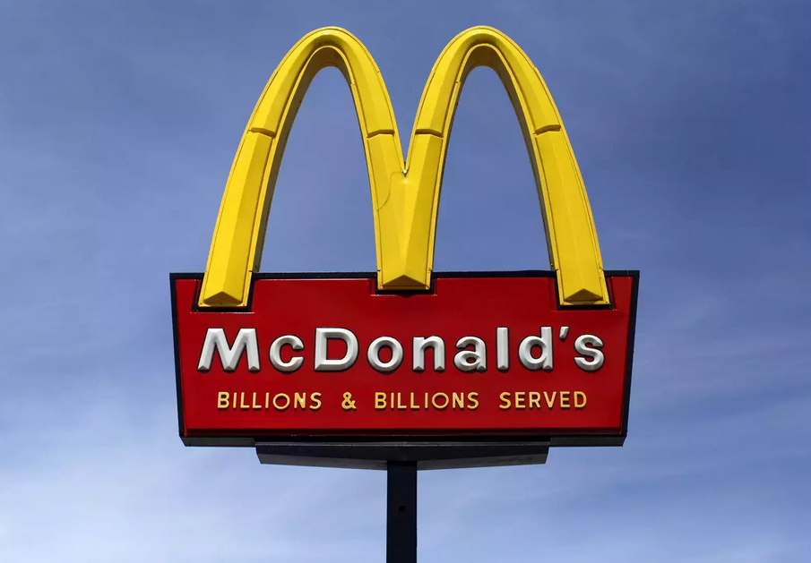
This version of the design is the same yellow emblem, but it’s placed inside a red square with rounded corners. The current logo remains very much the same, some with no background, some with red, sometimes the name is included in black or white, but over the years the logo has remained recognizable around the world.
From the studio
Want this done for you?
One dedicated team. 140+ creative services. Real humans doing the work.