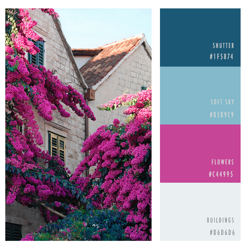
- Pairing blues with pinks gives palettes a dynamic, fresh vibe.
- Always balance your vivid colors with light pastels and soothing greys.
- Choose a darker base color to add depth and mystery.
Summer is a time of joy, relaxation, and adventure. If those attributes suit your company’s personality, you can use summery colors to visually refine your brand. The right color combination evokes customers’ feelings of bliss and excitement. Add a fresh, engaging look and feel to your brand with these color palettes.
Ocean Tide
If you want your brand to evoke feelings of wonder, depth, and beauty, draw your inspiration from the shifting colors as the ocean nears the shore.
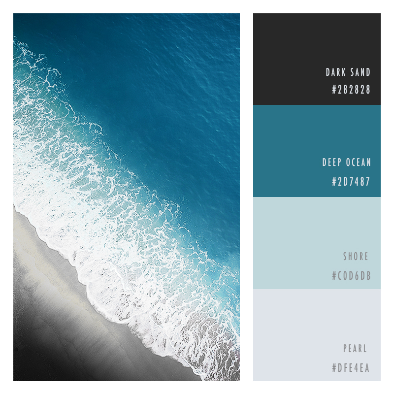
Seashore
Few things are more delightful than walking alongside the sea and seeing what’s drifted ashore. From shells to driftwood to seaside critters, there’s always something interesting to see
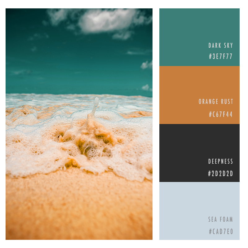
Summer Breeze
Looking for a yummy, refreshing palette, or a combination that evokes boardwalk excursions, ice cream shops, and summer shopping. ?
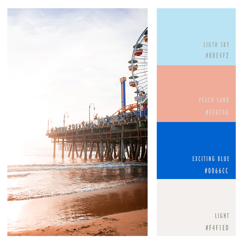
Sailboat
Bring a dose of tropical sophistication to your brand with a darker palette that mirrors the colors of a day at sea.
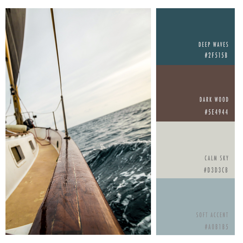
Poolside
Inspire your customers with the fun, vivid shades of a swimming pool and a vibrant summer garden.
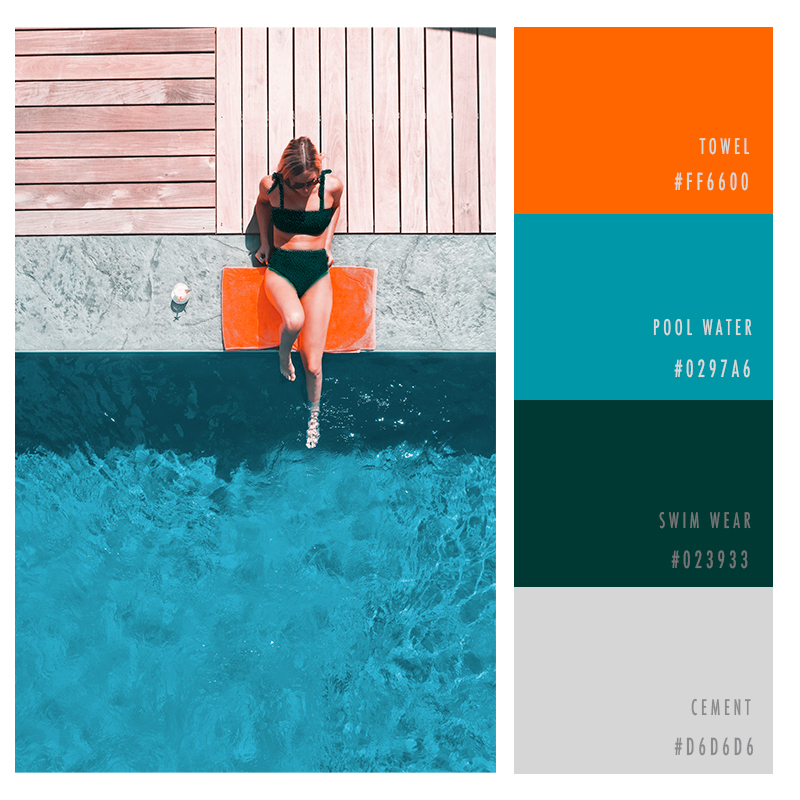
Summer Blues
It’s okay to stay in the shade and relax, and add a splash of bright color amidst some muted shades, to make the color variance balance out in a calming pleasing way.
Wrapping Up
These palettes may sing of summer, but they’ll give your brand a beautiful, fresh vibe all year-round. If your company wants to tap into the delight and relaxation of this wonderful season, try out one of these palettes. Your brand will benefit from a lush, fun look and feel.

