Blog · Logo Design
10 Famous Motorcycle Logos That Make a Statement
By Mark Ziegler
March 1, 2022 · Updated July 6, 2025 · 4 min read
No brand is complete without a logo, even if that logo has the brand name etched into it. But the difference with motorcycle logos is when you see a motorcycle going by and don’t know who makes it, the logo the manufacturer chose is so undeniable, many people can instantly recognize it and use it as the jumping off point for their potential future purchase.
Motorcycles come in many different shapes and sizes, from the chopper, to café style racing bikes, to the one we all know, the Harley Davidson. The identifier that sets these apart has to be unique, and as you will see from our list, there are almost zero similarities between the brands.
So, if you are ready to hit the open road and hear or see a bike you want, look for these and you will see your future of freedom.
Harley Davidson
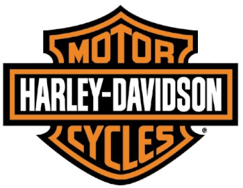
Despite the company being started in 1903, the world-renown logo wasn’t created until 1910, and is still the same logo for all Harley Davidson products.
The only changes this orange, black, and white symbol has undertaken happened at unique anniversaries within the brand, such as the addition of a “V” to the logo in 1953.
Indian
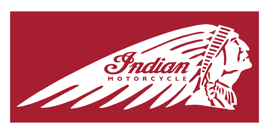
Indian motorcycles, started in 1901, became one of the largest motorcycle manufacturers in the world due to their innovative designs.
They are known as one of the few companies that adjust their logo with every new product release. It can always be seen on the tank, and at one point, the bikes even had an Indian head on the front fender.
Honda
Not only an auto maker, Honda has a history of building quality products are economical prices, and their motorcycle line is no exception.
From its flagship, The Goldwing, to the Magna, the VTX, and even the GSXR, Honda comes with the tools to impress. The wings on the logo are in reverence to Nike, the Greek goddess of victory.
Titan
Largely custom, Titan has a short but notable legacy because of the sleek and sexy design of their bikes. They were founded in 1994 in Phoenix, Arizona, and designed so the owner could make easy to add upgrades.
The logo was designed to be more hardcore than Harley, more distinct, and have a heavy metal feel, which works in concert with the style of their choppers.
Yamaha

Along with many high-quality Japanese products, the Yamaha motorcycle series aims to please. With its distinct logo, it can be easily recognized even when put next to similar bikes from other Japanese brands like Honda or Suzuki.
The standardized emblem of the triple tuning fork is an update from the original, which was a Chinese phoenix with a tuning fork in its mouth.
Ducati
If you are in the moto racing scene, then you will easily pick a Ducati out of the crowd, but for those who aren’t they made it easy to spot.
Ducati is emblazoned on their café series of bikes, usually with the model like 916 or 616 just below it. The company was started in 1926 in Italy, with the original logo the same shape as their parent company, Lamborghini.
Victory
The “V” on the Victory logo is distinct and a rallying cry to the employees to always push forward despite adversity. The wings in the symbol are for freedom and speed. Isn’t that what riding is all about.
Victory factored all that in when designing their logo and adding it to their line of heavy cruisers and stands by these principles to this day.
Kawasaki
Since the inception of Kawasaki’s high quality motorcycle line after the second world war, the logo has changed with the times, but has always maintained the essence of the original, using the name, or at least the “K”, and showing movement at speed.
However, the newest logo is simply an uppercase K, as the lines to indicate movement were found to be contrived and outdated.
Suzuki
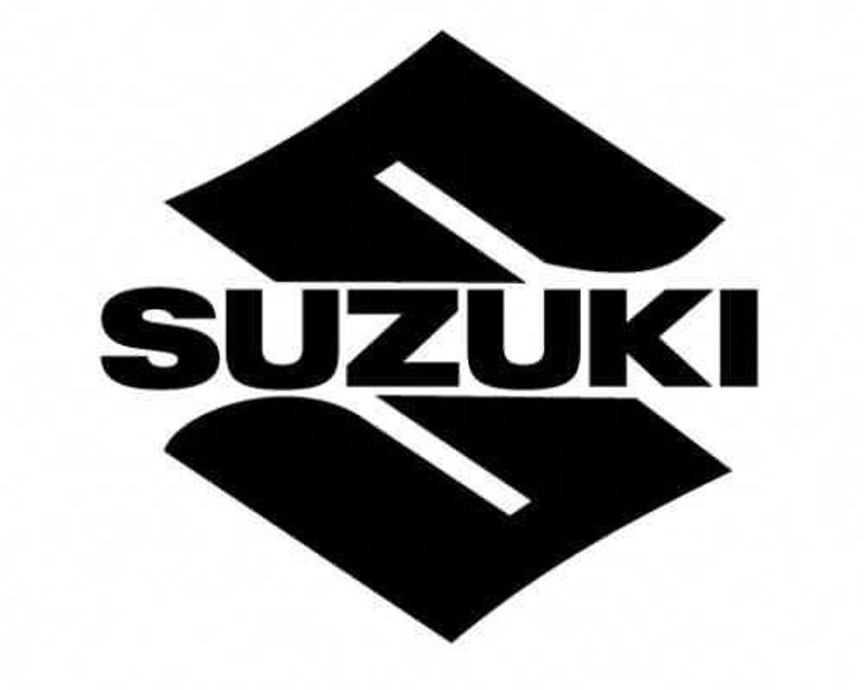
Suzuki has been a world-wide producer of production machinery since the early 1900s, but only started with motorcycle manufacturing in 1922.
Despite the new niche of products, the founder decided his original logo had enough recognition that having a different one for their bikes would be an error, and so, all Suzuki products share this logo.
Triumph
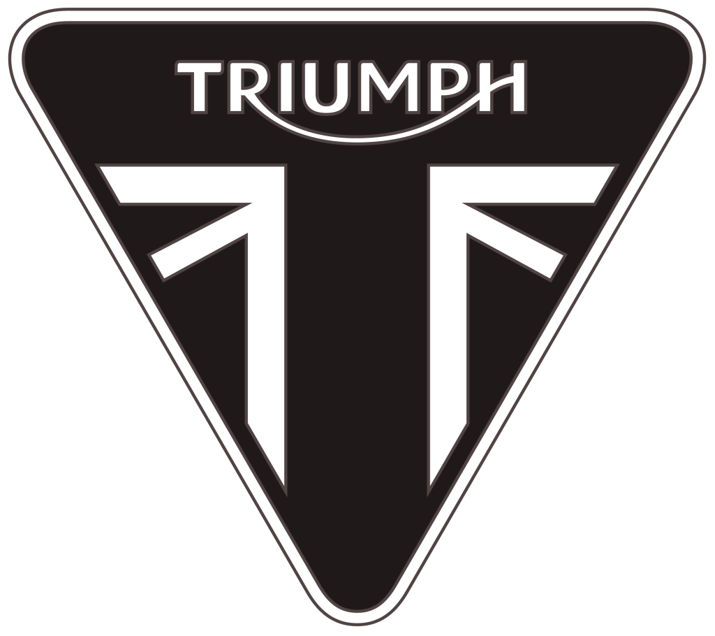
Similar to the concept behind Victory’s logo, Triumph is a testament to the undying spirit of innovation. A British company, it was started as a bicycle manufacturer int eh late 1800s by a pair of German designers, then was shuttered for almost 80 years for many reasons few can nail down.
It resurfaced with many styles of bikes from touring to cruisers and so forth, and the logo is designed to show the company’s resilience.
Final Thoughts
Some motorcycles have a distinctive sound, like Harley Davidson’s, but that can be copied, which was done by Honda in the 80s.
Some bikes have a look that is unique, but at speed, many can resemble others in the same design scheme. But logos are unique, heavily copyrighted, and will always give away what is flying by as you watch in awe.
That is what logo marketing for bikes is all about.
Enjoy our content? Your review makes a difference.
From the studio
Want this done for you?
One dedicated team. 140+ creative services. Real humans doing the work.