Blog · Logo Design
12 Great Movie Studio Logos To Inspire You
By Matt Gladstone
April 18, 2022 · 4 min read

If you’re into designing or creating, whether professionally or just as a hobby, you know what it’s like to hit a creative snag. There are some times where you just can’t think and the ideas won’t flow. One way to alleviate this creative block is to look at the creative projects from others.
There are thousands of examples you can turn to, but some not thought of often are movie studio logos. These logos are incredibly creative and convey information with just a few simple artistic building blocks. The next time you’re stuck, take a look through these creative examples.
MGM
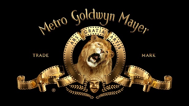
Starting off with one of the most iconic logos and studios, the MGM lion has been around for nearly one hundred years. The logo was made by filming a real lion in-studio and cutting out a hole from the rest of the logo to put the lion into.
MGM was one of the largest players when movies started to gain popularity, and they’ll forever have one of the most famous and iconic logos.
Janus Films
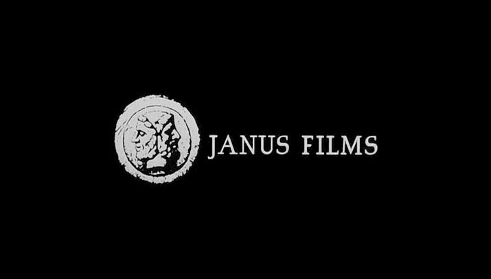
Pivoting to a lesser-known studio, Janus Films owns the rights to thousands of foreign and arthouse films throughout the 40s, 50s, and 60s. Their logo is simple but effective, a two-sided head known as “the Janus head” imposed on a stark black background.
This is a great logo because it fits many of the films it precedes, which are stark and minimalist tales from old school directors.
Pathe
Pathe is actually one of the oldest film studios in the world. Their logo has been designed and redesigned many times to keep up with the changing world and the newest version of the logo is a colorful and marionette-inspired interpretation.
The French company has overseen the production of films nearly since the inception of cinema itself.
Mill Creek
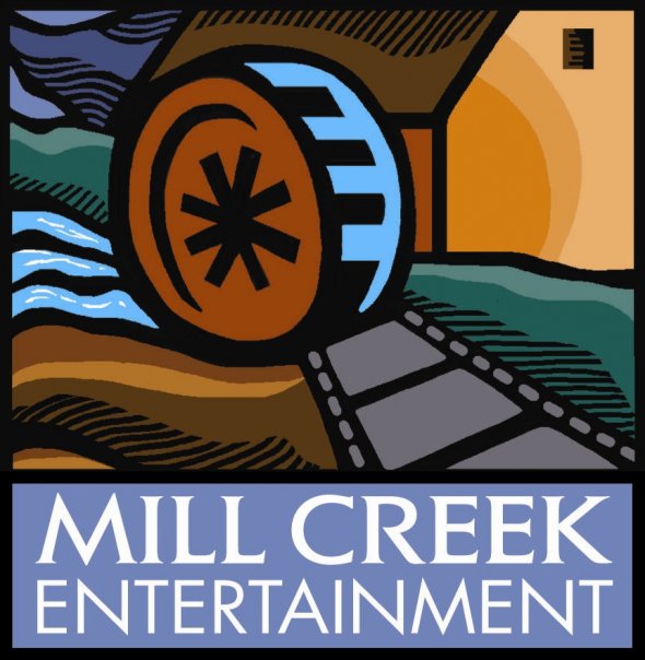
Mill Creek is actually a studio known for producing incredibly low-quality films, but they have one of the more creative and colorful logos in the film world.
Unlike other studios who have the money and time to make their logos epic an expansive, the Mill Creek logo is an understated and simple image of natural fortitude and old-time vibes.
The logo fits in with the low-budget and simple fare they provide viewers.
Pixar
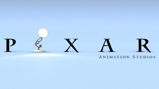
One of the most beloved logos in the film world, the Pixar lamp has delighted viewers for more than two decades.
This logo is clever and creative when viewed static, but it really comes to life when given movement, as the lamp hops up and down on the “I” in Pixar, only to crush and turn to the camera like a self-aware puppy.
The beauty of the logo is bringing an inanimate object to life, a feat Pixar is known for in their films
Dreamworks
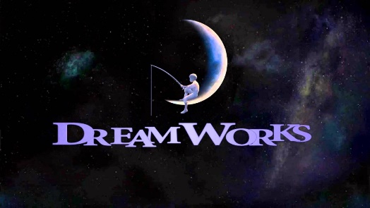
Rivaling the creative simplicity and wonder of the Pixar logo is Dreamworks. Their iconic “fishing moon boy” sits and relaxes on a crescent moon, fishing in the lake below.
This image conveys feelings of relaxation and, appropriately, a dreamlike quality that anything is possible. The color palate also fits in nicely, a subdued blue and white in preparation for the colorful films to come.
Paramount

Another iconic logo from film’s pre-golden days, the Paramount logo has survived, virtually unchanged, for one hundred years.
The iconic mountain peak and the stars around it symbolize the star-studded and grand fair audiences can see when they see a Paramount film.
This is applicable because Paramount was, in the 20s and 30s, home to foreign stars and directors, like Eric von Stroheim and Ernst Lubitsch.
The mountain peak and stars were a call to audiences that anything was possible on a global scale.
Universal
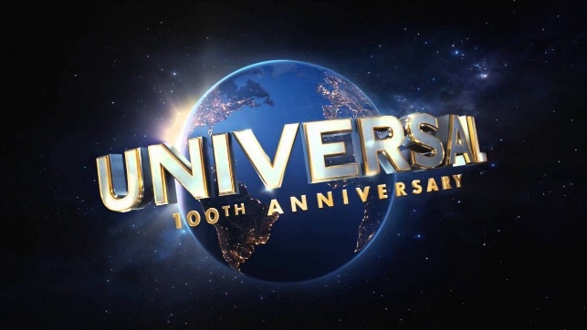
While Universal hasn’t always been the dominant power it is right now, their famous globe logo has also remained virtually unchanged since its inception.
Their logo is literal; they offer universal entertainment, starting with their roots as purveyors of audience-pleasing monster movies like Frankenstein, Dracula, and The Mummy in the 20s and 30s.
Since their birth, Universal has strived for crowd-pleasing hits. Their logo has also been made epic over the years, showcasing the Earth in HD glory nowadays.
Tristar/Colombia
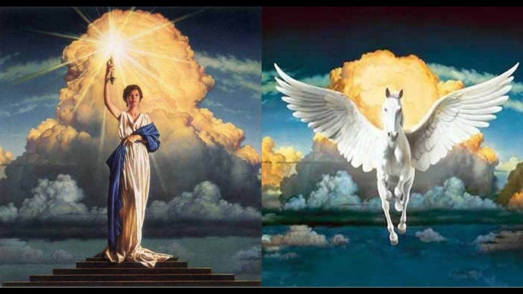
Joined at the hip, Tristar and Colombia have similar logos. Tristar features a Pegasus coming in through the clouds and Colombia features a womanly symbol of freedom and creativity.
Both logos feel epic and grand, stationed among the clouds and appearing from nowhere, a siren call to enjoy the proceeding film. The relaxed oranges and sky blues put viewers into a state of relaxation and anticipation.
Castle Rock
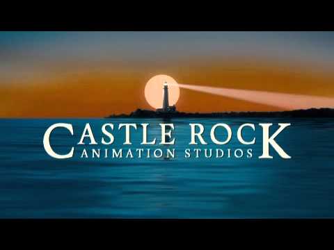
Founded by Rob Reiner, Castle Rock has made many projects of extraordinary depth and emotional intelligence, including hit sitcom Seinfeld.
The logo is an image of childhood wonder, a lighthouse guiding in the tendencies of creativity and artistic expression.
The logo boasts a stark black background and incredibly warm violets and reds, giving viewers a final image of peace after the films end.
Scott Free
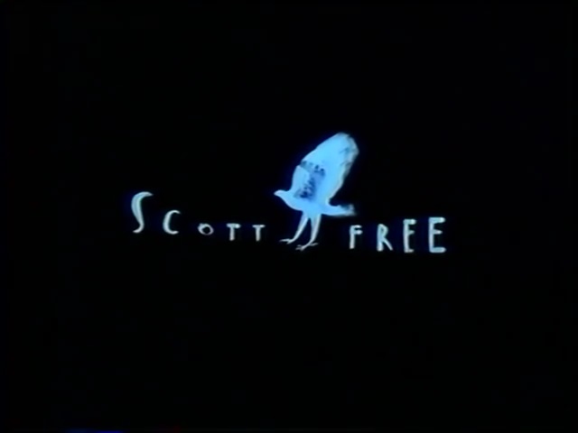
A logo which boasts the incredible and meticulous creativity of its founder, Ridley Scott free is a wonderful logo which elicits stop motion animation and painterly strokes.
The logo itself is a falcon in flight, but the in-theater animation sees a man transform into this bird as he runs out of a cage, evoking the Platonian thought of the man in the cave.
It’s a logo only Ridley Scott could conceive and execute with such grace.
Bad Robot
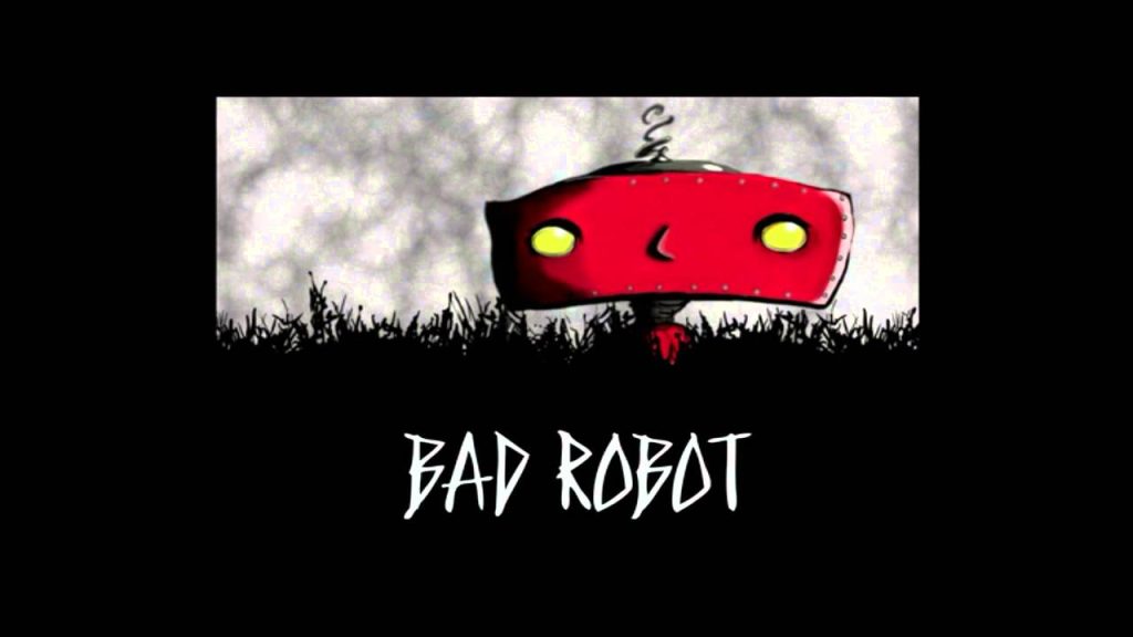
The final logo on this list comes compliments of J.J. Abrams, director of Star Trek and The Force Awakens. This logo is enigmatic and points to something greater, much like Abrams’ films.
The robot in the logo is seemingly mischievous and rambunctious, though we don’t know how or why. His movements are off-putting as well, as he moves from side to side and confronts the viewer during the animation.
From the studio
Want this done for you?
One dedicated team. 140+ creative services. Real humans doing the work.