Blog · Logo Design
12 Great Airline Company Logos To Inspire You
By Matt Gladstone
May 2, 2022 · Updated July 6, 2025 · 5 min read
If you’re having a creative blockage, the best course of action usually is to be inspired by the work of those around you. There are plenty of sources of inspiration to turn to, but one of the most under looked are airlines.
Airline logos are usually sleek and minimalist, incorporating the feel of the country and tradition that the airline is associated with. Here’s a list of twelve great airline logos to help you in times of creative crisis.
American Airlines
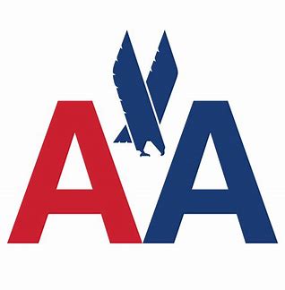
One of the largest and most venerable airlines in the United States, American Airlines has seen their logo go through a few different changes over the years.
The new logo keeps with the minimalism of the current artistic period, but their most famous and creative is their 1967 rendition.
This is an angular, bold, and flashy design that promises swiftness and safety to customers. It also makes great use of American colors and a smattering of negative space.
Lufthansa
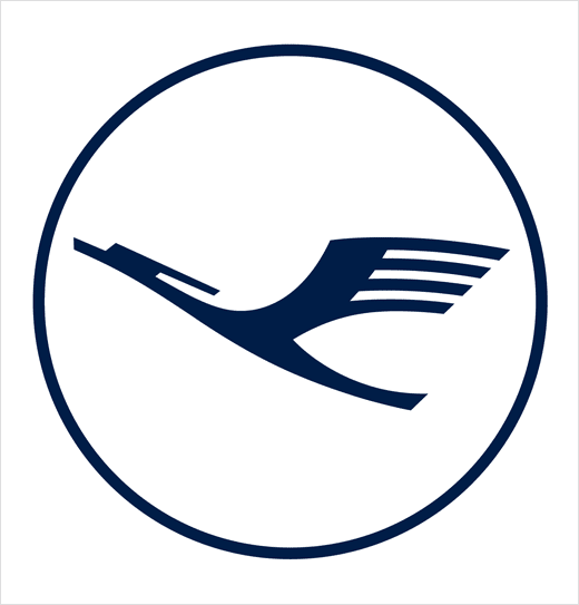
Actually the world’s oldest airline, Lufthansa has also seen a change of the guard frequently in regards to its logo. This choice is its 1963 version, a sleek and minimalist logo that’s ahead of the curb when it comes to design trends.
The bird depicted is actually a crane, which would later be colored yellow in order for the brand to stand out from competitors.
KLM
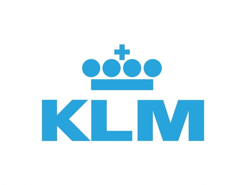
This Dutch airline is the oldest to retain its original name, and infrequently changes its logo. It’s easy to see why, as this crown design is bold and denotes royalty and good travels.
The simple but evocative design crown is meant to symbolize the name “Royal Dutch Airlines” that the company represents. This logo is one of the most famous in the world, recognized by many countries in the western hemisphere.
EgyptAir
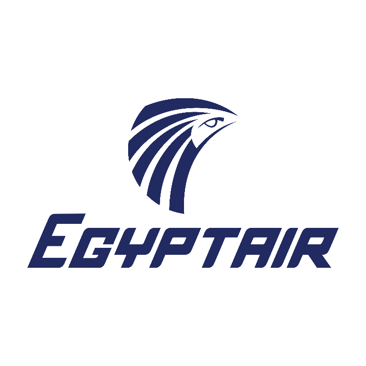
This logo is of Horus, the Egyptian god of the sun and sky. Horus was often depicted as having a falcon’s head, which the logo also depicts.
It’s clever in that only a few lines and some curves can evoke a specific ancient god immediately. The bold, dark blue is also descriptive and rarely used in other airline logos, which usually opt for a lighter, “airier” blue.
Observe the curiosity and imagination Horus displays on this stunning logo.
Sri Lankan Airlines
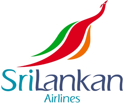
Many airlines use symbols of their country to display the mood and experience their passengers will feel when flying, and Sri Lankan Airlines does this better than most.
They depict a colorful, shimmering peacock, pointed straight up at the sky in flight. You feel the wings about to unfurl as the bird takes flight, hurtling toward its destination.
The font and colors are colorful and wavy as well, adding a sense of fun and adventure.
Hawaiian Airlines
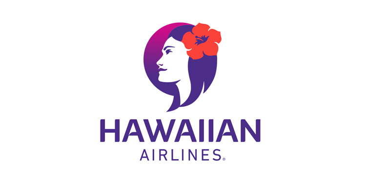
One of the most pleasant and comforting images on the list, Hawaiian airlines uses a friendly face to ease passengers. The face is of a typical but beautiful island girl, Pualani.
The setting sun and flowery headwear perfectly describe, in visual terms, the beauty and fun customers will have when they reach their destination.
This logo was designed by Lindon Leader in 2001 and is one of a precious handful of airline logos to depict a persona, rather than an animal or wing.
AeroMexico
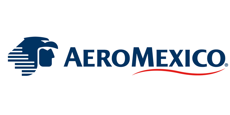
Here’s another of that precious handful. AeroMexico features a stoic and reserved Aztec eagle warrior. He wears a traditional headwear of eagle to symbolize the sun.
This logo works on so many levels because it pays homage to the past of its country while evoking the spirit of its ancestors and rich traditions. The blue also helps the planes and company stand out from a crowd.
Iran Air
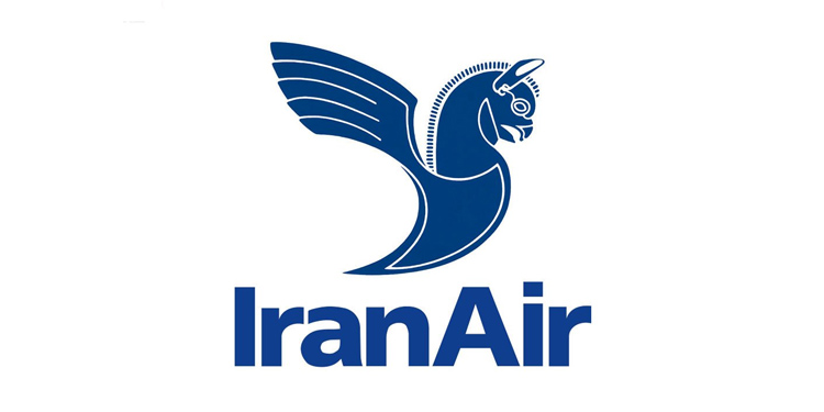
Iran National Airline was registered as a national company and changed its name to Iran Air. Shortly after, in 1961, a competition was held to select a new logo for the country.
The result is this beautiful depiction of a griffin. While the color and size of the logo is typical for airlines, what is atypical is the intricacy of the design.
Unlike many logos which are just a few lines, this is a full drawing, a careful depiction of a griffin in modest detail.
Azul Brazilian Airlines
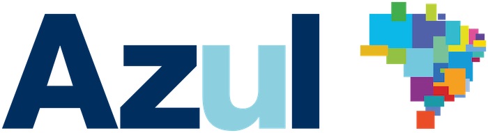
This is a fantastic logo because it represents the togetherness and unity of the region. There are two parts to the logo; the word “Azul” on the left was tweaked by TRIP Linhas Aereas when they acquired the company, changing the color of the “U”.
The logo on the right is a pastiche of many different regions, all working together to form the beautiful country of Brazil. The colors are fierce and bright and their unity speaks volumes about the message and mindset of the company.
Gulf Air
Unlike many airlines, the Gulf Air eagle brings feelings of luxury and exclusivity because of the fantastically rich colors and detail.
This Bahraini airline holds a place of elegance and dignity in the airline industry, a place which they’ve immaculately captured with their golden eagle.
In addition to the color, and much like Iran Air, the logo is splendidly detailed and shows swift and sudden movement. It also represents the values of traditional Arabs and functions as a bridge between the old and modern. Just perfect.
Qatar Airways
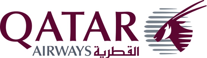
This is another nationally owned airline. Although many mistake the animal presented as an elk, it’s actually an oryx, which is the national animal of Qatar.
The oryx blends into the background and is ensconced in maroon, a symbol of national pride and resolve. The Arabic letters cleverly spell out “Al Qataria” which is the English name of the airline.
The entire logo is incredibly dignified and presents an image of grace and magnitude.
Qantas
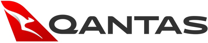
Qantas is the largest airline in Australia and it unfurled its first logo in 1994. Of course, as the largest airline in the country, it’s only natural that Qantas’ logo is a minimalistic kangaroo, hopping through a field of red and white.
This is an especially sleek and modern logo, one which conveys speed and efficiently, qualities often looked for in an airline of Qantas’ size and reputation. This logo is great because of its simplicity and streamlined nature.
Enjoy our content? Your review makes a difference.
From the studio
Want this done for you?
One dedicated team. 140+ creative services. Real humans doing the work.