Blog · Design
15 Inspiring Brochure Designs That Stand Out From The Crowd
By Rorye
July 5, 2022 · 5 min read
Brochures are a versatile marketing option for businesses from retailers to museums. A well-designed document shows why a company is special and why prospective customers should spend their money there.
It’s an instant opportunity to put your best foot forward, snagging readers’ attention and their desire to find what’s missing in their lives, whether it’s a product, a service, or something more intangible, like luxury.
Keep reading to see 15 brochures that think outside the tri-fold.
Events
1. 1 - 2 - 3 - Helsinki ! Design en Seine
Design Firm: Werklig
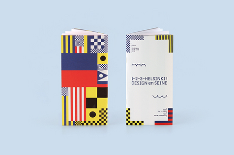
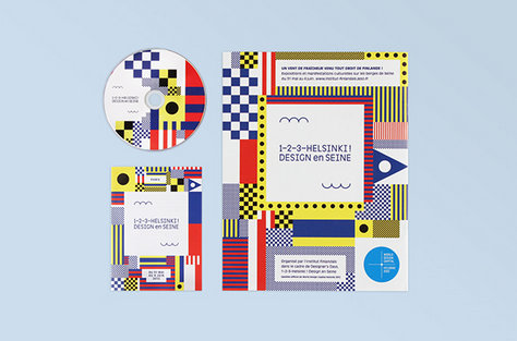
This brochure advertised a pop-up art and architecture event embracing design, with boldly decorated shipping containers installed along the Seine in Paris.
The colorful shapes are inspired by the marine flags and signals used on the Seine. The design included two waves: one to represent the water of the river, and one to represent the “1, 2, 3” in the event’s title.
2. BFD ‘08 Concert
Designer: Liz Hall
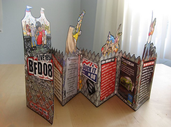
This document uses a mix of cutouts and lively artwork to create a festive feeling for a 2008 concert. The use of chain link fence, including a jagged line along parts of the brochure, adds an edgy feel. A mix of advertising and copy is presented like posters on the fence.
Retail Businesses
3. Ikea
Designer: Leonardo Borges
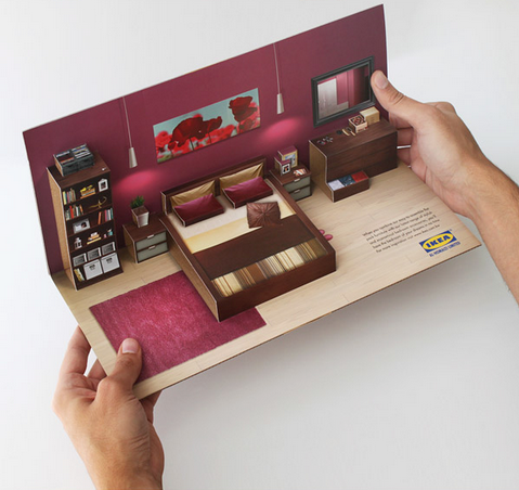
This mailer design references Swedish furniture superstore Ikea’s iconic in-store displays, using very little text and a 3-D design to help customers imagine how quickly and easily their new furniture can “pop up” in their home.
The outside evokes flat-pack furniture, for which Ikea is famous, making the mailer instantly recognizable.
4. Volkswagen
Designer: Josiane Marquis
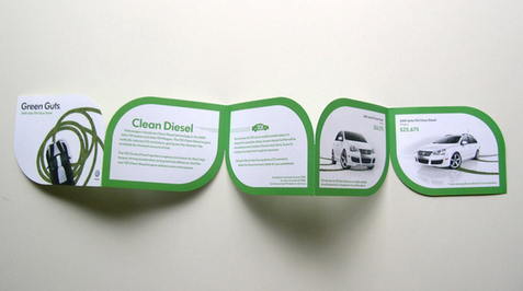
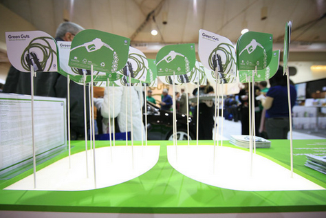
This brochure for Volkswagen’s line of hybrid cars uses a simple color palette of green and white to highlight the ideas of clean and green.
Each page is shaped like a simple leaf, an iconic image for all things environmentally friendly. The presentation at an event further uses the theme to make the documents look like sun-drenched leaves.
5. Skinny Blonde Baker
Designer: Nichole Ott
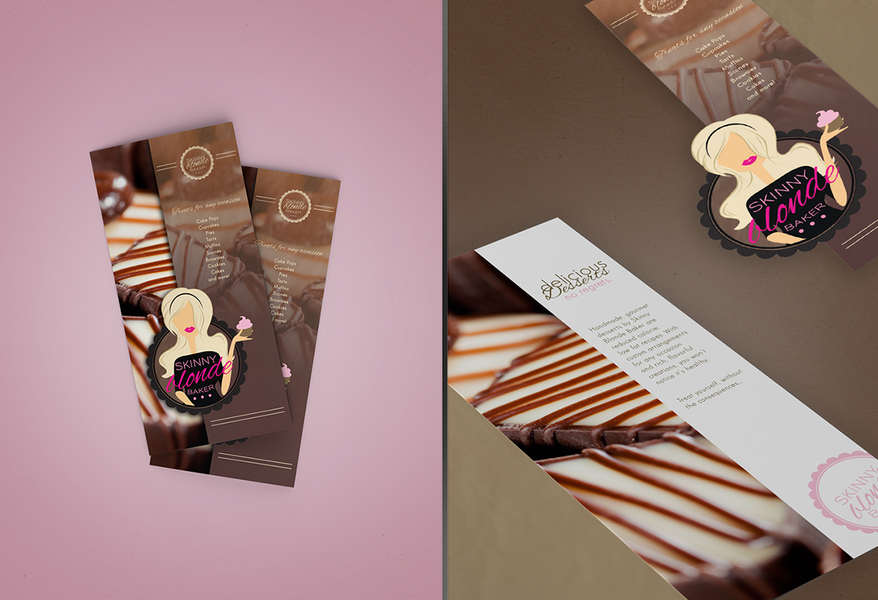
Designer Nichole Ott used oversized photos of this bakery’s healthier desserts to make readers’ mouths water. Two versions of the bakery’s logo are used throughout to give brand consistency.
Curvy script fonts evoke the femininity of the baker in the logo, and make use of the bakery’s slogan, “All Good, No Guilt.”
6. Tessuto Fashion
Designer: Greg Cannon
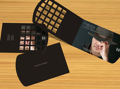
The brochure for this menswear retailer in New Jersey uses a unique cutout design to offer customers a peek at the fine fashions available.
The cutout evokes the square grid shapes used in the brand’s logo as well, lending consistency, while the dark colors give rise to feelings of strength and masculinity.
Destinations
7. Crystal Cave Park
Designer: Keith Lowe
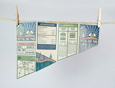
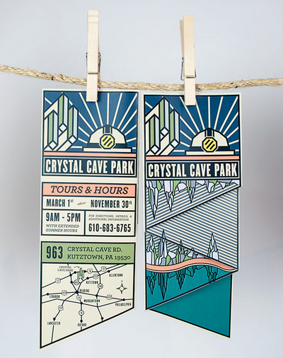
This design uses nostalgic-feeling artwork and bold lines in a unique shape to stand out amid other destination brochures.
The cream colored paper feels like a well-worn map, reminding visitors of bygone years. The art reflects the natural wonders inside Crystal Cave Park, including glittering crystals and a reflective pool.
8. National Museum of Extinct Insects
Designer: Natalie Perez
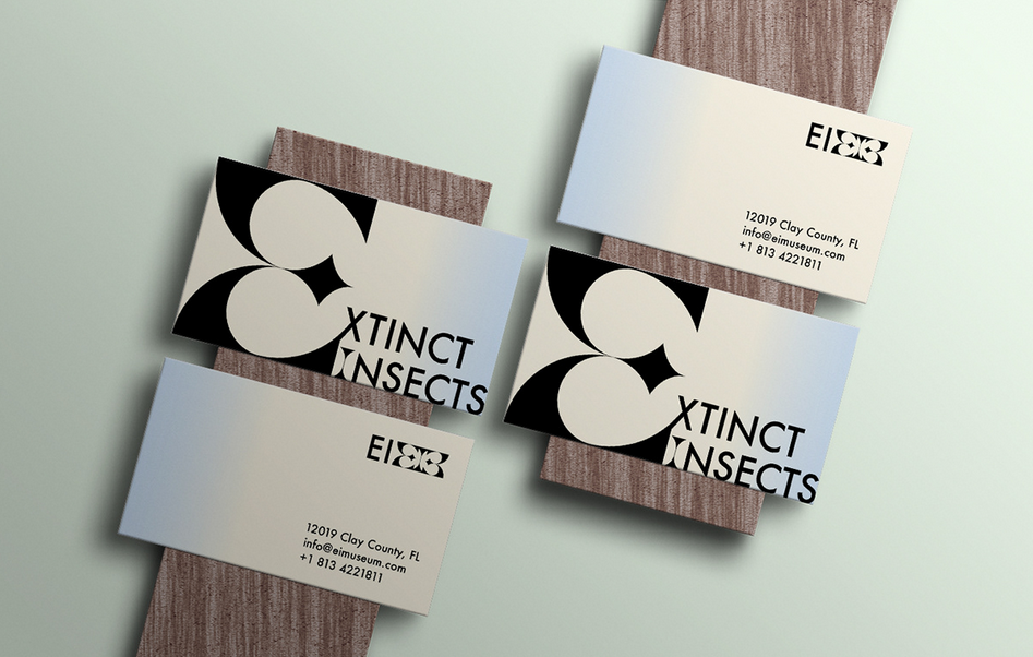
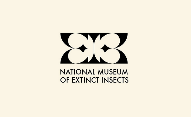
The logo for the National Museum of Extinct Insects looks like a butterfly in a nod to the many butterflies preserved there.
The brochure, using stark black and white, creates strong imagery while remaining minimalistic. Accent colors remind of the insects’ habitats, with the shades of a cloudless sky, the earth, and “juicy greenery.”
9. Simpson’s Hotel
Designer: Grieg Anderson
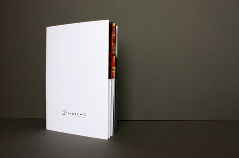
This document for a luxurious Scottish hotel uses a simple white cover and metallic logo to create a feeling of understated opulence.
Inside informs guests about the hotel’s large number of amenities and services. A folder is included in the back so hotel staff can put specific information in for clients.
Services and Features
10. Sparkbit Telematics
Designer: Balsam Studio
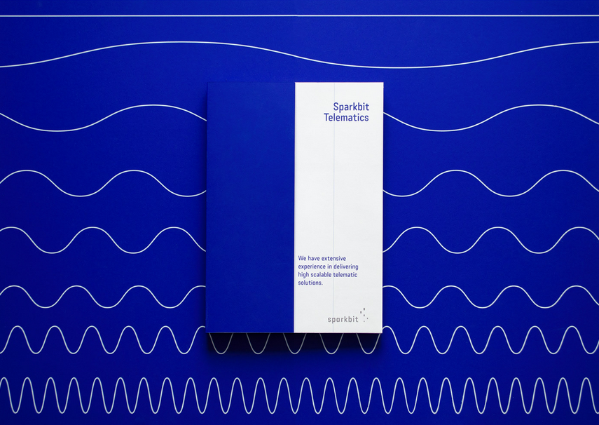
Design firm Balsam Studio employed a consistent motif of wavy lines to represent the data the business analyzes. Custom icons in thin white lines pair with the wave motif.
They use a bold aquamarine blue throughout to separate blocks of information and present it in a clear, understandable way.
11. Nottingham Trent University
Designer: Andrew Townsend
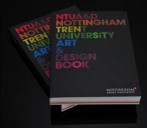
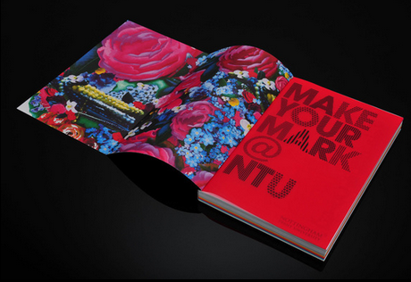
Using bright and bold colors contrasted by stark black, the art book for Nottingham Trent University is a compelling piece to entice prospective students.
The designer used 24 different patterns to create the font used within, highlighting visual interest. The package includes a multicolored sketchbook, stickers, postcards, and a stencil, for a memorable piece of advertising.
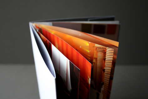
12. Vulture Labs
Designer: Jake Brandford
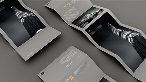
This brochure for a black-and-white long exposure photography business lets the photos speak for themselves.
Text is kept to a minimum, and the only colors used are gray, white, black, and sparing yellow contrast text. The unfolding of the brochure slowly reveals the stunning photography.
13. TVNZ 7
Designer: Thomas Pavitte
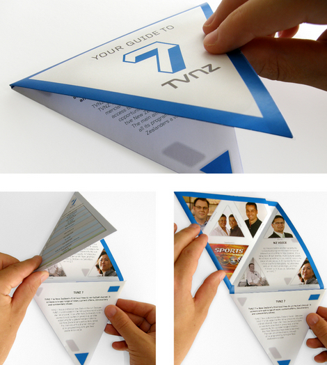
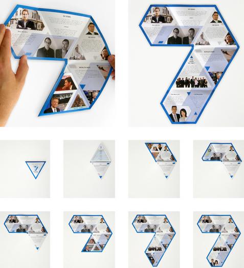
A triangular brochure for a New Zealand TV station folds out into a 7, reminding viewers of the familiar onscreen logo.
The brochure features the channel’s signature blue and triangular photos of station talent. Copy and programming information are kept brief to fit in the document’s distinctive triangles.
Places To Live
14. Spencer’s Crossing
Designer: Jennifer Springman
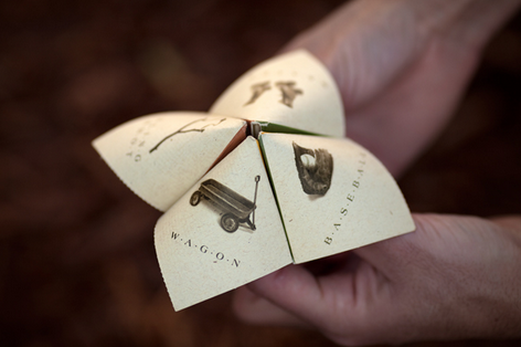
Brochures for a housing development called Spencer’s Crossing fold into a game to show that the neighborhood is for “kids at heart.”
The logo design features the words arranged in an arch over stepping stones to evoke the community’s walking trails.
Photos inside feature youngsters having fun at a pool and in a lush, green yard, to further reinforce the neighborhood as a place for family-friendly leisure.
15. Taj Villas
Designer: Vicom Group
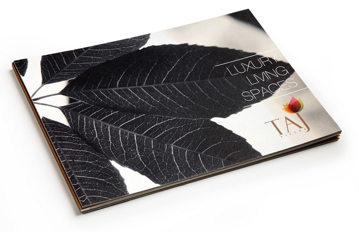
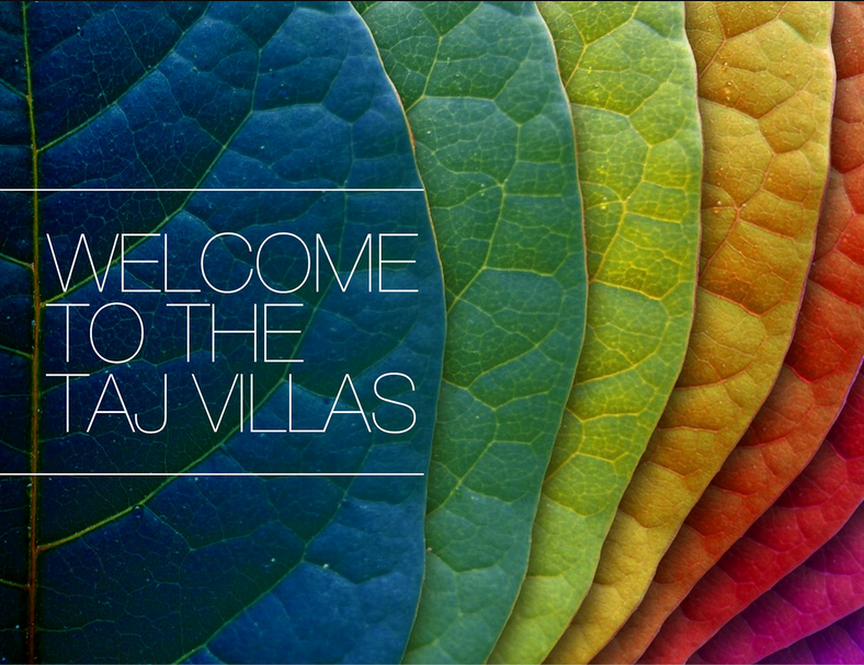
This brochure for luxury villas contrasts black-and-white and colorful leaves both in its logo and its opening pages to evoke the climate in India and the high living available.
The interior contains mainly photographs of the housing, letting the construction speak for itself. A thin sans serif font creates a simple, elegant feel.
From the studio
Want this done for you?
One dedicated team. 140+ creative services. Real humans doing the work.