ga('send', 'pageview');

12 Great Beer Logos To Inspire You

Logos tell their own story. In fact, they are often the first opportunity a company has to market to a customer. A great logo is essential for consumer products because it is what faces customers on the shelves.

The logos collected here attempt to share the stories of these beer companies. With some big and small brands, every beer logo has a story to tell.

Guinness

The Guinness logo has seen a great deal of evolution since its conception in 1759. However, the logo first appeared with the harp in roughly 1862.

This imagery dates back to King Brian Boru, the first ruler to unite all of Ireland. As the story goes, he had a golden harp, so its appearance here represents the unity of Ireland.

Yuengling

As it says right on its logo, Yuengling is America’s oldest brewery, established in 1829 by David G. Yuengling.

The logo, therefore, has a significant symbol for American freedom on the logo: an eagle. In the Yuengling logo, the eagle appears over a barrel (presumably of beer).

This logo, along with its classic script font, is elegant and classy and feels like a call back to America’s roots. 

Hofbräu

Over 500 years ago, the Reinheitsgebot or “The Purity Law” was decreed by Duke Wilhelm IV and Duke Ludwig X. The Reinheitsgebot stated that only barley, hops, and water be used to brew beer.

The unfortunate part was that they didn’t realize yeast was important as well, so it was added later. Bavarian beers tend to follow the Reinheitsgebot, even today.

In 1589, Duke Wilhelm V founded the Hofbrauhaus to bring quality beer to Bavaria. In the logo, the crown atop the HB represents regality, beer purity, and the crown (foam) atop a beer.

Trappist Westvleteren 12

Trappist Westvleteren 12 is one of the most exclusive beers in the world. Sold only to private customers, Trappist Westvleteren 12 dates back to 1839 when the Saint-Sixtus Abbey began brewing beer.

The bottle cap is the only place on the bottle where the logo appears. The writing itself is older-looking, appearing as though it hasn’t changed since 1839 with the first beers.

They are the quintessential no-frills brewery, so the logo follows suit. For a beer so beloved, the discrepancy between the minimalist design and the popularity of the beer is striking.

Asahi

Bret Syfert, also known as Hyde’s Lovelies, designed the logo for Asahi. He studied and graduated from the University of Arts in London and created the design for the text from nothing, relying on no other font types to create this text.

Kirin Ichiban

The Kirin is a mythological East Asian creature, and it is said to bring good luck. So the Kirin appears on the logo of Kirin Ichiban as a way to bring good luck to the drinker.

It’s like cheers from the drink itself! It also makes the label appealing to those who recognize the Kirin. 

Budweiser

For many Americans, the word “beer” is synonymous with Budweiser, and the logo perpetuates this. The bright red backdrop, with crisp writing and logo, stands out and screams recognition.

The script font in front of the bowtie outline also aims for sophistication. Their slogan is “The King of Beers,” and while the logo had a crown on it for some time, it no longer bears that imagery. 

Newcastle

Inside the oval (or sometimes circle) logo is a blue star. This blue star became part of the logo in 1928, only a year after this beer was born. Each of the points on the star represents one of the five original founding breweries of Newcastle. 

Carlyle Brewing Co.

Carlyle Brewing Co. is a small, beloved brewpub in Rockford, Illinois. Its primary logo is that of a regal-looking chalice. With the slogan “blessed is he who drinks beer,” this chalice alludes to the Holy Grail. 

Goose Island

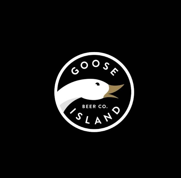
Goose Island has a very simple, elegant logo. One of the best parts of this logo is that it pays homage to the original logo while also gaining a recent refresh.

The designers also intended to create a logo with a bold, timeless font that would transfer well to merchandise and work in many different ways.

Pig Minds

Pig Minds is the very first vegan brewery in the United States. They attack this niche market with a quirky twist that is a little different but with on-point messaging.

Their logo contains a bold typeface that is clean while also being a little messy, as though caught in the bramble of hops that hang from the sides of the logo.

Heineken

Heineken is often synonymous with the color green. In fact, this modern color is known as “Heineken Green” and is meant to reflect the color of their bottles.

This green color also exudes trust and the natural world. The bright red star represents the tradition of brewing.

12 Great TV Logos To Inspire You

Great television is one of the blessings of the television age. With so many great shows, marketing teams need to develop great logos that fans can remember and recognize. These 12 great television logos are memorable, effective, and creative.

The best logos communicate the ideas behind a television show and seamlessly integrate them into the television show itself. Great logos also depict the themes, symbols, and concepts throughout a television show itself.

Unique for their own reasons, some of these logos are simple and others are complicated, but they are all memorable and take the logo game to the next level.

The Office

The logo for the funny, quirky workplace comedy The Office is relatively simple. In all lowercase letters, regardless of the their appropriate capitalization, this logo appears as though it has been typed on a typewriter. This, of course, is an appropriate look for a show that takes place in an office space.

The other benefit of this logo is that it is easily transferable. The letters can be any color marketing teams need because the lettering and logo are so simple. This, too, makes sense for a show with a sweet, simple idea.

Lizzie McGuire

Lizzie McGuire is a coming-of-age show that follows the titular heroine, Lizzie McGuire, as she navigates her middle school years. Alongside her adventures, as a cartoon reflection, viewers meet the cartoon version of Lizzie.

In the Lizzie McGuire logo, this cartoon version appears alongside a fun and funky font with the show’s name. Between the bright colors and the youthful font, this logo screams childlike fun and joy, two qualities the show represents.

Parks and Recreation

Like The Office logo, the Parks and Recreation logo is nothing too fancy. Instead, it simply reflects the show’s main action, which surrounds a park department in a small town.

The main character, Leslie Knope, is committed to making her small town the best place it can be and is absolutely in love with public service. Most people consider such a passion dull and exhausting, but Leslie is the complete opposite. Therefore, the logo for this show acts in opposition to the type of character Leslie is.

The juxtaposition between the excitable, passionate Leslie and the rather dull logo for the television show is what makes this logo so interesting.

Game of Thrones

The Game of Thrones television show is rich with imagery and invokes intense feelings for viewers. The logo is quite similar. The text for the logo appears to be quite regal, and with the towering T, pieces of it even feel intimidating.

Like the iron throne, a prominent symbol in the show and its marketing, these letters also feel sturdy and heavy, perhaps even ancient.

The Brady Bunch

The Brady Bunch is the story of two people who bring their respective children together to form a large family. Together, they become “The Brady Bunch.” The whole family is featured in the opening sequence, which was so popular that it is widely considered the logo for the television show.

In the center of these squares, viewers see a funky bit of writing that gives the show’s title. This font is absolute perfection for the time period portrayed in the show.

Rugrats

There’s almost nothing more iconically 90’s kid than a love for the Rugrats logo. Simple in its idea, the logo reflects the playful and imaginative stories of the show’s main characters.

Primarily purple font, the splotches of yellow, red, and green throughout represent the silliness (and often messy nature) of childhood play.

Friends

Written in all uppercase letters, the Friends logo is iconic because it is memorable and unique. Like the Rugrats logo, it features blue, red, and yellow dots, but these dots do not represent childlike play for this show.

Instead, they represent the vibrancy of the slow itself. Known for its colorful sets and exciting characters, this imperfectly perfect logo expresses the joys and frustrations of becoming an adult in the city.

Orange Is the New Black

Orange Is the New Black follows a straight-laced character who finds herself in jail for a crime she committed many years before. The sentence throws her into a life she thought she had left and interrupts her new life, and the logo represents this intersection of her new life and what life was like before.

The bright orange word that spells out “Black” represents Piper, as someone who stands out from the crowd. The black bars on either side of the logo represent the literal bars of the jail in which the characters are kept. The letters are all unfinished to show the growth that all humans go through, whether they are in jail or on the outside.

Full House

Like Rugrats, the sitcom Full House Is an absolute mainstay of the 90s. The logo for this one is quite simple, appearing in all uppercase lettering, but written in a handwriting font to appear more wholesome. This font style is so synonymous with the show and its characters that the spinoff, Fuller House, used the same font for its logo.

Breaking Bad

This gritty, intense, exciting, and disturbing show follows a chemistry teacher who becomes a methamphetamine dealer to help pay for his cancer treatment.

This logo highlights the importance Chemistry plays in the show by highlighting the elements of bromine and barium (respectively, Br and Ba) in the television show’s title. It’s memorable for the chemical element and how it is featured in the title.

Mad Men

The iconic logo for Man Men is the silhouette of a man’s back as he smokes a cigarette. It is a callback to the era of advertising that glorified smoking and Joe Camel. Besides that, the logo feels very tight and orderly, which is the very image the main character, Don Draper, aims to project to the world.

Survivor

As the only reality show on this list, the Survivor logo is truly iconic because it changes with every season to reflect the new contestants and location. One thing that does remain the same, however, is the Survivor name in the middle of the logo.

Always designed with an eye to graphic design, these logos always feature a font that is imperfect and a little jagged, meant to represent the type of places contestants compete.

The best logos communicate the ideas behind a television show and seamlessly integrate them into the television show itself. Great logos also depict the themes, symbols, and concepts throughout a television show itself.

Unique for their own reasons, some of these logos are simple and others are complicated, but they are all memorable and take the logo game to the next level.