ga('send', 'pageview');

Evolution Of The Marvel Logo

Marvel, a popular comic and comic film company, has a striking red logo with white lettering. The Marvel logo is bold and powerful, evoking connotations of power and strength. However, the logo has not always been so simple. Check out how this logo has evolved over time.

1939

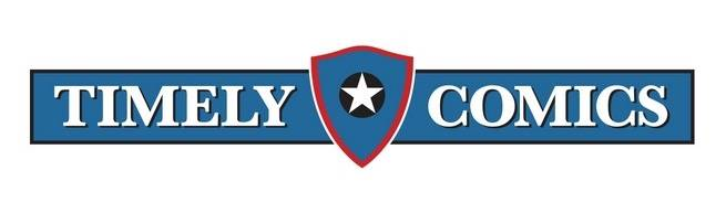
Before Marvel became Marvel, it was called Timely Comics. Timely Comics’ logo was created in 1939. For this logo, the company’s name is separated by a medieval European heater shield, and it follows the color scheme of red, white, and blue. This color scheme and logo bring to mind Captain America, one of the company’s first bestsellers. Publisher Martin Goodman created this logo.

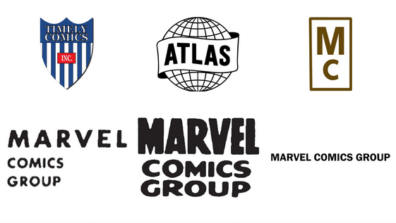
Then, in 1951, the company became Atlas Comics and had a logo change with the name change. The logo during that time was a globe encapsulated by the word “Atlas.”

By the year 1957, Stan Lee was writing comics for Atlas, and they began using the Marvel Comics name and logo. At the time, it was a black circle with a red background and “Marvel Comics.” In 1960, to compete with DC Comics, their primary competitor, Marvel released a new, less striking logo with “M” and “C” printed above one another.

Soon after, an explosion of popular comics emerged, including The Amazing Spider-Man, The Fantastic Four, and The Incredible Hulk. With this success, the company decided to change the logo and name to “Marvel Comics Group.” This logo remained pretty consistent throughout the 70s and 80s.

1993

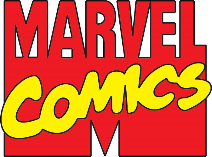
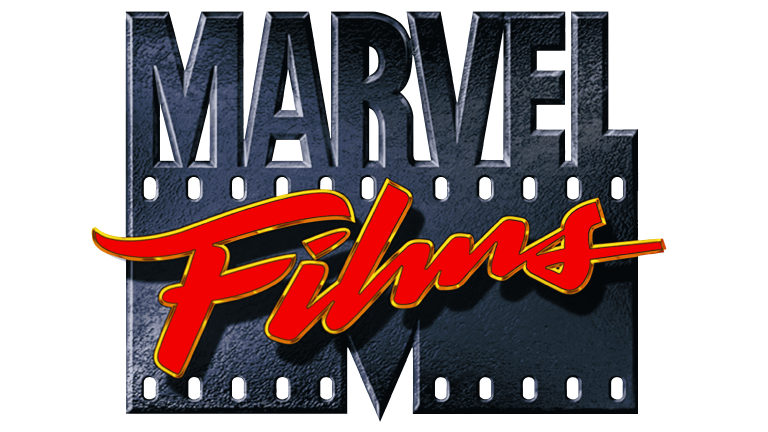
The 1993 – 1996 version of the logo is reminiscent of the MTV logo with a large “M” as the primary feature. The Comics version was bright red with yellow lettering across the M saying Comics. With the introduction of Marvel films, the film version of the logo is slightly different, The bottom part of the “M” looks like old film and even has a gradient color of black to suggest movement. From the film, the word “Marvel” grows in the same coloring.

The film here does appear to be made of something more robust than film, perhaps a metal to represent superhero strength. Splashed across the front in a red script is the word “Films” to make it clear that this logo represented the film component of the business. The wording is also outlined in a thin yellow line to suggest life and even a fire like quality to suggest high action and excitement.

1996

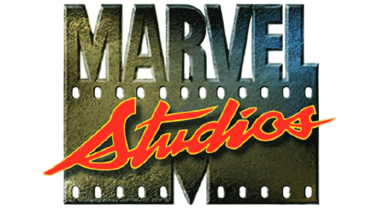
The logo that lasted between 1996 and 2002 is similar to its predecessor with a few changes. In the lower-left, they added a light source that casts a yellowish hue. This also makes it easier to tell that the logo is indeed metal in nature. On the right side, the yellow is contrasted by a cobalt blue, which adds some intrigue and great coloring to the logo. “Films” is also changed to “Studios” to provide more opportunities for featuring the logo in different types of mediums.

2002

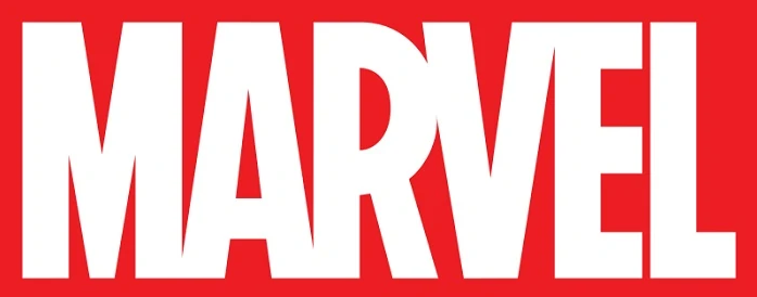
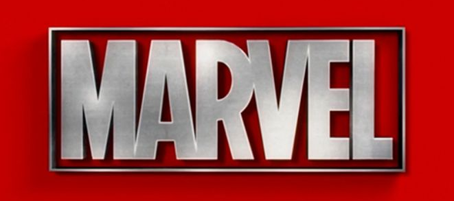
The red rectangle with the name “Marvel” written in white capital across the box premiered in 2002 in the later parts of X-Men. Red is a purposeful choice here because the color often represents strength and determination. Most of the letters are attached to one another, except for the final “L.” This logo lasted from 2002 to 2008, and the logos that follow it will remain pretty similar in the general styling of this logo. Marvel used this logo in publications as well as early movies.
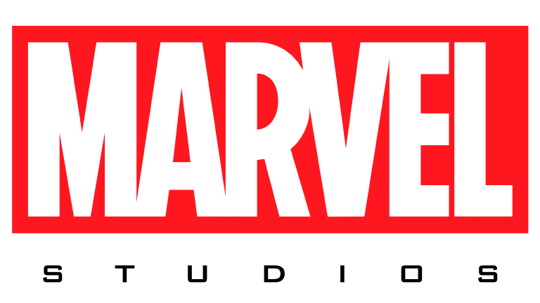
2008

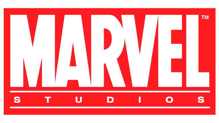
With the beginnings of the Marvel Cinematic Universe came a new logo. A new version of the red logo will be used from 2008 to 2013. Removing the “studios” designation from the red rectangle, Marvel took the bold red and white logo and added “Studios” across the bottom, framed by a set of parallel lines. The word “Studios” is in all caps, spaced out in a san-serif font different from the bold “Marvel” above it. This version first emerged in the first of the Iron Man movies. It was used until the fifth Captain America movie.

2013

From 2013 to 2016, Marvel ran with a similar concept. However, this time, they removed the “Studios” from the bottom of the red rectangle and put it on a white backdrop. As a result, the font color changed from white to black, and the font became one with cleaner lines and a more squared-off look.

2016

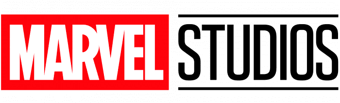
In 2016, a new logo began to be used, and this one is still used today. Now, the red “Marvel” rectangle is smaller and sits to the right of the word “Studios.” Like the other recent iterations, nothing changes about the font or coloring of the word “Marvel” here, only the location. “Studios” then moves from underneath the “Marvel” name to the left of the name.

Like the 2008 version, “Studios” gets its own horizontal, perpendicular lines frame. The logo is clean and striking with a nice, defined look with the red rectangle and the black frame. This logo premiered with the film Doctor Strange.

15 Famous Fashion Logos

Fashion and clothing brands that stick around for many years often become iconic with loyal followers over the years and maybe even decades. The most influential fashion brands also have logos that hold meaning and prestige all their own. The concept of name-brand clothing relies upon easy recognition of a company’s logo.

While fashion adjusts and changes with public preferences, the logos generally remain the same. The best companies will adapt to the changing tide while maintaining the recognition and reputation of their brand. A memorable logo will help a brand do just that. These 15 companies have iconic and recognizable logos to some who may not even closely follow fashion.

Nike

Nike creates athletic clothing and athleasure items for athletes and fans alike. The Nike swoosh is not only on every shoe Nike creates, it is also on many of their clothing items, including t-shirts, hoodies, and hats. The Nike swoosh is also synonymous with its slogan “Just Do It.” Since so many athletes wear Nike clothing, this one has also gained notoriety from who wears the logo. The logo not only symbolizes movement and athleticism, but it also seems like it is in motion.

Chanel

Chanel is a prestigious fashion company known for their high fashion merchandise, jewelry, accessories, and fragrance. Their logo is two interlocking “C”s standing for Coco Chanel, the company’s founder. This logo is so beloved, it adorns almost everything the company produces, even as a belt buckle. The Chanel company name and logo carry an air of wealth and prestige.

Gucci

Gucci sells a wide array of fashionable items. Like Chanel, Gucci’s logo has two interlocking “G”s for Guccio Gucci’s name. Gucci created the logo 11 years after Chanel, so it seems very possible Chanel inspired Gucci. In any case, their logo is also beloved and represents high class and wealth.

Louis Vuitton

Louis Vuitton is a luxury clothing, accessory, and cosmetic company. Their logo consists of an “L” and “V” linked together. This is possibly one of the most counterfeited logos out there because it is so popular. So prized and recognizable, the company has even used its logo in a popular pattern on merchandise.

Coach

Though Coach is a clothing company, they are best known for their handbags. Their logo is a horse carrying a stagecoach that harkens back to a Victorian era of elegance, prestige, and wealth.

Ray-Ban

Ray-Ban sells luxury sunglasses. Offering both prescription and base models, customers will find their frames in eyeglass stores as well as their website. The casual look of the logo is meant to represent the relaxed, laid-back philosophy of the company. This script-style logo is also on each pair of glasses they create.

Levi’s

Levi’s is best known for its blue jeans, but they have many other clothing items too. The first logo with color on this list, the Levi logo, connotes a note of action and movement with the use of red. Its stylized lines also show customers that their designs are measured and specific.

Hollister

Hollister is a clothing company for teenagers. The relaxed feel of the company is evident from the logo where a seagull flies above the company name atop the state of California. Meant to pull surfer life vibes, this logo is identifiable and reflective of the company’s branding.

The North Face

The North Face is a clothing company that creates outdoor adventuring gear. This logo is usually prominently featured as an icon on the chest of the clothing item. Representing their outdoor roots, the logo was inspired by the Half Dome Peak in Yosemite. The Half Dome has a sheer granite face and three other smooth and rounded sides.

Tommy Hilfiger

Tommy Hilfiger is an American clothing company, and they market themselves as proud of that fact. So proud, in fact, they have the colors of the American flag integrated into their logo.

Rolex

Rolex is a worldwide name for luxury watches. A grand aspiration for many, their logo plays into the fantasy with a rich, deep green typescript that flaunts wealth. In addition, there’s a gold crown atop the logo to further accentuate the brand’s exclusivity.

Versace

Versace is a high fashion company. Their name and logo get heavy recognition. For the logo, the founder wanted people to be infatuated with the company immediately, so Gianni Versace used the likeness of Medusa, a Greek God. Medusa is best known for being able to turn men to stone with her gaze. That’s one way to capture an audience.

H&M

H&M is a popular fashion brand that brings comfortable, quality fashion to people are a reasonable price. The logo is bright red, relaxed, and playful in capital letters representing their founders’ names: Hennes and Mauritz.

Adidas

Adidas is a sporting goods company making clothing, accessories, and shoes for athletes. The mountains in their logo represent the challenges you have yet to conquer.

Stüssy

Different from many other brands on this list, Stüssy is a streetwear company. Very popular in hip hop and skateboarding cultures, Shawn Stussy used his signature as the logo.

15 Clever Social Media App Logos

Social media: love it or hate it, the idea of connecting online using some platform or another is here to stay. Most adults have at least one social media account, and now, most teenagers do as well. Even kids in grade school are creating their own social media accounts.

While social media continues to grow, one of the most essential parts of a social media company’s marketing is its logo. Users click on these logos every day when they open the various platforms. Their design needs to be simple and memorable.

It must be simple because the logo needs to slow up nicely on a phone screen. It needs to be memorable so people can easily find it when they look for it on their phones.

Facebook

Facebook was one of the first major social media sites to capture a broad audience. While it has changed a bit from the early days, the idea of connecting people has remained the same. The current Facebook logo is a white, lowercase “f” on a blue gradient background.

The logo for the phone app is similar, except it usually appears in the typical rounded square as an icon. The blue gradient and white f remain, however. The gradient blue in the background gives this logo a feel of movement, representing a platform that is constantly changing each moment a new post is made.

Instagram

While users share articles and all kinds of things on Facebook, Instagram users primarily share pictures and short video clips. For that reason, this platform is very visual, so it makes sense that the Instagram logo would also be very visual. It is colorful and bright because Instagram users generally focus on the positivity in their lives on Instagram.

The white outline of a classic Polaroid camera calls back to earlier versions of the logo, which more prominently featured a camera.

TikTok

The platform TikTok is known for short videos and sound clips that people can use and interact with. The logo looks like an eighth note, but it actually symbolizes a lowercase “d” based on the app’s original name, “Douyin.” This little icon also has echos of red and teal.

These echos are creative because they could represent how different users use sounds and videos within the platform. It also has a slightly distorted appearance to celebrate the fun of attending live music concerts.

Twitter

Twitter is a social media platform where people share status and news updates. While the character count was once limited to 140 characters, it was extended in 2017. The Twitter logo is a bird that symbolizes short bits of information users hare, live birds singing songs. The brand name “Twitter” also means the calling and singing out of birds.

Pinterest

The premise of Pinterest is simple: a platform where users can virtually “pin” ideas to various boards to help them create or bring a vision to life. Meant to mimic the idea of an old-school pinboard, the logo is perfect for that purpose.

With a lowercase “p” in the middle of a red circle, the p looks like an older font, like something you would find in the 1950s when pin boards were popular. The vibrant red represents action because the whole goal of Pinterest is that users will create from their ideas.

YouTube

YouTube is a video sharing platform where people create and view videos made by content creators. The logo for YouTube is simple and straightforward. The mobile logo is a white play button with a red background.

The red helps it stand out, and the play icon makes users feel like they are just pressing play. The website logo includes the red play button as well as YouTube in black spelled out following the play button.

Snapchat

Snapchat is a common social media platform among young social media users. The idea behind Snapchat is that the message disappears after it is read, similar to a real life moment in the hallway or in the lunchroom between friends. The logo is a little white ghost on a yellow background. The ghost represents the idea that the messages do not stick around for long.

LinkedIn

LinkedIn is a social media platform focused on helping people connect and find jobs. The logo for LinkedIn is one of the few logos on a mobile that has part of the name inside of it. On the phone, the logo appears as a blue box with the word “in” written inside. This helps reinforce the idea that LinkedIn can help get people into the positions they want.

Discord

Discord is a popular social media platform for those in the gaming world. The logo plays off this idea and has a small purple logo that looks like a nondescript video game controller. Though there are applications for the platform for those who do not play games, gamers are the primary users.

Twitch

Going along with Discord, a popular social media platform for gamers is Twitch. Users can live stream their gameplay to share it with others using this platform. Through these live streams, gamers learn tips and tricks for playing through their games.

The logo for Twitch is a squared off speech bubble with a quotation mark inside of it. This logo represents the sharing of ideas through the live streams available on the platform.

Wattpad

Wattpad is a platform that creators can use to publish their independent work and find an audience. The logo is very simple but elegantly represents this social media platform; it is an orange “W” written so that it also resembles the squiggle of an artist’s brush. This dual representation shows that writers, even independent ones, are artists.

Nextdoor

Nextdoor is a social media platform that is specific to where you live. So if your house is in a subdivision or community, there’s a good chance it is also on Nextdoor. Users share observations, sales, and concerns with neighbors in their area on this platform.

The logo is a bright green “n” with a little chimney coming off its side. The lime green coloring really stands out among other social media logos. However, since it shares some similarities with Facebook, the act of using just a lowercase letter to identify that app is a smart move.

DeviantArt

DeviantArt is a place for artists to show and share their work. The logo is somewhat confusing to look at initially, but upon further inspection, it is an “A” that has been cut in half then rotated. Since this logo requires an extra minute to study it, the logo wonderfully represents the brand because art also needs a careful eye to study it.

WhatsApp

WhatsApp is a little different from other social media platforms because its primary purpose is to be a communication tool. It offers free calling and texting. Instead of sharing those calls and messages in public, everything on WhatsApp is private between users.

The logo is purposely similar to other communication apps on Apple. A speech bubble and a phone icon inside, it combines calling and messaging, the two primary kinds of communication on the app.

Peanut

Peanut is a social media app built for moms. It creates a community and opportunity for moms to connect with other moms. The logo is simple and cute, with a white outline of a peanut on a coral background. The logo plays with the commonly feminine color of pink. It includes a peanut icon to help people quickly find it while searching their phones.

10 Companies With Clever Holiday Logos

The holidays are a time for family and togetherness, and companies love to be part of the holiday magic. Though companies worldwide adapt their logos for the holidays, these ten take it to the next level, often modifying their already simple logo to be perfect for the holidays.

Google

If you’ve spent any time searching and surfing the web, chances are that you’ve also used Google. One of the most popular search engines on the internet, the brand name “Google” has become a verb all in itself. Google is also known for regularly creating new logos for its site. The holidays are no different. This one features the company’s name adorned in festive lights for the Christmas season.

Starbucks

Starbucks’ new holiday cups are a marker for the winter season for the coffee faithful. Generally beginning at the beginning of November, these coffee cups are different each year. For the 2021 season, this coffee giant utilized the green tone of their already Christmas ready logo and fashioned the rest of the cup in designs of white to match the lid, red, and even pink. The four-cup options perfectly complement the green siren logo.

photo credit popsugar.food

Radio City Rockettes

Each year, the Radio City Rockettes put on a holiday celebration of music and dancing at the infamous Radio City Music Hall in New York. Their simple logo is bright red and emblematic of a marquee you might spot in the city. They even feature their primary sponsor, Chase, in their logo. Unfortunately, the Radio City Rockettes had their season cut short due to the global pandemic this year. Still, fans of all ages look forward to seeing the snow next year.

Coca-Cola

Coca-Cola is a worldwide brand of soft drinks. They are nearly just as synonymous with Santa Clause and Santa’s reindeer. The marking design of using the likeness of Santa alongside the red field of the Coca-Cola logo makes this one stand out without changing anything with the original logo. Coca-Cola will use this premise throughout the holiday season. Santa will appear drinking an ice cold coca-cola in many commercials.

Facebook

Social Media has become a pastime and an essential means of communication for many people. As a result, Facebook, the social media giant, also regularly redesigns its logo for the holidays. A company that caters to people worldwide, Facebook generally keeps its logo more neutral in terms of the holidays, opting instead to reflect on the snowy season.

Target

Target is a popular big-box retailer known for having everything one may need and then some. So a casual stroll around Target, Starbucks in hand, is a fabulous way to spend a bit of an afternoon. And for a store with everything, it is convenient that this logo doesn’t take much to redesign its already iconic logo to make it festive. The logo becomes a wreath, snowy white and bright for the season against a red door.

Kohls

Kohls is another big box store that makes their logo for the holidays. Kohl’s sells clothes for all ages, toys, home goods, jewelry, cosmetics, and even small appliances. They are known for having great deals and offering customers plenty of ways to save in their stores. One of those primary ways is through Kohl’s Cash, which is the initiative highly featured here. The brand name appears in an ornament as the “O” in the second “joy.” The red and bright green colors make this logo feel exciting and festive.

Linkedin

Linkedin is a social media site for those looking to network or even find work. Often Linkedin will redesign its logo for the holidays. In this redesign, they make their usually blue box a gift and put the “in” over it. This clever redesign maintains the shape of the original Linkedin design while also innovating for the season.

YouTube

YouTube is a social media site that allows users to upload videos and interact with content creators. This design is similar to the Linkedin one because they also took the gift box idea and made it the backdrop for the “tube” part of their name. The orange bow is a clever choice to offset the red box and is a nice change from the typical green and red redesigns many companies choose.

UPS

As an essential shipper of gifts, it perhaps comes as no surprise that UPS features a gift in their design. This one is simple and straightforward, even maintaining the brown and mustard colors typically part of the UPS logo.

The holidays are a time for family and togetherness, and companies love to be part of the holiday magic. Though companies worldwide adapt their logos for the holidays, these ten take it to the next level, often modifying their already simple logo to be perfect for the holidays.