ga('send', 'pageview');

9 Incredible Illustrators Who Create Art With A Little Something Extra You Might Not Expect

For centuries, creative minds with an eye on breaking the rules of convention have dazzled us with their imaginations and personal perspectives.

From the old masters like Leonardo Di Vinci and Michelangelo, to more recently Salvador Dali and M C Escher, we have had a peek inside the artist mind, into the deep recesses of their viewpoint about the world through satirical scribblings.

This outlet has allowed a multitude of new artists, like the popular street artist Banksy, to show the world what is when we don’t see it ourselves, to give us an idea of what can be when we cannot allow our own imaginations to run free, and let us in on their personal thoughts, dreams, and fears.

When words just aren’t enough, sketches and paintings fill in the gap we need in order to see beyond what is right in front of us.

Embrace The Twist

  1. Shanghai Tango

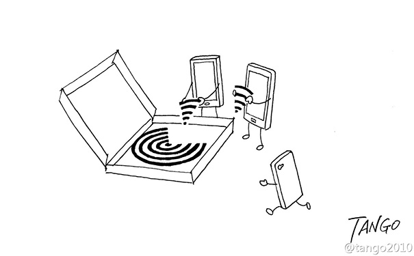
Shanghai Tango, whose birth name is Gao Youjun, is a Chinese artist and a popular cartoonist in the Chinese social network scene.

His work is so popular, he has amassed over half a million loyal followers who share his creativity with everyone they can, spreading his influence far and wide. His niche is the interactivity between coincidental concepts.
  1. Marcus Connor

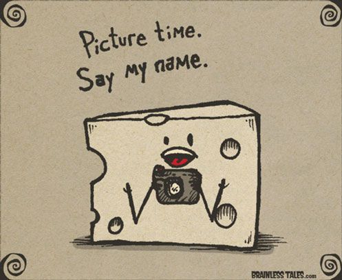
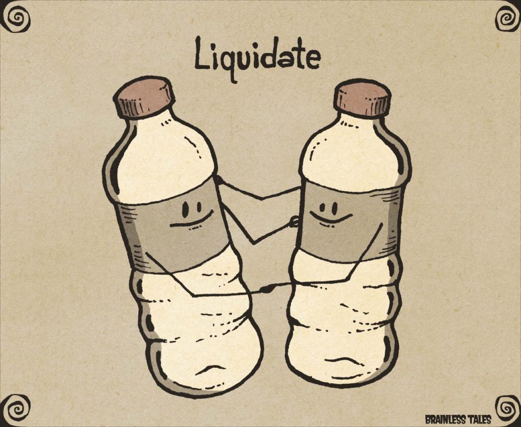
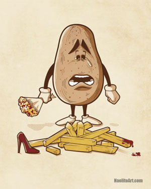
Using the power of puns, idiosyncrasies, and funny asides, Marcus Connor, who signs his art with the simple tag of “Marcus,” gives us Brainless Tales, a once a day, single panel drawing.

Each is a glowing depiction of the inner workings of his unique mind. It could be said that he took Dad jokes and gave them visibility.

  1. Nacho Diaz

The work of this prolific Spain-based artist can only be defined as bizarre. He revels in the unconventional and lives on the edge of every double entendre you can imagine when referencing ordinary items.

And he loves to play with the concept of before and after.
  1. Lim Heng Swee

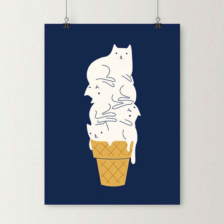
A true doodlebug, this Malaysian-based artist bends his work toward the adorable. He pairs funny phrases and puns in ways that will make you giggle as you did as a child and never feel awkward about it.

Everything is designed with the best, most wholesome intentions, making his work very family friendly. Also, he seems to have a thing for cats.

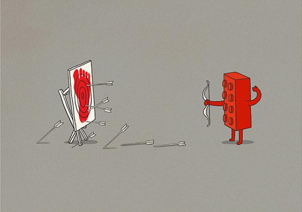
  1. Ben Chen

With a love of pop culture and a skill to give it a darker spin, Ben Chen inspires emotions with his work that are mixed playfully between a dark sense of dread and a humorous ideal that reaches the viewer where they dare not venture within their own mind, and all while being bold, cartoonish, and a little morbid.

6. Michael Godard

Have you ever thought of a cliche and wondered what it would look like if depicted by olives? Michael Goddard has, running with this idea and so many others to make an entire legacy of artwork depicting just that, cliches.

From card sharking to rolling hot dice, he covers the gamut and then some.

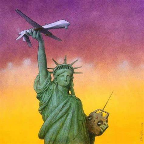
7. Pawel Kuczynski

A Polish-born artist, Pawel is also known as a satirist and philosopher, which punctuate his work very well.

His take on traditional problems in the world, in politics, in religion, give rise to feelings within the onlooker of curiosity, starting new conversations about that which we often ignore out of apathy or fear of personal investment.

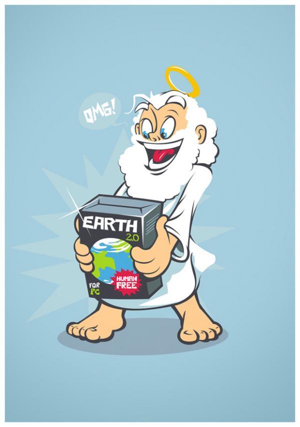
8. JrDragao
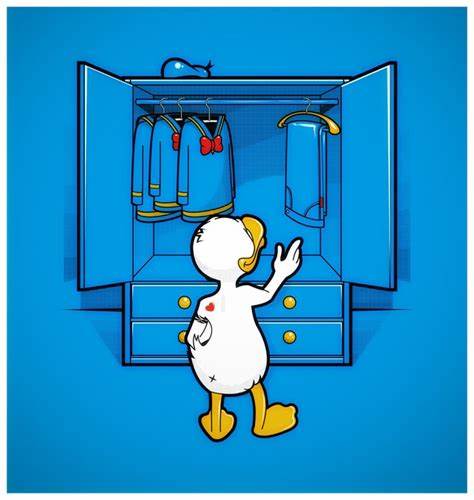
Many artists stick to a particular color scheme and rarely deviate. JrDragao does not, choosing to use vibrant colors that grab the eye and enrich the senses, while making you laugh.

His work often tackles notions we sometimes ponder but rarely dig too deep into. Does Donald Duck wear pants sometimes? What if God decided to make a better version of modern earth? Only JrDragao knows.

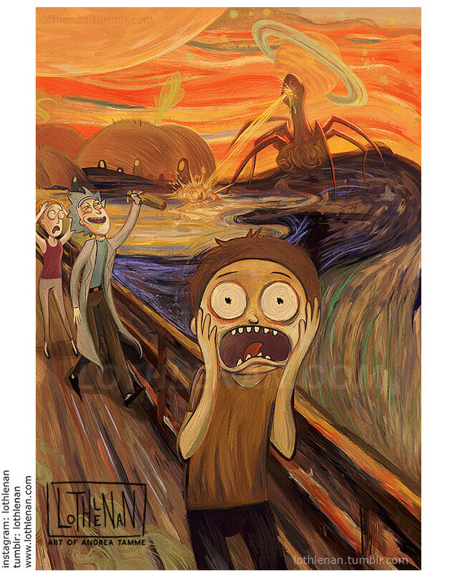
9. Lothlenan
We have all heard of art snobs. Those who are only attracted to the works of the great masters like Picasso and El Greco.

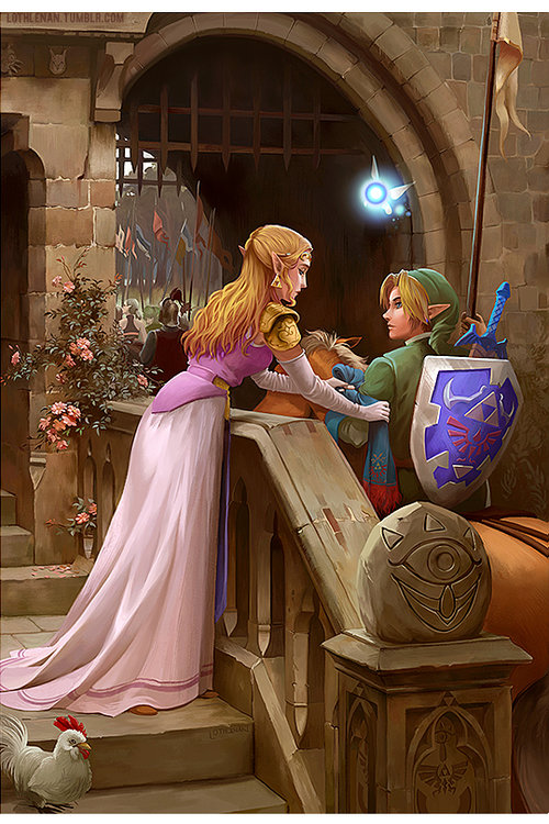
Lothlenan, an artist made famous by her following on Tumblr, is a Canadian/Estonian illustrator known for her clever recreations of famous historical paintings.

She also decided to thumb her nose at these few but faithful purists and geek up their favorite pieces with the insertion of Rick and Morty, Legend of Zelda, and even Adventure Time.

Final Thoughts

Art speaks from the soul of the artist to the mind and heart of the viewer. It is meant to be subjective, so each person feels differently that any other, opening doors and starting new and possibly earth-shattering conversations.

Art is more than something to be casually glanced at, but a living, breathing entity, meant to be absorbed. In the end, good art will change you, enrich you, and even evolve you.

12 Famous Toy Brand Logos You Might Know…

And Some You Might Not

The logos for toy companies are more than just the symbol of the brand but are also a promise that you will get the same quality from their toy line that you have come to expect since they started putting products on the market.

Their line of toys has changed over the years with new materials and standards of safety, but the logo still stands for the underlying resolve of the manufacturer to make the best playthings for your children.

The importance of a toy brand is in its niche audience, which is primarily children, who might not know why their favorite toys are made by Mattel or Hasbro but will often affiliate these companies only with selling toys and nothing else.

There have been movies made based on certain toy lines, such as the Transformers and GI Joe movies, but that is as far as they extend beyond their wheelhouse.

The Logos You Love

Here are a few of the more famous toy manufacturer logos you will easily recognize that go back decades and are still thriving to this day:

Mattel

Of the toy dynasties, Mattel is probably the one that comes to mind first if you were asked to name a toy manufacturer off the top of your head.

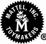
Started in 1945, Mattel is the brainchild of two founders, is the current holding entity of several toy brands under its umbrella, and the logo has had many changes over the years, all starting from the one displayed here on the left, which ran from 1955 to 1961.


Hasbro

Hasbro was started in 1923 and carried the original name of Hassenfield Brothers, Inc, before being shortened to Hasbro in 1944. Along with the evolving logo that changed roughly every decade since the company’s beginning, the Hasbro boy was also introduced to market their toys on TV using animation.

Today, to ensure their brand is associated with the playfulness of a child’s spirit, the logo features a smile below the company name.


Fisher-Price


Fisher-Price has always been a beacon for fun to children of infant and preschool ages. Their logo was designed to inspire the creativity, growth, and ingenuity of young children while also showing a sense of whimsy.

During the middle years of the brand, the logo got a little stale and dated, so they partnered with Pentagram, a marketing firm, to restore their brand identity as a playful product line.


Playskool


In 1928, two women had a vision. They thought, what if toys could be for more than just play, but open entirely untapped parts of a child’s mind. As teachers, helping children grow to their potential and studied what made children better versions of themselves in the classroom.

They started Playskool based on their observations. The original logo created in 1928 was modified in 2000 from the traditional rectangular version to the oval most widely seen today.


Radio Flyer


Antonio Pasin invented the Radio Flyer wagon in 1917. It is unlikely that, to this day, his labor of love would still be carting children around, or at least their belongings. His original design was entirely composed of steel, with quality wheels to ensure speed and a smooth trip, and those variables are present on the famous logo for this beloved brand.

Lego

More than almost any toy, Legos are the most universally recognized by children and adults alike. The logo was designed in 1934, but the brand didn’t get as much attention from its logo recognition and changed it a few times for the last 64 years, finally nailing it in 1998. They did the best thing they could and kept it big, bright, and very simple.


Nerf

Taking the applications of foam to the next level, Nerf brand toys will always be known for their innovations in playful artillery. The brand name has always been part of the logo, however, the logo colors, the font of the letters, and even the shape have been very fluid, changing wildly over the years.

The letter “e” in Nerf for some of the designs was lower case, yet today’s version is all uppercase in thick block letters.

Some Lesser-Known Logos

These are still common but will never quite hold a candle to the giants of toy manufacturing. Still, they make a great product and are worth your attention.

K’Nex

A proverbial babe in the toy game, K’Nex is not your average building set like the products from Legos. Instead, they went a different direction, making construction toys that help the user learn about kinetics, robotics, and physics.

The Rodon Group developed the logo based on what you are supposed to do when building their products, which essentially, is to connect the pieces. Hence, K’Nex.

Playmobil

Despite being a German toy manufacturer that only opened their line in 1974, Playmobil is to this day Lego’s biggest rival in the building blocks niche.

The first logo was drawn with Playmobil written in Sans Serif in all lower case, above the uppercase word “SYSTEMS.” Later, the “SYSTEMS” had been replaced, not with words, but with a smiling child’s face above the company name logo. It identified the product line as friendly.

A more recent update removed the child’s face but its overall word mark stayed the same.


MGA Entertainment


MGA was founded in 1979 and, while their logo might not look familiar, they are one of the larger toy companies with a reputation for brands that cross a variety of products. Their playthings have the innovation and intuition to predict what the next generation of boys and girls will want.

They had their first major success in 1997. The logo has changed to adding shapes since its release, the placement of “entertainment” has shifted and a more 3d effect overall was added.

Playmates Toys

Playmates was founded in 1966 in China. Their specialty is promotional toys, and despite fluctuating metrics and market volatility, they continue to be a leader in the industry.

Their logo has undergone almost no changes over the years, with one exception, and that is the word “toys” which was added to draw a distinction between their brand and the playmate products sold in Playboy magazine.

Tomy

A Japanese company founded in the 1920s, it was originally called Tomiyama, named after its founder. It is hailed as one of the first toy companies to have an assembly line and a research wing.

In the beginning, they specialized in toy planes and have propelled toy innovations and modernization since its opening. The logo is a pared-down version of the original which said Tomiyama Tomy, and is now just “Tomy.”

Wrapping It Up

Kids don’t look for brands. They know what they like and they gravitate to it. It is the parent’s job to know who makes the product, how they are made, and if they are safe. Consumer reports catch manufacturing problems all the time. The easiest way for you to know which toys are good for children and which might harm them is to look for the bright logos. They are always featured when a brand has trouble.

10 Famous Motorcycle Logos That Make a Statement

No brand is complete without a logo, even if that logo has the brand name etched into it. But the difference with motorcycle logos is when you see a motorcycle going by and don’t know who makes it, the logo the manufacturer chose is so undeniable, many people can instantly recognize it and use it as the jumping off point for their potential future purchase.

Motorcycles come in many different shapes and sizes, from the chopper, to café style racing bikes, to the one we all know, the Harley Davidson. The identifier that sets these apart has to be unique, and as you will see from our list, there are almost zero similarities between the brands.

So, if you are ready to hit the open road and hear or see a bike you want, look for these and you will see your future of freedom.

Harley Davidson

Despite the company being started in 1903, the world-renown logo wasn’t created until 1910, and is still the same logo for all Harley Davidson products.

The only changes this orange, black, and white symbol has undertaken happened at unique anniversaries within the brand, such as the addition of a “V” to the logo in 1953.

Indian

Indian motorcycles, started in 1901, became one of the largest motorcycle manufacturers in the world due to their innovative designs.

They are known as one of the few companies that adjust their logo with every new product release. It can always be seen on the tank, and at one point, the bikes even had an Indian head on the front fender.

Honda

Not only an auto maker, Honda has a history of building quality products are economical prices, and their motorcycle line is no exception.

From its flagship, The Goldwing, to the Magna, the VTX, and even the GSXR, Honda comes with the tools to impress. The wings on the logo are in reverence to Nike, the Greek goddess of victory.

Titan

Largely custom, Titan has a short but notable legacy because of the sleek and sexy design of their bikes. They were founded in 1994 in Phoenix, Arizona, and designed so the owner could make easy to add upgrades.

The logo was designed to be more hardcore than Harley, more distinct, and have a heavy metal feel, which works in concert with the style of their choppers.

Yamaha

Along with many high-quality Japanese products, the Yamaha motorcycle series aims to please. With its distinct logo, it can be easily recognized even when put next to similar bikes from other Japanese brands like Honda or Suzuki.

The standardized emblem of the triple tuning fork is an update from the original, which was a Chinese phoenix with a tuning fork in its mouth.

Ducati

If you are in the moto racing scene, then you will easily pick a Ducati out of the crowd, but for those who aren’t they made it easy to spot.

Ducati is emblazoned on their café series of bikes, usually with the model like 916 or 616 just below it. The company was started in 1926 in Italy, with the original logo the same shape as their parent company, Lamborghini.

Victory

The “V” on the Victory logo is distinct and a rallying cry to the employees to always push forward despite adversity. The wings in the symbol are for freedom and speed. Isn’t that what riding is all about.

Victory factored all that in when designing their logo and adding it to their line of heavy cruisers and stands by these principles to this day.

Kawasaki

Since the inception of Kawasaki’s high quality motorcycle line after the second world war, the logo has changed with the times, but has always maintained the essence of the original, using the name, or at least the “K”, and showing movement at speed.

However, the newest logo is simply an uppercase K, as the lines to indicate movement were found to be contrived and outdated.

Suzuki

Suzuki has been a world-wide producer of production machinery since the early 1900s, but only started with motorcycle manufacturing in 1922.

Despite the new niche of products, the founder decided his original logo had enough recognition that having a different one for their bikes would be an error, and so, all Suzuki products share this logo.

Triumph

Similar to the concept behind Victory’s logo, Triumph is a testament to the undying spirit of innovation. A British company, it was started as a bicycle manufacturer int eh late 1800s by a pair of German designers, then was shuttered for almost 80 years for many reasons few can nail down.

It resurfaced with many styles of bikes from touring to cruisers and so forth, and the logo is designed to show the company’s resilience.

Final Thoughts

Some motorcycles have a distinctive sound, like Harley Davidson’s, but that can be copied, which was done by Honda in the 80s.

Some bikes have a look that is unique, but at speed, many can resemble others in the same design scheme. But logos are unique, heavily copyrighted, and will always give away what is flying by as you watch in awe.

That is what logo marketing for bikes is all about.

5 Terrific Benefits To Running Your Own Small Business

Starting your own small business can be tricky and oftentimes even a little frightening. Getting out of the comfort of the usual corporate scene and commanding your own destiny is enough to give anyone pause. But the ambitious few who push through the fear and doubt soon realize that there is so much more to gain when you dare to take the first step.

It is true that many small businesses fail, but just as many succeed. The “why” varies as widely as the laundry list of potential pratfalls that made a particular business a success or doom it to disaster, but that doesn’t stop budding entrepreneurs from getting out there and taking a shot at making it in such a volatile economy. In fact, for many, it spurns them on. But why do something with such a stark likelihood of prosperity?

Why Entrepreneurs Take The Plunge

Maybe it’s destiny. Maybe it’s the desire to be the boss. Maybe it’s greed. But if you had to ask, many of them would likely boil it down to one word, and that is “love.” Love of family inspires them to work from home. Love of their passion that drives them to turn their art or skill into a profitable enterprise. Love of the idea of not answering to a nameless, faceless entity who signs their paycheck.

It is love, passion, desire, and grit that get the entrepreneur out of bed, make them want to get to work early, and keep their eye on the prize at all times. It is the love of the path they have taken that makes them work longer hours than they have ever before in their previous employment to ensure the trains keep running on time. And that love sustains them and gives them the push to reach new heights in their field.

That is who franchise opportunities are born, how they need to go on sites like Indeed.com to hire more staff is decided, and how someone working out of a garage can have a fortune 500 company in less than a decade. If you see a need, then fill it, there will always be work to do. The best entrepreneurs that succeed with the greatest frequency know there is always a need to fill.

5 Reasons A Small Business Is Worth Your Effort

Beyond the typical motivations, there are a few other ways you can profit from having your own business. And these apply if you intend to always stay small or if you wish to expand and create your empire. Just remember to pace yourself. Small business growth and cultivation is a marathon, not a sprint.

1. Credit Availability

Just like the equity in your home is available as long as it is gaining worth, your business is a resource for credit when needed. And these days, it is easy to get a credit line as long as your business model is viable for the long term. This is less true for niche markets, but these specialty shops are still a plausible risk as long as they have shown a quality history of positive returns.

But beware. Credit can be a slippery slope. Credit is against the profitability of your business, so when your business dives financially due to unforeseen market circumstances, creditors will still come for their pound of proverbial flesh. Don’t get overextended.

2. Tech That Works

Nowadays, we have the technology for everything. From your Point-of-Sale system to your marketing needs to your taxes, everything can be done and run by a single person on little more than a laptop. It is easier than ever to track transactions, issue billing, and even monitor employee efficiency, and you can do it all from home if necessary.

Tech has its downsides, though. If you haven’t taken the precautions to back up your data or properly secure your online systems, you are vulnerable to outside breaches. It is sadly easy to be targeted by cyber predators. Cover your technological bases and keep them updated.

3. Compete To Improve

More and more new online business opens every day. Sites like Shopify have made something as intricate as drop shipping so easy that the market is now saturated with stores selling everything from toys to pet products, all from the comfort of home, and never having to touch a single piece of inventory. But is this saturation a bad thing?

Many entrepreneurs would say “yes,” but the ambitious ones would disagree with that notion. Competition invigorates the soul, gets creative juices flowing, and makes a real fighter want to go a few more rounds. Having a few competitors raises the bar from mediocrity and complacency to excellence. It inspires you to strive to be the best.

4. Contact With The Customer

The worst cliché in any capitalist economy is the notion of “the customer is always right.” Why is this wrong? Because it is designed to move the meat, but it doesn’t address the real problem. The issue at hand has nothing to do with the customer, but with the way a transactional situation is handled in the intricacies of the deal. The nitty-gritty of the experience.

By interacting with your customers from the other side of the equation, you can see the perspective as the businessperson, and get involved in those details the average customer doesn’t know or even care about. It provides greater enlightenment into the mind of those who are often taken for granted due to that dated axiom. It flips the mental script.

5. Pat On The Back

When is the last time you felt truly amazing about doing something? When have you felt absolutely satisfied with a project or task? One last wonderful notion when running your own business is the ability to see the whole event from start to finish and know it all succeeded because of you. You did this. Maybe you had help, but they were driven by your love and passion.

Inspiring others, changing someone’s life, enhancing your own, are all great ways to see and feel that you have done work that is worthy of your efforts. You can stand back with a smile knowing that this is yours, a ship at your command, and you are at the helm. It is up to you to keep it on course, but those you have brought into your adventure will help you because they believe as you do that your small business is here to stay.