ga('send', 'pageview');

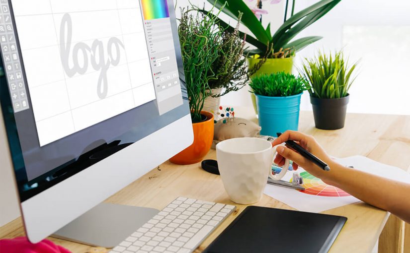
How To Get The Perfect Logo

  • Your logo design is integral to differentiating your businesses from competitors and defining your brand.
  • When thinking of ideas for your logo, use your brand’s identity (such as beliefs, mission, and values) to inform your design.
  • Seeking out professional designers can help you design the logo that truly represents your brand while helping you stand out.
Think of the top brands in the world. Is there a single one that you can remember that doesn’t have a logo? Exactly. Logos are one of the most important aspects of a brand. They are so important that many logos don’t contain a single word. With one look, millions of people can identify a ​Nike ​shoe by that infamous swoop.

Your logo plays a part in how people see (or don’t see) your brand. Like other aspects of branding, having a logo helps inspire trust and promote recognition of your business. So, how can your business create a recognizable logo to define your brand? Read on to learn how to design the perfect logo for your business. 4 Tips Towards Creating Your Logo Focus On Your Brand, Audience, and Competition Your logo should reflect the values of your brand. Ask yourself the following:

  • What are your values?
  • How would my audience describe my brand?
  • What are a list of adjectives that describe my business?

The knowledge of what your brand represents informs the colors and typography of your logo. Is your brand more authoritative and serious in tone with a mature audience? Neutral tones may best convey your brand whereas bold colors and nontraditional typography may work well with brands that emphasize fun and creativity (such as the bubble letters of the Lego toy brand). To gauge the feeling of your audience towards your proposed designs, consider sending out surveys with the different designs. Use their input to help narrow down the choices.

Lastly, aim for uniqueness. Your logo should be unique enough to readily differentiate your business from competitors at a glance.

Take a look at what your competitors are doing to get ideas about what direction you should go in. Are your competitors still using more traditional or formal logo designs? Think about going for a modern design to set your brand apart.

Simplicity Is Best

When designing your logo, it is not time to try to deviate from good graphic design sense. This means that you should avoid adding flashy elements or too many details.
Instead, keep design ideas simple with a few (or even just one!) colors that best represent your brand.

Examples of a well-known company that artly uses simplicity and minimalism in their brand is IBM​. With simple, striking blue and white stripes, the logo stands out and is instantly recognizable.

While simplicity is best, don’t forget to strike a balance between creativity, branding, and abstraction. Your logo should show more than it tells.

Take ​Twitter ​for example! Their logo is simply a blue bird. However, the sound of the bird (or “tweet”) perfectly describes the main draw of the social media platform.

Think About Where Your Logo Will Show Up
Your logo should be recognizable and easily visible on all of your branded material. A logo that looks great on your website but poor on a poster, business card or water bottle isn’t going to gain the traction you are looking for.

Logos should be versatile enough to show up in different media and even in black and white.

Hire A Designer

With their knowledge of graphic design, typography, and color psychology, a designer can work with you from the planning phase to the final design to create the perfect logo for your brand.

At Flocksy, we have a dynamic team of creatives that has the skill to make your logo come to life. Put one of the most critical elements of your brand into the hands of one of our designers!

How Graphic Design Has Helped During COVID – 19

  • During the COVID 19 crisis, graphic designers have stepped up to help create attractive, uncomplicated designs to clearly communicate messages that provide critical information and guidance.
  • Graphic designers have helped government, community, and business organizations with design expertise and by offering free access to gathered resources.
  • The graphic designs created impacted millions of people globally, creating emotional reactions and influencing behavior to help stop the spread of COVID 19.

The need for concise, easy to grasp information and guidance have come to the forefront during the COVID 19 crisis period. Millions of individuals have looked to all types of media for virus-related facts and stay at home orders and to validate their emotions including fear and isolation.

What better source would there be for user-friendly information than a graphic design? Professional graphic designers took on the call to create thousands of online and in-print infographics, charts, graphs, images, and photos mixed with words and numbers that have helped us get through the crisis.

Stepping Up

Graphic designers have faced the same challenges as everyone else during this COVID 19 crisis. Some suffered from a reduction-in-force, while others lost contracted work.

When meeting these obstacles, members of the graphic design field went to work for the good of helping everyone cope. Some were hired to work for organizations that needed to get their messages in the public eye.

Others volunteered their expertise and assistance, whether locally for community groups and area businesses or on a larger scale for further-reaching organizations. What did this creative community do? They made designs for websites, social media, and email.

They designed leaflets, information sheets, and postcards for neighborhood groups. Graphic designers were asked to create various types of COVID 19-related visual communications in a way that only a specialist can: creatively, attractively, strikingly yet with a clear, simple message.

If you read news articles, you’ve seen the images with lined up matches, people standing six feet apart, individuals in masks, and frontline workers. You’ve seen infographics that communicate the status of COVID cases, hospitalizations, and mortality rates, consumable in a brief moment. You’ve seen signs and floor markers in stores. Graphic designers have had their hands and their considerable talents in these visual communications.

Pitching In

In many cases, graphic designers have simply volunteered their time and talents to help government and community organizations get their messages to the people. In addition, some major advertising agencies offered their designers’ services for reviewing and providing feedback on in-house creations. The input of the designers improved the delivery and impact of the messages.

Some graphic designers created repositories of information and resources surrounding COVID-19 virus information and created apps so that others could access it freely, all because they knew it was the right thing to do. Helping each other strengthened the COVID 19 information campaigns touched.

Creating Change

Professionally designed infographics, charts, graphs, images, and photos including the right amount, often a minimal amount, of written content sends a message quickly and expresses it. People react emotionally to visuals in a way that they can’t quickly react to text-heavy materials. Emotional reaction can influence behavior in the desired way. It’s hard to beat the impact that graphic design has had during the COVID 19 crisis. in a way that cuts through literacy, language, and cultural roadblocks.

Are graphic designers heroes? Maybe not. Are they essential workers? No. Behind the front lines of essential workers and first responder, many services have been needed and numerous graphic designers stepped up to fill a support role with professionalism and forethought.

Millions of people across the world have seen beautifully designed visual communications displaying COVID 19 information and guidance, understood the message and did their best to stop the spread of the virus. If you want to know what it means to flatten the curve or to properly socially distance, there’s no doubt you’ll be able to find a great graphic design that explains the concept perfectly.

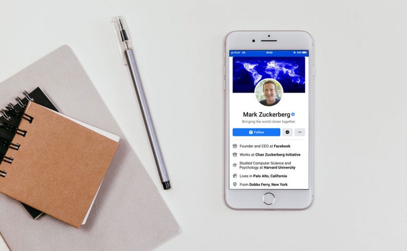
Successful Entrepreneurs: Mark Zuckerberg

Mark Zuckerberg is an inspiring example of a man who rose all the way to the top thanks to his hard work and entrepreneurial spirit. When you think ‘Mark Zuckerberg’, most likely your first association is ‘Facebook’, but there is a lot more to the story of the man behind the social media platform that changed our lives.

The Beginning

From a young age, it was clear that Mark had a penchant for creating computer programs. He built his first messenger, the ZuckNet, when he was only 12. With his parents’ support and encouragement, young Zuckerberg continued to devote most of his free time to his passion, and when he was still in high school, he created an intelligent media player he called Synapse.

Synapse caught the interest of Microsoft and AOL, who wanted to acquire the idea, but Mark refused. This point, I believe, is key to understanding the secret to his success. Independence and intellectual property ownership were more important to him than simply cashing out – a display of long-term strategical thinking not very typical for such a young man. 

Facebook

Mark’s triumphs continued at Harvard, where he soon earned the reputation of a brilliant software developer. The concept of Facebook was born during that time, and though other people had toyed with the idea of a social network just for Harvard students, Mark was the one who really took it to the next level, creating the early version of Facebook in 2004. It was wildly successful and soon moved beyond the stage of a student network, becoming available to the wider public. The rest is history.

In 2010, Mark Zuckerberg was given the Person of the Year title by Time magazine. He also became known as the youngest billionaire in the world. 

While there is undoubtedly an element of luck to Zuckerberg’s outstanding success story, he could not have achieved it without tenacity, hard work, and knowing how to take advantage of a splendid opportunity when it came his way: traits common to all thriving businesspeople. 

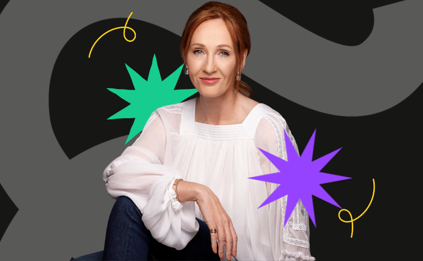
Successful Entrepreneurs: J.K. Rowling

When J.K. Rowling was six years old, she wrote a story about a rabbit who gets measles. That introduction into story telling was when Rowling knew she wanted to become a writer. Many years and several challenges later, Rowling would become the most famous writer in the world.

Success Rising from Hard Times

Before Harry Potter and J.K. Rowling were global household names and she was the first billionaire female author, Joanne Rowling was struggling through life. Her teenage years were difficult. When she was 15, her mother was diagnosed with multiple sclerosis, and it took a toll on her family. Ten years later, her mother passed away. It was a devastating event. Rowling also had suicidal thoughts while she was in her twenties. She claims that going through these emotional moments, helped her create the “Harry Potter” series. Her experience with depression helped shape characters, like the Dementors, in her books.

Graduating and Becoming a Parent

After graduating from the University of Exeter in 1986, she worked for Amnesty International as a secretary, but she realized it was not the job she wanted. She went to teach English in Portugal, where she met and married Jorge Arantes. After a miscarriage in 1992, Rowling had her daughter, Jessica, in 1993. Rowling separated from her husband the same year. After her marriage failed, Rowling traveled with her daughter back to Britain, with not job and a suitcase of Harry Potterwritings.

“Harry Potter” Introduced to the World

Rowling was a single mother living on government welfare but continued writing. She finished her first Harry Potterbook in 1995. Twelve publishers rejected it, but Rowling did not give up. “Harry Potter and the Philosopher’s Stone” was finally published by Bloomsbury in 1997. It became a big seller in the United Kingdom, and Rowling sold it to Scholastic in the United States for $100,000.

Her books flew off the shelves, Warner Bros. made movies, Universal Studios opened a Harry Potter attraction, and merchandise was developed. Rowling became a billionaire.

Rowling’s Awards and Financial Successes

J.K. Rowling became a legendary author despite her misfortunes. “Harry Potter and the Philosopher’s Stone” won the Nestle Smarties Book Prize and the British Book Award for Children’s Book of the Year.

Because of her monetary success, Rowling has been able to help others. She is a champion for poor families and single parents, and she has never forgotten what it was like being on welfare while trying to take care of her child. She also founded the Anne Rowling Regenerative Neurology Clinic at the University of Edinburgh.

Over 450 million copies of “Harry Potter” have been sold and the last movie earned $476 million just during opening weekend. Rowling wrote seven books for the “Harry Potter” series. “Harry Potter and the Deathly Hollows” became the fastest-selling book ever, selling 11 million copies on day one.

Rowling went on to work with Sony to develop Pottermore, an online resource dedicated to “Harry Potter” and the unknowns of the story.

Rowling continued her writing success with “The Casual Vacancy” selling one million copies in its first three weeks of release. The book was then adapted into a BBC TV and HBO miniseries. The “Cuckoo’s Calling”, published under the pseudonym Robert Galbraith, also received positive reviews.

Top Logo Stories – The Story Behind the Starbucks Logo

As you open the envelope and pull out the gift card, you notice the wavy hair, captivating eyes, knowing smile, twin tails, and other familiar features, and you know without having to read a word on the card that you have a Starbucks gift card, for the Starbucks logo is one of the most recognizable of all corporate logos worldwide.

If, however, you have not been a Starbucks patron for at least several years, you may be unaware that the logo has not always looked like the one on that gift card or that it has a rich history involving several transformations.

Origins

In 1971, Jerry Baldwin, Gordon Bowker, and Zev Siegel founded Starbucks Coffee, Tea, and Spice in Seattle, Washington, to sell coffee beans. Immediately, the founders knew they needed a unique, catchy logo.

Wishing to use a logo evoking coffee’s maritime history and Seattle’s own ties to the sea, the founders discovered their inspiration in one of the many old seafaring books they pored over. There, they found a Norse woodcut from the 16th century depicting a two-tailed siren.

The Greek epic The Odyssey reveals sirens as female monsters with beautiful voices whose songs lure sailors to them only to be killed and devoured. Other cultures have made sirens and mermaids virtually synonymous, with the sirens’ motives ranging from benign to sinister but always with the common thread of beauty and irresistible allure.

Did the founders wish to suggest overpowering temptation through their logo? No one but they seems to know for sure, but from that woodcut, they fashioned the original logo: a topless siren with long hair and two tails.

First Makeover

1987 brought a change of ownership (Howard Schultz), name (Starbucks Coffee), direction (selling brewed coffee and more), and logo. Simpler and more polished, the new logo still featured a full-body version of the siren/mermaid, now with the navel visible, and the company name encircling the figure (the “donut” design); new were two stars in the “donut” and a starred crown atop the mermaid’s head. In addition, to symbolize freshness and growth, the designers used a green palette with black and white present as well. Since then, the logo has undergone revision twice, but the 1991 version was far more similar to the current one than the original 1971 version was.

Second Makeover

In 1992, Starbucks became a publicly traded company, and the logo saw more changes. Perhaps most immediately significant was the close-up perspective of the mermaid; instead of showing the mermaid’s full figure, the logo showed her from the waist up, with the navel no longer shown, and with the ends of the two tails visible. Still present were the “donut” design and the wavy hair cascading sensuously over the breasts.

Today’s Version

Most recently, the logo changed in 2011. One reason for the change was to mark the company’s 40th anniversary, but there were also two “problems” the designers wanted to address.

The first was that the company had learned that the “donut” design drew so much attention to the words that overseas competitors were creating knockoff logos. To deal with this, the company abandoned the “donut” and enlarged the image of the mermaid. Gone was the company name, and that actually helped send the message that Starbucks was about more than coffee, as by then it sold other breakfast and lunch sandwiches and other foods and beverages.

The second “problem” really came about during the redesign process. With better technology, the team was able to create images in higher resolutions and which looked more realistic. As they “perfected” the mermaid’s features, they came to feel she was ​too perfect, almost impossibly perfect, and they felt it was due to the symmetry of her facial features. And that is why one side of the nose dips slightly lower than the other does; the designers felt that made the mermaid human and attainable enough to “work.”

A Fixture in Our World

However one perceives the Starbucks mermaid– perfect, real, benevolent, a seductress, a figure some are reading way too much into, or whatever else– there is no disputing that this logo is one of the most familiar and effective corporate symbols in the entire world.

How Artificial Intelligence is Revolutionizing Graphic Design

Artificial Intelligence has taken the retail and medical industries by storm over the last few decades. Defined as a computer system able to perform tasks that normally require human intelligence, Artificial Intelligence can come in many forms. Most of us naturally think of AI as the voice that responds on our phone or home device. In recent years, developers have also been working to integrate AI into website design. What does AI look like in web design – and what does it mean for the role of graphic designers?

The Promise of Artificial Intelligence

Many companies have worked to develop AI systems to aid the less trained user in creating quality web designs. These technologies include Firedrop’s chatbot Sacha, Adobe’s Sensei program, The Grid’s Molly system, Wix’s Artificial Design Intelligence (ADI), and DesignScape from the University of Toronto. The goal of these systems is to make graphic design a more intuitive, user friendly process. Some of these companies originally made huge promises alongside their technology, such as:

●  Little to no work for users

●  Unique web designs

●  Utilization of audience trends to influence site structure

●  Replication of graphic designer logic

Many of these promises could have meant that graphic designers would be on the hunt for new jobs, which was the fear of some speculative content creators. The possibility of businesses being able to create their own original site designs had the potential to disrupt the current industry. Instead, the presently available AI systems have so far fallen somewhat short of their high expectations. The Graphic Designer’s Role in AI Web Design As it turns out, graphic designers are still in high need, even with Artificial Intelligence systems in web design. Many users of AI systems found that their site felt unoriginal. The created site designs were closer to a drag-and-drop template than a uniquely tailored experience. Some of the less than positive reviews from early users included:

  • Look alike sites
  • Limited creative freedom
  • Requirement of hands-on human use
  • High prices with finite results

Conclusion

Overall, the feedback from users pointed to AI as an enhanced web design tool, not quite the game changing technology it was marketed as. Although this wasn’t the best news for the developers in charge of the AI systems, it did leave a very specific niche for graphic designers within web design. Graphic designers can often feel overrun by the tedious details of site design. With its ability to predict audience trends and provide aesthetically pleasing color palettes, AI has optimized the process of web design to be much quicker.

Now graphic designers can take a step back and focus on curating the ideal site for their clients. This change from creation to curation gives designers more opportunity for out-of-the box thinking and problem solving.

The Future of AI in Web Design Since all of the current AI programs still require a human user to achieve an ideal web design, graphic designers have more of a partnership with these systems than a competition. With the future development of more adaptive AI, designers are able to flex their creative skills beyond the basic site details that previously consumed the majority of their time.

This freedom to step beyond their ordinary design work can potentially spark more ingenuity and user-friendly content. Over the last 40 years we have witnessed graphic design develop from a hands-on, paper and pencil process to a digitalized, interactive experience. As AI continues to grow, program developers and graphic designers alike hope to improve web design to meet all user needs with intuitive and unique solutions.

What’s Trending in 2020 for Creative Hires

Creative hiring is important for so many people! Many say that finding the right professional is difficult in this sector. The trends are in for 2020, and people are planning to add both full-time team members and freelancers to fill creative roles at their companies.

Most of the roles are in things like web design and user experience. With tech-related jobs leading the way, better salaries and freelance rates can be expected.

Creative development and web production round out the creative roles that managers are looking to fill out this year.

People are looking for those with skills in relationship-building, with content marketing and strategy as well as social media and digital strategy topping the list of in-demand skills.

Vacancies also exist in AI, machine learning, data analysis, A/B testing, and UI design. It seems that everyone wants an excellent web experience, and companies are here to deliver!

Creativity, collaboration, and problem-solving skills are the most needed soft skills within creative fields.

These skills contribute to a lot of things in the workforce, but likely they are wanted because of the sheer volume of content and advertising needed online.

These skills help people create massive amounts of content that really differentiate companies as they try to appeal to consumers.

It’s a candidate’s market this year, and that means perks for senior employees and those with in-demand skills.

Some areas employers are seeking to improve are with employee wellness, flex options, and signing bonuses. While wages haven’t risen much in the U.S. for the last few years, it could be the year that trend discontinues if the field remains a candidate’s market for long.

Image is everything, as they say, and that remains true for online. This is the year companies are seeking to elevate their online offerings and presence. Candidates who help them stand out in this area will find themselves with more competitive packages than others.

You might be surprised to find data analysis and AI listed in the creative category. But these jobs, while not related to content and branding as much as some other creative jobs, require some creativity as well as a sense of numbers.

Without information, companies don’t have much to go on when it comes to the creative materials and agenda needed. So these newer fields of AI and data analysis are integral to companies who want their creative departments to make informed decisions about direction.

In addition to skills and experience, employers are still looking for the old stand-by’s: collaboration, adaptability, business acumen, curiosity, and a killer portfolio.

5 Ways To Give Your Logo A Facelift

Your logo is essentially the face of your brand. It’s the eye-catching, memory-evoking nugget of gold that keeps your brand in the forefront of everyone’s mind. Just like anything else in life, logos need to be updated periodically. Trends change constantly which is why it’s important to make sure your brand’s logo doesn’t get stale like an 80’s power mullet.

K.I.S.S. – Keep It Simply Stylish

Nowadays, many people are convinced that less is more. This isn’t always the case with logos but if your logo is packed full of details, then it may be time to simplify things. Get rid of excess details and focus on simple, clean lines.

The simplistic logo options aren’t a fit for every brand. For example, if you are an antique dealer then a modern and sleek logo probably doesn’t line up with your brand’s identity. But, you can still give your logo a quick revamp by swapping out image or text elements for fresh, new options.

Update The Colors

Colors go out of style, right? There aren’t too many people picking out pink shag carpet and orange wallpaper for their living room anymore. Colors are one of the fastest changing trends in all aspects of design.

Keep your logo relevant by updating the color palette. This doesn’t necessarily mean changing all of your colors entirely. You can achieve an entirely new look by eliminating one or two out of date colors or by increasing the visual presence of one color that is still trendy. Navy blue, greys and greens are all really popular colors currently.

Embrace A New Image

If your logo has an image element then it may be time to spruce it up. Technology and graphics have advanced over the years. Depending upon when your logo was created, it may quickly be showing signs of aging. Think of the quality of cartoons when you were a kid compared to the quality of animations now. That’s how far digital design has come!

You can either work with a graphic designer to make your current image more relevant or opt for a new image entirely. Or, if you really want to take a leap, forget the image all together. Logos that are text only can be just as visually appealing and thought provoking as their image-laced counterparts.

Try A New Font

A new font for a logo is like sending your logo for a day at the spa and having it re-emerge as a new person. You’ve heard the saying, “A picture is worth a thousand words.” Well, so is a font! There are different types of fonts for everything and each one creates an entirely different feeling. 

Pairing fonts together is another easy way to give a logo an additional boost. If you want to try your hand at pairing a couple new fonts, you want to be sure to choose fonts that contrast and yet still complement one another. A script style usually pairs well with a serif. You can also manipulate the look and feel by using all capital letters or making one of the fonts bold.

Play With Ratios And Positioning

If you’ve ever repositioned your furniture in your home, then you know what a little repositioning can do. Feng shui goes a long way! Moving your couch to a different wall can make your living room feel entirely different. It’s the same thing for a logo.

If your logo has a combination of text and an image, play with the scale and positioning of each. What if you moved the text below the image or reduced the text size and placed it vertically? There are so many possibilities when you start thinking outside the box of conventional placement and positioning.

A little bit of imagination and a lot of trial and error will set you on the right path to a killer new logo in no time!

Why You Need Custom Illustrations For Your Business

We have discussed unlimited graphic design, web development, copywriting, and much more. So I think it’s time to talk about custom illustrations! Illustrations are something that everyone should use, whether for a t-shirt design or a mascot. If you get the right designer, then you can get amazing illustrations.

Anyway, let’s talk about why illustrations can make your business better and overall are great.

Three Reasons Why You Need Illustrations For Your Business:

One: ​To start with, illustrations are perfect because they are 100% unique and one of a kind. That means that your mascot is your mascot. Your t-shirt design is your business’s t-shirt design that is original and amazing.

Two:​ If you are a business that creates coloring books or books in general, then illustrations are the way to go for you and your business. Illustrations make it so your business can create pages that are something you came up with, and told someone to bring it to life for you. And 99% of the time, it will come out exactly like you thought or better.

Three:​ When it’s comes to things like icons, you need custom icons because they will make your website shine and stand out like no other. That’s right, custom icons are something every business needs and something your business needs.

Overall, custom illustrations are fantastic for your business and are something every business should have. However, one thing to remember is that if you are going to use custom illustrations, then get them from a place that offers unlimited custom illustrations, and it will be a much better deal.

When you work with a business that offers unlimited custom illustrations, you can get as many versions as you want and run as many projects as you wish. Custom illustrations are what your business needs, so get out there and find a place to get them!

Growing Your Business with Unlimited Graphic Design and Web Development


Many business owners don’t realize how important graphic design and web development are to their business — until it’s too late. Cue frantic branding efforts or landing pages hastily thrown up.

It’s understandable. There’s a lot to think about when launching a business, and sometimes it seems easy enough to buy a $5 logo on Fiverr or build a quick Wix page. But what happens when you need new content on the website? Or designs for a new marketing campaign? Or multiple versions of your logo? You need a plan for unlimited graphic design and web development.

Unlimited Graphic Design

As your business grows and you launch new products or services, you’ll need brochures, flyers, billboards, Facebook page banners, Instagram posts, and countless other design elements. Still, the work may not be constant enough to warrant a full-time designer.

Why hunt for a new contractor each time you need work done? Sign up for an unlimited graphic design service such as Flocksy and never worry about not having someone to whip up a social media graphic or print an ad for you ever again.


Unlimited Web Development

Your website needs will change as you grow. You may need to build new pages to showcase new products or services, or set up landing pages for your latest marketing campaign. Again, a full-time developer or web content editor may not be needed, but having a team of designers on hand should you need anything is invaluable to maintaining a professional, functioning web presence.

By signing up with unlimited design and development service, you can prevent frantic searches for freelancers or having to rope your employees into working outside their scope. A service like Flocksy offers unlimited graphic design and web development along with so much more. Keep a team on standby and enjoy a sense of security that your business needs will be met.