Blog · Logo Design
15 Great Sports Logos
By Matt Gladstone
December 7, 2021 · Updated December 7, 2021 · 5 min read
There’s nothing in the sporting world like a great sports logo. They come in all different shapes, sizes, and color, and inspire emotions as diverse as fear, happiness, or awe. In honor of the many designs ingrained in the collective consciousness from sports teams, here are fifteen great sports logos, in no particular order.
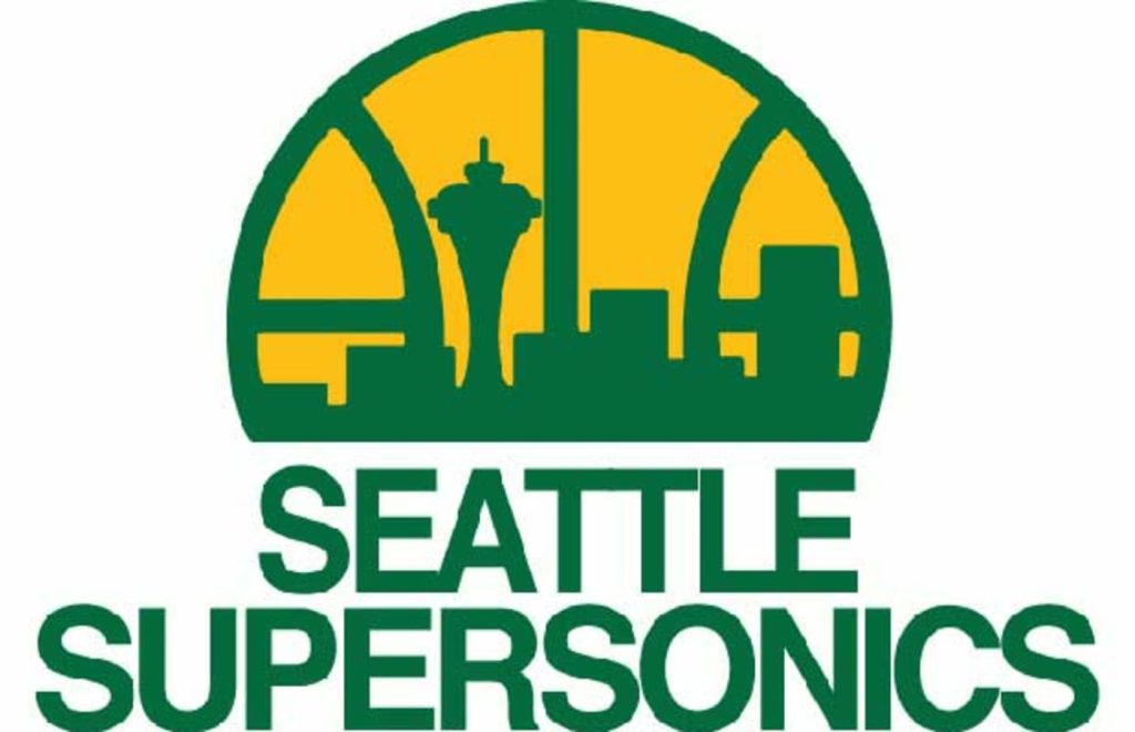
The Seattle Supersonics
This logo was introduced in 1975 to evoke the spirit and energy of Seattle. This great retro logo has the look and feel of the era and sports the buildings and icons of the city, including the Space Needle. The skyline can mostly still be seen to this day, making this a timeless and classical logo all at once.
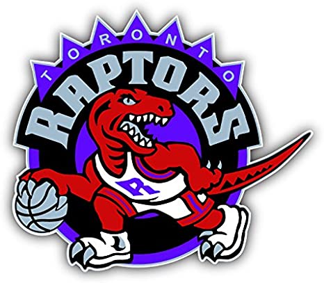
The Toronto Raptors
One of the greatest NBA logos in history, this design forewent sleekness and modernity to bring The Raptors back to their prehistoric roots. This is a mishmash of color, funky geometry, and points to strike fear into the opposing team. The raptor on the design is still the first thing most think of when they think of The Toronto Raptors.
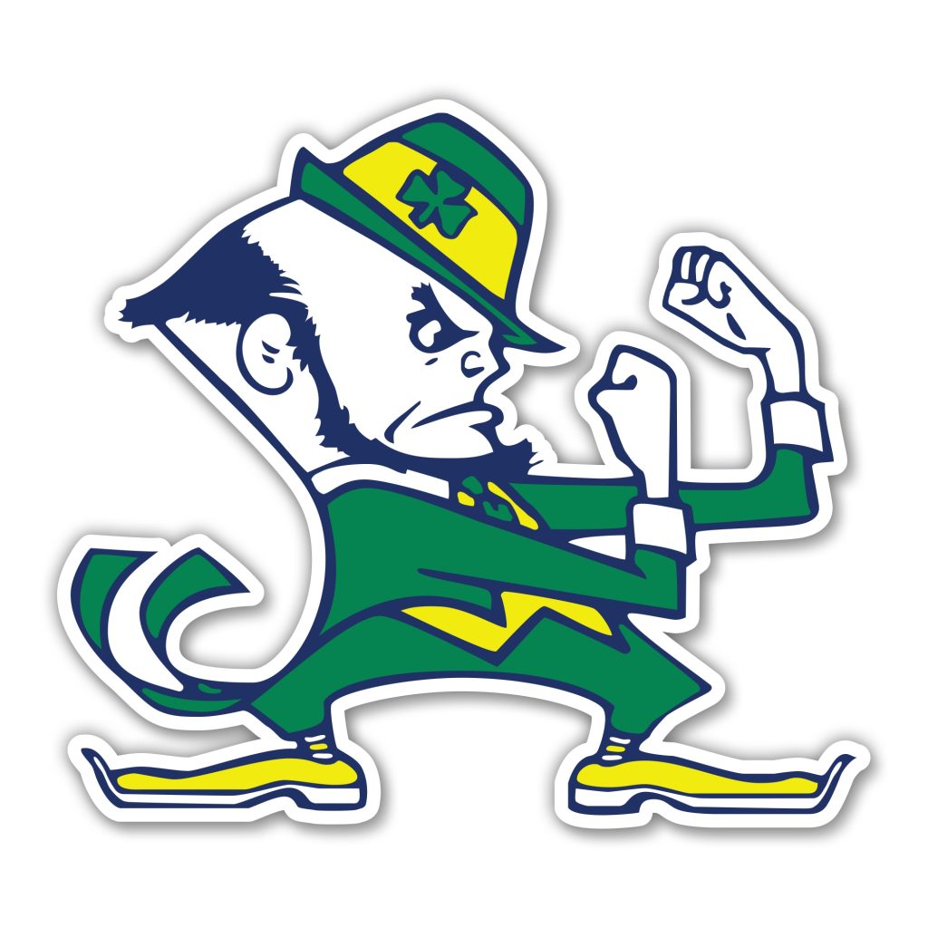
The University Of Notre Dame
One of the oldest and most varied universities in the country, the University of Notre Dame has been called the fighting Irish for nearly the last sixty years. To commemorate the name, this great logo of a fighting leprechaun was designed. Not one of the meanest logos, this little guy is still one of the fiercest; would you want to fight him?
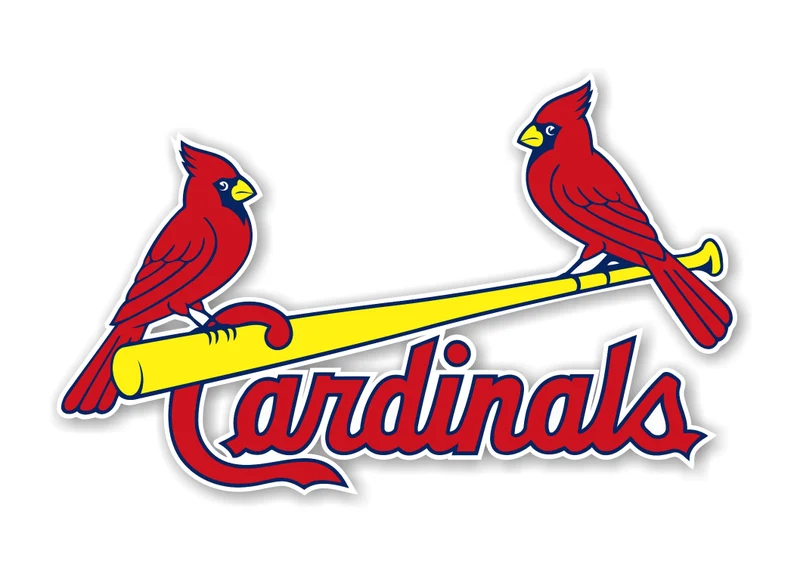
The St. Louis Cardinals
One of the oldest logo in American sports, the St. Louis Cardinals logo evokes a feeling of warmth and comfort, as well as fury and bitterness for opposing team players who have had to face their mighty bats. No other graphic logo looks as classical or streamlined as the St. Louis Cardinals logo.
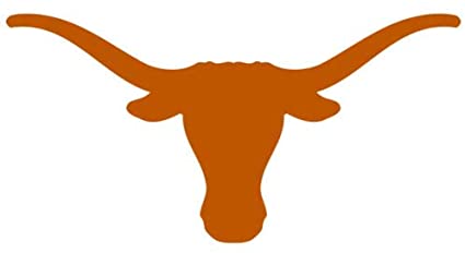
The Texas Longhorns
One of the all-time great logos in sports, The Longhorns logo needs little detail or texture to be feared and remembered. Simply an orange longhorn silhouette, the Longhorn’s logo is known throughout the world as a symbol of pride and admiration in Texas. A perfect orange dominates the logo and sends opponents packing early.
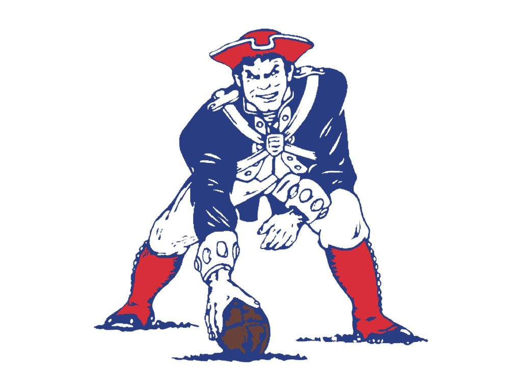
The New England Patriots
Although this logo looks like it belongs in the early 20th century, it was actually designed in 1960. What’s great about this logo is the texture and details in Pat the Patriot’s face and uniform. He’s ready to play ball and snarling at the enemy team with glee. Though it was dropped in the nineties, no Patriots logo will ever top Pat the Patriot.
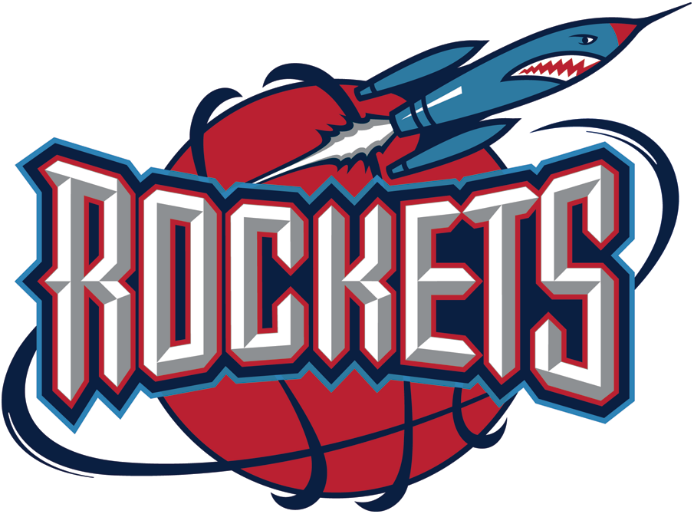
The Houston Rockets
This is a divisive logo to some, but there’s substitute for the colors, energy, or relevance the Houston Rockets’ logo offers. Houston is the home of NASA, and the logo pays homage to the city’s pride by featuring an angry rocket at the top. The text itself is big and bold it all rotates around a basketball designed to look like the Earth. Perfect.
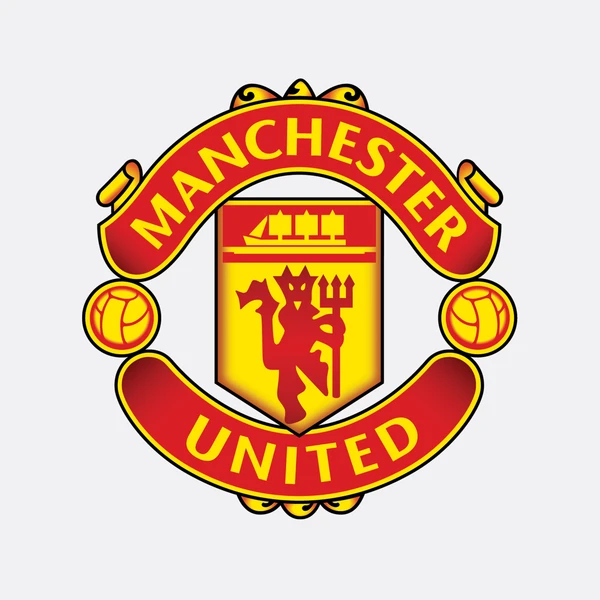
Manchester United
One of the all-time classic soccer logos, Manchester United is also one of the most significant. The team is one of the most dominant and iconic in European soccer history and their logo is imbued with the boldness and fresh aesthetic of the players. The devil at the center is the cherry on top, as most opposing team fans can attest to.
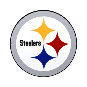
The Pittsburg Steelers
There’s no logo in sports like the Pittsburg Steelers logo. The logo was adopted by the team in the 1960s, near the peak of the industrial spirit in America. The logo is actually the only logo in American football to be worn on only one side of players’ helmets, making it extra unique. It’s sleek, dominating, and minimal, just like the team itself.
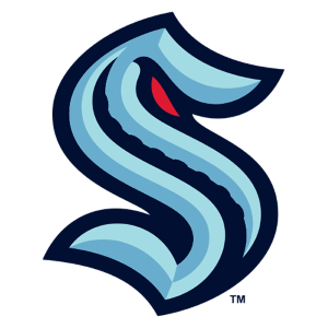
The Seattle Kraken
Easily the most recent logo on this list, the Seattle Kraken logo is inevitably destined to become a classic. It’s minimal but evokes a feeling of the deep sea. The S itself is molded into the shape of a monster with a curled eye staring down the opposing players’ souls. The texture of its spine is a nice addition as well.
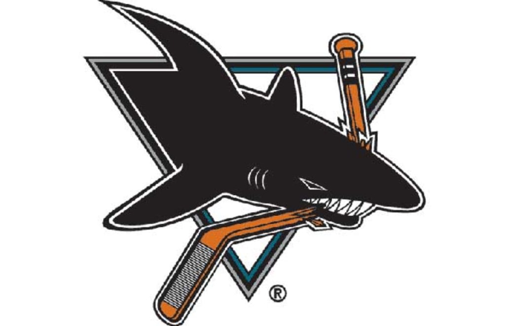
The San Jose Sharks
This sharp logo was introduced in 1991 and adopted by the fan base immediately. There are few mascots as fear-inducing and commanding as a shark, and this logo takes full advantage of this fact. The shark of the logo has always been a menacing logo and is contrasted nicely with the triangle and broken hockey stick within the logo.
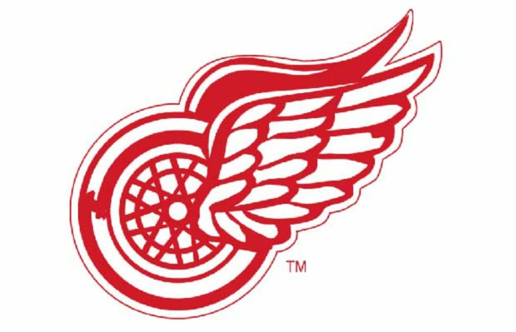
The Detroit Red Wings
The Detroit Red Wings logo has an interesting history. It was actually introduced because James E. Norris, owner of the team in 1932 when the team was introduced, was a member of the Amateur Athletic Association, which was a cycling club. The logo pays tribute to his history and the team by combining red wings with a literal bicycle tire.
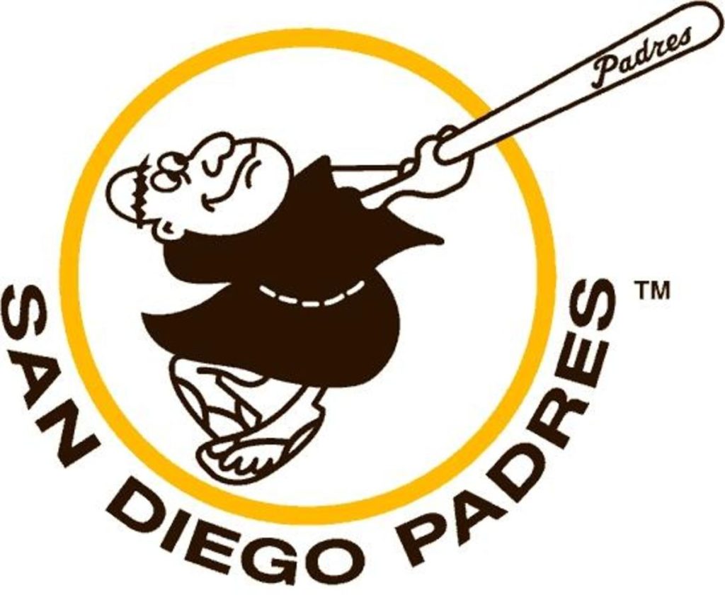
The San Diego Padres
Although the Padres logo has been changed and altered throughout their history, this remains the all-time most unique logo in their history. This swinging friar is a great tribute to the Spanish missionaries who settled the area in the deep past, while staying light and fun. Who doesn’t want to see a padre pay baseball? Stay holy.
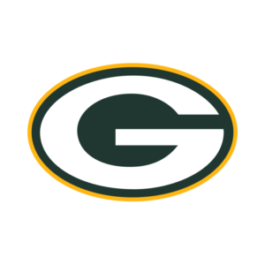
The Green Bay Packers
This iconic logo was introduced in 1969 and has not been altered since. On the surface it may seem like a plain logo, but the color combination and presence of the large G makes it unique. The Packers are a prideful and classic franchise, and the logo evokes their spirit well. This logo may never change again.
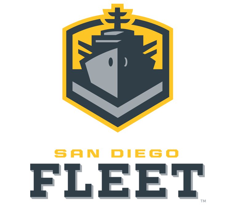
The San Diego Fleet
One of the greatest things about the short-lived AAF were the team logos, and none were cooler than the San Diego Fleet. Combining a sleek minimalism with the feel of San Diego and its military history, this logo anchored the team and led them to success before the unfortunate shuttering of the league.
From the studio
Want this done for you?
One dedicated team. 140+ creative services. Real humans doing the work.