ga('send', 'pageview');

How Does the CARES Act Help My Small Business?

The historic CARES Act, signed by President Donald Trump on March 27, 2020, provides a $2 trillion stimulus to help mitigate the negative effects of the COVID-19 pandemic.

The package provides broad financial support to healthcare organizations and major corporations. Small business owners and nonprofit leaders, and gig workers need not feel left out.

The CARES Act, which passed with broad bipartisan support, expands the Small Business Administration and provides for a new relief program, Paycheck Protection Program.

Let’s look at what the PPP offers and how to take advantage.

Disclaimer: The following information is provided as a means of convenience and on an as-is basis. This content does not constitute legal or accounting advice. Given the nascent nature of the Paycheck Protection Program, not all details are known. We will post further information in new articles as it comes to light. We encourage all readers to visit https://www.coronavirus.gov/smallbusiness/to learn more.

Summary

  • The Paycheck Protection Program (PPP) helps small businesses, nonprofits, and independent contractors cover the costs of payroll, overhead, and debt obligations, through low-interest loans. Forgiveness options are available.
  • PPP loans may also be used to refinance Economic Injury Disaster Loans if EIDL loans were received due to the pandemic.
  • Loans are forgivable if the funds are used to help keep workers compensated or to cover the business’s rent/mortgage and utility expenses. How does the stimulus bill help small businesses? The CARES Act allocates $349 billion to the new Paycheck Protection Program (PPP), which helps ensure that small businesses and nonprofit organizations can keep employees on the payroll.
  • The PPP also covers the so called “gig workers,” including sole proprietors. Although the program is just now rolling out, recipients can typically receive the funds quickly upon approval. All loans are guaranteed by the Small Business Administration and can be issued by any financial institutions that have partnered with SBA or been approved by the U.S. Treasury. This includes 1,800 financial institutions, with the potential for others to come on board as well.

Most business owners and sole proprietors will find that they can use their existing financial providers. The loans are primarily intended to help compensate workers, and the funds can be used for anything from salaries and hourly wages to benefits payments and paid leave, including sick leave. In fact, businesses will also receive advance tax credits if they provide sick leave to employees.

Recipients may also use the PPP funds to pay mortgage, rent, and utility payments, as well as any payments toward existing business debt obligations. The economic stimulus package also expands the Small Business Administration’s Economic Injury Disaster Loan (EIDL) program by $10 billion.

Some businesses have already received EIDL loans due to the pandemic; these recipients may be eligible to refinance these loans with PPP. If you have an existing SBA loan, you may be able to postpone your payments for up to six months.

Note that any SBA-backed loan might impact your eligibility for other forms of assistance.

Continue reading to learn how PPP and EIDL work and if these options are right for you.

How do I qualify? The CARES Act established the PPP to provide minimal-requirement relief to a broad range of vulnerable businesses and workers.

You are eligible if:

  • your small business or 501(c)(3)-certified nonprofit organization has 500 workers or fewer on its payroll or meets the employee-based size standard for your industry.
  • your business is a sole proprietorship, or you are self-employed and regularly perform business activities to supply your income.
  • you have any regular payroll costs or business expenses, including office rent and business loan interest payments.
  • your business has been negatively impacted by the pandemic.

How do I get a PPP loan? Unlike with many other forms of government assistance, you can take advantage of the Paycheck Protection Program through your existing financial institution. There is no need to visit any sort of government office or website. Your bank or credit union will have loan officers who can help you apply for SBA-backed loans, including PPP loans.

Get your paperwork together, then call to make an appointment. Remember that social distancing is in effect and many loan officers will be inundated with requests. Before applying, be sure that you have all the articles of incorporation, payroll reports, and other key documents related to your business.

You will need to calculate your expenses for an 8-week period and provide documentation to back up your application. The deadline to apply is June 30, 2020, which is also the last date that your 8-week period can extend. Should you apply on that date, the covered period will be retroactive.

What’s the difference between the Payroll Protection Program and an SBA Economic Injury Disaster Loan?

As mentioned above, the CARES Act not only created the Payroll Protection Program but also boosted the Economic Injury Disaster Loan (EIDL). The two loans are similar, but they have some key differences:

Paycheck Protection Program Loan

– A PPP loan may provide up to 2.5 times the average costs of monthly payroll over an 8-week period (12 weeks for seasonal businesses). The total loan amount is capped at $10 million for a business and $100,000 per year for sole proprietorships.

– You do not need to provide collateral or proof that you could not otherwise get a loan.

– You must have been in business before February 15, 2020, and you may set your covered period retroactively, starting as early as February 15, or in the future, extending up to June 30, 2020.

– A PPP loan is entirely forgivable if the funds are spent on payroll, mortgage/rent, and utilities, and debt obligations, and if business owners retain their employees and compensate them with at least 75 percent of their prior salary or wages.

– If a business owner lays off employees, the portion of the loan that’s forgiven may decrease with the number of employees laid off. You may also have the loan forgiven if you rehire laid-off employees by June 30, 2020. If you do not meet the 75 percent requirement described above, you may also have your forgiveness reduced.

– You are permitted to use the funds for other business expenses, such as for inventory or advertising, but your PPP loan will not be forgiven if you do. – The interest rate goes up to 4 percent and repayment terms extend up to 10 years.

3 Economic Injury Disaster Loan

– Collateral is not required for loan amounts less than $25,000.

– Previous recipients of an SBA-backed loan can use EIDL loans as bridge loans.

– EIDL loans typically cannot be forgiven. However, EIDL loans received due to the pandemic can be refinanced with a PPP loan, which, in turn, can be forgiven if all requirements are met.

– The interest rate is 3.75%, and recipients can repay in terms of up to 30 years. You may not receive both an EIDL and a PPP; the former must be refinanced into the later. You also may not receive more than one PPP loan.

Am I required to offer paid sick leave to my employees to receive PPP?

You are not required to offer paid sick leave if you have fewer than 50 employees, but keep in mind that you can receive advance tax payments for offering this benefit. Also, your PPP loan is forgivable if you use the funds to provide any sort of compensation to your employees, including paid leave. I already laid off employees.

Will my PPP loan be forgiven?

Your PPP loan will be forgiven if you rehire those laid-off employees and pay them at least 75 percent of what they were earning before the pandemic. You must do so by June 30, 2020. Remember, the PPP funds are intended to be used to cover payroll for an 8-week period. If you did not lay off employees due to the pandemic, you must retain them and meet the above-described payment threshold in order to have your loan forgiven. Ensure that you are requesting sufficient funds to meet payroll needs for the covered period.

How can gig workers get a PPP loan?

Anyone who runs a business as an individual can apply for a PPP loan to help keep themselves in business. Note that you must have been in business before February 15, 2020. You do not need to put up personal collateral to receive a PPP loan. You need only demonstrate that your business has been impaired by the pandemic and that you have documentation of your regular income and business expenses.

The loan can cover your own payroll and any business facility costs or debt, and you’re eligible for loan forgiveness as long as you use the PPP loan for the protected provisions during the covered period.

For more information, visit https://www.coronavirus.gov/smallbusiness/ or reach out to your financial institution to inquire about what’s right for you.

Top Logo Stories: The Curious Case of Twitter

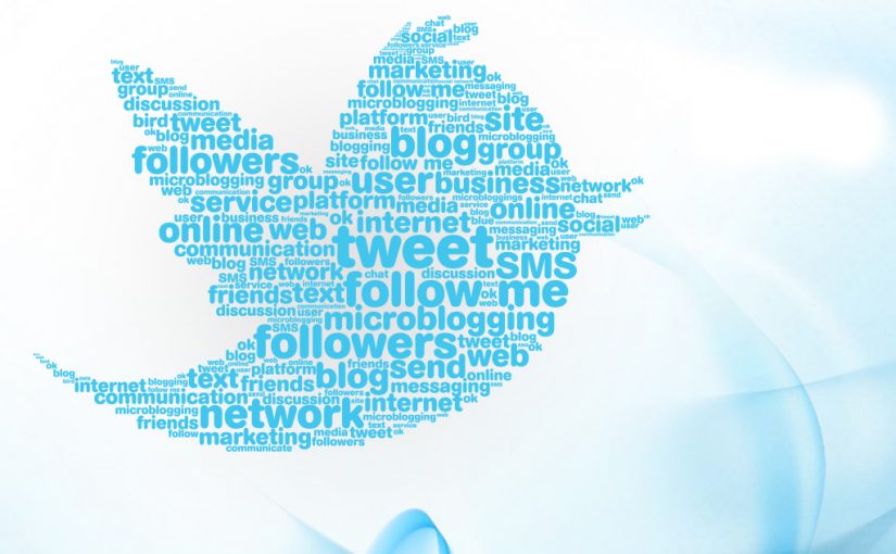
Of the major social media platforms, few have had the same logo for nearly 10 years. Twitter stands out as a tech giant with a consistent brand. Perhaps that’s because the small blue bird is instantly recognizable, with little to no indication of what company it represents. When you solidify your logo that well, there’s little need to make changes.

The Early Version

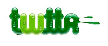
The company debuted in 2006 as a microblogging platform, “twtter.” Initially, its logo was a wordmark, and a rather gross one at that. With shades of green and a wet appearance, it was reportedly meant to look fun and youthful, but instead had a distinctively early-00s look — and not in a good way.

2006: The Pretty Wordmark

Graphic designer Linda Gavin reportedly had a single day to reinvent the green logo for the official launch of the platform. Gavin created a pleasant blue wordmark in an open, friendly font. The founders loved it and kept it until 2010.

2010: The Twitter Bird

In 2010, Twitter decided to develop a mascot. They were already using the term “tweet,” so a bird was a natural choice. The bird is meant to represent both the short “chirps” of information shared on the platform and the flights of conversation among its users. The resulting design, nicknamed Larry after the Boston Celtics’ Larry Bird, became an established part of the platform’s logo.

2012: Larry Breaks Free

Eventually, Twitter was ready to abandon their name— at least in their logo. They hired a novice graphic designer, Martin Grasser, to reinvent Larry the Bird. Grasser incorporated circles into his initial rendering to represent the democratization of the platform. These gave the bird an even, friendly appearance. Larry could now stand alone as a symbol of the platform.

Today

Now, the Twitter Bird is instantly recognizable around the world. As more people interact with the platform on their phones, it’s been important to create a logo that’s instantly recognizable, no matter how small. Thanks to a bit of nature-inspired whimsy, Twitter has been able to do just that.

Remote Businesses That Will Help You Scale Your Business From Home

As companies around the world take their operations remote to help reduce the spread of Covid-19, just as many people are looking to launch an online business or develop a personal brand. No matter your situation, there’s plenty of help online to help you grow or expand your business. Get started by taking advantage of these awesome tools and services that are experts in remote work and online business.

Slack

Although Slack can certainly be used in an office environment, its real power is its ability to easily connect people. It’s ultra-fast and can even send large files in the blink of an eye. It integrates with all your favorite third-party apps. It has a whole subculture surrounding it. It’s pretty awesome.

But where Slack truly excels is in what it promises: to replace email. With email, you’re limited to long, sometimes unwieldy threads that might be challenging to search and organize. With Slack, you can start organizing before the messages even start: Create different “channels” for your various teams, projects, etc, then add team members only to the channels to which they need access. This will help conversations stay on track and prevent those horrible email chains that talk about five different topics. When you’re transitioning from an office environment to remote, that’s especially important.

Set up a Slack for your business to help former in-house workers keep in touch without drowning in email, or as a way from members of your online business to chat about projects and share files. Slack easily ties into Google Drive, Trello, and other popular tools.

Flocksy

As you grow your business, you’ll likely find that you need a little help with all the emergent tasks that come up, especially in the face of a pandemic. Or perhaps you’re not quite ready (or able) to hire on full-time help yet you don’t have time to hunt for freelancers. You need Flocksy, where you pay a flat monthly fee to gain access to dozens of creatives.

Flocksy is a creative services agency devoted to providing you with a quick turnaround on whatever you need: copywriting, graphic design, web development, and even videos. It’s perfect for companies going remote, because Flocksy’s team members are already experts on working remotely and can help establish a productive workflow.

Skype

Especially if you’ve been forced into remote work by the pandemic, you might miss seeing your coworkers’ faces. Enter Skype, which offers free video calling, instant messaging, and virtual conference calls, all in one. It’s an affordable way to have instant meetings or phone calls with your team without resorting to personal cell phones.

Plus, you can chat in the app, then search conversations. While not as powerful as Slack’s search function, it’s still super convenient to be able to find exactly what your colleague said in chat two days ago.

Google Calendar

Speaking of Google… we’re impressed by everything that the Google Suite has to offer, but Google Calendar deserves a special shoutout. It integrates with Gmail to automatically detect events and appointments, and it’s available on multiple devices because it’s stored in the cloud.

But here’s what’s really great about Google Calendar for remote teams. This remarkably flexible calendar allows you to create and share multiple calendars, as well as subscribe to third-party calendars. That makes it much easier to coordinate multiple people for events and see what all members of your team are up to.

HootSuite

It quickly gets exhausting to log into multiple social media accounts for your company, and on some platforms, it’s not even possible to schedule posts in advance. Enter HootSuite, which allows your team to create, schedule, and review social posts right there in the platform!

Plus, you can respond to your followers’ comments and shares of your post and see ones that your team members have already handled. That saves you time trying to coordinate who responded to whom and who scheduled what.

Making social media easier? Yes please.

Google Docs

Why are you still swapping Word files back and forth? Google Docs permits you to quickly edit, save, export, and share rich documents with your team members. Need to make a document accessible to a wide range of people. Easy as pie. NEed to control who can edit a document? No problem. Need multiple people to be able to edit simultaneously? That’s one of Google Docs’ reigning features.

Google Docs integrates well with the rest of the Google Suite, so you can attach tasks or notes to docs, docs to tasks, and so on. Plus, you can import any text-based document and convert it into a Google doc. Alternatively, export a Google doc as a Microsoft Word file, PDF, or even an ePub document. Any remote team should consider Google Docs for their document creation and collaboration.

Wrapping Up

Remember, remote work can be challenging, especially if you’re getting used to working remotely or trying to navigate the world of online business. Using the above tools and services can help streamline your workflow and save you time and money. And ultimately, that’s the key to scaling up your business.

Working Remotely and Getting S#!% Done

As the pandemic sweeps the world and many of us begin working from home, it’s common to feel apprehensive yet excited about the prospect of remote work. No more commute? No more annoying coworker? No more angry bright fluorescent lights? Plus, more time in the day! It seems like remote work is a huge boon to productivity, and many people agree.

Office environments can indeed be distracting and even bad for your health, due to their harsh lighting, constant noise, and cramped layout. Working from home, the library, or even a coffee shop provides a comfortable experience that many people say boosts productivity. But does it, really?

Productivity stems from many factors, not just comfort. Let’s look at some factors that affect your productivity, then look at some techniques to help you get s#!% done.

What is Productivity?

Many people confuse productivity with progress. When you say that you had a productive day, do you mean that you got a lot done, or that you got a lot done in a small amount of time? The former is busy-ness; the latter is productivity. In true productivity, you can get your tasks done and also have time for relaxation, hobbies, chores, and so on. If you’re sacrificing something to get it all done, you’re not being productive, you’re being busy — and you might just be burning yourself out.

True productivity happens when you can maximize your available time to get the most important s#!% done. Note that I said “available” time and “most important s#!%,” not “all your time” and “all your s#!%.” Packing your day full of tasks is not true productivity. Yet many of us take long periods of time to check email, organize files, or work on tasks that don’t support our overall goals, then we wonder where the day went.

Rather, to maximize our productivity, we must optimize our time and energies for the most important tasks we need to do. Everything else can wait. This is the true meaning of productivity.

Productivity in a Remote Setting

As I mentioned above, remote situations might seem ideal for productivity, but they can detract from it for a couple of reasons. First, working remotely lets us avoid the process of traveling to our workplace, walking into the building, setting up our stuff, and so on. While that may seem like a good thing, those rituals also provide a buffer between us and our work. They give us a chance to disengage from “work mode.” When working remotely, especially from home, we don’t have that buffer.

Working from home can be especially dangerous because many of us are inclined to roll out of bed and immediately get to work. Productivity seems close at hand when we needn’t even change out of our PJs. However, that blurring of the line between work and home life can make it hard to “leave work at work, which, in turn, contributes to feelings of burnout and fatigue.

To be productive in a remote setting, then, we must create a workspace and a work time, then stick to it. Let’s discuss some strategies to do that.

Time Management Techniques

Just as many people confuse busy-ness with productivity, it’s easy to confuse a full schedule with time management. True time management isn’t just a matter of making it to each meeting on time or making all your deadlines (although those are certainly important). It’s the practice of doing your tasks at the optimal time so that you don’t waste time. As productivity guru Stephen R. Covey said, “The key is in not spending time, but in investing it.”

When you think about your time as money, as the saying goes, you can get a sense of how it’s being spent. Are you doing your most challenging work at the end of the work day, when you’re likely getting tired? Are you wasting your caffeine-fueled morning hours on email and meetings? These are the equivalent of spending higher prices on low-value items at a convenience store. With true time management, you would devote your highest-energy times to the most demanding tasks.

Here are some techniques for proper time management:

Eat the frog. Mark Twain famously said, “If it’s your job to eat a frog, it’s best to do it first thing in the morning. And if it’s your job to eat two frogs, it’s best to eat the biggest one first.” In the context of productivity, this means identifying your most important — and potentially unpleasant — task, then doing this first. This technique is also a great procrastination-buster.

Do one task at a time. While multitasking may seem like productivity, it’s actually busy-ness. In fact, research shows that workers are less productive when they attempt to

Block your time. As I mentioned above, it’s all too easy to allot our productive hours to tasks that don’t further our goals. The average worker spends 30 hours a week just checking email — what a waste! Time blocking, according to productivity expert Charlie Gilkey, optimizes your productivity by helping you do your tasks when you’re in the best shape to them. In his scheme, there are four types of time blocks:

Focus: The blocks in which we have strong mental energy and can do intensive work.
Admin: The blocks in which we have less energy and need to handle meetings, emails, etc. Social: The blocks in which we interact with family, friends, and people outside a work context. Recovery: The blocks devoted to our self-care and relaxation.

Gilkey advises you to block out your schedule with these blocks, then schedule your tasks to be done within them. That means that if you know you have a surge of energy at 10 a.m., you should assign your intensive work for that block. This, in turn, helps you get your s#!% done in less time, because you’re optimized to do the task in that block.

Remote Environment Techniques

When working from home, you need to dedicate a space solely for work rather than working from the couch. Keep it clean and professional-looking, just like you would at the office, and try to have it be away from distractions such as the refrigerator or TV. Then, spend your “office hours” in this location. This helps you get into work mode, so that when it’s time for a recovery block or work break, you can properly disengage.

To ensure that you stick to your time block assignments, track what you’re working on through a program like RescueTime or Harvest, then set reminders to take breaks or switch gears. There are oodles of free time-tracking and timer tools available on the Web and the app stores. These tools can also help you feel less disoriented when you’re getting used to working from home.

Collaboration Tools

Let’s not forget that most of your work is not done in a vacuum. You have colleagues, coworkers, clients, project managers, and supervisors that you need to talk to. And in a remote setting, it’s not as easy as walking down the hall to their office. It may not even be easy to call them once you’re outside the office network, and email can quickly turn into a tangled mess of files and messages.

Make sure that cloud-based collaboration tools are in your arsenal. Free apps such as Trello and Slack are ideal ways to keep in touch with your team. One of the most common drains on productivity is the time spent emailing people, searching for files, and so on. A collaboration tool can streamline this process so that you can better devote your time and energy to getting your s#!% done.

Wrapping Up

Working remotely and getting your s#!% done can go hand-in-hand, if you do them both correctly. Avoid the temptation to pack your day with tasks just because you can. Especially in these troubled times, it’s crucial that you leave time for self-care, housekeep- ing, relaxation, and time with your loved ones. Put true productivity into practice by striking a balance between work and life — even while working from home. That’s how you can most effectively get your s#!% done.

Top Logo Stories: The Happiest Logo on Earth

Few logos can put a smile on people’s faces like Disney’s can. Whether it’s nostalgia for adults or excitement for kids, Disney offers the promise of magical entertainment. Its logo is a big part of that, combining a distinctive font with a castle that evokes one of its classic films.

The Early Years

From Steamboat Willie’s debut to the mid-1980s, Disney was fairly minimalist in its branding. The name Disney carried a lot of weight, and Steamboat Willie (later Mickey Mouse) was enough to provide brand recognition. A later version featured an animated profile of Mickey to show the company’s innovative approach.

The Castle

In 1985, The Walt Disney Company decided to refine its branding. They introduced the distinctive Disney font and used an iconic image from one of their best known films: the castle from Cinderella. The logo was a simple white design on a blue background, and throughout its Disney Renaissance, the castle logo reigned supreme.

The Improved Castle

In 1995, Disney released Pixar Animation Studios’ new film, Toy Story. The CGI film required a new, computer-animated logo, and for years, Disney kept this branding as it transitioned its production from hand-drawn to CGI animation.

The Lush Castle

Over the past few years, Disney has developed its castle logo into more complex and beautiful. Meant to represent the pinnacle of animation, the lush new logo is fully animated. The distinctive font remains the same, and Disney has now cornered the entertainment market with its impressive brand presence.

Top Logo Stories – The Story Behind the Starbucks Logo

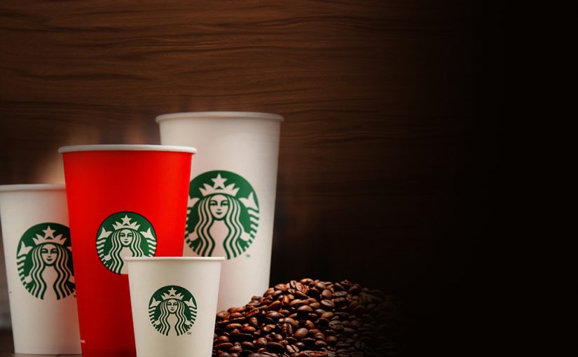
As you open the envelope and pull out the gift card, you notice the wavy hair, captivating eyes, knowing smile, twin tails, and other familiar features, and you know without having to read a word on the card that you have a Starbucks gift card, for the Starbucks logo is one of the most recognizable of all corporate logos worldwide.

If, however, you have not been a Starbucks patron for at least several years, you may be unaware that the logo has not always looked like the one on that gift card or that it has a rich history involving several transformations.

Origins

In 1971, Jerry Baldwin, Gordon Bowker, and Zev Siegel founded Starbucks Coffee, Tea, and Spice in Seattle, Washington, to sell coffee beans. Immediately, the founders knew they needed a unique, catchy logo.

Wishing to use a logo evoking coffee’s maritime history and Seattle’s own ties to the sea, the founders discovered their inspiration in one of the many old seafaring books they pored over. There, they found a Norse woodcut from the 16th century depicting a two-tailed siren.

The Greek epic The Odyssey reveals sirens as female monsters with beautiful voices whose songs lure sailors to them only to be killed and devoured. Other cultures have made sirens and mermaids virtually synonymous, with the sirens’ motives ranging from benign to sinister but always with the common thread of beauty and irresistible allure.

Did the founders wish to suggest overpowering temptation through their logo? No one but they seems to know for sure, but from that woodcut, they fashioned the original logo: a topless siren with long hair and two tails.

First Makeover

1987 brought a change of ownership (Howard Schultz), name (Starbucks Coffee), direction (selling brewed coffee and more), and logo. Simpler and more polished, the new logo still featured a full-body version of the siren/mermaid, now with the navel visible, and the company name encircling the figure (the “donut” design); new were two stars in the “donut” and a starred crown atop the mermaid’s head. In addition, to symbolize freshness and growth, the designers used a green palette with black and white present as well. Since then, the logo has undergone revision twice, but the 1991 version was far more similar to the current one than the original 1971 version was.

Second Makeover

In 1992, Starbucks became a publicly traded company, and the logo saw more changes. Perhaps most immediately significant was the close-up perspective of the mermaid; instead of showing the mermaid’s full figure, the logo showed her from the waist up, with the navel no longer shown, and with the ends of the two tails visible. Still present were the “donut” design and the wavy hair cascading sensuously over the breasts.

Today’s Version

Most recently, the logo changed in 2011. One reason for the change was to mark the company’s 40th anniversary, but there were also two “problems” the designers wanted to address.

The first was that the company had learned that the “donut” design drew so much attention to the words that overseas competitors were creating knockoff logos. To deal with this, the company abandoned the “donut” and enlarged the image of the mermaid. Gone was the company name, and that actually helped send the message that Starbucks was about more than coffee, as by then it sold other breakfast and lunch sandwiches and other foods and beverages.

The second “problem” really came about during the redesign process. With better technology, the team was able to create images in higher resolutions and which looked more realistic. As they “perfected” the mermaid’s features, they came to feel she was ​too perfect, almost impossibly perfect, and they felt it was due to the symmetry of her facial features. And that is why one side of the nose dips slightly lower than the other does; the designers felt that made the mermaid human and attainable enough to “work.”

A Fixture in Our World

However one perceives the Starbucks mermaid– perfect, real, benevolent, a seductress, a figure some are reading way too much into, or whatever else– there is no disputing that this logo is one of the most familiar and effective corporate symbols in the entire world.

Top Logo Stories – The History Of The Iconic Nike Swoosh

Nike’s iconic Swoosh might just be the most recognized logo the world has ever seen. The history behind its conception may surprise you though. In fact, the Nike Swoosh came from incredibly humble beginnings that demonstrate the power of well thought out design.

A $35 Investment

Carolyn Davidson was a graphic design student at Portland State University. As many young students, Carolyn was trying to work side jobs in order pay to further her education. Davidson had hoped to make enough money to take painting classes. Her accounting professor, Phil Knight, remembered Carolyn’s humble aspirations and offered her $2 per hour to help him out with odd jobs.

When Knight decided to branch out and start his own business, he turned to Davidson for help. Knight founded Blue Ribbon Sports and needed a logo. That’s where Davidson came in. 

The aspiring designer conjured up several options for Knight, one of which was the iconic Nike Swoosh. Ultimately, the Swoosh (known as “the strip” at the time) was chosen, although Knight later admitted that he wasn’t initially a fan of the design. What’s even more shocking is that Davidson billed Knight an invoice for just $35!

A Logo That Rocked The World

The Swoosh was a stroke of genius. It conveyed a sense of motion and speed. Additionally, its winged design was a clever tribute to the Greek goddess of victory, Nike.

Davidson continued designing for Knight until 1975. Blue Ribbon Sports didn’t become known as Nike until 1978. The Swoosh ultimately helped Nike become a world leader in athletic apparel with a logo that is recognized in all corners of the globe. Nike’s assets have soared to an estimated $15 billion, all with the help of a $35 logo!

Carolyn Davidson was eventually awarded compensation congruent with her design’s success. Nike held a special party for Davidson and awarded her a diamond and gold Swoosh ring. She was also given approximately $1,000,000 in Nike stocks.

The Nike Swoosh goes to show the capability and power of a simple but well-planned design.

Top Logo Stories – A Bite Out Of The Apple Logo History

It’s one of the most iconic logos. You may even be holding it in your hands as you read this! Apple’s unforgettable logo is one for the record books. But, did you know there is a bit of controversy behind its origins?

Facts First

Steve Jobs loved McIntosh apples.

Rob Janoff is the designer responsible for creating the Apple logo in 1977. He was approached by Regis McKenna who wanted him to become his art director. There have been many theories about the logo but Janoff put them to rest in 2009.

Apparently, Steve Jobs worked in an apple orchard when he was young. He decided to use his favorite type of apple as inspiration: McIntosh. It’s not so much the apple itself that has had theorists clamoring for decades. More so, it’s what’s missing from the apple. The delicious, juicy bite missing from the side.

Janoff said it’s simple. The bite was taken out purely for scale. This way, people would be able to easily recognize that it was an apple and not a cherry.

Theories Still Circulate

The inspiring and tragic life of Alan Turing.

One of the most popular theories about the partially eaten apple traces its origins to Alan Turing. He was responsible for pioneering research in artificial intelligence which ultimately became the groundwork for computers. Turing was a gay man living in a time where homosexuality was admonished. His revolutionary work went unrecognized and he was facing jail time for indecency. Turing became severely depressed as he faced a life of turmoil. In June of 1957, he laced an apple with cyanide and took a life-ending bite.

Janoff says he never knew the circumstances of Alan Turing’s death, though he did admire the moving irony of the story.

The Bible and science.

Other theories point towards Biblical references, particularly Adam and Eve. The story of Sir Isaac Newton is another common belief. And, as for the bite, some like to think it’s a sly reference to the kind of “byte” that makes up the inner workings of a computer. 

Regardless of what story you choose to believe, one thing is certain: Apple’s logo and the global impact it has propelled is one for the record books.

Top Logo Stories – The Story Behind Google’s Logo

Few logos have greater brand recognition than the one that adorns our phones, tablets, and web browsers. Google has become synonymous with web search, and with that development, its logo has turned into an icon.

The transformation of the Google logo over the years symbolizes the search engine’s increasing corner of the market — and its growing impact on our lives. Since its inception as a backlink crawler, Google has refined its brand and made its logo a cultural phenomenon.

The Early Days

In 1996, Google was called BackRub, so named because it identified and crawled backlinks to web content. Within the year, creators Larry Page and Sergey Brin choose Google, a misspelling of “googol,” as their rebranded name. “Googol” means 10 to the 100th power and was meant to represent the number of search results that the engine could return.

It’s unclear whether Page or Brin designed the logo for the new name, but it was a rather unassuming wordmark that read “Google!” rendered in primary colors. Graphic designer Ruth Kedar added the secondary color (green) for the “l,” which she says indicates that Google does not follow the rules. Still, the wordmark retained its classic look, bolstered by drop shadows and prominent serifs.

The Evolution

1999: Google’s design team began to experiment with new looks to match its new prominence as the world’s leading search engine. After a brief foray into a more stylized concept, the designers settled on a classic serif font with deep drop shadows and slightly darker colors that retained the original palette.

2010: Google began to evolve along with design standards. As drop shadows fell out of favor, Google’s design team began to “lighten up” their logo. They made the typeface flatter and more lightweight. They also boosted the colors to give it a more vibrant look.

2013: As the shift toward mobile devices continued, Google opted to remove the bevels in the typeface and flatten the design for a cleaner look. This change also helped the logo look better on small screens.

2015: Google finally abandoned its classic serif typeface for a fresh sans serif one. The new typeface, Product Sans, gave the word- mark a friendlier look and feel. The design team also drew upon Product Sans to create a simplified letter mark: a “G” featuring the wordmark’s classic colors. This new logo allowed Google to better cement its presence on mobile devices and gave it an icon with which to label its various products.

The Famous Doodle

Throughout the years, Google has debuted special illustrations for holidays, commemorative days, or famous anniversaries. These limited-edition wordmarks became known as the Google Doodles.

Sometimes animated, sometimes not, the Doodles became more elaborate and unique over the years. Often, they tapped into specific historical or current events, and eventually they were common enough that any trending topic or cultural phenomenon warranted a new Doodle. By 2015, Google had created more than 2,000 Doodles. They continue to welcome proposals for new ideas.

Wrapping Up

Google quickly established itself as a leader in internet technology, and its logo has showcased its evolution from a nascent search engine into a comprehensive digital provider. Now encompassing search, collaboration software, analytics, ads, and much more, Google is the frontier of the Internet. And it did it all with a simple logo that perfectly captured its brand promise: To be something a little bit different.

McDonald’s Harnesses The Power Of Minimalistic Ad Design

McDonald’s may be one of the most iconic brands throughout the entire world. When you see the golden arches peeking over a hillside, you know exactly what awaits inside. We know the jingles, the one-of-a-kind taste, the yellow and red accents that we all recognize from anywhere in the world. Plus, their signs say it all: BILLIONS SERVED.

It’s no question that McDonald’s holds a special power that reaches far into the minds of people around the globe. It’s this same omnipresent, pop-culture grasp that makes their newest ad campaign possible. McDonald’s recently teamed up with the Leo Burnett agency out of London and Minnesota-based designer, David Schwem. The group collaborated on a unique ad design that relies on the power of imagination and memory.

The idea was strikingly simple and started with one simple question: Are McDonald’s products so well-known that you can recognize them without being told who the ad is from?

The answer is a resounding yes.

The name for the campaign is Iconic Stacks and that’s exactly what the ads are. McDonald’s most-loved items – Big Mac, Filet-O-Fish and Sausage & Egg McMuffin – were recreated using one simple font and a handful of unassuming colors. The design paints a picture in a person’s mind without using any pictures at all. Simple elements like the layering of words coupled with the individual colors introduce values associated with food without making it obvious.

Each ingredient was vertically listed in the order that they appear in each item. A basic Helvetica font was used and each word was colored so that it matched the color of the item in real life. Even the unforgettable special sauce found a place in the Big Mac stack. The specific layering coupled with the colors give viewers just enough information to create their own visualization of each product.

“The minimalist approach developed from the needs of the communication. Simplicity. Nothing should distract. Everything is a ‘slave’ to the idea,” said creative director Pete Heyes.

It’s such an unbelievably simple design but its impact is huge. There aren’t too many brands who could be recognized globally by such a minimalistic design, but it’s perfect for a brand with a fan base as massive as McDonald’s. The campaign was partially inspired by a project that David Schwem did nearly a decade ago. It was simply titled Type Sandwiches and it listed various well-known sandwiches by their ingredients only.

Iconic Stacks has already done what it set out to do. People are already talking about the creativity and power behind the campaign. Its playful design and memorable-effect are exactly what any great design team strives to achieve.

The implications and reach of such a simple advertising campaign speaks to the power and depth of branding. The McDonald’s brand goes far beyond clown shoes and golden arches. Just the specific combination of ingredients proves to be enough to recognize the McDonald’s brand worldwide. Most importantly, the campaign highlights the significance of color and placement in advertisements. It is also proof that simple ad designs sometimes hold the greatest power.