ga('send', 'pageview');

Bi-Weekly Resource Round-up Vol 17

Hi Everyone,

Not ready to queue your project up to be worked on?

We’ve just released drafts!

Drafts allow you to save your project at any stage when creating it and later come back to change details, invited team members and more.

Cheers!
Sam Ryan
… and the rest of Team Flocksy!

Featured Flocksy Team Member Design Of The Month:


Here is a custom Infographic mockup created for a client by Flocksy team member James.

All custom illustrations/brand designs/marketing materials on Flocksy are created completely from scratch by one of our extremely talented graphic design creatives.

Start a graphic design project today and see results in just hours!  

How To Recognize And Deal With Business Burnout

  by Flocksy Staff Writer
  Business burnout is not an excuse. It’s a legitimate condition that the World Health Organization has classified as an “occupational phenomenon.” If you’re feeling completely exhausted and unmotivated to the point of tears, you may be suffering from business burnout… continue

How Empathy Is A Necessity In Skilled Leadership

by Flocksy writer Gerry.
Let’s take a shared look at how being empathetic towards your coworkers, your employees, and your clientele can have a remarkable effect on your business operations.   continue    

7 Tips On How To Boost Your Productivity During The Winter Months

by Flocksy writer Gerry.
  Are you feeling the doldrums setting in as the days are shorter and the weather is chillier? Well, fear no more, as these 7 winter tips can be used to help keep you feeling efficient, motivated, and wonderfully productive. continue

How To Get Paid Fairly As A Freelancer

by Flocksy writer Ana.
      While it may not be true for all creative freelancers, most still believe that they need to compromise on their rates in order to secure clients. We’re here to tell you, that doesn’t have to be the case, so let’s take a look at how you can get paid fairly for your creative freelance work. continue

12 Famous Record Label Logos To Inspire You

The nominees for the 2022 class of the Rock and Roll Hall of Fame are out so now is a great time to explore the world of inspiration that comes from the music industry.

This industry has not only inspired its own members to create masterpieces. It’s also inspired authors, artists, and, yes, even graphic designers.

One place you can see this inspiration is in the logos of record companies. A logo is a very important piece of branding.

It needs to be instantly recognizable, small enough to not detract from cover art or other band materials, and tell something about the company at the same time.

It’s a difficult feat but these twelve record companies nailed it when it comes to creating a powerful logo.

DFA

This first logo shows that you don’t need something smooth and slick to make an impact.

DFA was a label right in the middle of the New York dance punk scene and that vibe is carried right on through the logo with its stick-and-poke tattoo design.

Death Row Records

All the eighties and nineties kids out there will remember the many dramas and controversies that surrounded Death Row records in the early to mid-nineties and beyond.

Suge Knight and his stable of artists were as known for their criminal records as they were for their music.

Their choice of font, color, and image of a man in an electric chair clearly communicates the aggressive and violent mentality surrounding the music and artists.

Zarcorp

Zarcorp was a label that catered to the obscure and alternative. They only produced vinyl records and focused on mostly obscure bands in the electronic and alternative scenes.

Their logo embraces the weirdness and obscurity of the label with its nod to optical illusions that buries the company’s “z” behind overlapping circles.

Blue Note

This seminal jazz record company’s logo (in use from 1939-69) is so iconic that it has come to define the whole genre of jazz music. As simple as it is powerful, the logo calls to mind not only musical notes, but scores as well.

The logo’s simplicity would go on to inspire other record label logos, such as Sub Pop (see #9 on this list).

Def Jam Recordings

Def Jam was one of the first record labels to focus on producing and promoting hip hop music in the early 1980s.

The beauty of their logo was that it calls attention to, not only the first letters of the label’s name, but also highlights the importance of DJs to the early hip hop groups and music.

While the label expanded its stable of artists to include those beyond hip hop, their logo remained an icon of the early 1980s hip hop scene.

Factory Records

It’s rare that a logo becomes as iconic as the brand itself but that’s the case for Manchester, UK-based record label Factory Records.

Rather than trying to create a generic label logo that could encompass many places and genres or trying to create a logo that captures the feeling of a specific genre of music, Factory Records chose to pay homage to their hometown of Manchester.

The stylized cityscape is based on the cityscape of Manchester itself.

Island Records

Sometimes, a logo manages to encapsulate not just the genre represented by their artists, but also the hometown of the label. Island Records is a great example of that kind of label.

The label was founded in Jamaica and rose to prominence with their first big artist, Bob Marley.

The simple palm tree captures the island feeling both, while also being unique enough in its monochromatic color scheme that you know it’s an Island Records logo you’re looking at.

Motown

Many long running labels go through a series of evolving logos throughout their history with each one capturing a moment in time in the history of the label.

Motown has had many logos over the years but none as iconic as the logo from the mid-1960s that became synonymous with the Motown sound.

This logo became such an iconic part of Motown history that the label has gone back to using it in this modern era.

Sub Pop

The stark, bold black and white logo for this Seattle-based record label is one of the reasons this label has become an icon in the music industry over the past three decades.

The bold nature of this logo, and the compact design, was intentional so that it could be used on the front and back of album covers.

Ghostly

You know a logo is a pinnacle of sleek graphic design when some use it to cover the Apple logo on their MacBooks. Ghostly International’s logo is just that kind of design.

Ghostly specializes in blissful electronic music and, in addition to being an impactful design in and of itself, also captures the dreamy, modern feel of the music they are known for.

Earache Records

Going beyond the name, the Earache Records logo lets you know that you’re in for some loud, hard music when you pick up one of their records.

The splatter paint background combined with the harsh-looking font very effectively conveys the label’s hard metal roots and current indie-metal focus.

Warp

Other than a color change, the Warp Records logo has remained constant since the label’s founding.

The logo was designed in 1989 by Ian Anderson of The Design Group and captures the international edginess that has become synonymous with Warp.

Bi-Weekly Resource Round-Up Vol 16

Featured Flocksy Team Member Design Of The Month:

Here is a custom logo graphic mockup created for a client by Flocksy team member Birendra.

All custom illustrations/brand designs/marketing materials on Flocksy are created completely from scratch by one of our extremely talented graphic design creatives.

Start a graphic design project today and see results in just hours!  

6 Tips For Better Productivity

    by Flocksy writer David G.
  In today’s world, with so many distractions and 24-hour information overload, you will need a clear vision to manage your time better. In this article we shed some light on a few techniques to help get you there…continue

What Makes Successful Creatives Different From The Rest?

by Flocksy writer Mercedes.  
How do successful creatives stay inspired, what separates them from others? The difference lies in the way they think, as your mind determines your success or failure.   continue    

How To Get Ahead Of What Your Customer Is Thinking

by Flocksy writer Gerry.
  Getting ahead of what your customer is thinking requires a commitment and dedication like no other, and in doing so, you’ll reap the rewards for a lifetime as a business owner.  continue

How To Create A Productive Home Office

by Flocksy writer Abbie.
      Working from home used to be optional, but the COVID-19 pandemic has made working from home more common than working in an office. Constant work from home, for the foreseeable future, no less, requires a more intentional setup than the occasional work-from-home stint. continue

15 Interesting Facts About Popular Logos

Logos have been around forever, and companies across the globe use their logos to help tell their story and sell their brand. Their logo is representative of who they are and why you should buy from them.

Their logo gets to the heart of their uniqueness, and you can hear it in their stories. We discovered some interesting and cool facts about these 15 logos and thought we’d share them with you.

1. FedEx

The FedEx logo immediately caught the attention of the CEO as he noticed the forward arrow between the E and X. Was this intentional? No. It just happened to be the space between the E and the X. But the designer, Lindon Leader, was very intentional about ensuring that it looked like it stood for something.

So, to make it stand out, he used the right combination of two fonts, Univers and Futura Bold, to make the arrow look natural and unforced. FedEx has been moving forward ever since.

2. Dominos

It can be difficult to keep up when your business is growing by leaps and bounds. Someone should have forewarned Domino’s owner James Monaghan in 1965 when he came up with the logo for Domino’s. At the time of logo creation, Tom only had three Domino’s stores, so the three dots were representative of each store.

The plan was to add a dot for every store thereafter, but the business expanded so fast that he decided to not even do it. Just think, Domino’s logo could have more than 13,000 dots by now!

3. VLC Media Player

If you’ve ever wondered what the cones represent in the VLC Media Player logo, you’re probably overthinking it. Apparently, the students who were responsible for writing the code used what they had. They had collected a lot of traffic cones, so they thought it would be good to use as the logo.

4. Bluetooth

The Bluetooth wireless design was named after King Harold Bluetooth, who ruled Denmark between 958 and 986 CE. During his reign, the king united the tribes of Denmark into a single kingdom.

This analogy fits well for the Bluetooth logo since the technology unifies various devices and makes communication between them easier. The logo is a merging of two Scandinavian runes that represent the king’s initials.

5. Wikipedia

With Wikipedia being an online encyclopedia, ever-knowing to all there is, it’s not surprising that their logo would symbolize the world. The logo represents a globe constructed from puzzle pieces.

Each puzzle piece bears a character symbolizing the multilingualism of Wikipedia, and the missing pieces at the top symbolize the infinity of the knowledge, there’s more to come.

6. Android

It turns out Android can credit the male and female symbols we see on the outside of the bathroom for the inspiration that came for their logo. The logo designer needed to be inspired to create a logo that would include a robot and be easily recognized.

See if you can recognize the ideas he got from the male and female symbols seen universally outside of restrooms. Just goes to show that inspiration can come from literally anywhere!

7. BMW

Although most think the famous BMW logo symbolizes an airplane propeller, it’s much simpler than that. While it is true that the firm’s first technical creations happened to be aircraft engines, the designers chose the logo to represent the Bavarian flag. When you google the Bavarian flag, you’ll get it.

8. Pinterest

Sure, the spelling of Pinterest has the first three letters of the word pin, which symbolizes “pinning” pictures to walls. But if you look closely at the “P”, you’ll notice that the line is literally a pin that you would use to pin pictures to the wall.

9. Uber

Uber’s new logo is more synonymous with the notion that you can find an Uber anywhere you go. The logo was changed from a “U” to a symbol that is meant to resemble an atom. The new logo represents the fact that their cars can be found anywhere, just like bits or atoms.

10. Baskin Robbins

Baskin Robbins started their company in 1945 with 31 flavors of ice cream, and they made a point to include that very important number in their logo. Can you see it?

11. Ferrari

Many people probably think the Ferrari logo symbolizes horsepower, but it doesn’t. Turns out, a horse silhouette was initially painted on the plane of an Italian ace pilot Enzo Ferrari knew. The emblem was later given to Ferrari by the pilot’s mother after he won a very important race, and the rest is history.

12. Lacoste

Rene’ Lacoste made a bet and lost. The bet cost him a crocodile suitcase he desired in a shop window. Had he won his game, he would have won the suitcase. A journalist who overheard the details of the bet wrote an article about a tennis player who hadn’t won his match but fought like a crocodile.

From that point on, the name Crocodile was given to him. It only seemed right to have a crocodile serve as the logo for his company.

13. Starbucks

The inspiration for the Starbucks logo came from a myth of a fairy, a woman who was also a fish who was holding her two tails. You could see the nakedness of the woman in the 1971 version of the logo.

That logo was censored and we now see a more respectable-looking mermaid on the logo. Her hair covers her breasts, and we can no longer see her entire two tails, only the ends of it on both sides of her.

14. MGM

Since 1917, Metro Goldwyn Mayer, also known as MGM, has used seven different lions for the lion roar that accompanies their famous logo. It’s not as easy as you think, though. The lions have to be tamed and trained to roar on cue.

15. McDonald’s

McDonald’s thought that arousing people’s appetite would make them spend more money on their food, so in 1962 they hired a psychologist who came up with the arches. His thinking was that the red tips inside the arches resemble female breasts, which subconsciously reminds people of their happy childhood and arouses the appetite.

McDonald’s has been using the arches ever since. Who knew the favorite take out of so many families with children, had a somewhat NSFW inspiration for its logo?

Bi-Weekly Resource Round-up Vol 15

Featured Flocksy Team Member Design Of The Month:

Here is a custom book cover mockup created for a client by Flocksy team member Facundo.

All custom illustrations/brand designs/marketing materials on Flocksy are created completely from scratch by one of our extremely talented graphic design creatives.

Start a graphic design project today and see results in just hours!  

13 Creative Guitar Logos

  by Flocksy Staff Writer .
  Here, We will take a walk through the design of some of the most well-known, and a few not-so-well-known guitar company logos continue

10 Companies With Clever Holiday Logos

by Flocksy writer Dani.  
Though companies worldwide adapt their logos for the holidays, these ten take it to the next level, often modifying their already simple logo to be perfect for the holidays.  continue    

History Of The McDonald’s Logo

by Flocksy writer Abby.
  The McDonald’s franchise had a surprising start and a lot of major changes throughout its journey from the beginning to where they are now.    continue

Five Tips for Business Writing

by Flocksy writer Matt G.
  Writing about business and business topics can often be a dry, tedious experience, but it doesn’t have to be…    continue

Bi-Weekly Resource Round-up Vol 14

Featured Flocksy Team Member Design Of The Month:

Here is a custom flyer mockup created for a client by Flocksy team member Jerry.

All custom illustrations/brand designs/marketing materials on Flocksy are created completely from scratch by one of our extremely talented graphic design creatives.

Start a graphic design project today and see results in just hours!  

How To Lead Successful Virtual Meetings: 5 Guidelines

  by Flocksy writer David G.
  This article will outline the best practices for running an effective virtual meeting. You might not need every single one of them, but you can use this as a general guide to run meetings that everyone enjoys. continue

12 Interesting And Iconic Logo Redesigns

by Flocksy writer Sophia.
   Regardless of the size of the change, seeing redesigns that Iconic companies make are also always a fun adventure and the public is very quick to judge whether it was a success or not. continue    

8 Mascot Designs That Have Left An Impression

by Flocksy writer Sophia.
  One of the more creative ways that businesses are beginning to market their brand is by using mascot designs. Establishing their brand with one or multiple mascots is a unique way to not only get consumer’s attention but to also get them interested in what you have to offer and to learn more about the company.   continue

The Ultimate Guide To Giving And Receiving Design Feedback

by Flocksy writer Rachel E.
  The design process should be a collaborative moment between both the client and the designer, spearheaded by the client’s knowledge of the product and consumer base, and the designer’s knack for creativity and bringing the client’s needs to life.   continue

13 Creative Guitar Logos

A Look Into The Creativity Behind Guitar Brand Logos

Brand recognition is not a new concept and product logos are everywhere. It is likely that if tested on who a company is based solely on their logo, you will score very high. That is the point.

Why say in even a couple of words what you can feel from a cleverly designed logo? And guitars are no exception. From Fender and Gibson to the lesser-known brands, the logo is cemented in your mind. And if it isn’t, it will be soon.

Here, We will take a walk through the design of some of the most well-known, and a few not-so-well-known guitar company logos

Fender

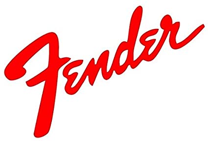
Easily one of the most recognizable logos, as well as easiest to spot guitars, Fender has been the iconic leader in high-quality, incredibly popular guitars for decades.

Everyone from Jimmy Hendrix to Kurt Cobain has jammed on a Fender and made the audience scream for more. Every aspect of the Fender logo design was carefully chosen, from the cursive writing to the bold lettering.


Gibson

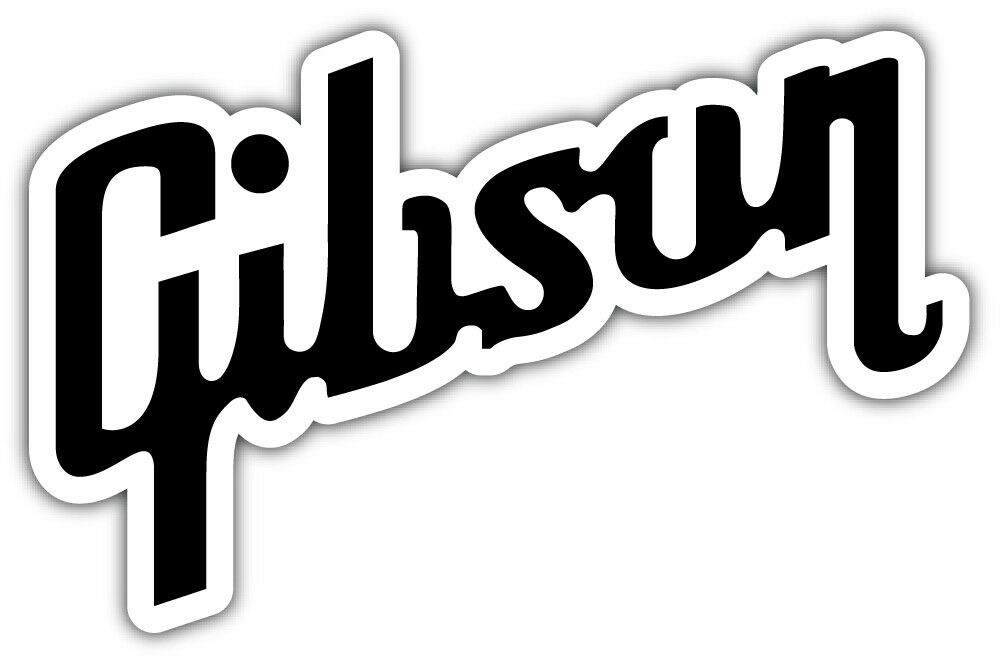
Another logo that employs cursive in the type, although with a little flourish for individuality, is the brand mark for Gibson guitars.

With its corporate headquarters in Michigan, the logo incorporates a more industrial design. Its most distinctive characteristic is the long tails on the “G” and the “n” that add a twist to the design.


Washburn

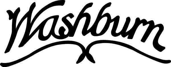
While their cursive signature look of the logo isn’t overly creative, their brand is a testament to innovation. Washburn has created stringed instruments beyond the traditional guitar, including the mandolin.

But its most well-known rock guitar is the Parallaxe, an unmistakable flying V guitar used by rock stars since the ’80s. If you see the Washburn logo, you know you are getting quality for a good price.


Ibanez

A logo designed for a different type of rocker, Ibanez is written in block letters, not the cursive of more seasoned brands.

It is always written in black, bold to stand out, and the Ibanez product line is very distinct. Even more so if you see the Ibanez mark on one of the 7-string electric guitars played by the band Korn.


Peavey

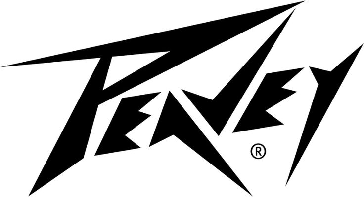
The first thing people think of when looking at the Peavey logo is how much they wish they were a rock star. Peavey’s logo features dagger-sharp lines akin to the Logo for the bank Metallica.

It is bold and spits in the eye of convention. You know exactly what you are getting when you strap on a Peavey, plug it into an amp, and jam. Peavey’s logo is its promise to its guitar owners that their product is for rockers.


BC Rich

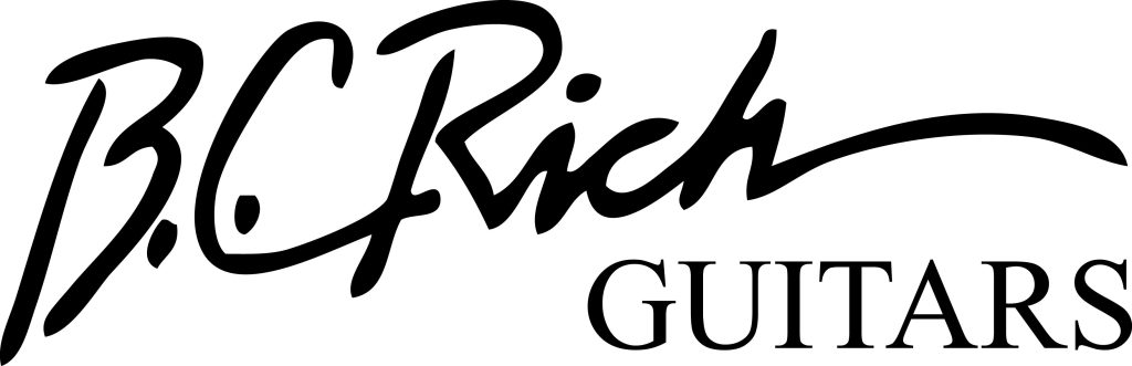
Nothing more than a simple bolded signature, BC Rich is a pretty popular option when planning to rock someone’s face off. Its most commonly recognizable guitar, the warlock, is a departure from the mundane reality of the logo.

When looking at the name BC Rich you might think horses, but what you will get are rhinos in armor, ready to make some noise and raise the dead.


Yamaha

They make motorcycles and guitars, and both fly under the same banner. Unlike the previous logos, Yamaha not only displays its name in a standard type font but also a logo, which looks like the spindle of a bike.

If the name won’t fit, the logo circle will do the trick, and Yamaha’s legacy of brand quality over decades has cemented it in the minds of motorcyclists and guitar lovers alike. Their most popular guitars are acoustic.

DBZ

More than words, the DBZ logo is backdropped in black with lettering and the logo in gold. It features the brand name below with its initials above, shield behind, the “z” enlarged, and on it, perches an eagle.

If you aren’t impressed, you aren’t paying attention. The eagle is added to draw the attention of groups who will appreciate the music of bands using these exciting guitars, whereas the gold symbolizes rock and roll at its finest.

Liquid Evergreen Productions

Stepping away from the logos for guitars themselves, Liquid Evergreen gives lessons to promising students who want a future behind the guitar they love so much.

The LE logo is a vertical guitar that almost looks like Japanese calligraphy. It is supposed to show a level of artistry, which is a testament to the lessons taught by LE that playing music and artistic expression are intertwined, no matter what stage of learning.

Dean Guitars

While not super well-known, there are plenty of rock stars that live and die by their Dean Guitars. They likely chose it because of the interesting logo, which features unfurled wings attached to the word Dean, with Guitars below it.

Bird wings are a visual cue often in heavy metal. The words are blocky, minimalist, and hint at an underground movement hearkening back to the dark days of rock.

Bill Pierce

If you see this logo, you can feel its edge, its pure intensity, and those sensations are spot on. From the deep red artistry to the black background, it catches the eye and won’t let go.

A circle tries to trap the guitar and words within, but the neck and split tail of the guitar cut it without hesitation, breaking free of their cage. The only thing not harsh and dramatic about this logo is the simple block lettering of the brand that runs down the neck.

Breedlove

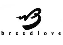
One of the softer logos, the Breedlove brand tag is uniquely typography based. All of the letters are lower case, giving it no edge or fearful imagery. There is a subtle serenity in the overall look of the logo.

The large “B”, the only capitalized letter in the logo, seems to be floating on the wings of angels as well as indicating movement or sound. These guitars are for more conservative enthusiasts.

Peter Malinoski Art Guitars

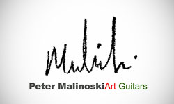
These guitars fall under the title of Art Guitars because they resemble what you might think of if someone asked you what Pablo Picasso’s guitar would look like.

They are as eclectic as they are beautiful, and if they never feel a single note strummed from their strings, they make an impressive work of art for your collection. The last name “Malinoski” is scrawled in harsh cursive above the full company name, these words in block.


Final Thoughts

From the most idiosyncratic design to an unforgettable logo that reminds you of better days, brand recognition will always play a part in the landscape of product loyalty.

If you find your favorite guitar, you have but to find its logo and smile, reminiscing about those times rocking with friends in the garage, or when you opened for Five Finger Death Punch. Memories are linked to logos. Which is your favorite and why?

Bi-Weekly Resource Roundup Vol 13

Featured Flocksy Team Member Design Of The Month:

Here is a custom label mockup created for a client by Flocksy team member Airice.

All custom illustrations/brand designs/marketing materials on Flocksy are created completely from scratch by one of our extremely talented graphic design creatives.

Start a graphic design project today and see results in just hours!  

6 Writing Tips To Help You Write Fast And Professionally

  by Flocksy writer Rachel E.
  You’ve come to the right place to read tips on how to master writing fast, while still keeping your work coherent and professional. There are a few great ways to implement efficient writing habits that will have you meeting your deadlines within a timely manner.  continue

Tips For Crafting Your Resume So It Gets Noticed

by Flocksy writer David G.
  For recruiters who are always on the lookout for great talent and quality candidates to fill their open positions, a polished and professional resume is very much sought after. It’s one thing to do the hard work on your resume, but it’s another thing to do it in a thoughtful manner. So with that in mind, here are a few great ways to get your resume noticed.    continue    

10 Easy Ways To Boost Your Rankings Using SEO Tactics

by Flocksy writer Kasey V.
  As much as 93 percent of internet experiences begin with a search. Think about how often you turn to your favorite search engine, whether it’s to find a hot new restaurant or to get the answer to your burning question. Right now, people are searching for answers to their questions. Are you ranking high enough for them to find you?  continue

Utilizing Google Trends To Enhance Marketing Content

by Flocksy writer Matt G.
  Google has a tool which helps you create better and more favorable content more easily, called Google Trends. This tool is great for keeping your content fresh and up to the minute. It also contains many features to check on competition and enhance your existing your content. Here are five ways you can use Google Trends in your favor.   continue

Bi Weekly Resource Roundup Vol 12

Great Articles and Designs to Inspire You!

Featured Team Member Design Of The Month:


Here is a custom character design mockup created for a client by Flocksy team member Alberto.

All custom illustrations/brand designs/marketing materials on Flocksy are created completely from scratch by one of our extremely talented graphic design creatives.

Start a graphic design project today and see results in just hours!
 

How To Hire A YouTube Editor

  by Flocksy writer Sophia
  Editing videos can be a timely process. Yet, video editing is so necessary for marketing your business and reaching your audience. You may be considering how to hire a youtube editor for your business.  continue

14 Clever Tech Logos That You Can Use As Inspiration For Your Start-Up

by Flocksy writer Rachel Estes
  If you are researching inspiration for impactful, yet simplistic, logos for your new tech start up, this list has some amazing ideas. Read on to discover 14 clever logos from well established tech companies.    continue    


6 Benefits Of Having Your Employees Work Remotely

by Flocksy writer Rachel Estes
  Studies have found that businesses that implement remote work policies see increased productivity, efficiency, and fulfillment from their employees, which in turn means your business will benefit greatly.  continue

Branding Vs. Marketing: Building Relationships While Driving Sales

by Flocksy writer Kasey Van Dyke
  Understanding the differences between branding and marketing is crucial in developing effective strategies and strong tactics.  continue

Bi-Weekly Resource Round-up Vol 11

Hi Everyone,

We now offer an easy way to share work done with your clients without showing any of the Flocksy branding.

This is great for agencies that want to share work with their clients without showing that Flocksy did it.

If you are on the Access Plan, simply go to the project and click the share button above the work. Then simply toggle off “Flocksy branding” and you are good to go.


Sam Ryan
… and the rest of Team Flocksy!

Featured Team Member Design Of The Month:


Here is a blog post design mockup created for a client by Flocksy team member Sunardi.

All custom illustrations/brand designs/marketing materials on Flocksy are created completely from scratch by one of our extremely talented graphic design creatives.

Start a graphic design project today and see results in just hours!
 

The 8 Most Common Web Design Blunders To Avoid

by Flocksy writer Valentine Karimi
  Easy and inexpensive self design platforms have simplified the process of creating sites. In fact, you no longer require coding knowledge these days. However, acquiring a website is not the problem; usability is… continue

Some Great Logo Examples To Help You Get Inspired

by Flocksy writer Sophia
  Logos are a critical aspect of any brand; they’re what represents a brand and makes it recognizable to customers. When you think about all the top brands(Apple, Google, Target, Microsoft) a lot of times what will instantly come to mind is their iconic logos. Logos speak for their brand and are a huge part of their advertising.   continue    

12 Interesting And Iconic Logo Redesigns

by Flocksy writer Sophia
  Regardless of the size of the change, seeing redesigns that Iconic companies make are also always a fun adventure and the public is very quick to judge whether it was a success or not. Here are some examples of famous brands, and their logo redesigns:  continue

How To Design The Best Characters For Websites

by Flocksy writer Alexander Lundrigan
  If you are a web designer, you will likely run into a client that wants a cutesy or cool looking character design for their website. If your goal is to dazzle the client, you need to understand the best conventions when designing these characters. continue