

Without a doubt, a great logo will help skyrocket a company’s customer base and financial success. A brand’s very identity is tied to its logo until the end of time.
Logos are used to convey what your brand is all about. The best tech logos do a combination of the following:
- Clearly states what the company offers to consumers. It is important that a logo be relevant to your audience. People should immediately understand what your start-up has to offer to them by looking at the logo.
- The design should be simple. Quality designs don’t have convoluted details. Think about what describes your business best, it can be either your company history or the product offerings, and focus on them while designing your logo.
- Incorporate the use of fonts and colors smartly. These two tools should work together in a unique way to catch people’s eyes.
If you are researching inspiration for impactful, yet simplistic, logos for your new tech start up, this list has some amazing ideas. Read on to discover 14 clever logos from well established tech companies.
Grammarly
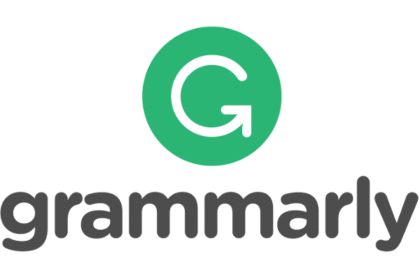
Grammarly is a popular tool that assist with real-time spell checking and grammar as you write a document.
For the logo, the creators wanted to go with a green color as it represents growth and elicits a calming effect.
The letter “G” is actually a white arrow and the button that activates Grammarly in Google Docs and other similar apps.
Adobe
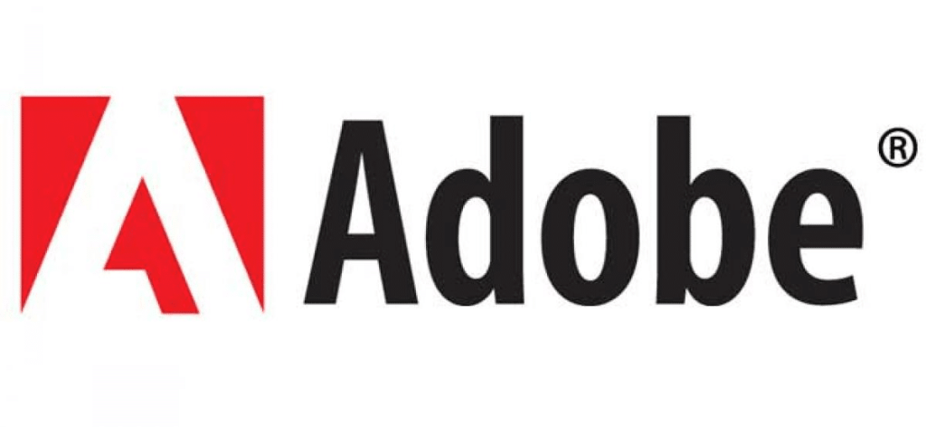
Adobe Systems Incorporated is a software company that uses graphic design, video editing, web development, and photography.
Ironically, their simplistic corporate logo, despite the array of services it offers, is what makes Adobe instantly recognizable.
SalesForce
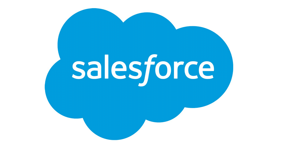
Founded just in 1999, Salesforce one of the biggest companies in the field of cloud computing.
The logo is just a simple cloud, but within the cloud, written in white letters, is the word “Salesforce”. In the middle of the word, the F is italicized to differentiate between the two words. Both the upper and lower ends of the F curl outwards to give the otherwise simple logo a personality.
Mobiversal
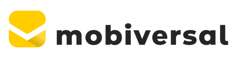
Mobiversal is a tech company that works on product strategy and design to build start-up mobile apps with their leading technology.
Their past logo illustrated three mobile phones standing next to each other with their edges attached, speaking toward their promise to use teamwork to build mobile businesses.
However, they recently rebranded with a simplified envelope as their new icon
LinkUp
Dating back to around 2007, LinkUp has been the global leader in providing accurate, real-time, and predictive job market data analytics. LinkUp prides itself in indexing millions of job listings directly from employer websites daily.
Their logo is a simple word mark.
Crew
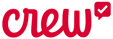
Crew is an easy messenger app that lets teammates message one another through mobile phone, but it can also be accessed on a desktop.
Their startup logo has a cursive font with a check mark symbol on its right side.
Crew’s lowercase, flowing font is light, friendly and close together, representing the feeling of approachability and collaboration, as is the app’s mission.
Caper
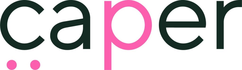
Caper offers self-checkout technology that works in grocery and convenience stores. Simply toss your products in a cart, pay for your purchase at the cart, and leave.
Since Caper is tech company that specializes in paying conveniently from shopping carts, their previous logo included a dotted letter C. Grocery cart wheels are to be what they two dots represent. The pink color, often representing youthfulness and fun, gives the logo an exciting feeling, which represents the ease of shopping with this technology.
Caper has also recently updated their logo to a simple wordmark
Snapchat
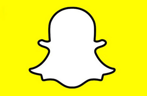
The Snapchat incorporated logo has an image of a ghost on it surrounded by a block of yellow. As “ghost” disappears, so do snapchat messages after you view them.
Interestingly enough, the yellow color choice for the border was chosen for a very simple reason. As said by the Snapchat CEO, he noticed that none of the top apps had yellow logos at the time. Thus, he choose the signature, standout color for his own company.
Amazon
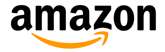
Everyone knows that you can go on Amazon’s website and find pretty much anything. Did you know, though, that Amazon’s logo is a nod to its own knowledge of being the mecca for most products?
With its arrow, Most people think that Amazon’s logo is to represent a smile, If you look closer, the arrow starts at the letter “A” and ends at the letter “Z”, implying that Amazon does, indeed, sell nearly everything imaginable within their warehouses.
Picasa
Although now retired and under the name of Google Photos, Google’s “Picasa” name was a play on the concept of a safe home for your phone’s photos.
Casa is Spanish for house, and there is a house on the inside of the vibrantly colored camera shutter leaves in the logo.
Ubuntu
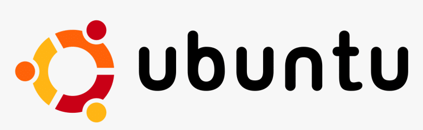
Ubuntu is an open-source Debian-based Linux distribution that is great for beginners.
Ubuntu has three editions: Desktop, Server, and Core, which can be thought to be represented in their logo that shows three people holding hands and looking upward.
Hotel Tonight
Hotel Tonight is a website offers last minute hotel deals near you.
The logo is either a bed, representing the bed in a hotel room or a lower-case “h”, referencing the company’s name, depending on how you look at it.
Cisco
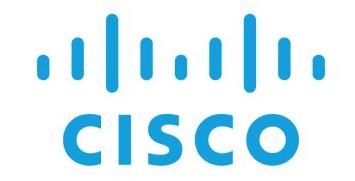
Cisco is a company that develops, manufactures and sells networking hardware, software, telecommunications equipment and other high-technology services and products.
This tech company was named after the city of San Francisco, hence the name “Cisco”.
One of the biggest tech companies in the San Francisco area, the logo is a digital signal that takes the shape of the Golden Gate bridge, one of the city’s most known attractions.
Allset
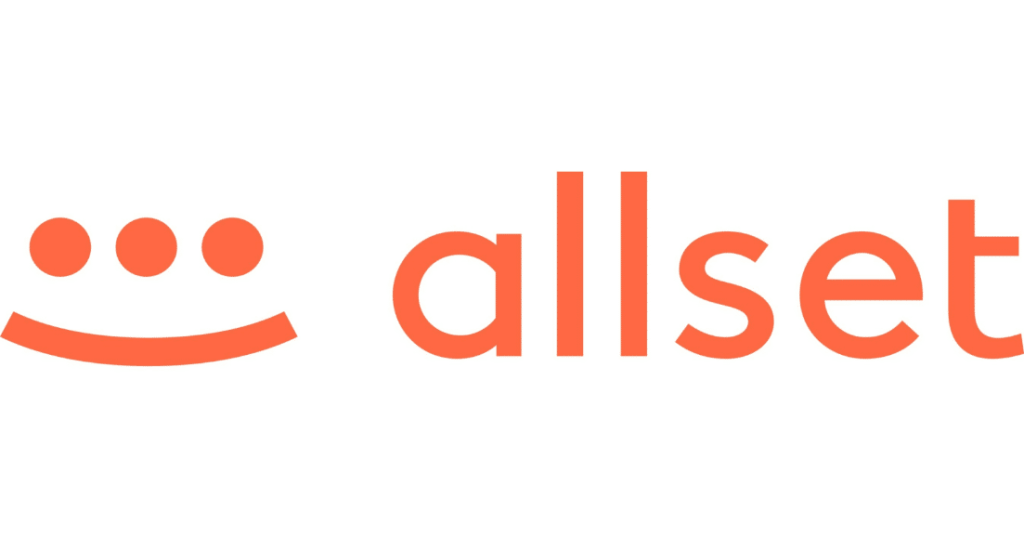
Allset is an app that allows users to browse for restaurants nearby and order ahead for pick up or dine in services.
With the promise to save time and provide and enjoyable service, Allset makes their users feel satisfied and safe. In addition to the wording on the logo, the smile alongside it evokes the feeling of happiness and friendliness.
The added eye, the third eye, of the smiley face brings more character to the logo and makes it stand out.