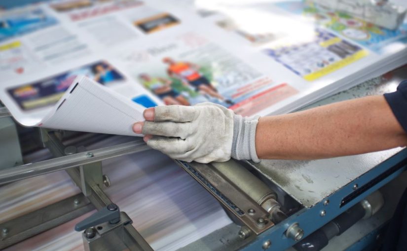
Who says print is dead? Business flyers still have a place in marketing strategies. In fact, direct mail has an open rate of 57 percent. That’s much higher than email!
Print advertisements also offer creative ways to build brand awareness and drive conversions.
Business owners can get some great mileage out of a well conceived flyer campaign, and designers can flex some new artistic muscles compared to email design!
So, what makes a print mailer or handbill most effective? If you want to truly captivate your audience, follow these 10 tips for designing a powerful business flyer.
#1 Minimize Your Copy
The key to effective flyer design is to make it SKIMMABLE. Yes, people are more likely to peruse a print mailer than an email, but you still don’t want giant blocks of text. Focus on punchy, enticing headlines and simple sentences.
#2 Break It Up
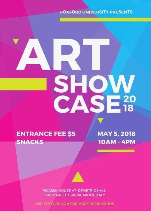
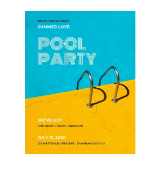
Concise, readable copy is just one part of making a flyer skimmable and enticing. Try breaking up your flyer into distinct segments. This helps draw the eye and create a flow.
Remember, people tend to read in an L pattern, i.e. across the top and down the left side. By dividing your design into sections, you help them repeat that pattern and absorb more of the information.
Your segments can be parallel, a grid of boxes, a row of circles, anything that breaks the flow and helps organize your flyer.
#3 Skip The Bells And Whistles
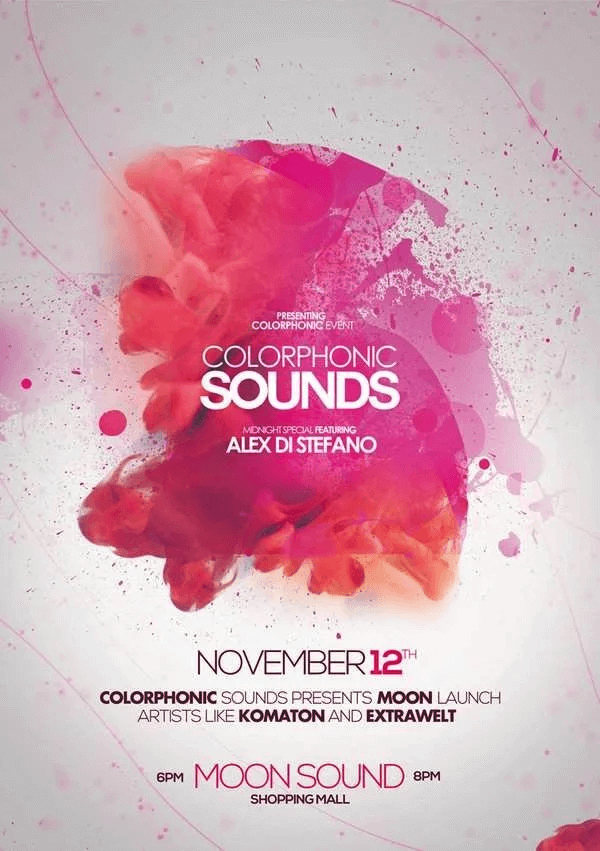
Gradients, drop shadows, and clip art, oh my! With so many graphic elements and effects out there, it’s tempting to go a little overboard.
Limit the use of complex designs and cheesy effects. Current trends favor gradients, neon colors, and masking, but you’ll want to stick to one key effect.
For example, don’t use gradients in both your lettering and the background. If using a glow effect, apply it only to the primary image or text.
In short, your design should be accessible and simple, rather than an 80s throwback party!
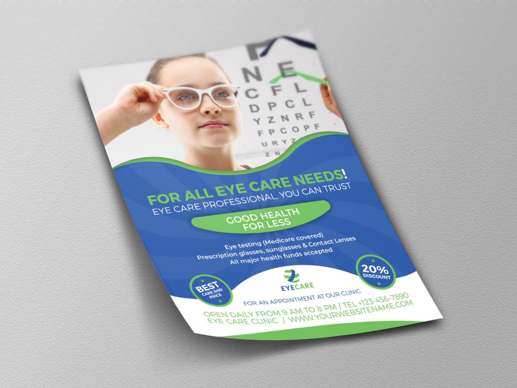
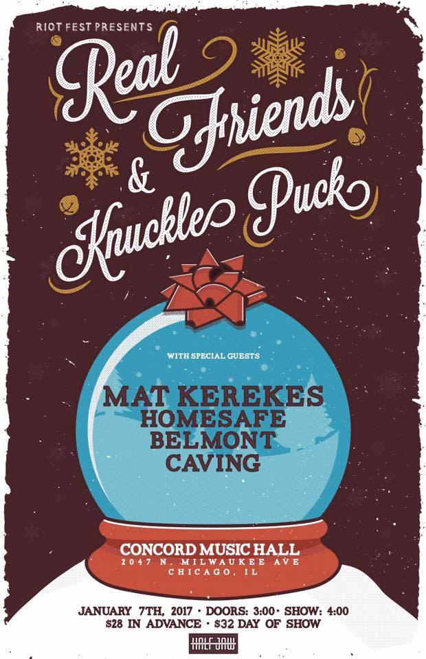
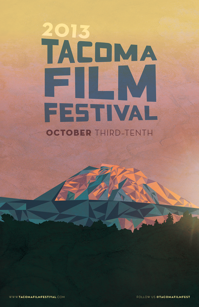
#4 Use Relatable Images
Speaking of clip art, be sure to use it wisely. Goofy illustrations and generic icons can detract from your message. They just scream, “We threw this flyer together in 5 minutes.”
Modern business flyers benefit from a more human aesthetic. When possible, incorporate original photography or illustration.
If you must use stock images, choose ones that look more natural rather than the slick commercial portraits. Hand drawn pictures are very “in” right now and can offer a creative, inspiring aesthetic.
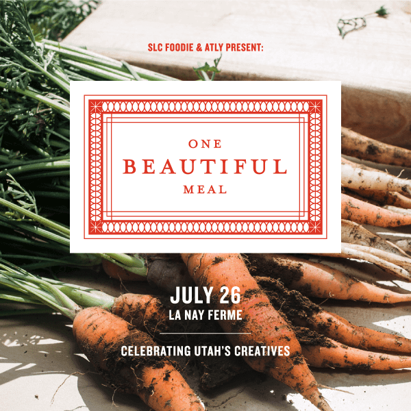
#5 Stay On Brand
Always stick to the brand identity, if one exists. People should see the same colors and fonts on your flyer and your website.
If there’s no brand identity to work from, choose 1 to 3 fonts and 3 to 6 colors that will define the aesthetic. Remember, fonts are not the same as typefaces. They are variations of typefaces.
Try to use no more than 2 typefaces, and simply use the bold or “heavy” version for emphasis.
#6 Choose the Right Colors
Even if you’re using brand colors, be aware of color psychology. Certain hues trigger specific emotions or moods. These effects also depend on the fonts you use.
For example, if you want to hype up your new product, high energy colors (red, orange, etc.) and “display” typefaces are usually better. By contrast, cool blues and greens plus sans serif fonts seem more relaxed and contemplative.
#7 Benefits, Not Features
We’re borrowing this tip from the world of copywriting as it applies to flyers, too. When developing a business flyer, you should emphasize what customers could enjoy. What’s most enticing for them?
For example, a flyer for a new burger restaurant could lead with the text “Restaurant Opening” and list all the details below.
Recipients likely won’t care about any of that. But what if the flyer had a big, bold headline of “Hot, Juicy Burgers,” plus a dramatic photo of a hamburger and subheads about “grass fed beef” and “homemade buns”? Isn’t your mouthwatering?
Both the copy and graphics should focus on benefits rather than features. Let that key selling point steal the show.
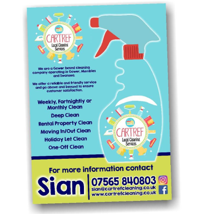
#8 Include A Call To Action
After you’ve gotten your potential customers all excited, it’s time to tell them how to get those big, juicy benefits. One of the top mistakes in designing a business flyer is forgetting the call to action (CTA).
What should people do after they read your flyer? Should they call your business? Pay you a visit? Log onto your website? Choose ONE primary CTA and make sure it’s crystal clear.
The more options you add, the more confusing it is. Remember, your goal is to catch their attention and inspire them to take action ASAP.
#9 Leave Room To Breathe
White space is everyone’s friend. It separates key design elements and helps prevent the reader from getting overwhelmed. Be sure to leave a buffer around each part of the flyer.
If white space doesn’t fit your design, it can be “negative space,” i.e. any area where there is no text or distinctive image. This is especially helpful if you have a beautiful background. Why cover it up?
#10 Keep It Simple
While print design offers a bit more flexibility than an email campaign, it also has more constraints. There is limited “real estate” and the flyer must really POP to catch the eye.
That means cohesive, simple layouts are more effective than crazy collages of images.
Choose the primary message of your design, whether textual or graphic. Let that stand out while the rest of the design complements it.
Bonus Tip: Proofread, Proofread, Proofread!
We’ve all done it. When you spend a lot of time on something, you get tunnel vision. This can make it hard to see errors, even if they’re glaringly obvious to anyone else.
You definitely don’t want to spend tons of money on printing without proofreading your flyer!
It’s usually a good idea to have a new set of eyes review the flyer. Look for both copy mistakes (typos, misspelled words, incorrect grammar, factual errors) and design issues (misaligned layers, muddled colors, font legibility).


