Here is a custom book cover mockup created for a client by Flocksy team member Facundo.
All custom illustrations/brand designs/marketing materials on Flocksy are created completely from scratch by one of our extremely talented graphic design creatives.
Start a graphic design project today and see results in just hours!
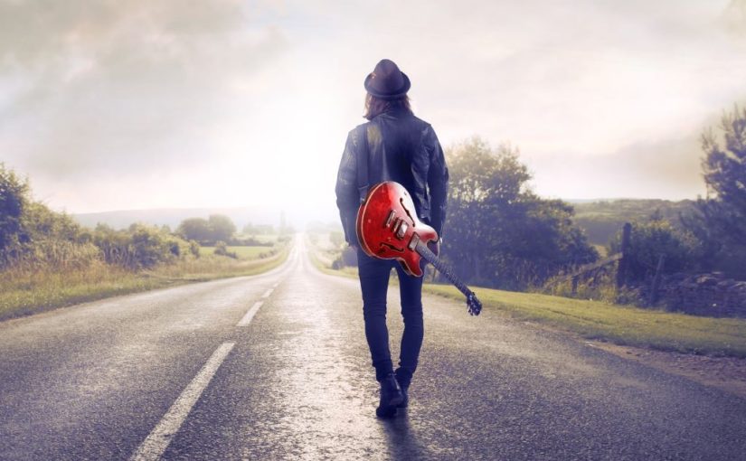
by Flocksy Staff Writer . Here, We will take a walk through the design of some of the most well-known, and a few not-so-well-known guitar company logos continue
by Flocksy writer Dani. Though companies worldwide adapt their logos for the holidays, these ten take it to the next level, often modifying their already simple logo to be perfect for the holidays. continue
by Flocksy writer Abby. The McDonald’s franchise had a surprising start and a lot of major changes throughout its journey from the beginning to where they are now. continue
Social media: love it or hate it, the idea of connecting online using some platform or another is here to stay. Most adults have at least one social media account, and now, most teenagers do as well. Even kids in grade school are creating their own social media accounts.
While social media continues to grow, one of the most essential parts of a social media company’s marketing is its logo. Users click on these logos every day when they open the various platforms. Their design needs to be simple and memorable.
It must be simple because the logo needs to slow up nicely on a phone screen. It needs to be memorable so people can easily find it when they look for it on their phones.
Facebook was one of the first major social media sites to capture a broad audience. While it has changed a bit from the early days, the idea of connecting people has remained the same. The current Facebook logo is a white, lowercase “f” on a blue gradient background.
The logo for the phone app is similar, except it usually appears in the typical rounded square as an icon. The blue gradient and white f remain, however. The gradient blue in the background gives this logo a feel of movement, representing a platform that is constantly changing each moment a new post is made.
While users share articles and all kinds of things on Facebook, Instagram users primarily share pictures and short video clips. For that reason, this platform is very visual, so it makes sense that the Instagram logo would also be very visual. It is colorful and bright because Instagram users generally focus on the positivity in their lives on Instagram.
The white outline of a classic Polaroid camera calls back to earlier versions of the logo, which more prominently featured a camera.
The platform TikTok is known for short videos and sound clips that people can use and interact with. The logo looks like an eighth note, but it actually symbolizes a lowercase “d” based on the app’s original name, “Douyin.” This little icon also has echos of red and teal.
These echos are creative because they could represent how different users use sounds and videos within the platform. It also has a slightly distorted appearance to celebrate the fun of attending live music concerts.
Twitter is a social media platform where people share status and news updates. While the character count was once limited to 140 characters, it was extended in 2017. The Twitter logo is a bird that symbolizes short bits of information users hare, live birds singing songs. The brand name “Twitter” also means the calling and singing out of birds.
The premise of Pinterest is simple: a platform where users can virtually “pin” ideas to various boards to help them create or bring a vision to life. Meant to mimic the idea of an old-school pinboard, the logo is perfect for that purpose.
With a lowercase “p” in the middle of a red circle, the p looks like an older font, like something you would find in the 1950s when pin boards were popular. The vibrant red represents action because the whole goal of Pinterest is that users will create from their ideas.
YouTube is a video sharing platform where people create and view videos made by content creators. The logo for YouTube is simple and straightforward. The mobile logo is a white play button with a red background.
The red helps it stand out, and the play icon makes users feel like they are just pressing play. The website logo includes the red play button as well as YouTube in black spelled out following the play button.
Snapchat is a common social media platform among young social media users. The idea behind Snapchat is that the message disappears after it is read, similar to a real life moment in the hallway or in the lunchroom between friends. The logo is a little white ghost on a yellow background. The ghost represents the idea that the messages do not stick around for long.
LinkedIn is a social media platform focused on helping people connect and find jobs. The logo for LinkedIn is one of the few logos on a mobile that has part of the name inside of it. On the phone, the logo appears as a blue box with the word “in” written inside. This helps reinforce the idea that LinkedIn can help get people into the positions they want.
Discord is a popular social media platform for those in the gaming world. The logo plays off this idea and has a small purple logo that looks like a nondescript video game controller. Though there are applications for the platform for those who do not play games, gamers are the primary users.
Going along with Discord, a popular social media platform for gamers is Twitch. Users can live stream their gameplay to share it with others using this platform. Through these live streams, gamers learn tips and tricks for playing through their games.
The logo for Twitch is a squared off speech bubble with a quotation mark inside of it. This logo represents the sharing of ideas through the live streams available on the platform.
Wattpad is a platform that creators can use to publish their independent work and find an audience. The logo is very simple but elegantly represents this social media platform; it is an orange “W” written so that it also resembles the squiggle of an artist’s brush. This dual representation shows that writers, even independent ones, are artists.
Nextdoor is a social media platform that is specific to where you live. So if your house is in a subdivision or community, there’s a good chance it is also on Nextdoor. Users share observations, sales, and concerns with neighbors in their area on this platform.
The logo is a bright green “n” with a little chimney coming off its side. The lime green coloring really stands out among other social media logos. However, since it shares some similarities with Facebook, the act of using just a lowercase letter to identify that app is a smart move.
DeviantArt is a place for artists to show and share their work. The logo is somewhat confusing to look at initially, but upon further inspection, it is an “A” that has been cut in half then rotated. Since this logo requires an extra minute to study it, the logo wonderfully represents the brand because art also needs a careful eye to study it.
WhatsApp is a little different from other social media platforms because its primary purpose is to be a communication tool. It offers free calling and texting. Instead of sharing those calls and messages in public, everything on WhatsApp is private between users.
The logo is purposely similar to other communication apps on Apple. A speech bubble and a phone icon inside, it combines calling and messaging, the two primary kinds of communication on the app.
Peanut is a social media app built for moms. It creates a community and opportunity for moms to connect with other moms. The logo is simple and cute, with a white outline of a peanut on a coral background. The logo plays with the commonly feminine color of pink. It includes a peanut icon to help people quickly find it while searching their phones.
Looking for custom designs, motion graphics, video editing, and more? Get started with Flocky today!
Here is a custom flyer mockup created for a client by Flocksy team member Jerry.
All custom illustrations/brand designs/marketing materials on Flocksy are created completely from scratch by one of our extremely talented graphic design creatives.
Start a graphic design project today and see results in just hours!
by Flocksy writer David G. This article will outline the best practices for running an effective virtual meeting. You might not need every single one of them, but you can use this as a general guide to run meetings that everyone enjoys. continue
by Flocksy writer Sophia. Regardless of the size of the change, seeing redesigns that Iconic companies make are also always a fun adventure and the public is very quick to judge whether it was a success or not. continue
by Flocksy writer Sophia. One of the more creative ways that businesses are beginning to market their brand is by using mascot designs. Establishing their brand with one or multiple mascots is a unique way to not only get consumer’s attention but to also get them interested in what you have to offer and to learn more about the company. continue
by Flocksy writer Rachel E. The design process should be a collaborative moment between both the client and the designer, spearheaded by the client’s knowledge of the product and consumer base, and the designer’s knack for creativity and bringing the client’s needs to life. continue
The holidays are a time for family and togetherness, and companies love to be part of the holiday magic. Though companies worldwide adapt their logos for the holidays, these ten take it to the next level, often modifying their already simple logo to be perfect for the holidays.
If you’ve spent any time searching and surfing the web, chances are that you’ve also used Google. One of the most popular search engines on the internet, the brand name “Google” has become a verb all in itself. Google is also known for regularly creating new logos for its site. The holidays are no different. This one features the company’s name adorned in festive lights for the Christmas season.
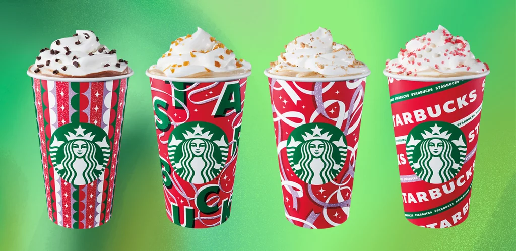
Starbucks’ new holiday cups are a marker for the winter season for the coffee faithful. Generally beginning at the beginning of November, these coffee cups are different each year. For the 2021 season, this coffee giant utilized the green tone of their already Christmas ready logo and fashioned the rest of the cup in designs of white to match the lid, red, and even pink. The four-cup options perfectly complement the green siren logo.
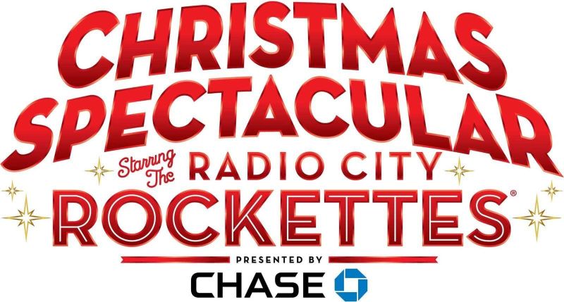
Each year, the Radio City Rockettes put on a holiday celebration of music and dancing at the infamous Radio City Music Hall in New York. Their simple logo is bright red and emblematic of a marquee you might spot in the city. They even feature their primary sponsor, Chase, in their logo. Unfortunately, the Radio City Rockettes had their season cut short due to the global pandemic this year. Still, fans of all ages look forward to seeing the snow next year.
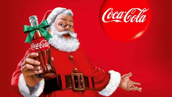
Coca-Cola is a worldwide brand of soft drinks. They are nearly just as synonymous with Santa Clause and Santa’s reindeer. The marking design of using the likeness of Santa alongside the red field of the Coca-Cola logo makes this one stand out without changing anything with the original logo. Coca-Cola will use this premise throughout the holiday season. Santa will appear drinking an ice cold coca-cola in many commercials.
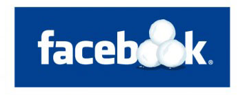
Social Media has become a pastime and an essential means of communication for many people. As a result, Facebook, the social media giant, also regularly redesigns its logo for the holidays. A company that caters to people worldwide, Facebook generally keeps its logo more neutral in terms of the holidays, opting instead to reflect on the snowy season.
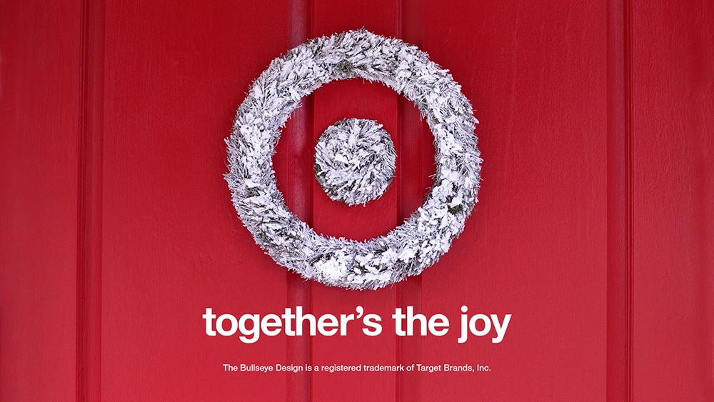
Target is a popular big-box retailer known for having everything one may need and then some. So a casual stroll around Target, Starbucks in hand, is a fabulous way to spend a bit of an afternoon. And for a store with everything, it is convenient that this logo doesn’t take much to redesign its already iconic logo to make it festive. The logo becomes a wreath, snowy white and bright for the season against a red door.
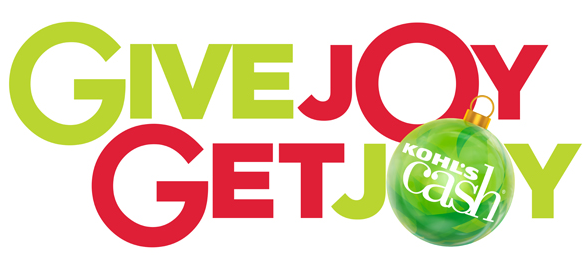
Kohls is another big box store that makes their logo for the holidays. Kohl’s sells clothes for all ages, toys, home goods, jewelry, cosmetics, and even small appliances. They are known for having great deals and offering customers plenty of ways to save in their stores. One of those primary ways is through Kohl’s Cash, which is the initiative highly featured here. The brand name appears in an ornament as the “O” in the second “joy.” The red and bright green colors make this logo feel exciting and festive.
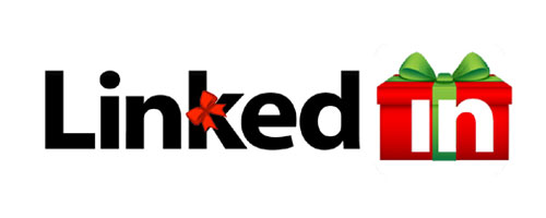
Linkedin is a social media site for those looking to network or even find work. Often Linkedin will redesign its logo for the holidays. In this redesign, they make their usually blue box a gift and put the “in” over it. This clever redesign maintains the shape of the original Linkedin design while also innovating for the season.
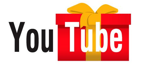
YouTube is a social media site that allows users to upload videos and interact with content creators. This design is similar to the Linkedin one because they also took the gift box idea and made it the backdrop for the “tube” part of their name. The orange bow is a clever choice to offset the red box and is a nice change from the typical green and red redesigns many companies choose.
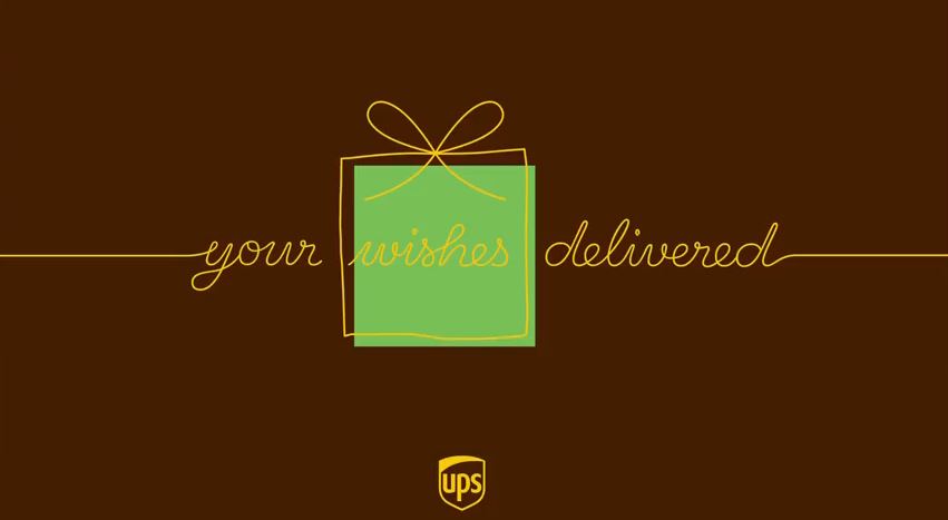
As an essential shipper of gifts, it perhaps comes as no surprise that UPS features a gift in their design. This one is simple and straightforward, even maintaining the brown and mustard colors typically part of the UPS logo.
The holidays are a time for family and togetherness, and companies love to be part of the holiday magic. Though companies worldwide adapt their logos for the holidays, these ten take it to the next level, often modifying their already simple logo to be perfect for the holidays.
A Look Into The Creativity Behind Guitar Brand Logos
Brand recognition is not a new concept and product logos are everywhere. It is likely that if tested on who a company is based solely on their logo, you will score very high. That is the point.
Why say in even a couple of words what you can feel from a cleverly designed logo? And guitars are no exception. From Fender and Gibson to the lesser-known brands, the logo is cemented in your mind. And if it isn’t, it will be soon.
Here, We will take a walk through the design of some of the most well-known, and a few not-so-well-known guitar company logos
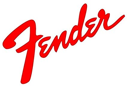
Easily one of the most recognizable logos, as well as easiest to spot guitars, Fender has been the iconic leader in high-quality, incredibly popular guitars for decades.
Everyone from Jimmy Hendrix to Kurt Cobain has jammed on a Fender and made the audience scream for more. Every aspect of the Fender logo design was carefully chosen, from the cursive writing to the bold lettering.
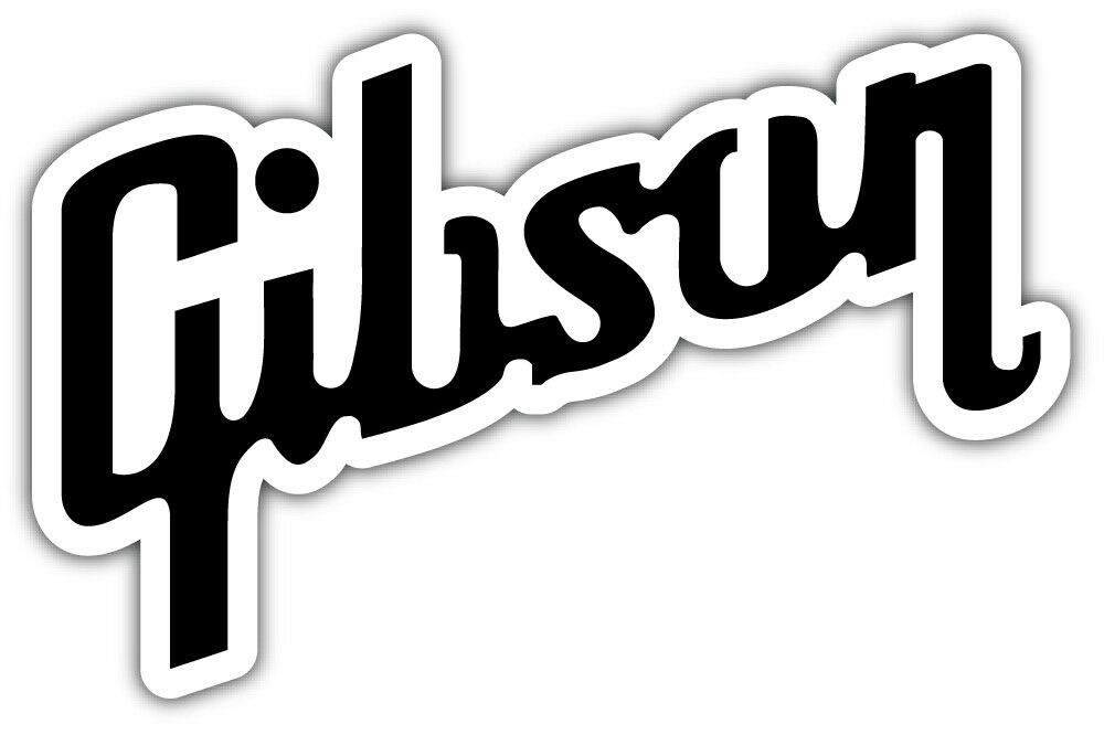
Another logo that employs cursive in the type, although with a little flourish for individuality, is the brand mark for Gibson guitars.
With its corporate headquarters in Michigan, the logo incorporates a more industrial design. Its most distinctive characteristic is the long tails on the “G” and the “n” that add a twist to the design.
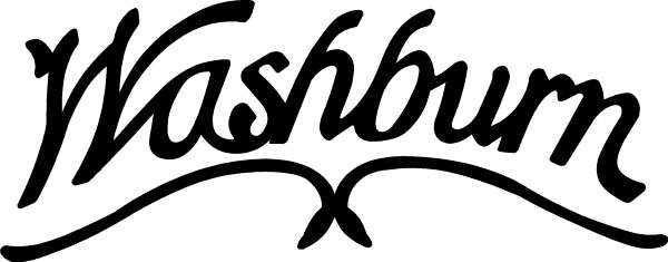
While their cursive signature look of the logo isn’t overly creative, their brand is a testament to innovation. Washburn has created stringed instruments beyond the traditional guitar, including the mandolin.
But its most well-known rock guitar is the Parallaxe, an unmistakable flying V guitar used by rock stars since the ’80s. If you see the Washburn logo, you know you are getting quality for a good price.
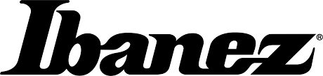
A logo designed for a different type of rocker, Ibanez is written in block letters, not the cursive of more seasoned brands.
It is always written in black, bold to stand out, and the Ibanez product line is very distinct. Even more so if you see the Ibanez mark on one of the 7-string electric guitars played by the band Korn.
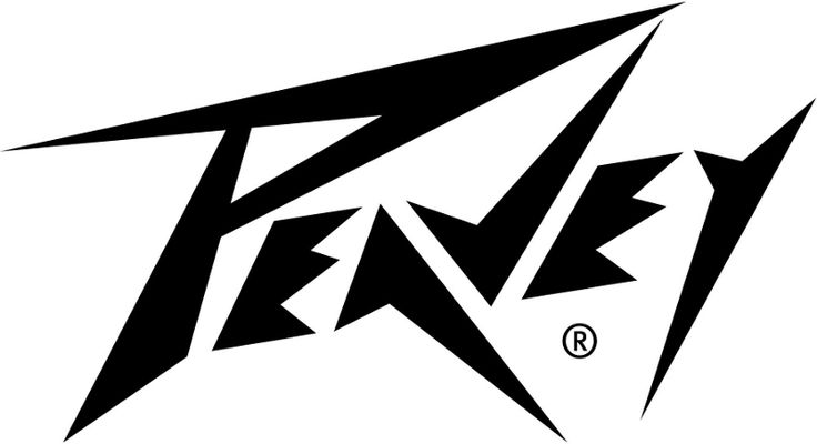
The first thing people think of when looking at the Peavey logo is how much they wish they were a rock star. Peavey’s logo features dagger-sharp lines akin to the Logo for the bank Metallica.
It is bold and spits in the eye of convention. You know exactly what you are getting when you strap on a Peavey, plug it into an amp, and jam. Peavey’s logo is its promise to its guitar owners that their product is for rockers.
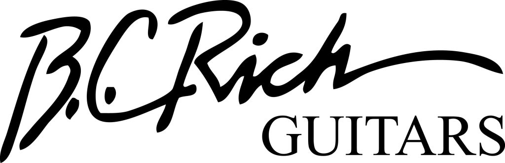
Nothing more than a simple bolded signature, BC Rich is a pretty popular option when planning to rock someone’s face off. Its most commonly recognizable guitar, the warlock, is a departure from the mundane reality of the logo.
When looking at the name BC Rich you might think horses, but what you will get are rhinos in armor, ready to make some noise and raise the dead.
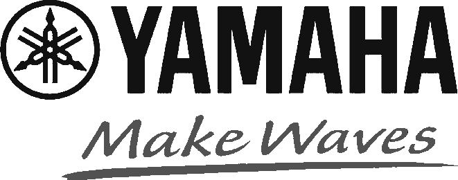
They make motorcycles and guitars, and both fly under the same banner. Unlike the previous logos, Yamaha not only displays its name in a standard type font but also a logo, which looks like the spindle of a bike.
If the name won’t fit, the logo circle will do the trick, and Yamaha’s legacy of brand quality over decades has cemented it in the minds of motorcyclists and guitar lovers alike. Their most popular guitars are acoustic.
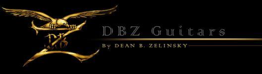
More than words, the DBZ logo is backdropped in black with lettering and the logo in gold. It features the brand name below with its initials above, shield behind, the “z” enlarged, and on it, perches an eagle.
If you aren’t impressed, you aren’t paying attention. The eagle is added to draw the attention of groups who will appreciate the music of bands using these exciting guitars, whereas the gold symbolizes rock and roll at its finest.
Liquid Evergreen Productions
Stepping away from the logos for guitars themselves, Liquid Evergreen gives lessons to promising students who want a future behind the guitar they love so much.
The LE logo is a vertical guitar that almost looks like Japanese calligraphy. It is supposed to show a level of artistry, which is a testament to the lessons taught by LE that playing music and artistic expression are intertwined, no matter what stage of learning.
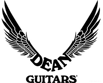
While not super well-known, there are plenty of rock stars that live and die by their Dean Guitars. They likely chose it because of the interesting logo, which features unfurled wings attached to the word Dean, with Guitars below it.
Bird wings are a visual cue often in heavy metal. The words are blocky, minimalist, and hint at an underground movement hearkening back to the dark days of rock.
If you see this logo, you can feel its edge, its pure intensity, and those sensations are spot on. From the deep red artistry to the black background, it catches the eye and won’t let go.
A circle tries to trap the guitar and words within, but the neck and split tail of the guitar cut it without hesitation, breaking free of their cage. The only thing not harsh and dramatic about this logo is the simple block lettering of the brand that runs down the neck.
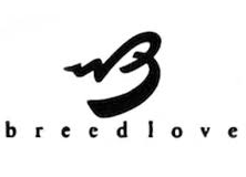
One of the softer logos, the Breedlove brand tag is uniquely typography based. All of the letters are lower case, giving it no edge or fearful imagery. There is a subtle serenity in the overall look of the logo.
The large “B”, the only capitalized letter in the logo, seems to be floating on the wings of angels as well as indicating movement or sound. These guitars are for more conservative enthusiasts.
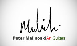
These guitars fall under the title of Art Guitars because they resemble what you might think of if someone asked you what Pablo Picasso’s guitar would look like.
They are as eclectic as they are beautiful, and if they never feel a single note strummed from their strings, they make an impressive work of art for your collection. The last name “Malinoski” is scrawled in harsh cursive above the full company name, these words in block.
Final Thoughts
From the most idiosyncratic design to an unforgettable logo that reminds you of better days, brand recognition will always play a part in the landscape of product loyalty.
If you find your favorite guitar, you have but to find its logo and smile, reminiscing about those times rocking with friends in the garage, or when you opened for Five Finger Death Punch. Memories are linked to logos. Which is your favorite and why?
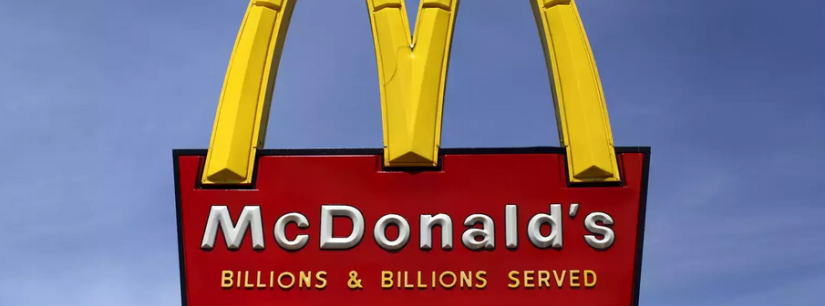
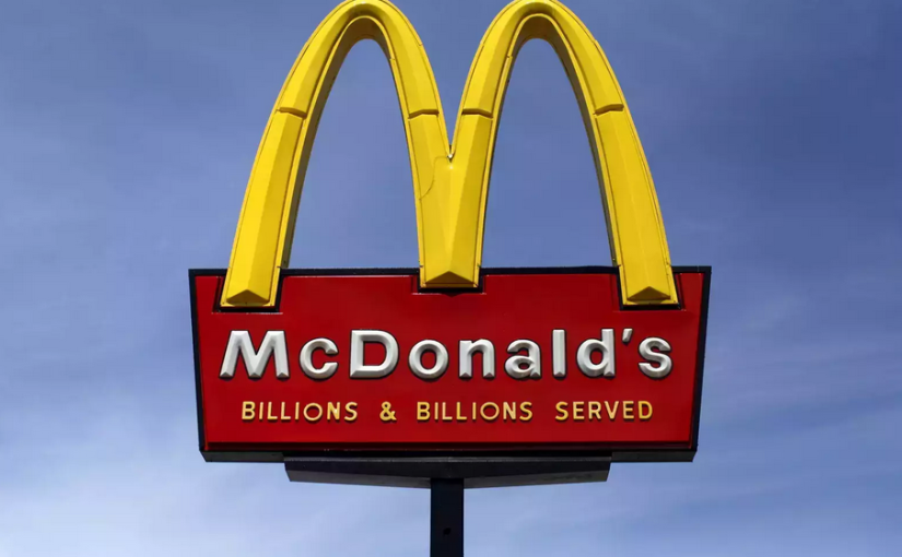
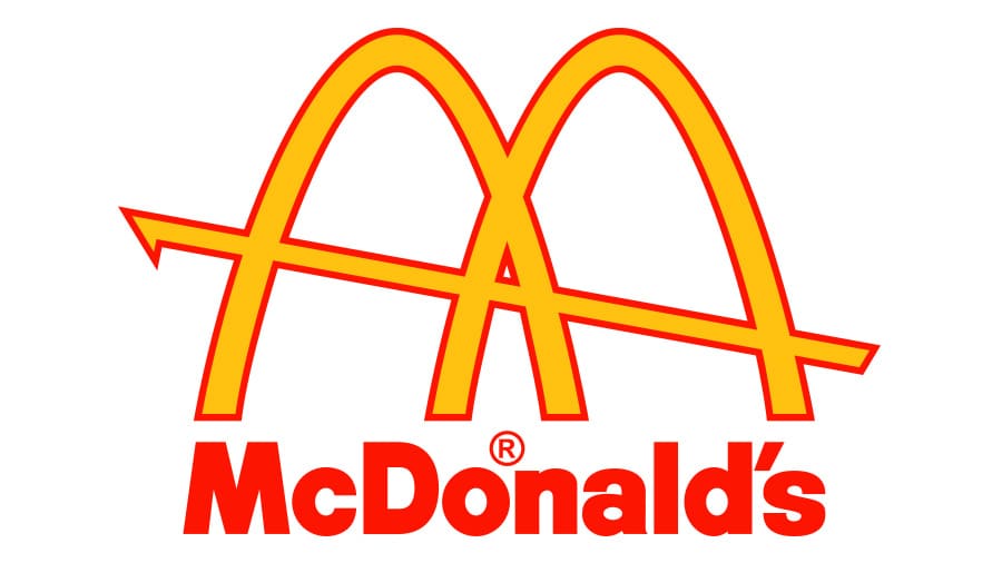
McDonald’s is one of the most well known restaurants and franchises in general around the world. The logo itself is easily recognizable and it does not take long to know what it is associated with. The McDonald’s franchise had a surprising start and a lot of major changes throughout its journey from the beginning to where they are now.
Originally called “The Airdome,” even their name had a drastic change once the McDonald brothers took over their father’s restaurant. Not many years later were the golden arches formed and the face of what once was The Airdome changed forever.
1940
Originally, McDonald’s sold more barbecue items than just their famous hamburgers and cheeseburgers. Starting out as a roadside hotdog stand, they expanded their menu with burgers and an additional 25 barbecue items. Something so simple would soon change the face of the restaurant business entirely.
1948
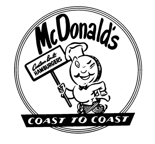
Removing barbecue items from their menu required McDonald’s to remove it from their name and sign. When it was shown that burgers were giving them more profit, it was decided to remove those from the menu thus creating the hamburgers and cheeseburgers they are so famously known for around the world. The winking cook known as “Chef Speedee” in their logo is a sign for their quick service that they were, and still are, offering.
1953
This is when they changed their name to just ‘McDonald’s’ thus needing a change in their logo. With McDonald’s not being as big of a chain as it is today, they needed a logo that was clear to read but also had some of their signature color palette. It was important to have a logo that was a clear image of what their name is and who they are as a company. The red and yellow combination are so well known today, and this was the first logo created to include one of their signature colors. In 1952, the golden arches were designed in part of their new building by Stanley Meston. Though it would not be thought to be used in a logo until 1962 by Jim Schindler.
1961
This logo is the first of the many McDonald’s logos to feature the famous golden arches. First shown in the early architecture of their buildings, McDonald’s was known for those giant yellow arches on either side of the building. Incorporating that into the logo solidified the familiarity of those arches with the McDonald’s franchise.
1968
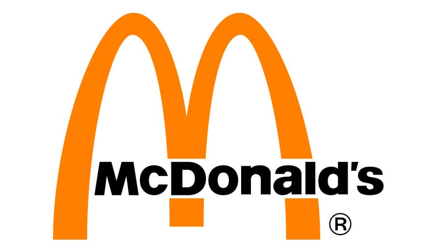
This was the first logo to turn the golden arches into an ‘M’ shape versus just the two arches with a line through. This design started what we now know today as the McDonald’s logo. Not only was this perfect to continue to incorporate the golden arches into the logo, but to also have it shaped like an ‘M’ for ‘McDonald’s’ made it known globally what franchise this logo stands for.
1993
A few minor changes to the logo happened in 1993. Taking out the word “McDonald’s” on the logo itself and instead adding a black shadow behind it allowed for a logo that would be used for almost twenty years. This is the first logo that they developed that did not have “McDonald’s” incorporated somewhere on it. The golden arches by now were mostly associated with the McDonald’s franchise that words were not even necessary to have such a successful image. Which is why it was able to be used for so long.
2003
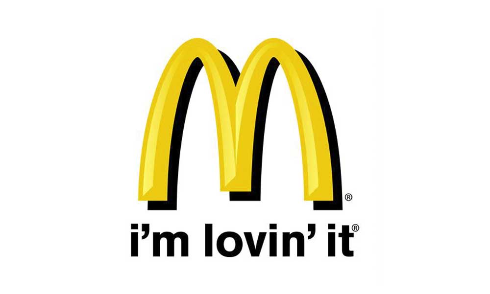
2003 is when the slogan “I’m Lovin’ It” rose to fame. The original shape and color were changed just a bit along with adding the “i’m lovin’ it” slogan at the bottom. They added some shading to give a more three dimensional aspect to the yellow part of the logo. The campaign for this slogan was so successful, it is still used today as well as the majority of society knowing who this phrase belongs to shows just how successful this campaign actually was. Even today we still see signs of this slogan in McDonald’s advertisements or commercials.
2006
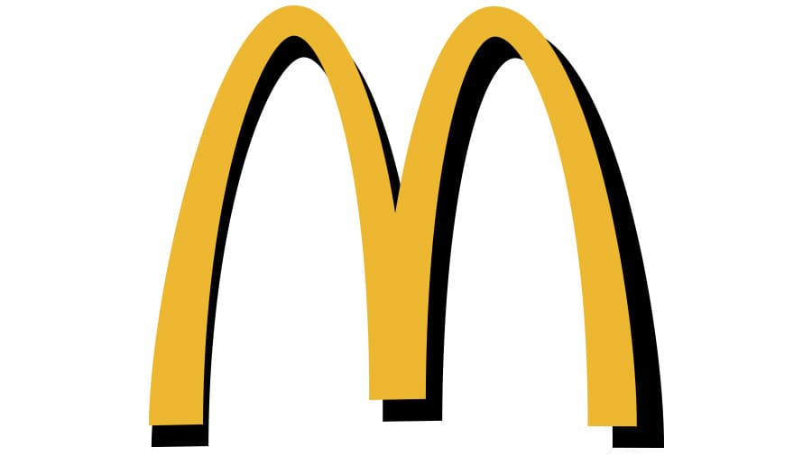
Creating a more modern and simple look, this is the logo that we are familiar with today. A slightly different shade of yellow without the black background on a plain white background gives it a chic look that McDonald’s has been using since 2006. A simplistic look that has the versatile abilities to be used for multiple marketing platforms as well as the popularity of the golden arches in today’s society allows McDonald’s to be successful with such a simple logo.
2018
This version of the design is the same yellow emblem, but it’s placed inside a red square with rounded corners. The current logo remains very much the same, some with no background, some with red, sometimes the name is included in black or white, but over the years the logo has remained recognizable around the world.
There’s nothing in the sporting world like a great sports logo. They come in all different shapes, sizes, and color, and inspire emotions as diverse as fear, happiness, or awe. In honor of the many designs ingrained in the collective consciousness from sports teams, here are fifteen great sports logos, in no particular order.
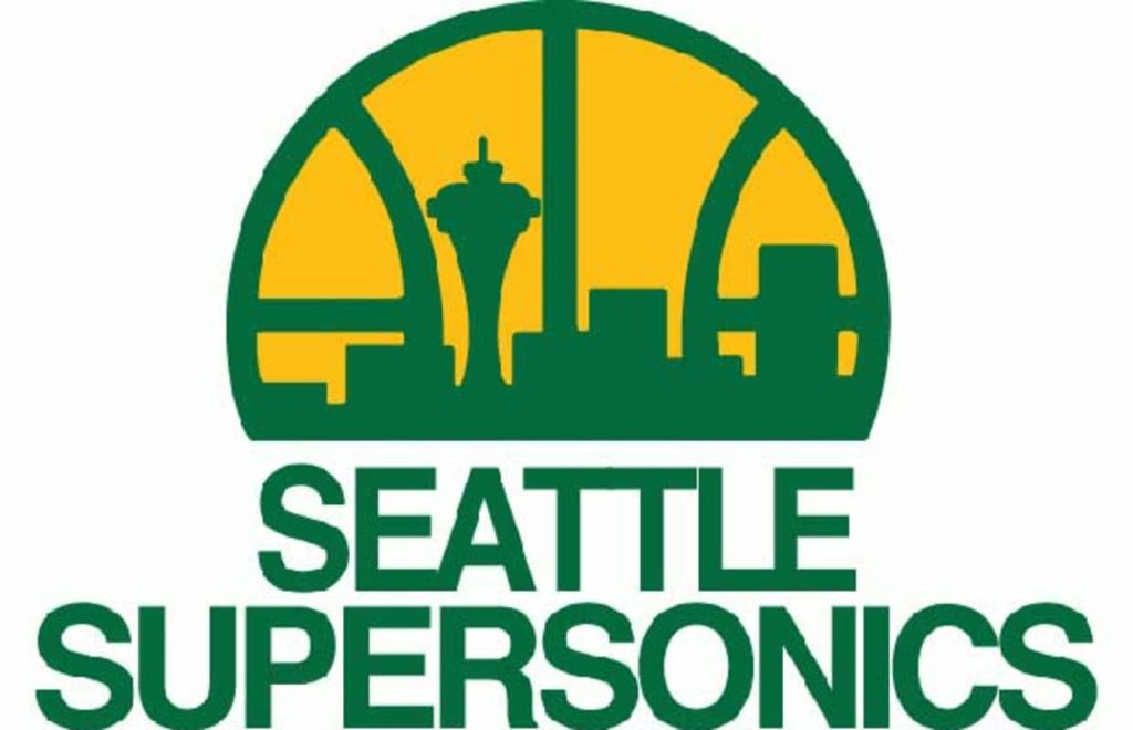
This logo was introduced in 1975 to evoke the spirit and energy of Seattle. This great retro logo has the look and feel of the era and sports the buildings and icons of the city, including the Space Needle. The skyline can mostly still be seen to this day, making this a timeless and classical logo all at once.
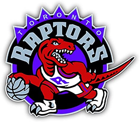
One of the greatest NBA logos in history, this design forewent sleekness and modernity to bring The Raptors back to their prehistoric roots. This is a mishmash of color, funky geometry, and points to strike fear into the opposing team. The raptor on the design is still the first thing most think of when they think of The Toronto Raptors.
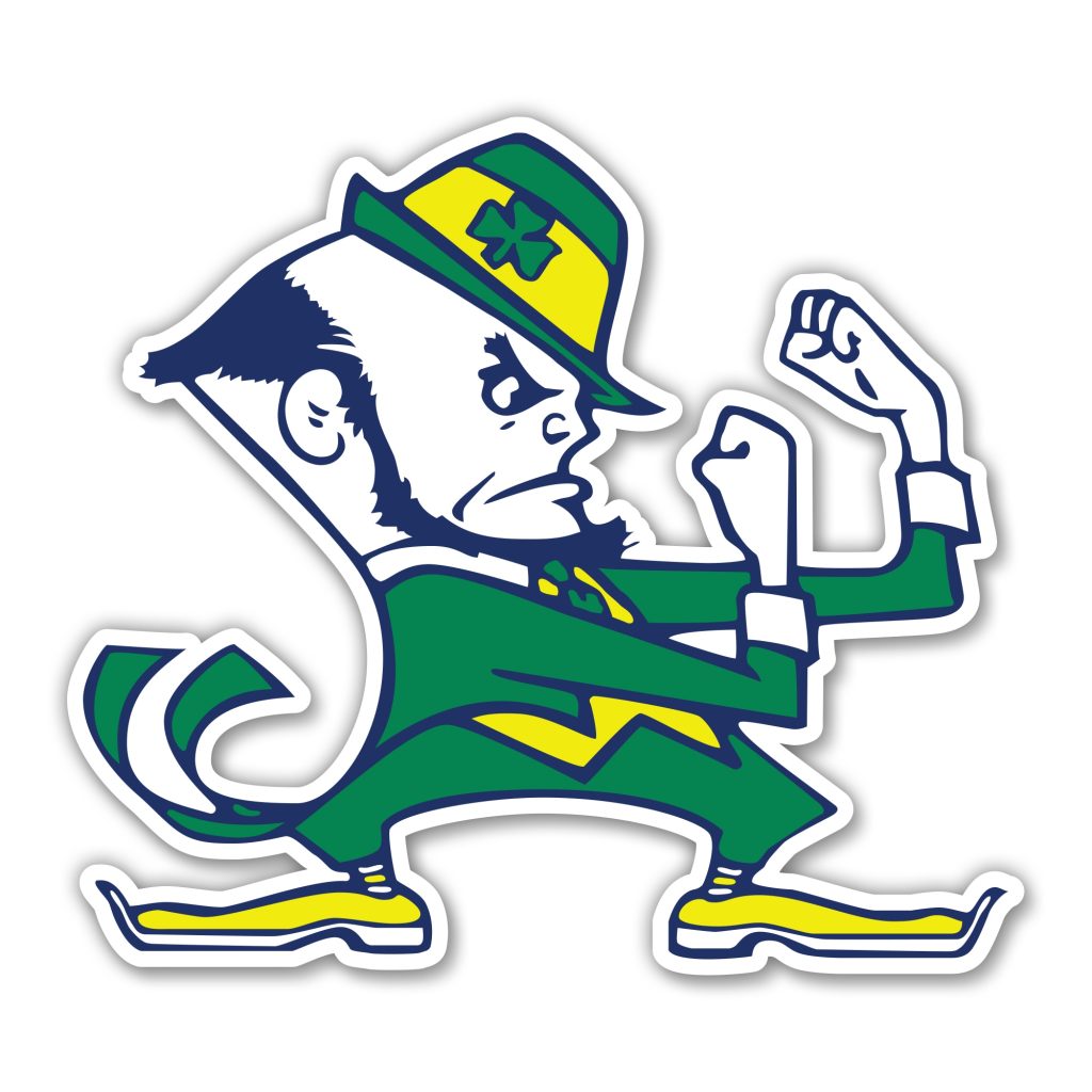
One of the oldest and most varied universities in the country, the University of Notre Dame has been called the fighting Irish for nearly the last sixty years. To commemorate the name, this great logo of a fighting leprechaun was designed. Not one of the meanest logos, this little guy is still one of the fiercest; would you want to fight him?
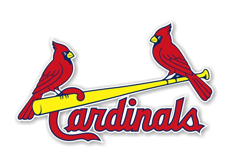
One of the oldest logo in American sports, the St. Louis Cardinals logo evokes a feeling of warmth and comfort, as well as fury and bitterness for opposing team players who have had to face their mighty bats. No other graphic logo looks as classical or streamlined as the St. Louis Cardinals logo.
One of the all-time great logos in sports, The Longhorns logo needs little detail or texture to be feared and remembered. Simply an orange longhorn silhouette, the Longhorn’s logo is known throughout the world as a symbol of pride and admiration in Texas. A perfect orange dominates the logo and sends opponents packing early.
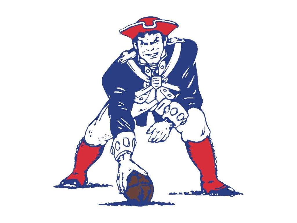
Although this logo looks like it belongs in the early 20th century, it was actually designed in 1960. What’s great about this logo is the texture and details in Pat the Patriot’s face and uniform. He’s ready to play ball and snarling at the enemy team with glee. Though it was dropped in the nineties, no Patriots logo will ever top Pat the Patriot.
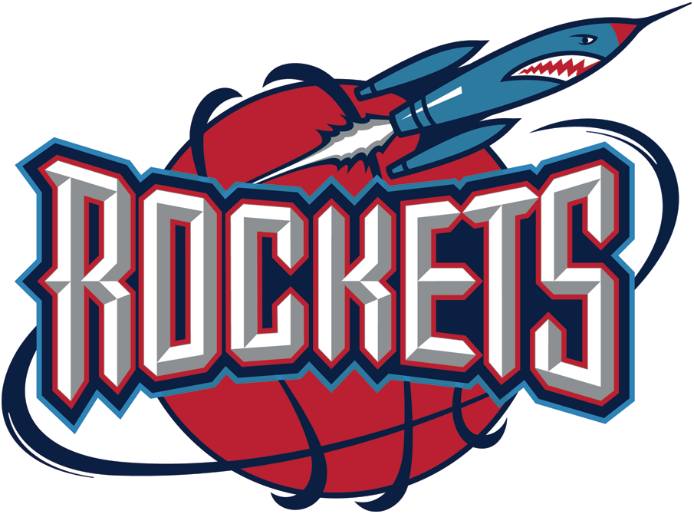
This is a divisive logo to some, but there’s substitute for the colors, energy, or relevance the Houston Rockets’ logo offers. Houston is the home of NASA, and the logo pays homage to the city’s pride by featuring an angry rocket at the top. The text itself is big and bold it all rotates around a basketball designed to look like the Earth. Perfect.
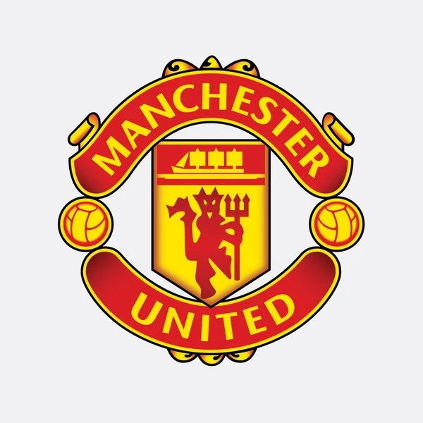
One of the all-time classic soccer logos, Manchester United is also one of the most significant. The team is one of the most dominant and iconic in European soccer history and their logo is imbued with the boldness and fresh aesthetic of the players. The devil at the center is the cherry on top, as most opposing team fans can attest to.
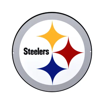
There’s no logo in sports like the Pittsburg Steelers logo. The logo was adopted by the team in the 1960s, near the peak of the industrial spirit in America. The logo is actually the only logo in American football to be worn on only one side of players’ helmets, making it extra unique. It’s sleek, dominating, and minimal, just like the team itself.
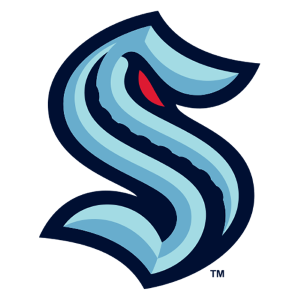
Easily the most recent logo on this list, the Seattle Kraken logo is inevitably destined to become a classic. It’s minimal but evokes a feeling of the deep sea. The S itself is molded into the shape of a monster with a curled eye staring down the opposing players’ souls. The texture of its spine is a nice addition as well.
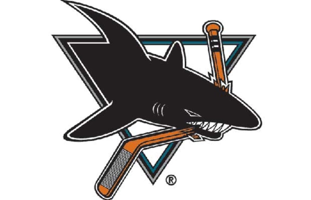
This sharp logo was introduced in 1991 and adopted by the fan base immediately. There are few mascots as fear-inducing and commanding as a shark, and this logo takes full advantage of this fact. The shark of the logo has always been a menacing logo and is contrasted nicely with the triangle and broken hockey stick within the logo.
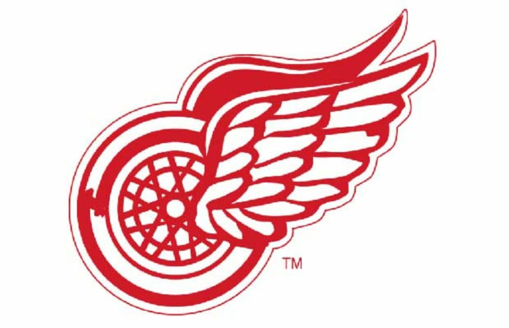
The Detroit Red Wings logo has an interesting history. It was actually introduced because James E. Norris, owner of the team in 1932 when the team was introduced, was a member of the Amateur Athletic Association, which was a cycling club. The logo pays tribute to his history and the team by combining red wings with a literal bicycle tire.
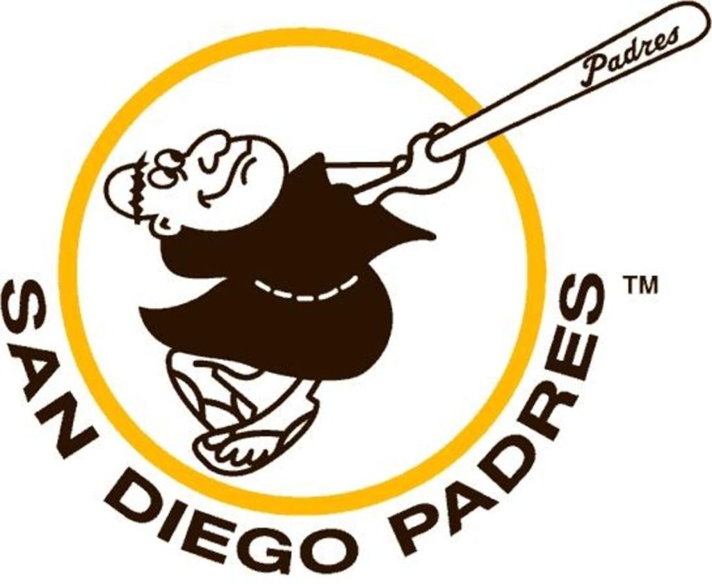
Although the Padres logo has been changed and altered throughout their history, this remains the all-time most unique logo in their history. This swinging friar is a great tribute to the Spanish missionaries who settled the area in the deep past, while staying light and fun. Who doesn’t want to see a padre pay baseball? Stay holy.
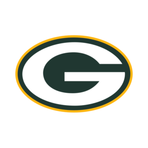
This iconic logo was introduced in 1969 and has not been altered since. On the surface it may seem like a plain logo, but the color combination and presence of the large G makes it unique. The Packers are a prideful and classic franchise, and the logo evokes their spirit well. This logo may never change again.
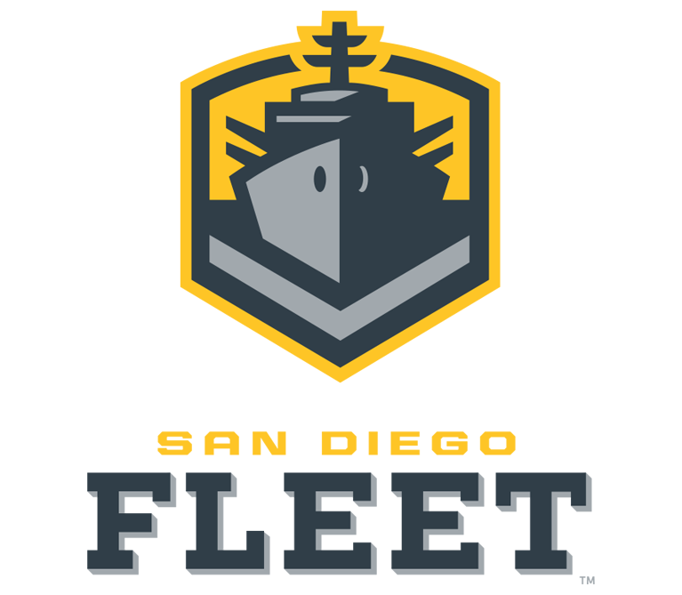
One of the greatest things about the short-lived AAF were the team logos, and none were cooler than the San Diego Fleet. Combining a sleek minimalism with the feel of San Diego and its military history, this logo anchored the team and led them to success before the unfortunate shuttering of the league.
Ever wondered what makes a perfect logo? Recognizability is obviously important: your logo is a crucial tool for developing your brand. But what makes a logo recognizable? It’s usually a blend of design simplicity, compelling visuals, and iconography that aligns with your brand values.
The best way to understand the art of logo design, and to find the perfect visual identity for your own business, is to review the world’s best corporate logos. These are the designs that have endured in the public imagination, which means they’re ideal study material for developing your own memorable logo.
Nike’s famous “swoosh” expertly communicates the brand’s core values: dynamism, accomplishment, and simplicity. Designer Carolyn Davidson was inspired by the company’s namesake Nike, the Greek goddess of victory. The eye pleasing design makes excellent use of the golden ratio (1.618:1).
The swoosh’s curve corresponds to a Fibonacci spiral, a shape that grows by a factor of 1.168 with each quarter turn. A final upward stroke evokes feelings of movement and motivation, yet aligns perfectly with the initial point of the curve.
This highly recognizable logo has been hailed as one of the world’s best, and it’s indeed an achievement in stellar design!
Amazon’s famous logo combines its name with the “smile,” which doubles as an arrow pointing from the “a” o the “z.” The message is clear: Amazon has everything from A to Z. The arrow also connotes speed and innovation, both of which are crucial to the Amazon brand promise. And of course, the “smile” reflects the satisfaction and entertainment that Amazon customers can enjoy.
According to legend, the iconic Disney font seen in its wordmark is based on Walt Disney’s handwriting. It also has a whimsical and dynamic vibe ideal for the world’s leading animation company. Disney’s logo is recognizable both in the full wordmark and the abbreviated “D” lettermark.
The “D” comprises a distinctive swirl with a wandlike vertical stroke, an homage to the seminal short film “The Sorcerer’s Apprentice” in the Disney classic Fantasia. Many versions of the logo also contain Cinderella’s castle from Disneyland to reflect the brand’s dominance in theme parks and immersive entertainment.
Plenty of companies earn brand recognition with lettermarks, but Unilever’s logo takes it a step further. Look closely at their “U” and you’ll see leaves, fruits, trees, starbursts, bees, hearts, and more … all symbols of their commitment to nutrition, natural wellness, and beauty. This collage of icons gives Unilever’s logo a whimsical vibe, yet the overall image is a simple, professional feel.
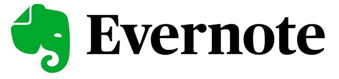
Based on the idea that “an elephant never forgets,” note taking app Evernote promises to help you remember everything. The visually pleasing and adorable logo features a simple green elephant head.
But look closer and you’ll see that the elephant’s ear is folded as you would fold a page in the book. This subtle yet clever design choice signifies the wisdom of the elephant and the purpose of the Evernote app.
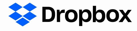
Dropbox’s logo depicts an open box. While this may seem like an obvious image, the logo is actually quite clever. If you look closely, you see that the “box” is composed of five identical diamonds. Four of them are arranged in a square, with a diamond shaped negative space in the middle.
The fifth diamond makes the shape of the box and is dropped exactly below the open space. The resulting illusion is of an open box, but the logo’s symmetrical design and strategic spacing also perfectly illustrate this digital syncing service.
Inspired by the legends of Seattle’s seaside culture, Starbucks made a bold choice with its logo. Rather than going the obvious route with imagery of coffee beans and cups, they created the mythical and enticing siren.
The image not only taps into Seattle’s history as a port of call but also evokes ideas of magic, temptation, and wonder, all of which reflect the brand’s commitment to premium coffee and innovative recipes.
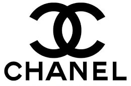
Two interlocking C’s, each a mirror image of the other, is the perfect way to symbolize coordination and balance. This makes it an ideal logo for the leading fashion brand Chanel. It’s technically a letter mark for “CC,” the initials of founder Coco Chanel. However, it’s also a simple and elegant logo that affirms the company’s sophistication as well as its historic roots.
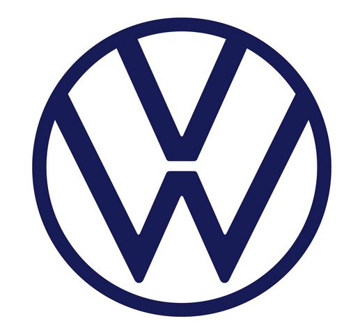
While automobile logos all tend to look alike after a while, it’s easy to recognize Volkswagen’s. After recovering from a dark period in which Hitler’s Germany required them to use the swastika, Volkswagen rebranded to focus on its initials.
However, their “VW” lettermark subverts convention with a vertical orientation. The “V” is positioned above the “W,” with the middle point of the latter directly supporting the bottom point of the former. The “W”‘s upward strokes run parallel to the “V’s,” providing a dynamic yet synchronous design that illustrates the brand’s progressive and streamlined engineering.
Electronics logos are more than a recognizable shape to print on the devices. They symbolize the subculture that emerges around the experience of using those electronics. (Just look at Apple’s famous logo, also on this list!) One of the best known logos in the gaming world is that of PlayStation.
Composed of an interlocking “P” and “S,” this unique design has the illusion of being 3D. The curve of the “P” flows seamlessly into the top of the “S”, evoking the circuitry that makes the gaming console work. It also has a playful vibe, which aligns perfectly with PlayStation’s subculture.
With a dynamic design, bright colors, and simple shapes, Pepsi’s logo connotes happiness, community, and effervescence. This is the perfect visual complement to the soda brand’s “Pop Fizz Ahh” slogan.
The round logo comprises a large red semicircle, a swooping white shape, and a blue wave. Together, they evoke both the physical experience of opening a can of Pepsi and the patriotic, dynamic vibe of the brand.
Did you know that FedEx’s logo has a hidden arrow? Once you see it, you can’t unsee it! At first glance, it appears to be a standard wordmark with the company name. However, the negative space between the E and the X creates an arrow that symbolizes the company’s commitment to fast shipping and forward thinking. Plus, the unique combination of adjacent secondary colors (purple and orange) adds a dynamic yet balanced feel.
Abbreviated to “Cat,” Caterpillar’s wordmark is the epitome of double valence in logos. The black, tall lettering expresses power and dominance, while the yellow triangle suggests either a mound or a highway. Either way, this logo signifies construction, progress, and authority.
The striking contrast of black and yellow is unique to logos: it perfectly expresses the energetic potential of construction while evoking the strong, sturdy foundation of the company.
The Apple logo is so recognizable that it doesn’t even need to appear alongside the company name. Inspired by the classic story of Sir Isaac Newton theorizing the law of gravity when an apple fell, the logo evokes feelings of insight and progress.
Early versions of the now famous design included a rainbow pattern to symbolize inspiration and discovery. Today, the logo is minimalistic, but with its gentle curves and the distinctive “bite,” it’s the perfect icon for this seminal electronics company.
Netflix’s wordmark is quite simple. But look closely and you’ll see the streaming giant’s brand values captured in the design. With tall, dominant letters and moderate kerning, the typeface hints at Netflix’s role in the streaming revolution, as well as its seamless experience.
The words are also curved slightly downward from a center point, giving the wordmark the illusion of expanding. The platform’s animated logo enforces this idea.
A letter mark that also reflects the iconic “golden arches” used in early restaurant design, McDonald’s logo is now a globally recognized symbol of happiness. The vibrant yellow, simple strokes, and whimsical vibe capture the brand’s core values: satisfaction and playtime. It’s also a nicely open and symmetrical design that makes it very appealing to young people, especially!
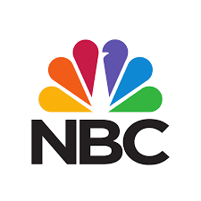
A rainbow peacock doesn’t exactly seem like a suitable logo for a broadcasting company, but NBC’s enduring and highly recognizable logo has proven that assumption wrong. As a leading provider of color TV programming, NBC wanted to feature vivid colors in its logo.
Today, each of the colors represents one of NBC’s core departments. The peacock is looking toward the right to signify forward thinking, while the teardrop shaped “feathers” evoke imagery of flower petals and lens shutters. The messaging is simple: NBC promotes growth through innovative visual media.
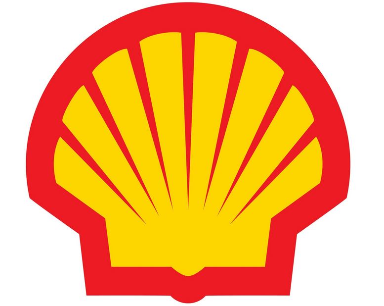
Shell began as a seashell export company that eventually moved into oil extraction and refined. Its famous “pecten” logo illustrates both its history and its current role as a global supplier of fossil fuels. Composed of a simple scallop image with bold red and yellow colors, Shell’s logos definitely stand out on the roadside.
The thick outer trace gives the design a fresh energy, while the subtle tapered strokes evoke elegance. Interestingly, the shell’s bottom is square, with only a small caret to suggest a real world scallop. This subtle design choice connotes reliability and durability while hinting at the company’s drilling expertise.
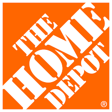
With a bright orange hue, angled layout, and a dramatic typeface, Home Depot’s logo is the cornerstone of their visual presence. The font is cleverly modeled after stencils, with just enough space in between to suggest there’s still work to be done.
Meanwhile, the sharp 45 degree angle of the words evokes feelings of hard work and determination. Notice also that the “H” and “E” in “HOME” and the “D” and “T” in “DEPOT” extend just beyond the orange square. This is a perfect illustration of “thinking outside the box” if we ever saw one.
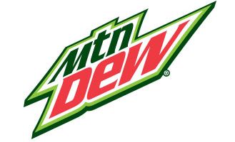
Abbreviated to “Mtn Dew,” this famous logo has become a cultural icon of a beloved beverage. This distinctive and zany design features the product name in complementary colors (green and red). Yet despite looking like a Christmas logo, the Mountain Dew logo evokes feelings of energy, athleticism, and youth culture.
The words are arranged at 45 degree angles, with the “M” and “W” distorted to stretch slightly beyond the core shape. Tight kerning and leading give the logo an urgent and dynamic feel.
Wrapping Up
What did you learn from these logos? Which do you think are the most enticing and effective?
The World of Graphic Design is on the rise in our digital age. It is a source of product marketing, and it also makes businesses stand out amongst competitors.
If you’re just starting out with a small business, your attention and commitment to your brand design is crucial.
If you’re looking for ways to help bring your company the attention it deserves by way of graphic design, then we’ve got you covered. Read on below to see our 8 graphic design tips for small businesses.
Online Design Templates Are Your Friend
As soon as you commit to making designs for your business, make sure that you get familiar with the various design tools that you’ll need to be successful.
As a small business owner, your money may be tight, and you may not have the funds right away to invest in a professional designer. The good news for you is that the internet has a wealth of knowledge and design tools for you to use, so you can hold off on hiring a designer and make designs yourself, at least initially.
There are logo maker tools, email signature tools, and merch design tools online. Some are even free to use! With all these tools, you can create professional graphic designs for your business in just a matter of minutes.
Know Your Story
Before you start the design process, be clear about what this design means to you and your business goals.
Firstly, does this design speak to your brand’s purpose and what your company offers? You shouldn’t create a design based off something cool that you saw on Instagram or a design that has no barring to your specific product offering. The graphic elements need to be personal to you, just like your product is.
If you’re clear on what your design’s objective is, then you can move toward creating the best design for the brand.
Identify Your Target Customer Base
Once you’ve found out how your brand design correlates to your business, it’s important to discover how it relates to your customers, as well.
Just like with marketing, your target audience will play a big part in how you proceed with your graphic design strategy. For example, are you providing a service for financial assistance or education? Are you posting vlogs about dog behavior? Perhaps you create daily food blogs? No matter your purpose, you want to have a clear view on who your audience is and from there, you can let your design speak to them.
Get That Logo Down
Your logo should be both unique and easily recognizable to your audience. They are, after all, the biggest identifiers for brands.
Although it’s great to research other companies to get an idea of how brands invest in their logos, your own should be something new and not plagiarized from bigger companies.
Get started with creating a logo by using online logo maker tools.
Choose Your Brand Colors
In graphic design, colors play a role in customers recognizing who you are amongst other companies. It also can be a deciding factor in consumers purchasing from you.
Brand colors have the power to influence and play on the emotions and perceptions of your audience toward your brand. So, use colors that signify your company. Neutral and warm tones like sandy brown, greys and whites often represent comfort and go with brands highlighting relaxation and home design. Colors like green can work for brands that promote financial help, health, or outdoor activities.
Remember, too many colors can be overwhelming and turn people away from your design and thus your product.
Don’t Go Crazy With The Design
You ever heard of the acronym K.I.S.S (Keep It Simple Stupid)? Well, that couldn’t apply more in graphic design. Simplicity in your graphic designs is key.
Now, simple does not boring or bland. A number of businesses think that too much white space in a design means that it needs to be covered up. Keeping it simple means creating something that is easy to read and interpret. This translates to limiting extra shapes, photos, and unnecessary wording.
Your Fonts Should Be Consistent
Similar to brand colors, fonts also play a crucial role in graphic design. The font and font size can make or break your ability to gain interest from customers. Make sure the fonts you use are easy to read and reflect your brand and audience personality.
More importantly, use the same font in all your graphic designs. Not only will it look better, but it will be much less distracting than having multiple fonts on one design. The rule of thumb is to stick to a maxim of two fonts for your design.
Research Other Companies
While you need to make sure that you aren’t copying other companies’ designs, consider doing some research to see what other, successful brands are doing with their graphic designs.
Take inspiration from how the put together meaningful creations to engage their audiences. Look at their colors, fonts, designs and services. Learn what works and what doesn’t work with graphic design from your peers and cultivate something unique for your business.
Customers return to the restaurant scene after a whole year off due to the pandemic in record numbers. As the business in restaurants increases across the country, it could be time to also revisit your logo.
A restaurant logo is responsible for the first impression you give your customers. Does yours invoke the right emotions? Does it represent your brand in the right way?
All of these are crucial questions you need to ask yourself when designing a restaurant logo. As the dining experience returns to normal, you wouldn’t want to miss out on customers because of an outdated or lackluster logo. Below are some general tips when designing yours and ten killer examples.
Tips For Designing Your Restaurant Logo.
Do not feel intimidated by the design process for your logo. All the choices you have can feel overwhelming at first. You should try to find enjoyment in the process. Picking the image to represent your business should be exciting! The design process is also not finite.
You can always go back to square one if you don’t like where you end up.
However, tip number one is mapping out a plan. You need to include several things. First, who are your clients? What do they like or appreciate? These are the people you want to attract to your restaurant. They are your target audience. By identifying them and becoming an expert in their interests, you can create a logo that appeals to them.
Secondly, identifying your target audience will help you know how you want to present yourself. Are you a classy joint? A family establishment? Or a relaxed hipster vibe? Choosing your logo should appeal to your target audience and represent who you are as a restaurant.
The easiest way to articulate the feeling you want to give is to envision what emotions you want to feel when you walk into your restaurant.
Thirdly, keep in mind how your targeted audience physically sees your restaurant. If your business is a more fast-food type, you’ll want an easily recognizable logo from the street while your customers walk or drive by.
Once you have a plan for your new logo set in place, you then should get designing. You can hire a designer or take it upon yourself. Neither one is right nor wrong. You should pick the one that fits your circumstances the best.
Take the path that feels like it is going to generate the most professional and representative logo.
Learn From Some Of The Best Out There.
There’s no better inspiration for your logo than looking at some killer examples. Below are ten restaurant logos that used theirs to accentuate their customers and brand.
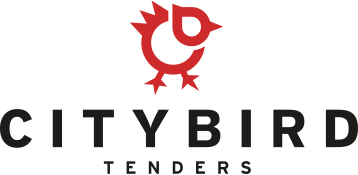
City Bird Tenders is a restaurant that serves high-quality chicken tenders, sandwiches, and other fast-food items. Their logo embodies their brand perfectly. The lettering is clear and tells new customers exactly what to expect. Additionally, the iconic chicken-shaped logo is easily recognizable while driving or walking.
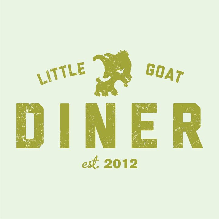
Little Goat Diner is a quirky brunch spot in Chicago. Located in the famous Fulton Market, the logo is doing everything it needs to for the restaurant. It gives customers a quirky and fun feeling with the cartoon smiling goat. Additionally, by encompassing the word “diner,” customers know what type of food to expect.
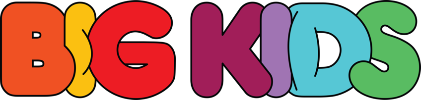
Big Kids is a restaurant that capitalizes on nostalgia, and its logo captures that feeling perfectly. It serves childhood-inspired meals and cocktails like artisan PB&Js and tang-flavored margaritas. The logo tells the customer exactly what to expect while the bright colors and lettering catch the eye. This logo demonstrates how to capture the feeling of your restaurant’s brand.
Oriole is a fine dining restaurant that embodies the word classy. Their logo naturally invokes a high level of prestige. The simplistic but elegant lettering tells the customer, they can only expect high-quality at this establishment.
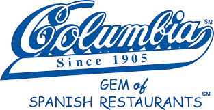
Columbia is one of Tampa Bay’s oldest restaurants, and the font of their logo gives off a feeling of timelessness. Plus, using the original logo is crucial because of its longevity. As a staple in the area, they kept the familiar logo. Why rebrand something everyone already recognizes?
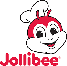
Jollibee is an international fast-food restaurant that serves fried chicken, spaghetti, burgers, and chicken sandwiches. The logo is an example of utilizing a cartoon character. The character is a play on their name. It’s a happy bee. Also, it captures the attention of their targeted audience: families.
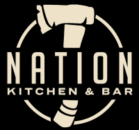
Nation is a burger and bar joint in Cincinnati, Ohio, that pulls a little local history into the logo. You won’t know the full story about the hatchet in the logo until you dine there. However, the mystery of the logo draws customers in and becomes a cool callback once they learn the history. It also demonstrates how mystery can be a device to intrigue potential customers.
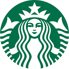
The logo we all recognize. Despite its universal branding, the logo is a great example of iconic symbolism. Simple and unique, the logo became something everyone knows. Your restaurant’s logo may never achieve the universal recognition, but you can still get inspired from the one-of-a-kind appeal of the Starbuck’s logo.
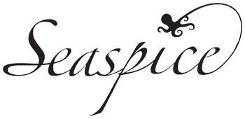
Seaspice is a seaside restaurant serving high-quality seafood and ocean views. The restaurant’s logo tells this exact story. The elegant lettering tells you it is fancy, and the octopus gives away the establishment’s food specialty.
Chipotle is another international fast-food eatery that specializes in Mexican. The logo uses the iconic chipotle pepper in the center. The color scheme embodies the flavor profile of the restaurant’s food: heat, earthy flavors, and spicy flavors.