Logos have been around forever, and companies across the globe use their logos to help tell their story and sell their brand. Their logo is representative of who they are and why you should buy from them.
Their logo gets to the heart of their uniqueness, and you can hear it in their stories. We discovered some interesting and cool facts about these 15 logos and thought we’d share them with you.
1. FedEx
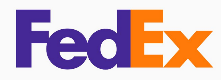
The FedEx logo immediately caught the attention of the CEO as he noticed the forward arrow between the E and X. Was this intentional? No. It just happened to be the space between the E and the X. But the designer, Lindon Leader, was very intentional about ensuring that it looked like it stood for something.
So, to make it stand out, he used the right combination of two fonts, Univers and Futura Bold, to make the arrow look natural and unforced. FedEx has been moving forward ever since.
2. Dominos
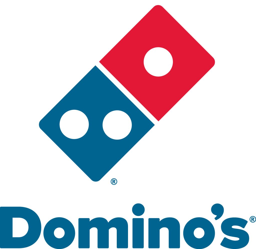
It can be difficult to keep up when your business is growing by leaps and bounds. Someone should have forewarned Domino’s owner James Monaghan in 1965 when he came up with the logo for Domino’s. At the time of logo creation, Tom only had three Domino’s stores, so the three dots were representative of each store.
The plan was to add a dot for every store thereafter, but the business expanded so fast that he decided to not even do it. Just think, Domino’s logo could have more than 13,000 dots by now!
3. VLC Media Player

If you’ve ever wondered what the cones represent in the VLC Media Player logo, you’re probably overthinking it. Apparently, the students who were responsible for writing the code used what they had. They had collected a lot of traffic cones, so they thought it would be good to use as the logo.
4. Bluetooth
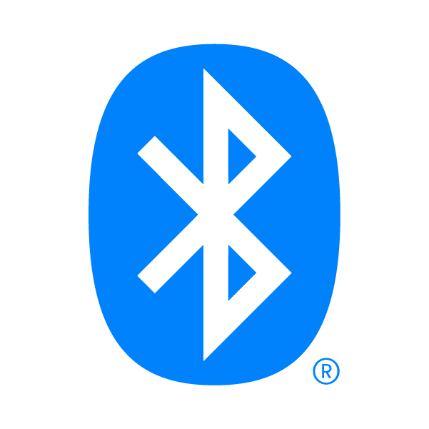
The Bluetooth wireless design was named after King Harold Bluetooth, who ruled Denmark between 958 and 986 CE. During his reign, the king united the tribes of Denmark into a single kingdom.
This analogy fits well for the Bluetooth logo since the technology unifies various devices and makes communication between them easier. The logo is a merging of two Scandinavian runes that represent the king’s initials.
5. Wikipedia
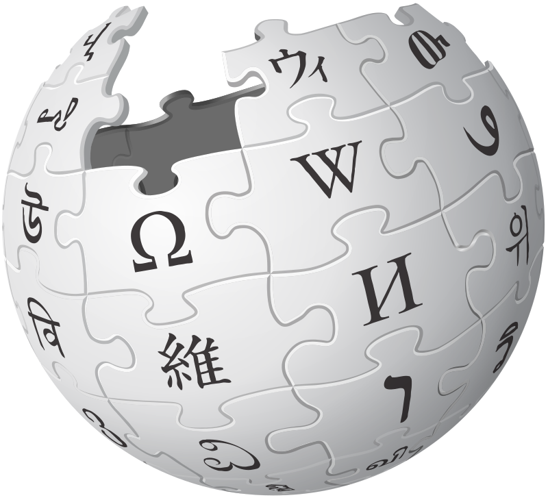
With Wikipedia being an online encyclopedia, ever-knowing to all there is, it’s not surprising that their logo would symbolize the world. The logo represents a globe constructed from puzzle pieces.
Each puzzle piece bears a character symbolizing the multilingualism of Wikipedia, and the missing pieces at the top symbolize the infinity of the knowledge, there’s more to come.
6. Android
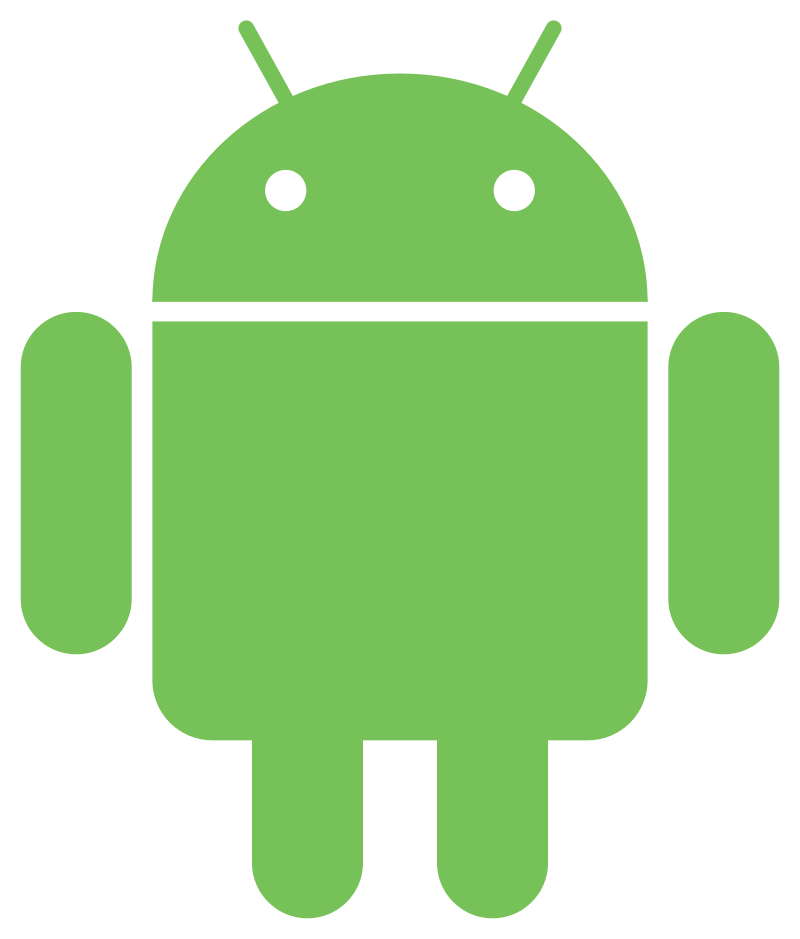
It turns out Android can credit the male and female symbols we see on the outside of the bathroom for the inspiration that came for their logo. The logo designer needed to be inspired to create a logo that would include a robot and be easily recognized.
See if you can recognize the ideas he got from the male and female symbols seen universally outside of restrooms. Just goes to show that inspiration can come from literally anywhere!
7. BMW
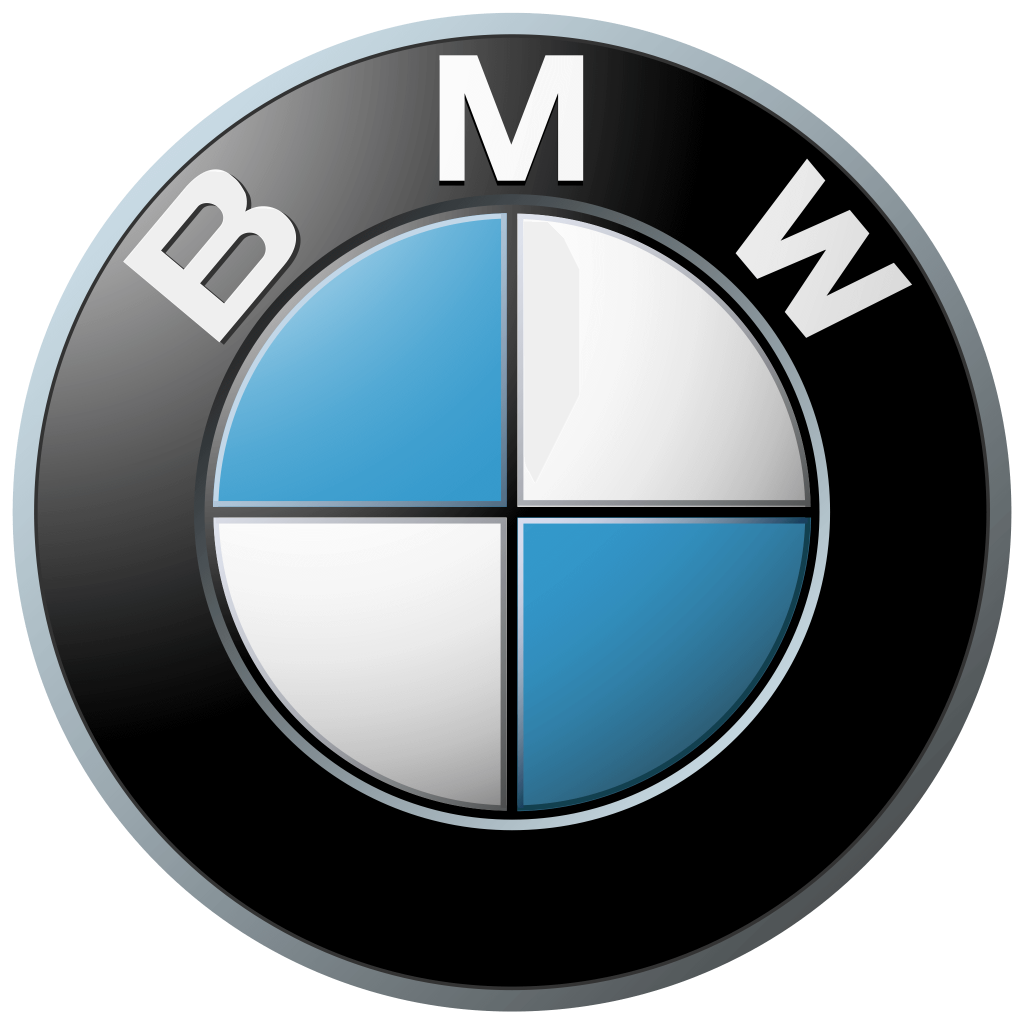
Although most think the famous BMW logo symbolizes an airplane propeller, it’s much simpler than that. While it is true that the firm’s first technical creations happened to be aircraft engines, the designers chose the logo to represent the Bavarian flag. When you google the Bavarian flag, you’ll get it.
8. Pinterest

Sure, the spelling of Pinterest has the first three letters of the word pin, which symbolizes “pinning” pictures to walls. But if you look closely at the “P”, you’ll notice that the line is literally a pin that you would use to pin pictures to the wall.
9. Uber

Uber’s new logo is more synonymous with the notion that you can find an Uber anywhere you go. The logo was changed from a “U” to a symbol that is meant to resemble an atom. The new logo represents the fact that their cars can be found anywhere, just like bits or atoms.
10. Baskin Robbins
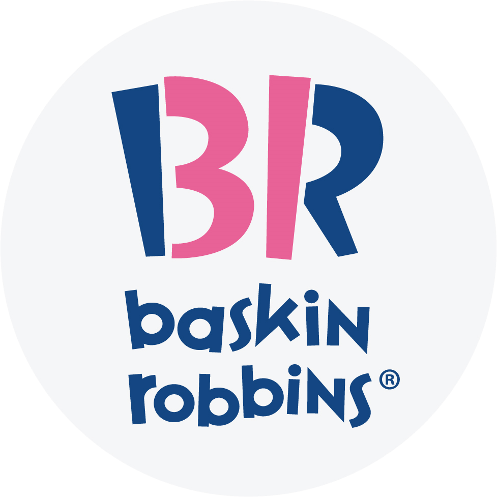
Baskin Robbins started their company in 1945 with 31 flavors of ice cream, and they made a point to include that very important number in their logo. Can you see it?
11. Ferrari
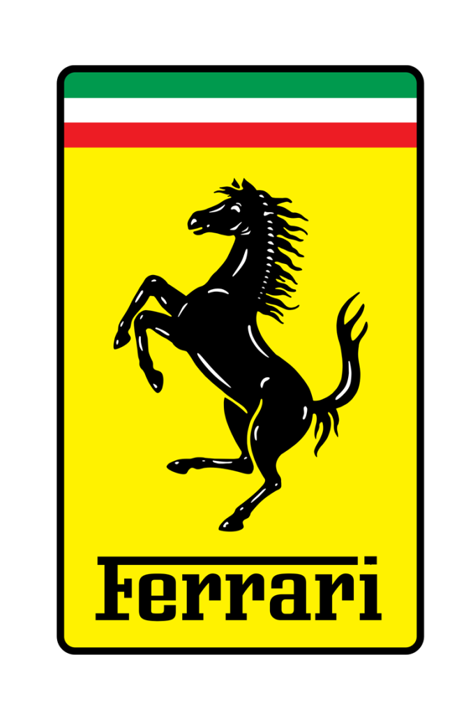
Many people probably think the Ferrari logo symbolizes horsepower, but it doesn’t. Turns out, a horse silhouette was initially painted on the plane of an Italian ace pilot Enzo Ferrari knew. The emblem was later given to Ferrari by the pilot’s mother after he won a very important race, and the rest is history.
12. Lacoste
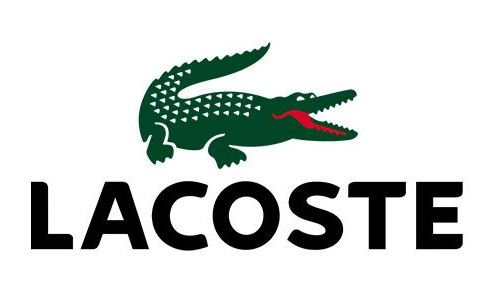
Rene’ Lacoste made a bet and lost. The bet cost him a crocodile suitcase he desired in a shop window. Had he won his game, he would have won the suitcase. A journalist who overheard the details of the bet wrote an article about a tennis player who hadn’t won his match but fought like a crocodile.
From that point on, the name Crocodile was given to him. It only seemed right to have a crocodile serve as the logo for his company.
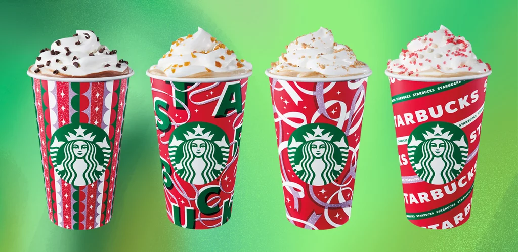
13. Starbucks
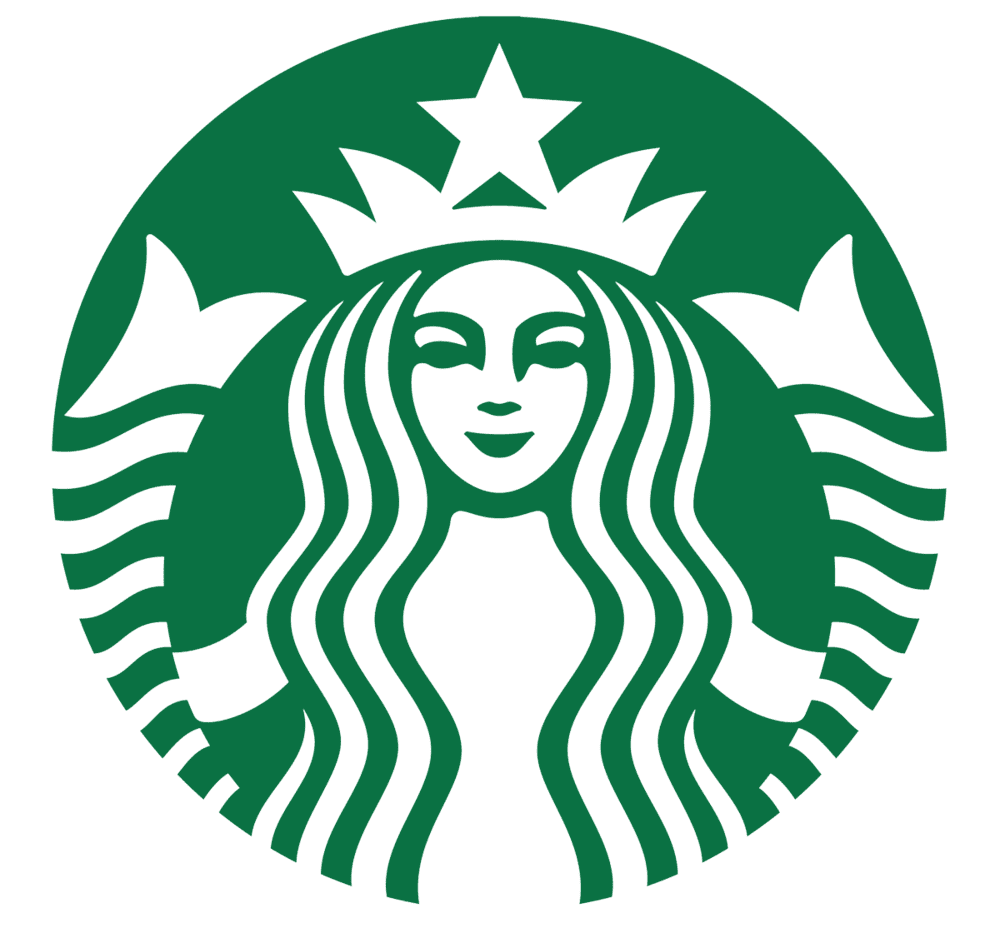
The inspiration for the Starbucks logo came from a myth of a fairy, a woman who was also a fish who was holding her two tails. You could see the nakedness of the woman in the 1971 version of the logo.
That logo was censored and we now see a more respectable-looking mermaid on the logo. Her hair covers her breasts, and we can no longer see her entire two tails, only the ends of it on both sides of her.
14. MGM
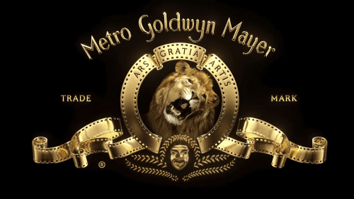
Since 1917, Metro Goldwyn Mayer, also known as MGM, has used seven different lions for the lion roar that accompanies their famous logo. It’s not as easy as you think, though. The lions have to be tamed and trained to roar on cue.
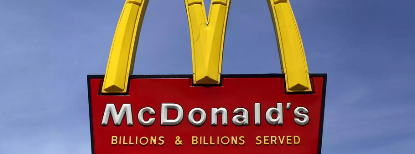
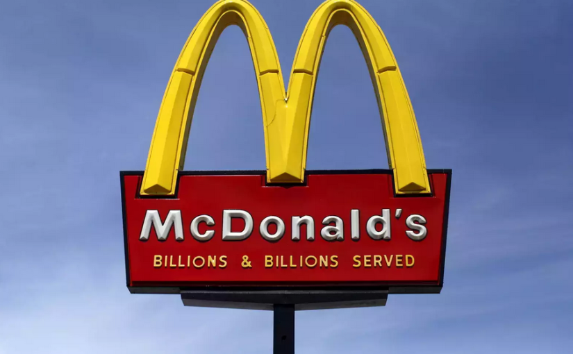
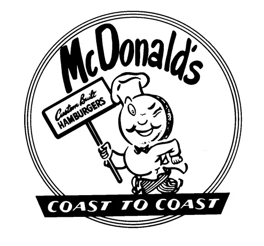
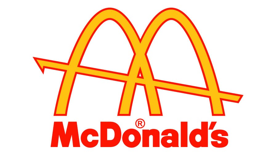
15. McDonald’s
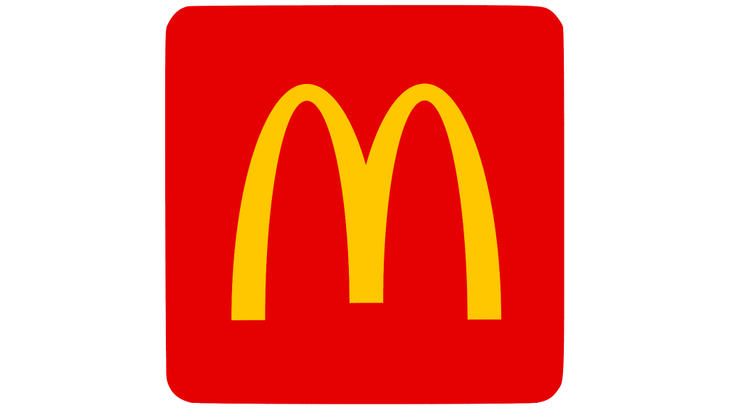
McDonald’s thought that arousing people’s appetite would make them spend more money on their food, so in 1962 they hired a psychologist who came up with the arches. His thinking was that the red tips inside the arches resemble female breasts, which subconsciously reminds people of their happy childhood and arouses the appetite.
McDonald’s has been using the arches ever since. Who knew the favorite take out of so many families with children, had a somewhat NSFW inspiration for its logo?