And Some You Might Not
The logos for toy companies are more than just the symbol of the brand but are also a promise that you will get the same quality from their toy line that you have come to expect since they started putting products on the market.
Their line of toys has changed over the years with new materials and standards of safety, but the logo still stands for the underlying resolve of the manufacturer to make the best playthings for your children.
The importance of a toy brand is in its niche audience, which is primarily children, who might not know why their favorite toys are made by Mattel or Hasbro but will often affiliate these companies only with selling toys and nothing else.
There have been movies made based on certain toy lines, such as the Transformers and GI Joe movies, but that is as far as they extend beyond their wheelhouse.
The Logos You Love
Here are a few of the more famous toy manufacturer logos you will easily recognize that go back decades and are still thriving to this day:
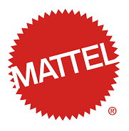
Of the toy dynasties, Mattel is probably the one that comes to mind first if you were asked to name a toy manufacturer off the top of your head.
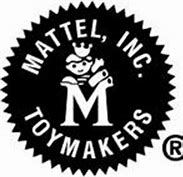
Started in 1945, Mattel is the brainchild of two founders, is the current holding entity of several toy brands under its umbrella, and the logo has had many changes over the years, all starting from the one displayed here on the left, which ran from 1955 to 1961.
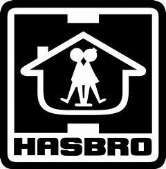
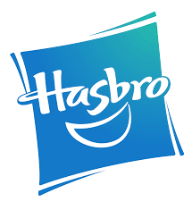
Hasbro was started in 1923 and carried the original name of Hassenfield Brothers, Inc, before being shortened to Hasbro in 1944. Along with the evolving logo that changed roughly every decade since the company’s beginning, the Hasbro boy was also introduced to market their toys on TV using animation.
Today, to ensure their brand is associated with the playfulness of a child’s spirit, the logo features a smile below the company name.
Fisher-Price has always been a beacon for fun to children of infant and preschool ages. Their logo was designed to inspire the creativity, growth, and ingenuity of young children while also showing a sense of whimsy.
During the middle years of the brand, the logo got a little stale and dated, so they partnered with Pentagram, a marketing firm, to restore their brand identity as a playful product line.
In 1928, two women had a vision. They thought, what if toys could be for more than just play, but open entirely untapped parts of a child’s mind. As teachers, helping children grow to their potential and studied what made children better versions of themselves in the classroom.
They started Playskool based on their observations. The original logo created in 1928 was modified in 2000 from the traditional rectangular version to the oval most widely seen today.
Antonio Pasin invented the Radio Flyer wagon in 1917. It is unlikely that, to this day, his labor of love would still be carting children around, or at least their belongings. His original design was entirely composed of steel, with quality wheels to ensure speed and a smooth trip, and those variables are present on the famous logo for this beloved brand.
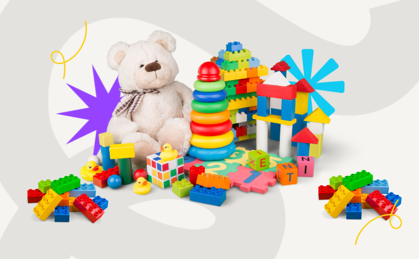
More than almost any toy, Legos are the most universally recognized by children and adults alike. The logo was designed in 1934, but the brand didn’t get as much attention from its logo recognition and changed it a few times for the last 64 years, finally nailing it in 1998. They did the best thing they could and kept it big, bright, and very simple.
Taking the applications of foam to the next level, Nerf brand toys will always be known for their innovations in playful artillery. The brand name has always been part of the logo, however, the logo colors, the font of the letters, and even the shape have been very fluid, changing wildly over the years.
The letter “e” in Nerf for some of the designs was lower case, yet today’s version is all uppercase in thick block letters.
Some Lesser-Known Logos
These are still common but will never quite hold a candle to the giants of toy manufacturing. Still, they make a great product and are worth your attention.
A proverbial babe in the toy game, K’Nex is not your average building set like the products from Legos. Instead, they went a different direction, making construction toys that help the user learn about kinetics, robotics, and physics.
The Rodon Group developed the logo based on what you are supposed to do when building their products, which essentially, is to connect the pieces. Hence, K’Nex.
Despite being a German toy manufacturer that only opened their line in 1974, Playmobil is to this day Lego’s biggest rival in the building blocks niche.
The first logo was drawn with Playmobil written in Sans Serif in all lower case, above the uppercase word “SYSTEMS.” Later, the “SYSTEMS” had been replaced, not with words, but with a smiling child’s face above the company name logo. It identified the product line as friendly.
A more recent update removed the child’s face but its overall word mark stayed the same.
MGA was founded in 1979 and, while their logo might not look familiar, they are one of the larger toy companies with a reputation for brands that cross a variety of products. Their playthings have the innovation and intuition to predict what the next generation of boys and girls will want.
They had their first major success in 1997. The logo has changed to adding shapes since its release, the placement of “entertainment” has shifted and a more 3d effect overall was added.
Playmates was founded in 1966 in China. Their specialty is promotional toys, and despite fluctuating metrics and market volatility, they continue to be a leader in the industry.
Their logo has undergone almost no changes over the years, with one exception, and that is the word “toys” which was added to draw a distinction between their brand and the playmate products sold in Playboy magazine.
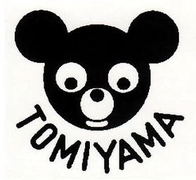
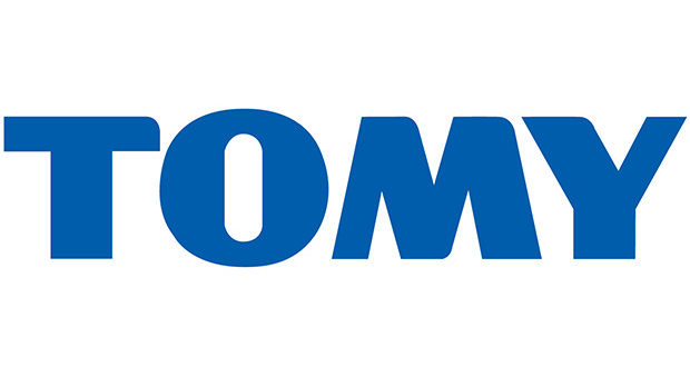
A Japanese company founded in the 1920s, it was originally called Tomiyama, named after its founder. It is hailed as one of the first toy companies to have an assembly line and a research wing.
In the beginning, they specialized in toy planes and have propelled toy innovations and modernization since its opening. The logo is a pared-down version of the original which said Tomiyama Tomy, and is now just “Tomy.”
Wrapping It Up
Kids don’t look for brands. They know what they like and they gravitate to it. It is the parent’s job to know who makes the product, how they are made, and if they are safe. Consumer reports catch manufacturing problems all the time. The easiest way for you to know which toys are good for children and which might harm them is to look for the bright logos. They are always featured when a brand has trouble.


