Nobody likes ads…until they do. The right ad can make your potential customers laugh, nod their heads, or come down with a case of FOMO. When done well, ads start a conversation with your audience.
So, how can you capture consumers’ attention and speak to their desires in one simple ad? It all comes down to the visuals. Design is a powerful communication tool. Here’s how to cut through the noise and make a lasting impact with just a few words!
#1 Make Your Fonts Legible
Your audience does not sit down to consume ads. They are an interruptive form of marketing, one that pops up throughout people’s daily lives. To catch their eye, you need to make your ad as legible as possible.
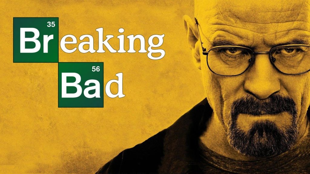
The first place to start is the typeface. While fancy cursive or funky headline fonts may be fine for a wedding invitation or album cover, ads’ typefaces should be clean, simple, and highly legible.
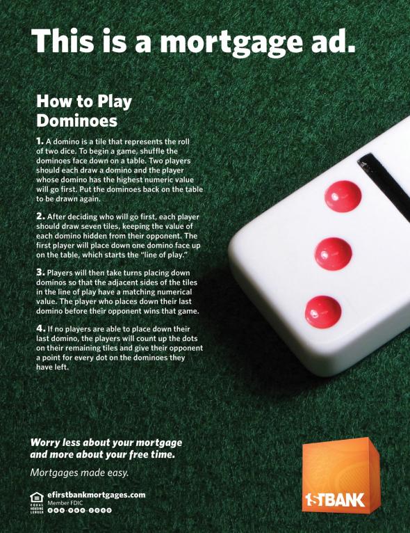
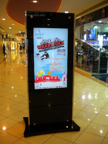
For example, this ad design features too many different typefaces, several of which are tightly kerned or heavy cursive. There is also way too much text on the design. Much of it could be illustrated visually!
#2 Limit The Text
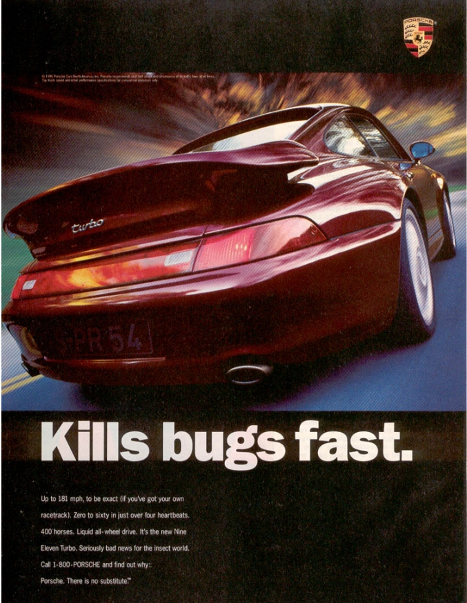
In addition to having great copy on your ad, you must keep it short. Most people can read short snippets of text in mere seconds. But once you start putting paragraphs on your ad, you’ll quickly lose them.
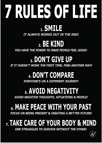
For example, this ad design started with a great concept (“we make mortgages easy so you have more free time”) but got weighed down by its long paragraphs.
Also, each bit of text should have a font size proportionate to its importance. Obviously, key heading and calls to action should be the biggest! That’s not the case in this design.
So, keep your ad copy short and sweet. It’s best to use active language and simple phrasing. Remember, you want people to read it as easily as possible. Bonus points if you can make it funny!
#3 Embrace The F Pattern
People tend to process visual information from left to right across the top, then down the left side and across. This “F pattern” describes how most viewers direct their focus.
Therefore, important elements should be at the top and left of your ad design.
#4 Mix It Up
Sameness is the enemy of attention. The more similar your ads’ visual elements, the less likely it is that viewers will parse critical information. Your most impactful graphic should outweigh the others.
Also, headings and other key messages should be significantly larger than the other text.
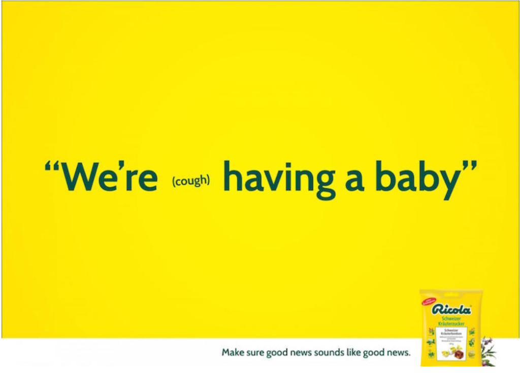
You can play with font sizes to further express your message. Consider how this Ricola ad illustrates how a small cough can intrude upon a conversation.
Also, each graphic should be sized appropriately to capture attention and balance the other elements. This is especially important if you have lots of images in your design!
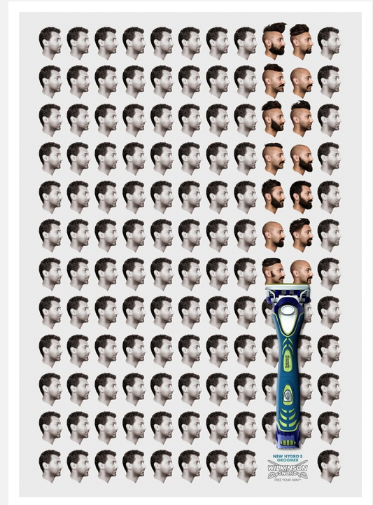
Notice how this ad design balances the size of the razor against the grid of portraits. The razor is placed in the lower third, which gives the overall layout a dynamic feel.
#5 Get Suggestive
Let’s face it: the most provocative ads are often the most effective. Tantalizing or tricking the audience definitely gets their attention!
To make this design approach work for you, consider how you can tease something taboo or uncomfortable. Then, let the viewer fill in the gaps.
#6 Optimize Your Use Of Color
Your ad’s color scheme has more of an impact than you might imagine. First, colors play a huge role in how people perceive and process your design. Intentional color choices help express your values while engaging your audience.
Second, colors can clarify your key message. See how this ad uses color contrast to draw attention to the most important visual elements.
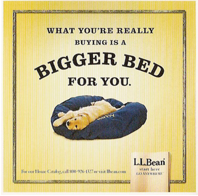
#7 Leverage Color Psychology
Following from tip #7, consider how different colors evoke different emotions. Color psychology is a well established set of principles that guide how people perceive visuals.
For example, purple suggests power, yellow connotes friendliness, and so on.
This L.L. Bean ad uses a friendly yellow to complement its central image of an adorable golden retriever. Combined with a witty, benefit driven headline, the overall design creates feelings of comfort and happiness.
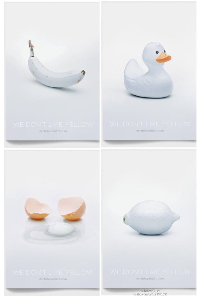
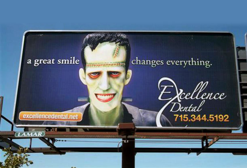
By the same token, a deliberately “wrong” color choice will turn viewers’ heads and get them to pay more attention. That’s because our brains want to reconcile any incongruous information.
Take a look at how this series of dentist ads portrays famously yellow objects as pearly white to promote their services.
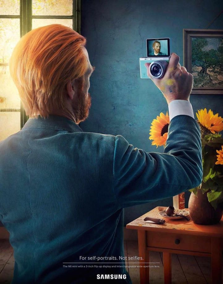
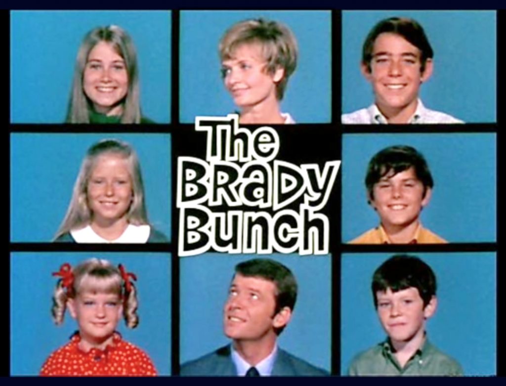
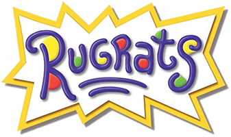
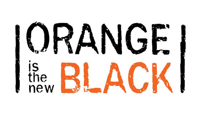
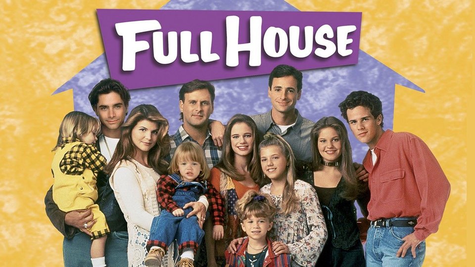
#8 Incorporate Iconic Figures And Places
Our brains are wired to pay more attention to what we already know. That’s why recognition is so critical to advertising success. You want people to instantly recognize the elements of your ad.
If they don’t recognize your brand itself, use something they will definitely find familiar.
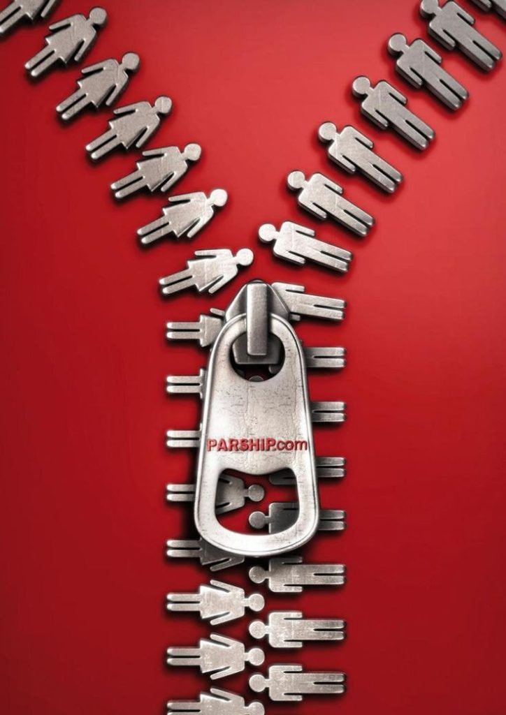
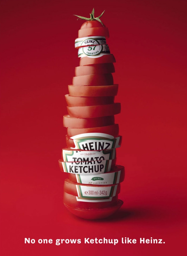
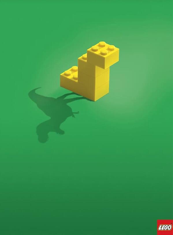
#9 Focus On Concept, Not Content
Ad designs don’t need to be highly literal. For example, it may seem obvious to depict a lawnmower for a lawn care business. However, is that unique enough to be eye catching?
Remember, the key to effective marketing is to emphasize your benefits over your features. Try using visuals to illustrate a concept rather than merely describing what you do.
For example, can you guess what’s being advertised by this design?
If you guessed “matchmaking service,” you would be correct!
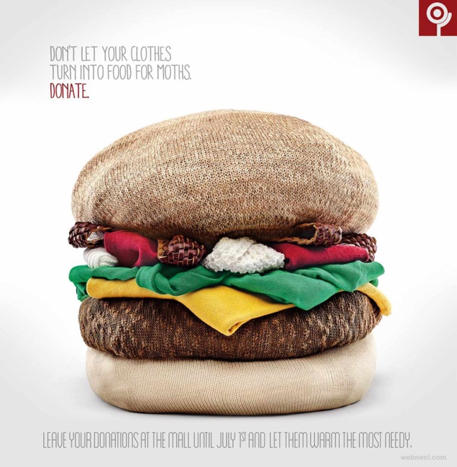
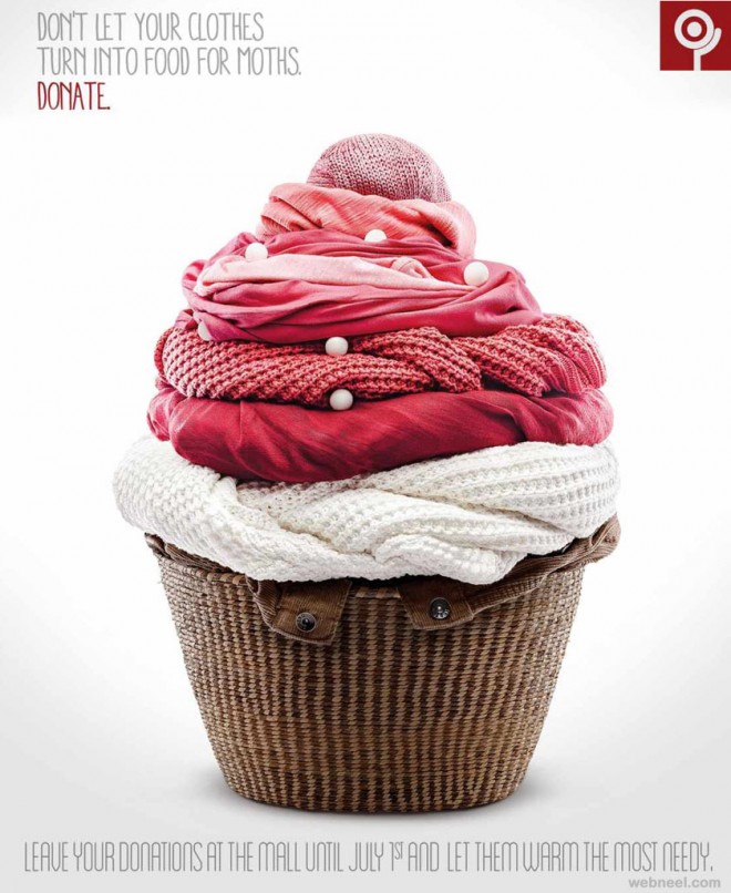
Here’s another example that illustrates the key pain point the brand wants to resolve: getting old, moth eaten clothing out of your home.
#10 Choose A Strong Image
The most impactful ads are rarely complex assortments of words and pictures. A single, compelling image grabs your viewers’ attention. If you can send a clear message with one image, do it!
As the saying goes, a picture is worth a thousand words. An iconic image for your ad might be worth a million.
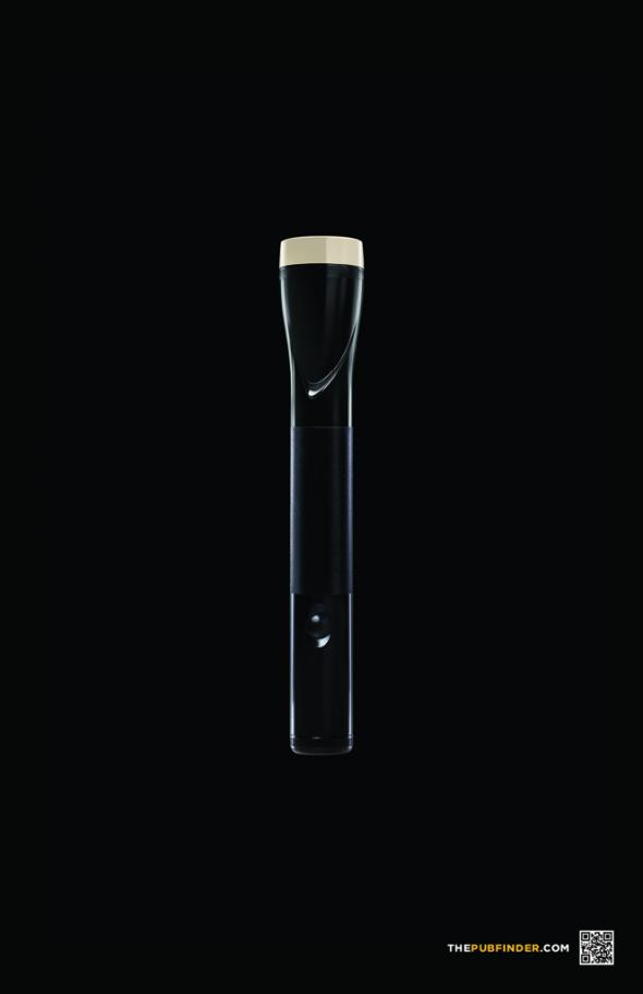
#11 Use Visual Mimicry
Ad design is an opportunity to get creative with your images. Rather than visually depicting your product’s benefit, illustrate it with an imitation.
Portraying a well known object as your audience’s desire (or even their pain point) engages their interest with few words.
A refreshing lime or dragonfruit infused tea? Coming right up!
When taking this approach, be sure that you differentiate the image from what it’s mimicking!
For example, this ad for PubFinder.com is comparing a flashlight to a pint of beer, but at first glance, it looks too much like the former.
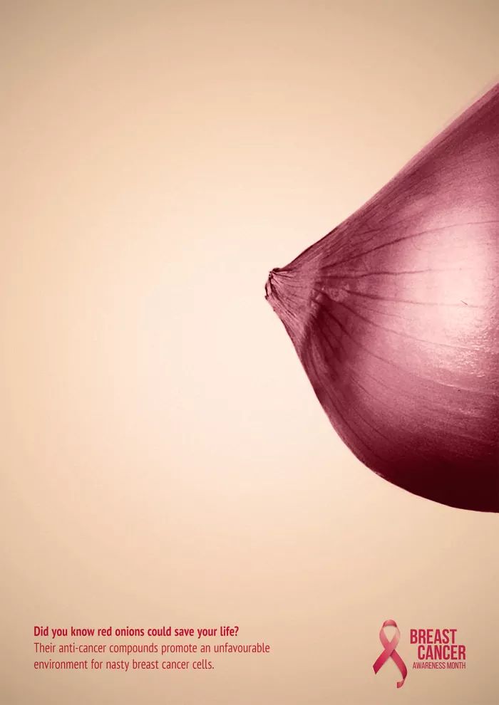
#12 Lead With Symbolism
As we discussed above, shorter is better for your ad’s text content. You want to catch people’s eyes without forcing them to read too much.
But what if you could share your message without making them read at all? A symbolic design can say much more than words alone. More importantly, symbolic images resonate more strongly with audiences.
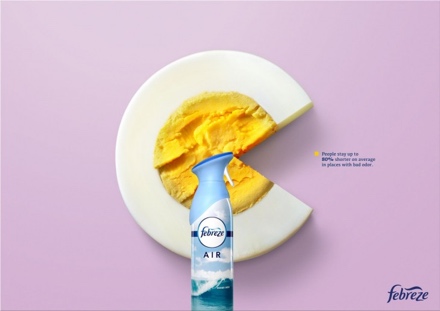
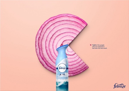
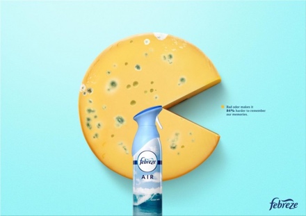
Tap into visual metaphors to express deeper themes in your ad design. These can include images with certain connotations as well as altering graphics to deliver your message.
For example, check out this Febreze campaign that depicts well known smelly foods as pie graphs.
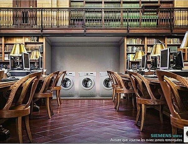
And this design portrays typically noisy objects (washing machines) in a typically quiet place (a library).
The clear message, discernible with minimal copy, is that these washers are much quieter than their competitors.
Wrapping Up
There are definitely some time honored principles for great design … but innovation is crucial for standing out in today’s information overload!
Consider your target audience’s interests, psychology, and pain points, then get creative with your visuals.
Keep the text short and sweet, and swap out copy for strong imagery whenever possible.
Remember: you have just a few seconds to captivate your potential customers. Make them count!


