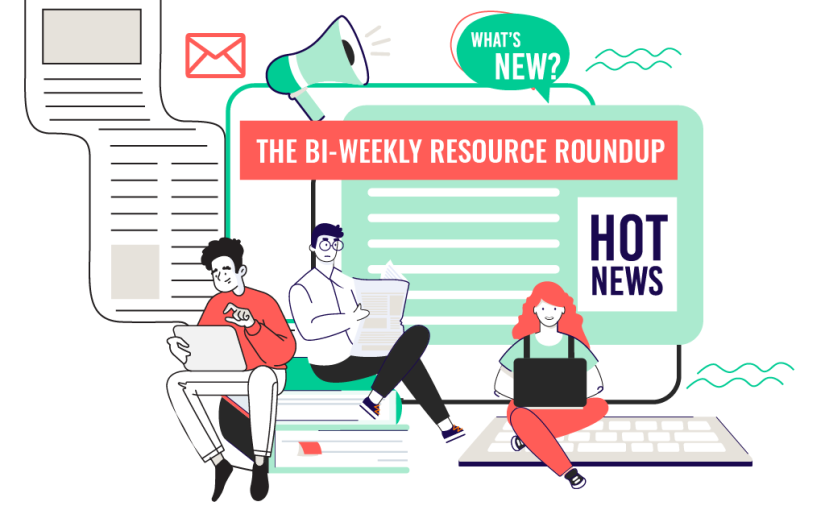
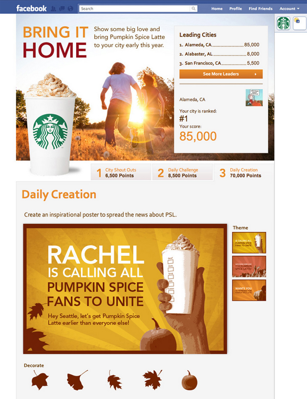
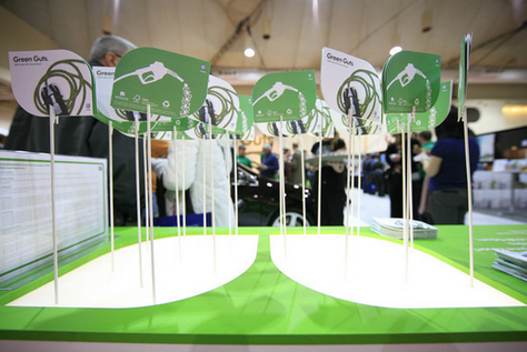
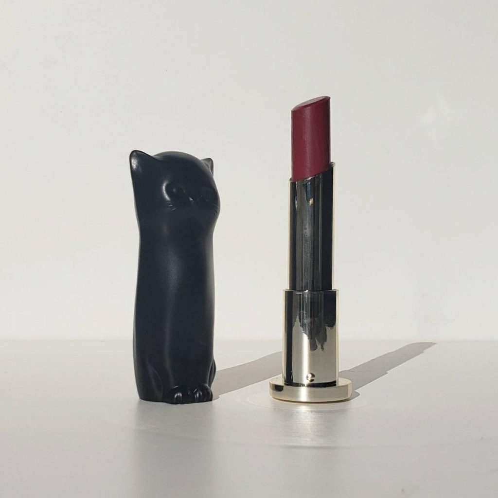
Here is a custom facebook ad mockup created for a client by Flocksy team member Amanda.
All custom illustrations/brand designs/marketing materials on Flocksy are created completely from scratch by one of our extremely talented graphic design creatives.
Start a graphic design project today and see results in just hours!
There’s no question that a social media presence is good for business. Over 80% of people in the US have at least one social media profile, and more than half of those have multiple accounts.
That means there’s a high chance of reaching customers on various social media platforms, whether through brand awareness, content marketing, or video ads. In fact, the majority of social media users also use their favorite platforms to directly purchase products.
While some of the best social media platforms to include in your marketing campaigns are household names that you may already use, there are a number of less commonly used apps with millions of daily users that can be an effective addition to your media mix.
Here are our top 12 social media apps to market and grow your business – in no particular order.
Facebook is not only the biggest social media network in the world, it also has the most developed advertising platform of all of the apps available. Because it is such an established site, the tools at your disposal are easy to use, intuitive, and make the most of your budget.
Whether you choose to list your business on Facebook, utilize ads to target users, or set up your customer service through Messenger, it’s very likely new customers will find you there.
Unless you’ve been living under a rock, chances are you’ve heard of TikTok, one of the fastest-growing social media apps of all time.
With TikTok’s reputation for attracting a younger generation and having its own set of rules and trends dictating videos including dancing and lip-syncing, some businesses shy away from the platform.
But given it’s enormous potential for advertising either as a business or through influencers, companies should take note.
Smart advertisers already know that Instagram is so much more than a place to post vacation pictures. You can easily start by setting up an Instagram business profile and posting deals, promotions, sales, and product information.
As a visual app, companies can easily post images or videos without having to write long posts. Instagram also gives its business users access to dedicated resources to assist them in growing their audience.
Looking to branch out into international markets? If you’re considering China, it’s important to note that many popular US social media apps like Facebook and Instagram aren’t available to Chinese consumers.
This makes WeChat a great option for businesses looking to enter the Chinese market. While it started as a messaging app, it has grown into a platform for online shopping, advertising, and booking.
Pinterest is a social media site for curating a digital pinboard of your ideal aesthetic – whether that’s through interior design, fashion, beauty products, or even food.
While the company does provide Pinterest Ads to businesses looking to promote their services, simply setting up a free Pinterest profile for your business to tell visual stories about your products or services can drive serious traffic to your company.
Similar to WeChat, QQ is an instant messaging app. Based in China, the platform has grown its reach into more than 80 countries with a whopping 807 million users.
That’s twice the number of Twitter users around the world, making QQ the biggest social media app you’ve never heard of.
While Reddit began as a more obscure destination for internet users with specialized interest, it has quickly grown into a reputable platform for crowdsourced information.
While finding your niche on a subreddit is relatively easy, a self-promotion ban is heavily enforced on the site.
This means businesses need to get creative with what they share. With 430 million users, however, the payoff is well worth it.
One of the oldest and most established social media sites, Twitter allows you to share videos, pictures, and short posts in real time.
Many companies have found success with live-tweeting and using hashtags for promotions, as well as using the opportunity to easily interact with users.
The platform also boasts business-friendly tools such as Twitter Analytics to track the success of your campaigns.
Users watch over 1 billion hours of video on Youtube every day. That’s good news and bad news for companies looking to expand their video marketing: there’s a lot of users to watch your content, but there’s already quite a bit of great content out there!
Decide ahead of time how you’re going to make the best use of your YouTube marketing strategy by asking yourself beforehand if you want to grow your audience through search optimization, promote products through direct ads, or increase brand awareness through content marketing.
Formerly known as “Google My Business,” your Google Business Profile is a listing for your company that users find when searching on Google.
While it’s more of a straightforward listing service, you can use the social media aspects, such as reviews and localized posting, to your marketing advantage.
Data shows that keeping your Google Business Profile verified and up to date significantly increases your click through rate and any potential purchases.
Companies may shy away from Snapchat because the main draw of the app is that content disappears after 24 hours.
But many intrepid brands have found ways to use that to their benefit when marketing, by promoting sales and other news with more urgency to their users.
Snapchat allows you to directly tap into a younger audience with a basic free profile, or choose to pay to advertise your posts on their discovery page.
Whether you’re new to marketing or are a seasoned veteran, every marketer needs to know how to make an explainer video.
Explainer videos are where you can come alongside your customers and give them the answer to their products in the form of your product or service.
They’re a way to show the conflict, turning point, and resolution in the buyer’s journey. But what if you’re stuck on what to do when making your explainer video?
It’s one thing to know the elements that go into one, but you’ll need some creative inspiration to keep your muse pumping for as long as you need it to.
Luckily, we’re here to help you. This blog post will discuss 10 examples of great explainer videos and why we like them so much.
Microsoft is one of the tech giants of the modern age, and their explainer video covers the dangers of cybersecurity threats and how Microsoft can help individuals, businesses, and companies better manage this problem.
The smooth graphics, informative speech, and excellent solution make this one of our favorite explainer videos.
Cisco is another leading cybersecurity company here to showcase its explainer video.
This video details all the companies using their model to complement the threat-centric method, beginning with the concept of trust, the basis for an excellent customer-company relationship.
Because the idea of customer trust is so vital to the image of a functioning business, we’ve rated this explainer video pretty high up on the list.
Ahrefs, using the domain Semrush, is an SEO-keyword search engine. And they make use of that in their explainer video, too!
But, of course, the best way to make sure people know about you is to hook them in immediately with what they’re searching for, and they use that by opening with the phrase “Here’s the problem.” Take a look at their video today!
Have you ever wanted to pay someone without having to give away all your bank account information? If so, Paypal is your site, and their explainer video captures customers’ attention.
The animation combined with live-action filming makes the fantasy of ease with money transfers a reality. The promise of convenience makes this explainer video a good one.
The cute graphics and friendly voice make Fonolo one of the explainer videos we’d recommend to you.
First, the problem is introduced but given a silver lining – you have a thriving business. Still, you need a better call center to keep up with everything.
Then it offers the solution in a chipper tone: Fonolo. This device allows people to automatically be called back once an agent is available. The pleasant voice, layout, color palette, and music make this a great example.
This explainer video takes a slightly different approach than the ones we’ve covered.
Still, it’s one of the best for that very reason. Rather than discussing the problem and only offering the solution after they remind the customer of their situation,
Slack shows the answer right off the bat. The video below depicts a happy world with a digital HQ so employees can communicate and invite you to join in.
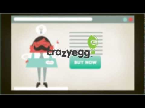
Crazy Egg’s explainer video below taps into an issue that all marketers have: the need to analyze and expand their web traffic.
The problem is relatable, meaning they can discuss it in detail before moving on to the solution – getting one’s website analytics started with Crazy Egg. Look for yourself!
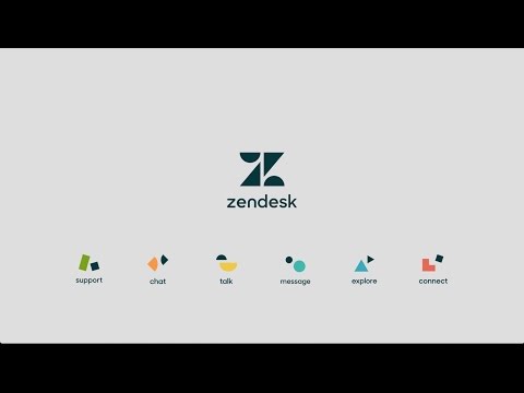
Zendesk, like many other explainer videos described here, makes use of visually stimulating elements to deliver a compelling message about a product people desperately need.
For example, customer service is defined using shapes, in keeping with their brand redesign, and the analogy of puzzle pieces to people is kept as a theme throughout the video. Take a look to see what we mean.
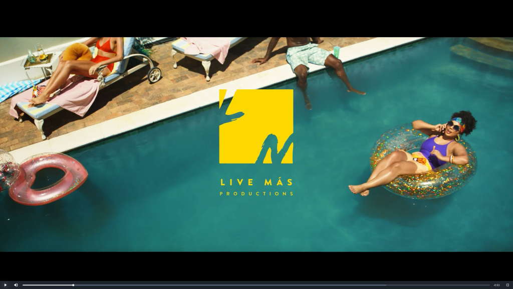
It works for movies, and it can work for you, too! A teaser trailer gives audiences a sneak peek of what your brand has to offer. Use one to welcome people to your YouTube channel, jazz up your landing page, or as a pinned post on Facebook or TikTok.
You can play up the cinema theme with an exciting supercut of your product, or take a more practical approach and show them around. Choose the concept that best suits your brand personality.
For example, Taco Bell has created a series of trailer-style commercials to promote its products, under the fake studio “Live Mas Productions.”
Who doesn’t love a challenge? Choose an activity that makes sense for your target audience. Then, let your followers try it themselves. When promoted well, challenges can attract attention from other social media users. This creates a lot of potential for people to discover your brand!
Your challenge could be a physical action that people replicate (e.g. the ice bucket challenge), a problem they solve, or their twist on a theme. Think about what would entice your potential customers yet also drive them toward your product.
During the pandemic, stores such as Michaels and Jo-Ann Fabrics began offering online crafting classes. These helped them stay afloat while people were staying home.
And it turned out to be a great idea. Customers loved the opportunity to learn and have fun with crafting experts! See the full videohere
What’s your brand’s area of expertise? Turn it into a virtual class or workshop. You can release sessions as an edited video or a live stream.
4. Use Guerrilla Marketing
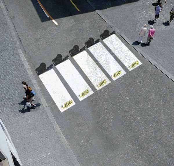
Named for independent fighters with unconventional methods, guerrilla marketing means popping up in unexpected places.
For example, instead of posting handbills, you’d paint a mural advertising your brand. You could also do impromptu street demos or flash mobs to grab attention.
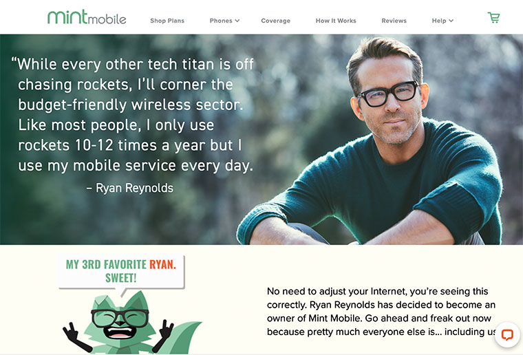
If it suits your brand identity, spice up your marketing with a bit of comedy. Insurance giants GEICO and Progressive have both become cultural icons thanks to their whimsical and absurdist commercials.
But you don’t need a huge advertising budget to make your audience laugh. Try making a humorous skit to release on your social channels. You could even poke fun at yourself if it makes sense for your brand personality.
Here’s an example of how Mint Mobile owner, actor Ryan Reynolds, uses his offbeat comedy to promote the business.
Witty copywriting, the whimsical mascot, and the funny quote from Reynolds help forge Mint Mobile’s silly yet relatable brand identity.
Everyone likes to feel smart. Give your audience a chance to show off their trivia knowledge. A quiz could be a fun piece of social media content to boost engagement.
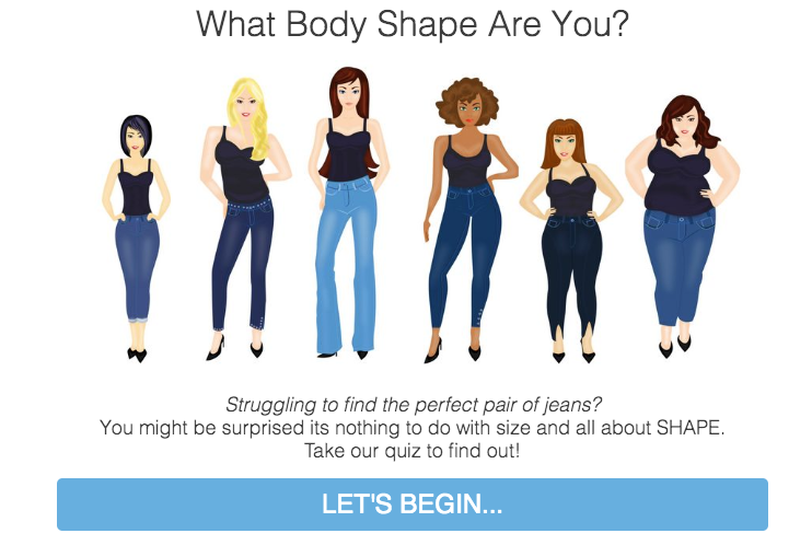
And don’t forget personality quizzes! These are perfect for engaging your potential customers and making them feel special. For example, you could let people find out their “hair personality,” and then drive them to your haircare products.
Above is a great example from ILoveJeans.com that encourages visitors to find their body shape before browsing the shop.
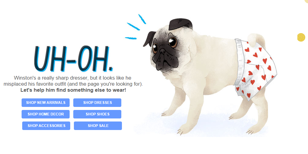
7. Rethink Your 404 Pages
Affirm your brand identity and keep wayward customers engaged with customized 404 pages. Following a broken link is frustrating. But if you get creative with your 404 page design, you turn a mistake into a marketing opportunity!
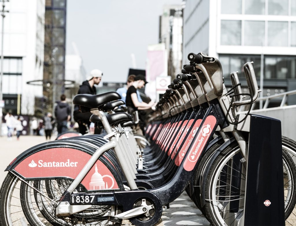
Need to expand your customer base? Try putting your name somewhere unexpected. In addition to pop up advertising (see idea #4), you could sponsor a product, organization, or event that aligns with your brand values.
For example, banking giant Santander sponsors these city bikes that residents can rent. This gets their name all around town, literally!
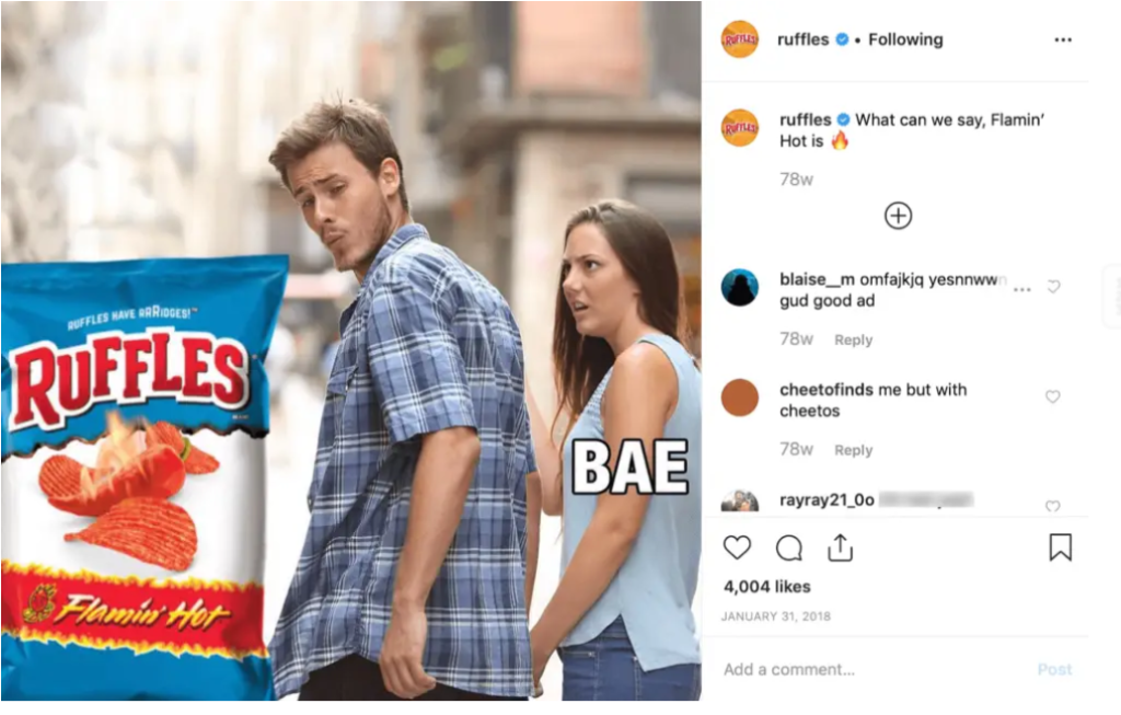
Memes are the bread and butter of the internet, right up there with funny cat videos. If it makes sense for your brand, create some memes! You could poke fun at a relatable situation, portray your brand in a humorous way, or show what happens without your product.
Here’s a funny example using the popular “Distracted Boyfriend” meme format. It not only plays on the word “hot” but also jokes that people would ignore their significant other for Ruffles chips.
Before creating a meme, make sure you understand the origin of the meme format and how to use it. Otherwise, you may seem out of touch, inauthentic, or even cringey.
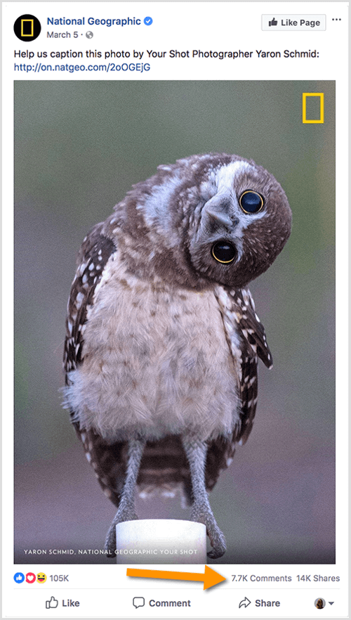
Invite your social media followers to caption an image. This could be an interesting photo from behind the scenes, an image of your product in action, or simply a funny image that relates to your brand.
National Geographic makes its traditionally sophisticated brand more engaging and humorous with this post.
Event marketing allows consumers to immerse themselves in your brand. This is an amazing way to build recognizability.
Who could forget a fun contest, pop up fair, or food truck experience? If your brand name is on it, people associate that with their good memories.
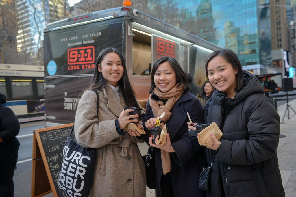
For example, to promote the show “9-1-1 Lone Star” in New York City, Fox TV set up food trucks and handed out Texas style chili and cornbread. After all, the quickest way to someone’s brand loyalty is through their stomach!
No time to create new social media posts? No problem. User generated content (UGC) strengthens your brand by showing off your loyal community. There are three main ways to collect UGC:
Run a contest, such as a photo competition, then publish the winner. Check out the #ChipotleCreator Challenge for a great example. Chipotle asked customers to compete for the best burrito combination.
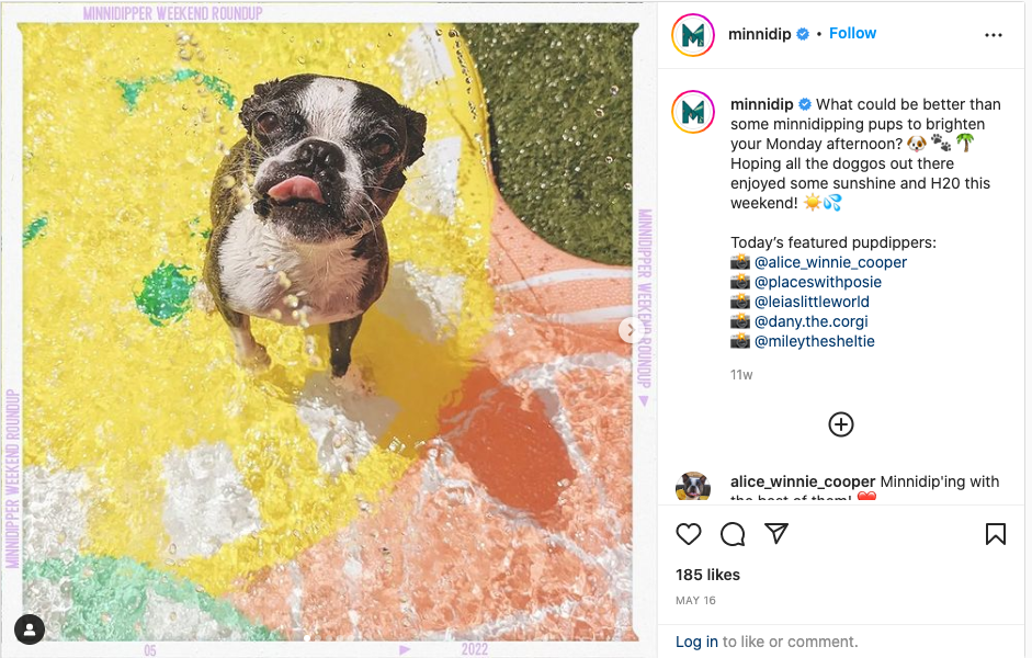
Host a social media challenge (see idea #2) or promote a hashtag, and ask people to contribute. For example, Kodak will republish photos tagged with #MadeWithKodak, and Minnidip will round up pictures of cute dogs in their inflatable pools.
Monitor hashtags related to your brand and request permission to repost photos and videos. Starbucks is known to republish posts tagged with #starbucks or #starbuckscoffee.
Posting UGC on your brand channels proves that you care about your customers. Plus, it saves you tons of time!
Wrapping Up
See any ideas on this list that you like? With a bit of creativity, you can turn your marketing from mediocre to magical.
If you need some help creating designs or writing copy for your new clever marketing campaigns, sign up for Flocksy! Our diverse team of creatives is eager to bring your vision to life.
Here is a custom flyer mockup created for a client by Flocksy team member Janelle.
All custom illustrations/brand designs/marketing materials on Flocksy are created completely from scratch by one of our extremely talented graphic design creatives.
Start a graphic design project today and see results in just hours!
Need a hand making an explainer video for your business? You’ve come to the right place. An explainer video can assist with business, advertising, and marketing in several ways.
What is an explainer video, you might ask? Well, an explainer video is a short film explaining your product to the consumer and why they should buy it.
In this guide, I’ll give you ten tips on how you can make an awesome explainer video for your business in order to drive up sales and show others how you stand out uniquely from the rest of the crowd. continue
The internet is filled with tiny ads no bigger than a stick of gum to elaborate and often irritating pop-ups.
But their size is a deficit. Business posters, on the other hand, reign supreme because they can be many sizes, often larger than 3 feet by 5 feet, and can incorporate visual attractions more than many other options, including internet marketing ideas.
The resolution, the colors, the style, and even the shape, all draw the eye, and with the right focus points, can even improve your exposure to a large audience. continue
Building your personal brand can be just as important as building a company brand.
No matter what your business or career industry is, by building your personal brand, you develop an audience and are able to further your creative and business endeavors. continue
Business cards are one of the most effective means of marketing, especially when you’re just starting out in the business world.
A cute, stylish card that you can easily pass around containing your company’s list of services is the perfect way to garner customer attraction and spread the word about the good or service you provide more effectively.
But sometimes it can be daunting to know where to start or what design will be most beneficial for what you’re trying to accomplish.
If you feel this way, you’re not alone, and we’ve got you covered. In this article, we’ll share with you fifteen business card designs that are sure to provide you with inspiration for making your own.
15 Of Our Favorite Unique Business Card Designs
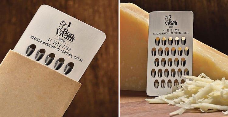
Cheese Grater Card
From JWT Advertising, this unique card is sure to get people to come back for more. Sometimes having a theme to your business card centered around who you are and what you do is the best way to paint a memorable picture in the mind of your customers.
Having a business card in a creative shape, such as a spray bottle for a cleaning company or a cake for a bakery, will remind potential customers of what you do whenever they see the card, even if they don’t have time to glance at the contact information.
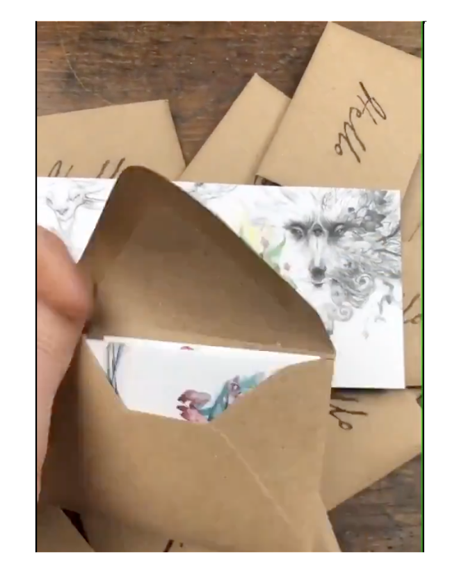
Mini Portfolio
This adorable mini-portfolio envelope by illustrator Iris Compiet doubles as both a business card and an example of what she can do.
If you’re into the arts, this design is for you – it perfectly encapsulates the creativity of the artist in both what she does and how she presents herself.
Using this design is sure to show people your skills at photography, graphic design, art, or even writing!
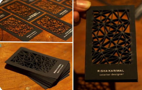
Interior Designer Card
Interior design is a job where it’s super important that you stand out from the crowd – after all, that’s what you’ll help your customers do with their homes!
This ornate business card by Smriti Kariwal illustrates the beauty of patterns in home design array, displaying a preview of the business owner’s talent for potential buyers.
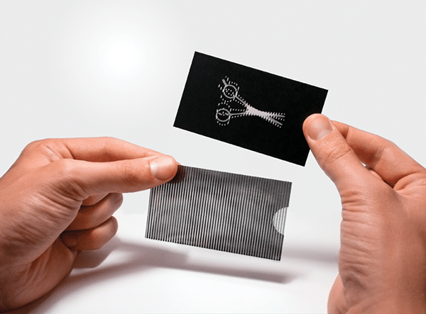
Illusion Card
Remember those visually-stimulating cards you got at parties or after a trip to the doctor’s office?
The ones with a shifting image, almost like a mirage? Well, turns out these ones are great for business too! Evengy Katz’s design for a barber shop card can be used for all sorts of jobs for a versatile, eye-catching design.
Because it doubles as both a fidget toy and a business card, it’s sure to keep customers’ eyes on your business; literally, in this case!
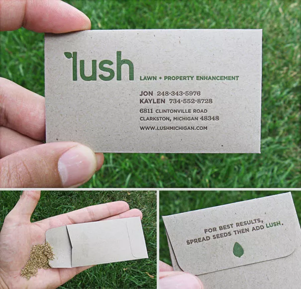
Lush Seed Packet
Because gardening and lawn care companies are a dime a dozen, you have to make absolutely sure that yours pops out the most among your customers’ choices.
Luckily, this card designed by Struck Creative is here to do the trick. This business card doubles as contact information for your company, as well as being a seed pouch.
This makes it perfect for remembering who you are as well as for practical use in the gardening adventures of your potential customers!
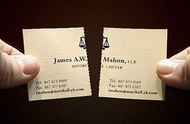
Tearable and Shareable
Divorce is never fun to deal with, but this card by James A.W. Mahon can at least help people know their options better.
Even better, this card can be used for a variety of businesses as a way to share the information with others!
If you run a painting class, a party place, or even a bakery, you can make sure that your business card is the gift that keeps on giving with this design.
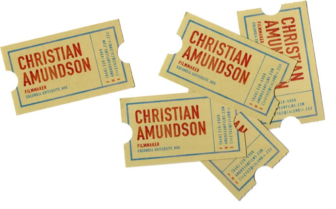
Filmmaker Ticket Cards
If you’re a filmmaker, you’ve probably wondered how on earth you could possibly compete with enormous studios. Not to worry, though; Alice Cho has you covered with this callback to classic cinema.
With this business card being shaped like the movie tickets of old, it generates both nostalgia and interest in your next big production.
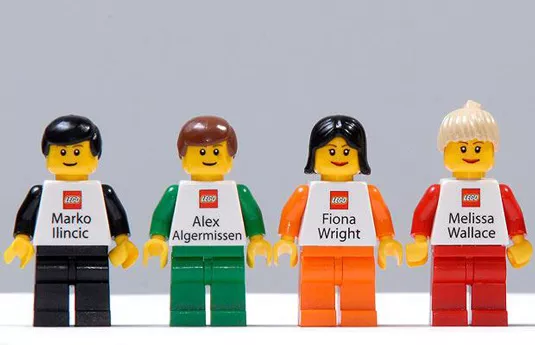
LEGO Business Card
Toys are a timeless mode of diversion for children and adults alike, and LEGO may have the most interesting design for their business card yet.
These cards match each employee’s features quite well, and the contact information is printed on the back.
If you’re selling to customers who love toys, the best way to remind them of who you are and what you do might be to become a part of their daily play with this creative and unique informative toy.
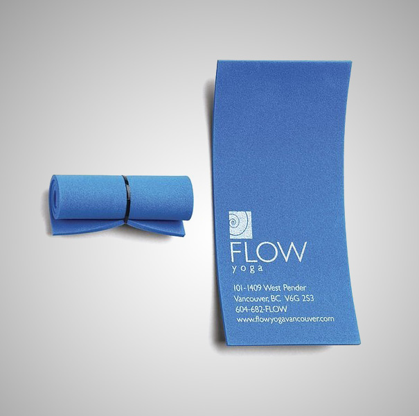
Rollable Yoga Mat Card
Yoga is a timeless way to relax and exercise, and there’s no better way to accomplish this than by giving your potential clients a reminder of what you do.
The relaxing blue encapsulates the quiet peace of Vancouver Yoga Center’s wonderful atmosphere, and rolls up just like the mats they use to help their fitness members find more balance in their lives.
The language of color is especially powerful, and one of the most effective tools you have at your disposal in whatever business endeavor you have planned.
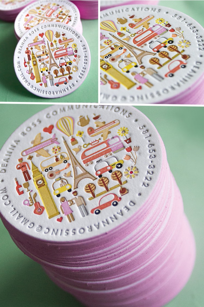
Coaster Card
If you’re a communications expert, chances are you’ve been a few places in your life.
This coaster card by Jukebox Prints is both cute and informative, letting your customers know what it is that you do and what your experience level is while also being chic, classy, and generally wonderful for get-togethers!
Place it on the table and watch people go nuts for it; it’s sure to get people to ask more questions and request your business for their needs.
Cotton Business Cards
These cards from MOO may not look especially unique, but if you take a closer look, you’ll find that they’re a lot cleverer than they seem at first glance.
These are actually repurposed T-shirt scraps, pressed into paper using one of the most ancient methods of papermaking.
This method creates a premium business card with an interesting story behind it, making it a great choice if you’re wanting to get a chance to explain your business to others.
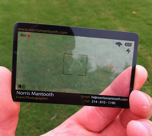
Event Photographer’s Film Card
Photographers have tight competition in the market, so it’s super crucial to have a card that looks unique and classy, and captures what they do at a glance.
Norris Mantooth’s card, translucent and appearing to be a camera lens, helps accomplish this wonderfully.
Plus, it’s pretty fun to look at, meaning customers will be drawn to it even more and share it with everyone around them as a result.
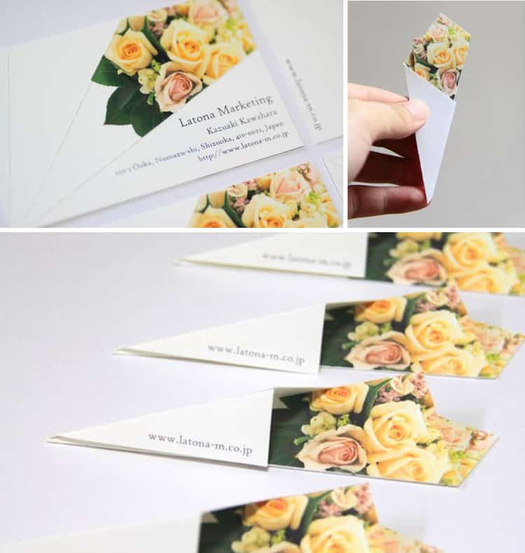
Flower Bouquet Cards
The importance of the right bouquet (and the right marketing scheme for your company!) cannot be overstated.
Latona Marketing made this perfect business card for what they do, all boiled down into a simple shape resembling a flower bouquet.
Posturing your business card around the main idea of what you do is a must, and there’s no better example of that than right here!
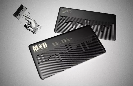
Not only does it plainly advertise the services offered, it’s also a usable comb!
To top it all off, this business card plays a classic rock tune, meaning you’ll never forget which hair salon it’s talking about.
With an almost magnetic pull, this card appeals to a wide range of people while also functioning as a preview for the service provided.
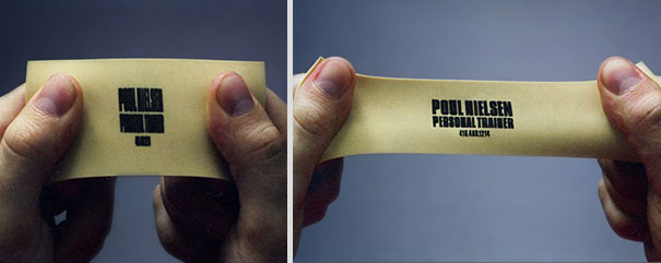
Personal Trainer Card
Our brains are constantly linking stimuli to information; that’s why it’s so easy to study when listening to music or chewing gum.
This business card makes use of the fact that you have to pull it to see the personal trainer contact information, making it a great choice for potential clients looking to improve their overall fitness.
Brochures are a versatile marketing option for businesses from retailers to museums. A well-designed document shows why a company is special and why prospective customers should spend their money there.
It’s an instant opportunity to put your best foot forward, snagging readers’ attention and their desire to find what’s missing in their lives, whether it’s a product, a service, or something more intangible, like luxury.
Keep reading to see 15 brochures that think outside the tri-fold.
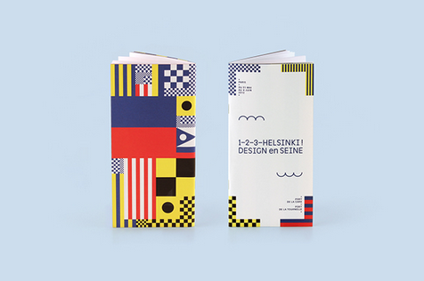
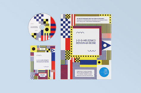
This brochure advertised a pop-up art and architecture event embracing design, with boldly decorated shipping containers installed along the Seine in Paris.
The colorful shapes are inspired by the marine flags and signals used on the Seine. The design included two waves: one to represent the water of the river, and one to represent the “1, 2, 3” in the event’s title.
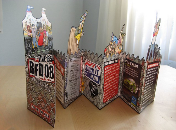
This document uses a mix of cutouts and lively artwork to create a festive feeling for a 2008 concert. The use of chain link fence, including a jagged line along parts of the brochure, adds an edgy feel. A mix of advertising and copy is presented like posters on the fence.
This mailer design references Swedish furniture superstore Ikea’s iconic in-store displays, using very little text and a 3-D design to help customers imagine how quickly and easily their new furniture can “pop up” in their home.
The outside evokes flat-pack furniture, for which Ikea is famous, making the mailer instantly recognizable.
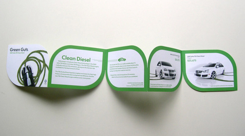
This brochure for Volkswagen’s line of hybrid cars uses a simple color palette of green and white to highlight the ideas of clean and green.
Each page is shaped like a simple leaf, an iconic image for all things environmentally friendly. The presentation at an event further uses the theme to make the documents look like sun-drenched leaves.
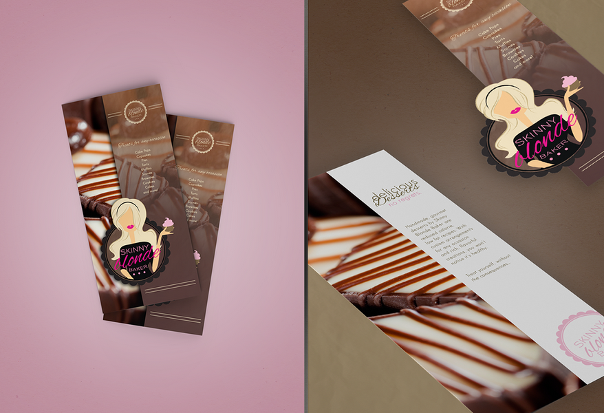
Designer Nichole Ott used oversized photos of this bakery’s healthier desserts to make readers’ mouths water. Two versions of the bakery’s logo are used throughout to give brand consistency.
Curvy script fonts evoke the femininity of the baker in the logo, and make use of the bakery’s slogan, “All Good, No Guilt.”
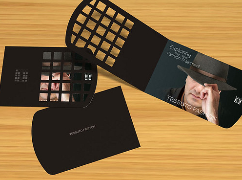
The brochure for this menswear retailer in New Jersey uses a unique cutout design to offer customers a peek at the fine fashions available.
The cutout evokes the square grid shapes used in the brand’s logo as well, lending consistency, while the dark colors give rise to feelings of strength and masculinity.
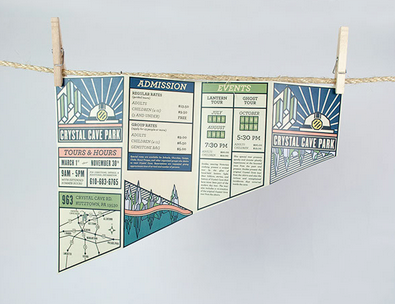
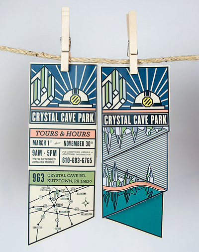
This design uses nostalgic-feeling artwork and bold lines in a unique shape to stand out amid other destination brochures.
The cream colored paper feels like a well-worn map, reminding visitors of bygone years. The art reflects the natural wonders inside Crystal Cave Park, including glittering crystals and a reflective pool.
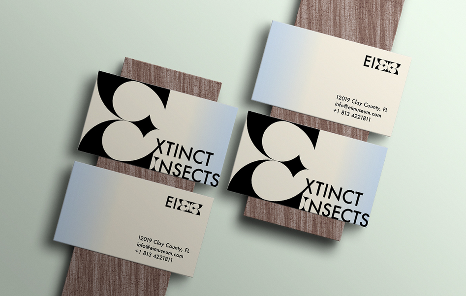
The logo for the National Museum of Extinct Insects looks like a butterfly in a nod to the many butterflies preserved there.
The brochure, using stark black and white, creates strong imagery while remaining minimalistic. Accent colors remind of the insects’ habitats, with the shades of a cloudless sky, the earth, and “juicy greenery.”
This document for a luxurious Scottish hotel uses a simple white cover and metallic logo to create a feeling of understated opulence.
Inside informs guests about the hotel’s large number of amenities and services. A folder is included in the back so hotel staff can put specific information in for clients.
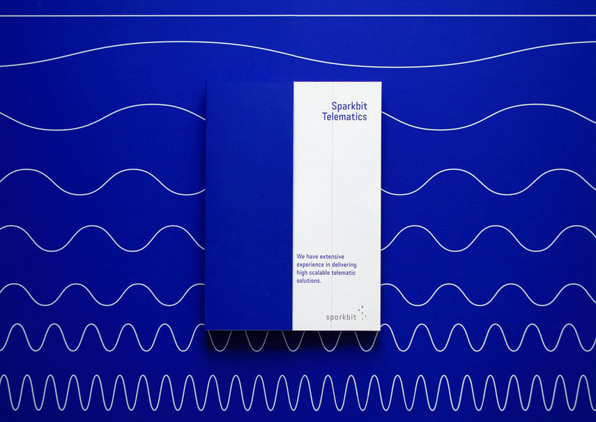
Design firm Balsam Studio employed a consistent motif of wavy lines to represent the data the business analyzes. Custom icons in thin white lines pair with the wave motif.
They use a bold aquamarine blue throughout to separate blocks of information and present it in a clear, understandable way.
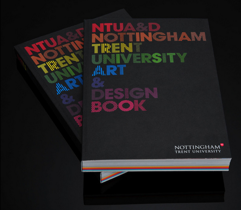
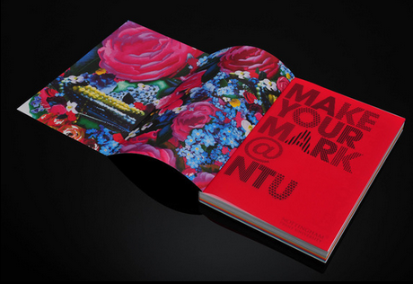
Using bright and bold colors contrasted by stark black, the art book for Nottingham Trent University is a compelling piece to entice prospective students.
The designer used 24 different patterns to create the font used within, highlighting visual interest. The package includes a multicolored sketchbook, stickers, postcards, and a stencil, for a memorable piece of advertising.
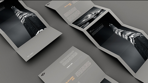
This brochure for a black-and-white long exposure photography business lets the photos speak for themselves.
Text is kept to a minimum, and the only colors used are gray, white, black, and sparing yellow contrast text. The unfolding of the brochure slowly reveals the stunning photography.
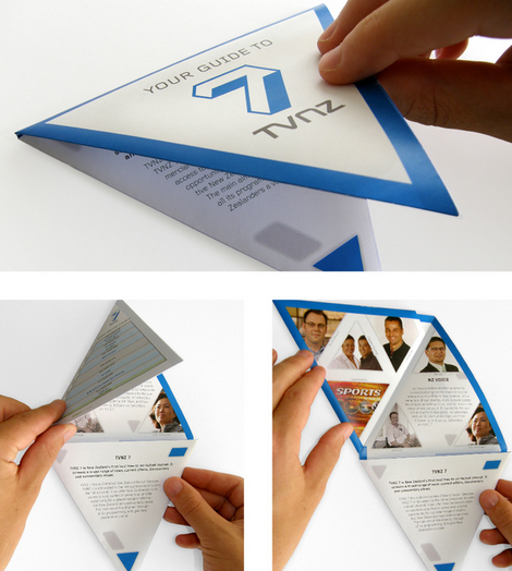
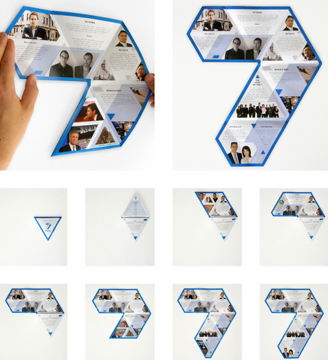
A triangular brochure for a New Zealand TV station folds out into a 7, reminding viewers of the familiar onscreen logo.
The brochure features the channel’s signature blue and triangular photos of station talent. Copy and programming information are kept brief to fit in the document’s distinctive triangles.
Brochures for a housing development called Spencer’s Crossing fold into a game to show that the neighborhood is for “kids at heart.”
The logo design features the words arranged in an arch over stepping stones to evoke the community’s walking trails.
Photos inside feature youngsters having fun at a pool and in a lush, green yard, to further reinforce the neighborhood as a place for family-friendly leisure.
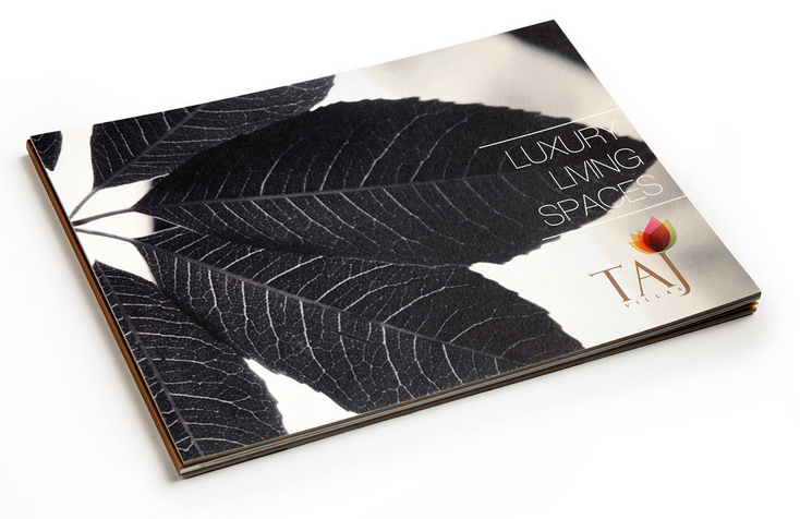
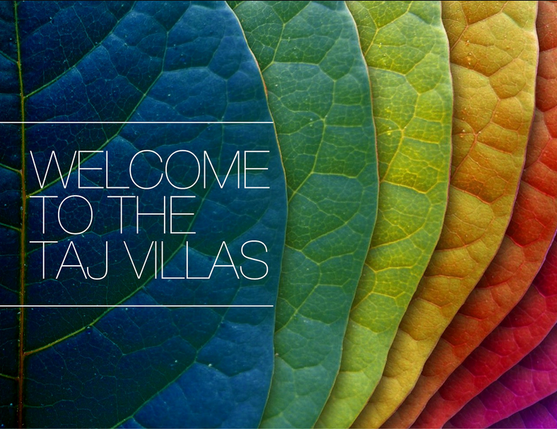
This brochure for luxury villas contrasts black-and-white and colorful leaves both in its logo and its opening pages to evoke the climate in India and the high living available.
The interior contains mainly photographs of the housing, letting the construction speak for itself. A thin sans serif font creates a simple, elegant feel.
Pure, authentic branding is one of the most powerful things you can do to get your messaging and products to the world. The right packaging design will make your brand identifiable and distinguishable.
Thus, enabling an element of trust within your clients. How people perceive your company is critical in growing a vibrant audience that raves and supports your business.
Developing the “know, like, trust” factor when marketing your products will transform and naturally attract more attention to whatever it is you are marketing.
People enjoy buying from organizations they feel confident in. In the age of e-commerce, product packaging does not only take things from point A to point B, but it is the only physical touch point that brands have with their customers.
Think of your packaging design as your display window. The first impression is the only impression your consumer could potentially have of your work.
The right merchandise design will allow you to stand out and improve your online presence.
Below are 12 innovative ideas that have taken the packaging world by storm. Use these as inspirations to out-design your business competitors and get the audience you crave.
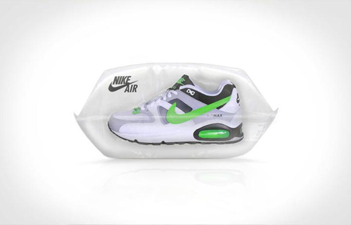
What better way to translate the imagery of the softness and comfortability of air pillow sneakers than by packaging them inside an actual air cushion design?
It is an aesthetically pleasing way to highlight the benefit of the sneaker. The language is clear; these sneakers will make you feel like you’re walking on air. The effectiveness of this esthetic heightens the marketing.
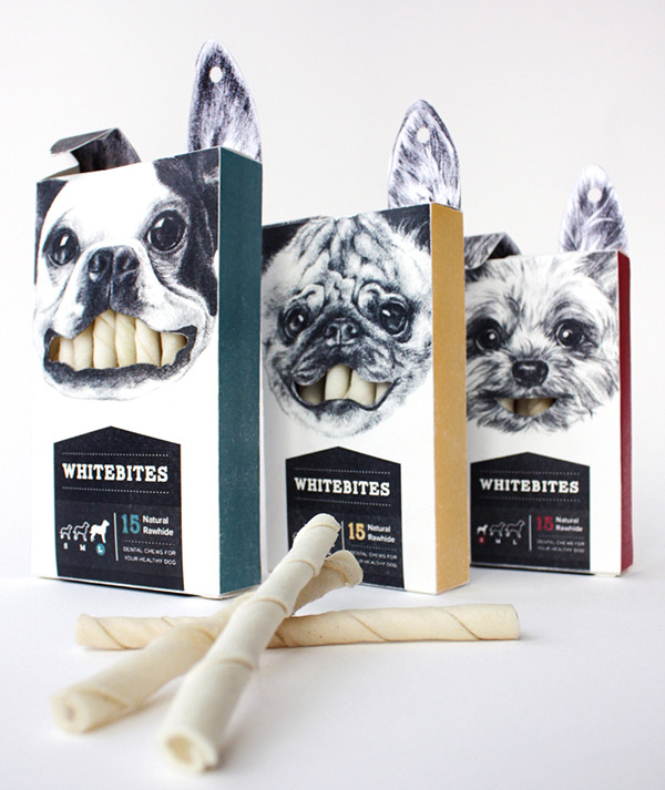
If you want your brand to be discernible from a sea of online content, your product packaging needs to be striking. An effective way to strategize this is to make your design memorable. Whitebites illustrates this brilliantly.
Your product packaging should communicate the messaging of your brand in a way that is unique and attracts attention.
Creativity is a highly desirable quality. In the design of your product packaging, you can incorporate a level of innovation to engage your potential consumer to purchase your product.
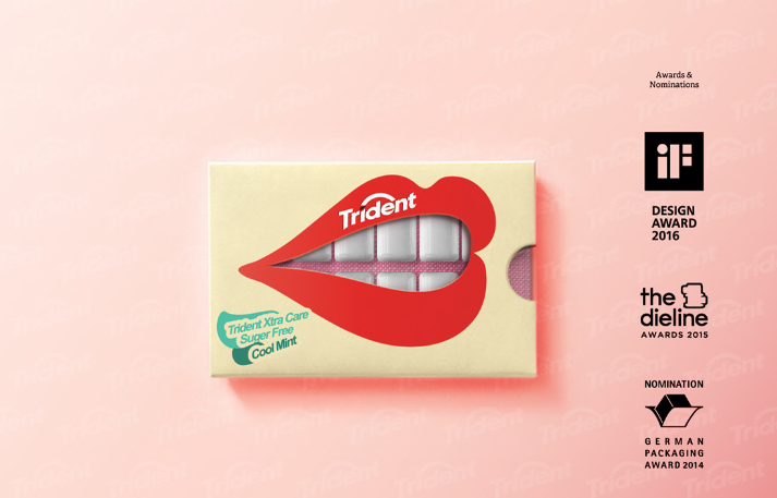
Trident gum is a fantastic example of design packaging executed excellently and with originality. Speaking to your audience’s emotions and innate creativity is a surefire way to convert them to buying customers.
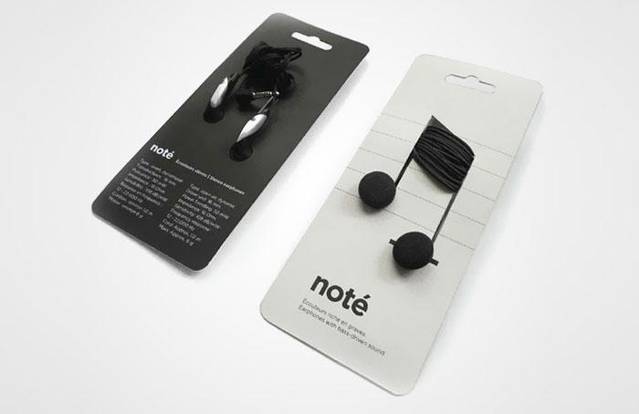
Your consumer’s purchasing decision is dependent on how well connected they feel to your brand. Designing your product package with this in mind will help you convert more customers.
An instance of this approach implemented creatively is note headphones. Clever ways to aesthetically express the value of your product will entice your target audience.
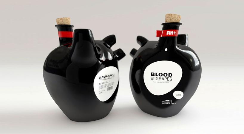
Constantin Bolimond developed a concept that synchronized brilliantly with its product name, Blood of grapes wine bottles. The style was created and themed after the shape of a heart.
It’s a striking visual representation. It is mesmerizing because it’s unexpected, a fantastic way to grab your audience’s attention. The product design is not yet available for retail.
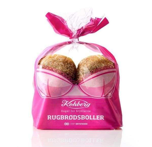
The largest bread manufacturer knows a thing about appealing to their ideal consumers. Their sketch attracts attention to the fight against breast cancer. The visual image is vibrant and innovative.
Appeals to emotion are an effective way to persuade and influence potential consumers. We make decisions based on our intuitive and emotional responses. Speaking to emotions is a compelling way to move people to action.
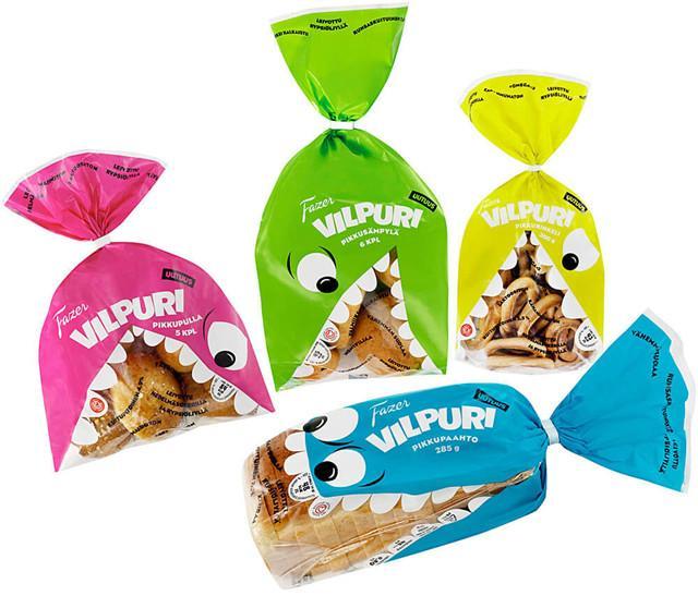
What better way to intensify your consumer’s natural urge for candy than by strategically placing a mouth on the product packaging design? Triggering a consumer’s impulse buying is an effective marketing strategy.
And a great way to increase your revenue and create brand loyalty. Fazer Vilpuri cookies and breadrolls is an example of this technique executed excellently.
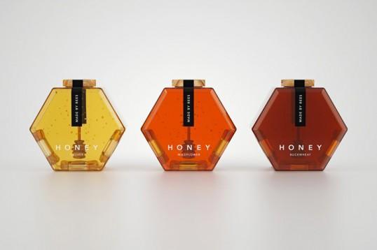
Design packaging does not need to be complex. You do not need to recreate the wheel.
All you have to do is put your creative spin on what is already working in your market. For example, you can add a clever design to a simple paper bag.
The hexagon honey bottle design stands out from the blend of sameness most honey jars have. A true example of what it means to make your brand packaging exceptional.
When designing your product packaging, don’t try to reinvent the wheel. Learn from what has survived the test of time. And remember to add your individual brand’s uniqueness and core messaging. Make your consumer’s first impression a lasting one.
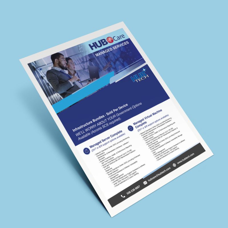
Here is a custom flyer graphic mockup created for a client by Flocksy team member Eman.
All custom illustrations/brand designs/marketing materials on Flocksy are created completely from scratch by one of our extremely talented graphic design creatives.
Start a graphic design project today and see results in just hours!
by Flocksy writer Rachel With web technology changing and improving constantly, it’s easy for websites to look out- of-date even within a few years of creation. You may be wondering whether you need a whole new website or merely a facelift. Here’s what to keep I mind when making that decision. continue
by Flocksy writer Matt. One question many marketers ask themselves is “how can I get my emails opened?” While there are plenty tricks out there, we recommend a thoughtful approach that focuses on communicating with those subscribed and giving them something valuable or tangible from the beginning so it pays off at the end. continue
by Flocksy writer Kasey. In the digital age, a relationship with the media is crucial to getting your business out in the public eye. The process of building this relationship is the core of media relations. Not only does this build a valuable connection with people who can improve your reputation in the community, it’s a way to get some free marketing. continue
by Flocksy Writer Danielle. With so many great shows, marketing teams need to develop great logos that fans can remember and recognize. These 12 great television logos are memorable, effective, and creative. continue
Need a hand making an explainer video for your business? You’ve come to the right place.
An explainer video can assist with business, advertising, and marketing in several ways. What is an explainer video, you might ask? Well, an explainer video is a short film explaining your product to the consumer and why they should buy it.
Generally, explainer videos are used as both advertising and explanation of your product, and they tend to be phrased in a problem-solution manner.
However, creating a good explainer video can be a bit daunting!
In this guide, I’ll give you ten tips on how you can make an awesome explainer video for your business in order to drive up sales and show others how you stand out uniquely from the rest of the crowd.
Know Your Audience.
Knowing who you’re marketing to is incredibly important in order to craft a good explainer video. Different age groups, ethnic groups, and genders prefer different things to be in their advertising.
For example, if you plan on selling a men’s deodorant, focusing on the dainty smell of perfume and the soft feeling of the smell against their smooth skin would not be ideal.
Conversely, an elderly couple is not going to be particularly impressed by the idea of TikTok references in an advertisement about the ideal arthritis medication for people their age.
Below is a video from the YouTube Creators themselves about how you can know and understand your audience for the content you’re making.
A good video can’t take off without a good script! Scripts should explain what the problem is that the product is aiming to solve, possible pitfalls that other products may cause, and the solution: your product.
It’s best to keep these scripts entertaining (another reason you should know your audience well!), brief, and clear. Without these things, you’ll have a hard time keeping your viewership engaged, and the quality of your work could suffer.
As discussed above, clarity both in the script and in the visuals is essential for a good explainer video!
A good script leaves no room for errors or confusion and is easy to recount without having to write down notes, and should be structured in an orderly fashion so potential customers can keep track of what you’re saying easily.
The explainer video should include the most important information about your product, what it does, and what needs it fulfills, rather than being a novel about everything in detail. For tips on this, you can view Biteable’s video on how to create a clear and enticing script.
Just as important as clarity is the issue of brevity. It can seem like a daunting task to keep the word count down enough to fit into a focused, minute-or-two-long video.
You should always have a thesis statement and supporting statements when discussing your product, and the elimination of the extra word fluff is a must.
This way, you can capture customers in their busy lives or with their short attention spans and get your information across in an easy-to-read, concise manner.
Jazza explains this concept below, but there are many resources available to help you accomplish this goal.
Picture this: you’ve followed all the tips above, and you still can’t seem to get audience members to stick around or engage with your product.
If this is you, you’ll want to provide a frequently-asked-questions section in order to avoid confusion with your audience.
These questions can be polled from the audience directly, or you can anticipate beforehand which questions they might ask.
This will improve clarity if you find that the brevity of your video is impeding your outreach. The Collaboration Coach has a way to make an FAQ page that balances the need for conciseness with the need for clarity.
If your market audience is human (which they will be!), there’s a strong possibility that people with disabilities will be viewing your explainer video.
Including captions or a transcript is a must for the deaf and hard-of-hearing, and you should always ensure that your audio is stellar for those with a visual impairment.
And if you’re marketing to disabled folks directly, pay extra-close attention to these things!
An overstimulating visual palette will drive away the autistic, and if you’re selling something to dyslexic people, make sure you use their preferred font and colors so as to make it readable to them.
Some people need a little extra help, and it’s your job to provide that so they can see how awesome your product is!
Below, Aquent Gymnasium explains how to accomplish these things.
Even if you have the most glorious script ever to grace mankind, that won’t mean anything unless you can put the rubber to the road and make that video look beautiful!
Your advertisement should include engaging graphics, well-designed fonts, and interesting scenarios.
Hire the right actors for the role if it’s a live-action production, or get someone to make you some wondrous animated content for the role.
There are many ways to accomplish a professional, engaging, and entertaining blog post.
Below, Parker Walbeck is just the guy to help you.
Now, we’re onto the final stage of production: the sound production.
Music, funny voices and company jingles can cement your explainer video in a customer’s mind as interesting, unique, and most of all, helpful.
Music should never drown out voice over, and if you want a captivated audience, you’ll use music that’s appropriate for the advertisement’s tone and genre.
Remember to keep your audience in mind when choosing the sound production! Monkey Pixels has some tips for us all on how to accomplish a gorgeous sound reel for your next commercial.