ga('send', 'pageview');

AI Design & The Future

Artificial Intelligence has long been a staple of science fiction movies, books, and TV shows. But what we thought was a single-faceted concept has grown and spawned several different types of machine learning, algorithms, and creation tools.

There is a lot to understand about what AI design is and how it’s being used presently if we’re going to have a good idea of what’s to come. Moreover, because the technology is still so new and growing, numerous kinks need to be addressed and updated, not just when it comes to delivering good results but also regarding ethics and legality.

As a brand or business, it may be challenging to imagine how a tool like AI design could pose any issues like that. However, AI design can affect artists significantly. 

With everything in life, there are pros and cons to using AI design and its tools. Today, we’ll cover what it is, how it affects businesses and creatives, and what you can likely expect from it in the future.

Let’s dive in.

What Is AI Design Or Generative Creation?

Generative creation or AI design employs machine learning software and a workflow to generate content, graphics, or copy. The program takes your input as a prompt, words describing your concept or idea, and then uses it to generate an outcome by putting it into an algorithm. The algorithm creates an asset using what it’s learned to pull pieces from external sources and join them together.

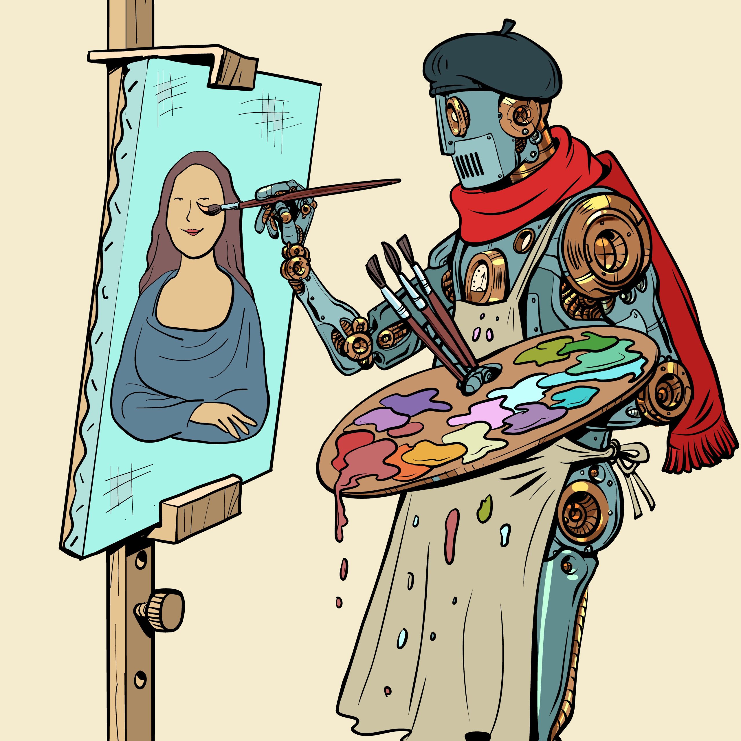
Robot artist drawing mona lisa. AI generated drawing, artificial intelligence. Pop art retro vector illustration 50s 60s vintage kitsch style

While using a designer may sound similar (you tell them what you need, and with their skills, they create something for you in one to two days), it’s very different. The technology is “creating” on its own and does it in just a few minutes, maybe less. Now, the creation that takes place is also different as well. Instead of a human hearing or reading your request and then taking the time to draw or design something from scratch, the AI is taking pieces of existing art, jumbling them up to fit the parameters you set, and displaying a somewhat mathematical result.

There often isn’t the opportunity to provide feedback and refine the design either, though some programs are adding this feature.

These tools are frequently used to create illustrated looks for a person via an app’s AI filter, draw characters or picture concepts, or see images in different styles.

One of the most popular tools is MidJourney, which uses Discord to take prompts and turn them into pictures.

What Does AI Design Look Like?

It looks similar to art, but many software options out there currently still need some help. With a basic AI tool, you can type in princess with a dragon and get something close to what you imagine. However, the technology is still growing, and some issues may be with proportions, distortion, or placement.

Should AI Design Be Used In Corporate Or Commercial Spaces?

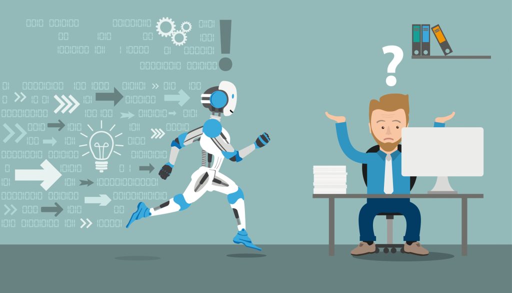
Running robot cartoon with businessman in an office on the gray background. Eps 10 vector file.

This is a tricky road to navigate. While using an AI tool could certainly hasten your timeline and get you satisfactory results, the question of where those results are truly coming from and their quality still hangs heavy overhead.

Here is a scenario to consider. 

Suppose you’re working with a company like Flocksy and request a design using our intuitive brief. In the best-case scenario, we’ll get your designs back to you within 24 hours, and you’ll be thrilled with the results- no revisions needed. When you work with Flocksy, this does happen quite a bit. 

But what if you do have revisions? That’s also very normal. The artist will take your feedback, update the design, and give you the final result you want. That process takes a bit longer than the design with no revisions.

Now, say you or the artist used an AI tool to create a quick concept reference for your design.  The project would start with an example that is ready to be expounded on. Whether the AI concept is way off or close to the mark, it could inform the artist and cut back on revisions in the long run.

However, it’s important to note that the AI design can’t be used as-is or as the base layer of your design if you want something truly original. Remember, these tools pull from existing designs, meaning part of this creation already exists on the internet. You don’t want your outcome to look like a tweaked version of someone else’s work.

Are There Drawbacks To AI Design?

There are a number of drawbacks and ethical considerations to make when it comes to AI design.

At the start is the communication barrier. Because the technology is new, it’s very possible that the AI might not understand you on the first try. You’ll have to re-generate several times to get what you want.

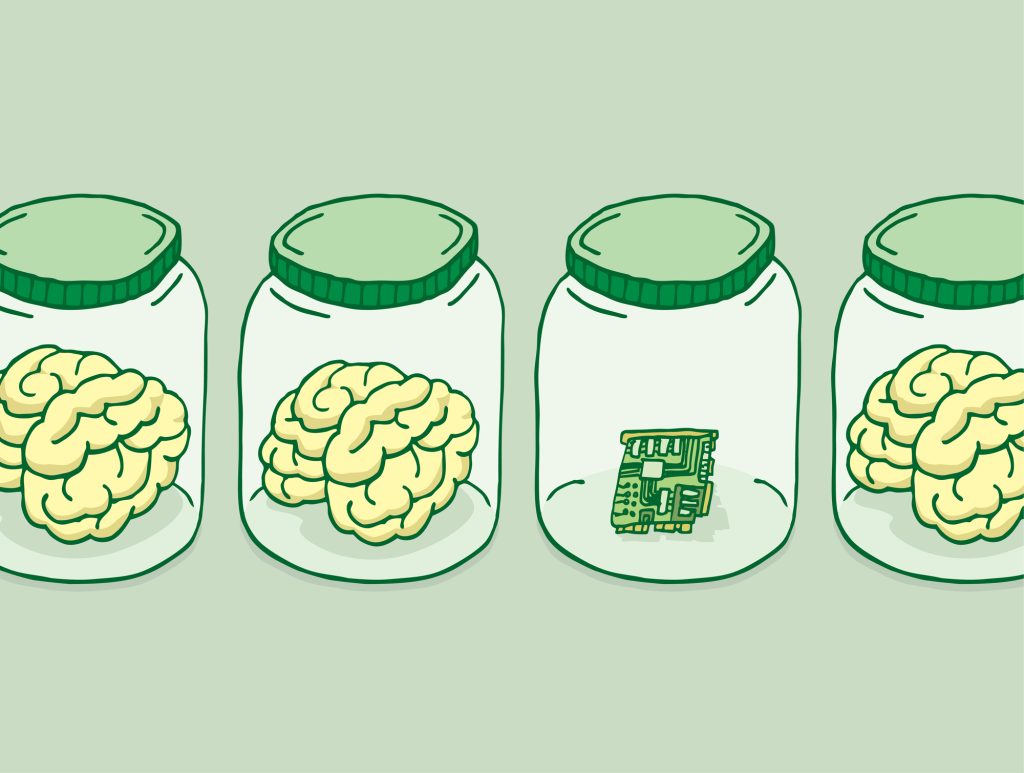
Cartoon illustration of artificial intelligence besides brains in jars

If you eventually get what you’re looking for, it might not be so bad to repeat the process for a few minutes, but if the AI never truly understands what you want, you’ll have to go back to work with an artist anyway.

Another crucial consideration is ethics. Yes, all creative work is influenced by something. However, that’s different from taking something from another source and claiming you made it.

To better understand this, allow us to provide an example. Say you want to design a character- for a book, a comic, a website, etc. You do some searching on the internet and find one you love. It’s perfect. They just need red hair and to be holding an umbrella. So, you copy that image, whether printing it out, downloading, or snipping it.

Then, you trace over that image, change the coloring either digitally or by hand, and add an umbrella. Once you’re finished, you take that design and put it on your merchandising and promotional materials. Well, we’ve got a problem, right? 

You didn’t create that design. You traced it and updated a few things. 

At present, that is essentially what AI tools are doing. They’re taking art that someone made, digitally manipulating it, potentially combining it with art from the same or a different artist, and calling it new. It’s not.

Lastly, many are thinking of these generated designs as stock photos. That doesn’t quite line up because the artist of the images on the web hasn’t necessarily consented to or is being paid to provide stock assets. When a photographer or artist submits their creatives to a stock website, they’ve consented to let their work be used as such and are being compensated for it.

A picture pulled from an artist’s website where they sell their prints isn’t stock, and with AI tools, we can’t presently tell where it’s pulling its resources from.

Will AI Design Affect Creative Jobs?

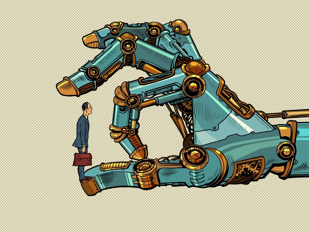
man versus robot. advantage of technology. robot hand click. Pop art retro vector illustration vintage kitsch 50s 60s style

Many clients may come to artists with more AI concepts as a rough start, which could be helpful. We could also see people using these AI tools to create the design entirely and using it out in the world. Hopefully, people still know that they can get better, more ethical results by working with a human.

Correctly combining colors, logos, and brand guidelines so that they are consistent across your brand is still a human job. The AI tool doesn’t possess the same knowledge of your brand, likes, or dislikes that an artist who’s been working with you for a while will have. They also aren’t as accurate as a result. While design and art are subjective, marketers’ creative needs are unique and specific, and AI design alone can’t hold up to those standards in most cases.

What Are The Legal Implications & Risks Of AI Design?

If you’ve used these AI apps or tools, particularly one where you input an image, you’ve likely accepted the terms and conditions associated with that app. What that fine print often says is that you’ll be relinquishing the rights to the assets to the parent company in perpetuity. 

Courthouse with Scales Symbol on Facade with Stairs and Columns Empty Exterior. Tree, Plant, Grass and Shrub on Enterance. Government State Court, Justice House. Space of Legal Litigation

That’s a significant concern.

Licensing and commercial use are significant issues with AI design used as-is. There is a risk that using this content as your own may or may not be legally protected. After all, it’s very possible that someone could enter a similar prompt and get a similar result. The AI isn’t concerned with making something entirely unique each time it spits out an image or, at least presently, where it’s getting its sources. We’ll likely see a lot of these lawsuits begin to be successful.

What is Flocksy Doing?

We understand that tools like AI “art bots” can provide a rough idea of what you need, and using them to create a first draft may even speed things up a bit. However, we also know that a human has to step in to do the actual designing or drawing.

At Flocksy, we hire real people to sit down and design or draw your assets. You won’t find an AI bot delivering material harvested from the internet that may or may not be correct. Our skilled design experts do the work, craft unique content that matches your idea, and isn’t copied from someone else.

We won’t use AI, and we assure you that the assets you get from our creatives will have an exceptionally high quality and accuracy rate.

You can see examples of our top-notch designs and illustrations in our portfolio here.

A Conclusion About AI Design

When used properly, this technology could be complementary and not competitive to designers. Employing them to mock up designs that you’ll later create from scratch can eliminate some back and forth over revisions, and saving time is great. 

What will be essential to keep a lookout for in the future is the continuing growth of these tools and the sourcing they do for their results. If there’s a way that the bots can pull from only approved artwork that the original artist can consent to, similar to a stock photo service, then these tools could be handy. 

It’s unlikely that these types of services would exist without a fee, but paying to use an AI generator is already starting to happen, even for entirely personal use. It’s also unlikely that a human won’t be necessary anymore, and for all your design needs, you have Flocksy at your back.

15 Inspiring Brochure Designs That Stand Out From The Crowd

Brochures are a versatile marketing option for businesses from retailers to museums. A well-designed document shows why a company is special and why prospective customers should spend their money there.

It’s an instant opportunity to put your best foot forward, snagging readers’ attention and their desire to find what’s missing in their lives, whether it’s a product, a service, or something more intangible, like luxury.

Keep reading to see 15 brochures that think outside the tri-fold.

Events

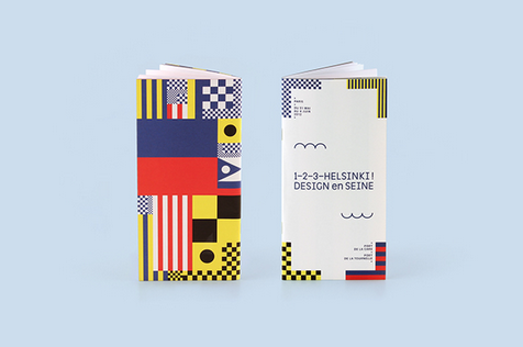
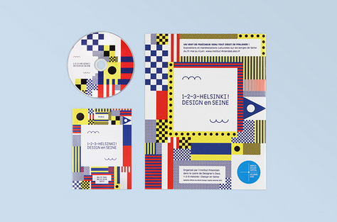
1. 1–2–3–Helsinki ! Design en Seine

Design Firm: Werklig

This brochure advertised a pop-up art and architecture event embracing design, with boldly decorated shipping containers installed along the Seine in Paris.

The colorful shapes are inspired by the marine flags and signals used on the Seine. The design included two waves: one to represent the water of the river, and one to represent the “1, 2, 3” in the event’s title.

2. BFD ‘08 Concert

Designer: Liz Hall

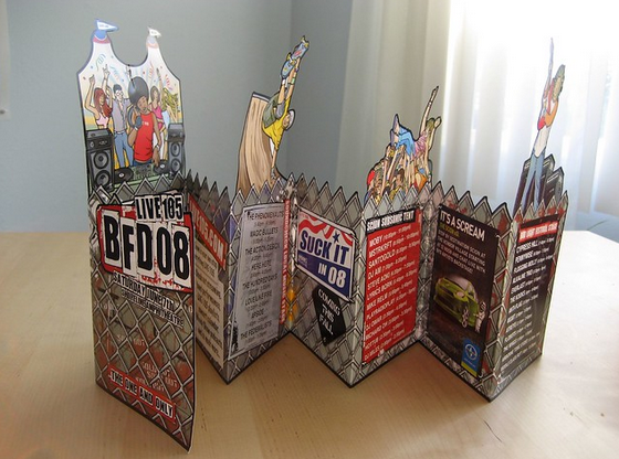
This document uses a mix of cutouts and lively artwork to create a festive feeling for a 2008 concert. The use of chain link fence, including a jagged line along parts of the brochure, adds an edgy feel. A mix of advertising and copy is presented like posters on the fence.

Retail Businesses

3. Ikea

Designer: Leonardo Borges

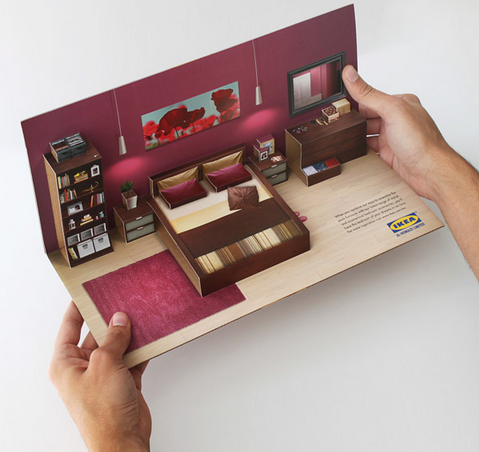
This mailer design references Swedish furniture superstore Ikea’s iconic in-store displays, using very little text and a 3-D design to help customers imagine how quickly and easily their new furniture can “pop up” in their home.

The outside evokes flat-pack furniture, for which Ikea is famous, making the mailer instantly recognizable.

4. Volkswagen

Designer: Josiane Marquis

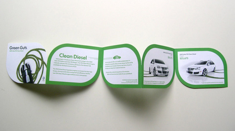
This brochure for Volkswagen’s line of hybrid cars uses a simple color palette of green and white to highlight the ideas of clean and green.

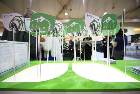
Each page is shaped like a simple leaf, an iconic image for all things environmentally friendly. The presentation at an event further uses the theme to make the documents look like sun-drenched leaves.

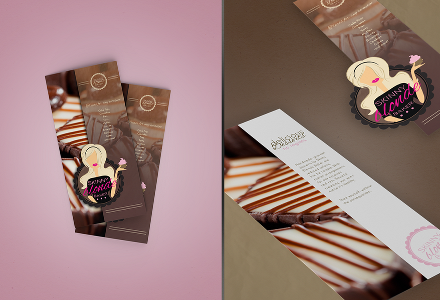
5. Skinny Blonde Baker

Designer: Nichole Ott

Designer Nichole Ott used oversized photos of this bakery’s healthier desserts to make readers’ mouths water. Two versions of the bakery’s logo are used throughout to give brand consistency.

Curvy script fonts evoke the femininity of the baker in the logo, and make use of the bakery’s slogan, “All Good, No Guilt.”

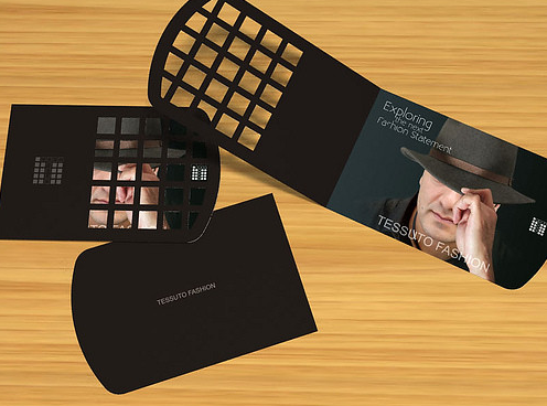
6. Tessuto Fashion

Designer: Greg Cannon

The brochure for this menswear retailer in New Jersey uses a unique cutout design to offer customers a peek at the fine fashions available.

The cutout evokes the square grid shapes used in the brand’s logo as well, lending consistency, while the dark colors give rise to feelings of strength and masculinity.

Destinations

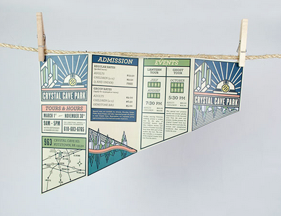
7. Crystal Cave Park

Designer: Keith Lowe

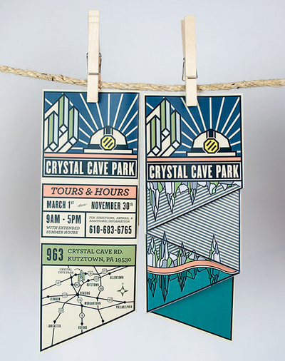
This design uses nostalgic-feeling artwork and bold lines in a unique shape to stand out amid other destination brochures.

The cream colored paper feels like a well-worn map, reminding visitors of bygone years. The art reflects the natural wonders inside Crystal Cave Park, including glittering crystals and a reflective pool.

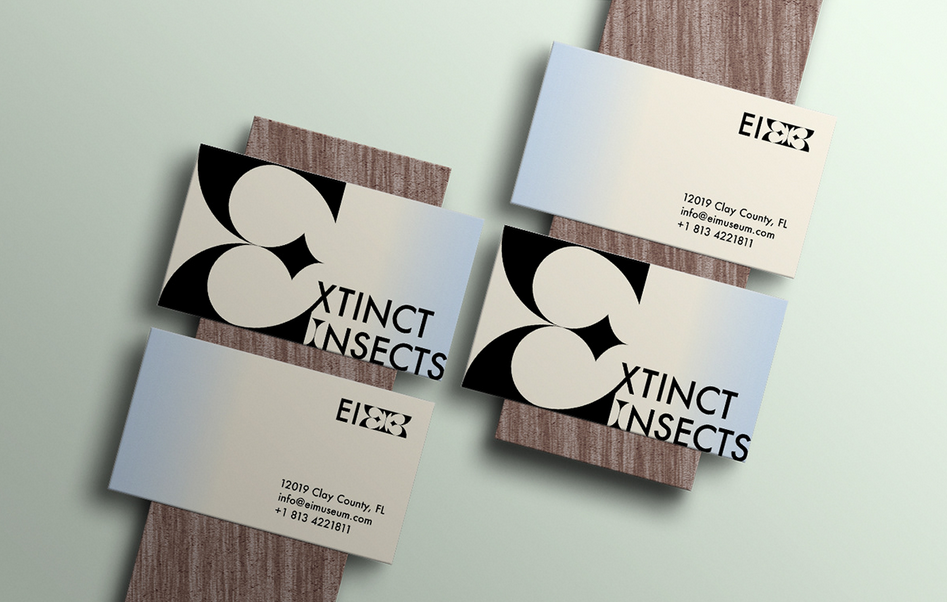
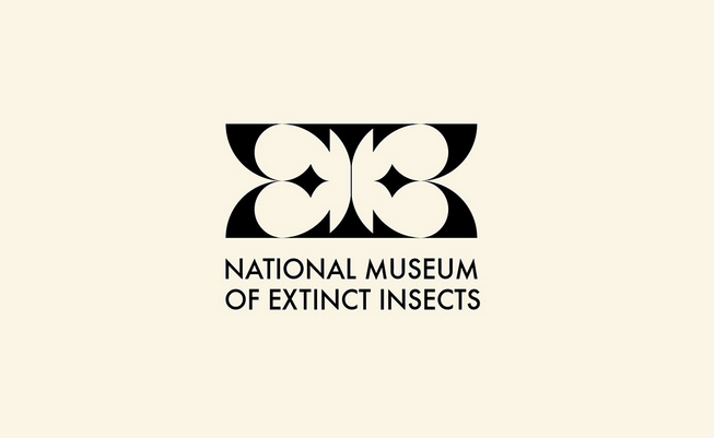
8. National Museum of Extinct Insects

Designer: Natalie Perez

The logo for the National Museum of Extinct Insects looks like a butterfly in a nod to the many butterflies preserved there.

The brochure, using stark black and white, creates strong imagery while remaining minimalistic. Accent colors remind of the insects’ habitats, with the shades of a cloudless sky, the earth, and “juicy greenery.”

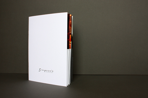
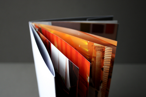
9. Simpson’s Hotel

Designer: Grieg Anderson

This document for a luxurious Scottish hotel uses a simple white cover and metallic logo to create a feeling of understated opulence.

Inside informs guests about the hotel’s large number of amenities and services. A folder is included in the back so hotel staff can put specific information in for clients.

Services and Features

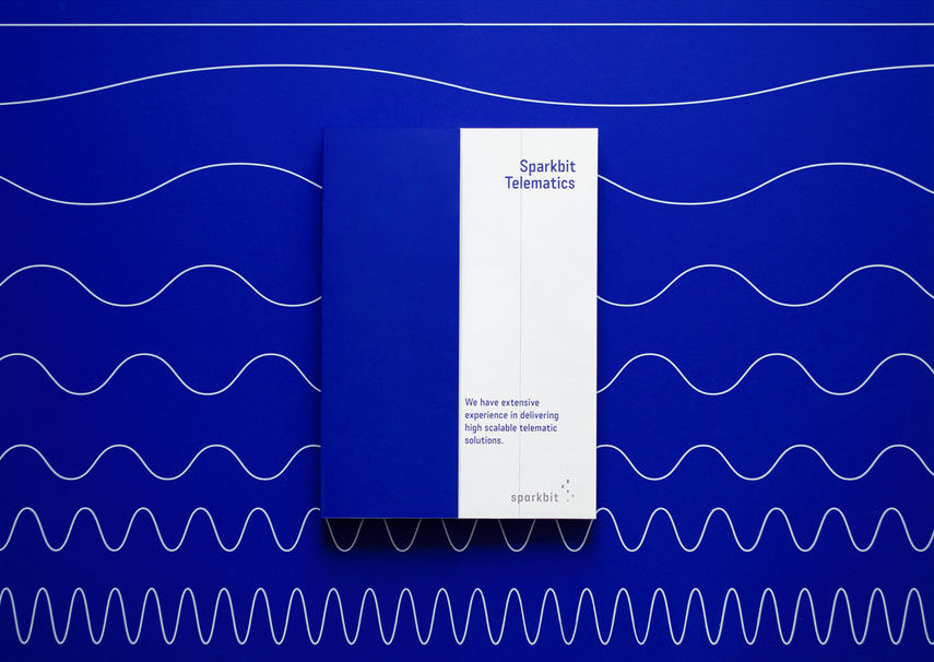
10. Sparkbit Telematics

Designer: Balsam Studio

Design firm Balsam Studio employed a consistent motif of wavy lines to represent the data the business analyzes. Custom icons in thin white lines pair with the wave motif.

They use a bold aquamarine blue throughout to separate blocks of information and present it in a clear, understandable way.

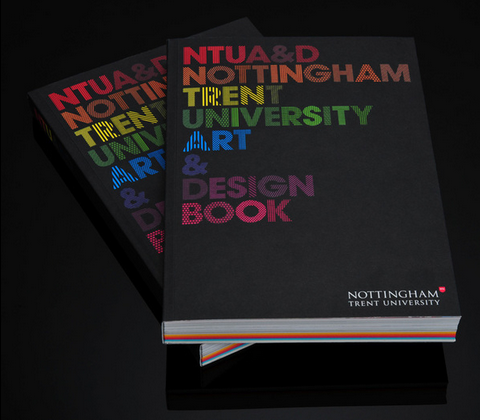
11. Nottingham Trent University

Designer: Andrew Townsend

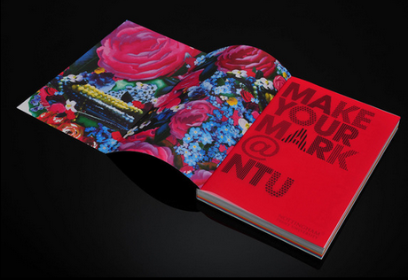
Using bright and bold colors contrasted by stark black, the art book for Nottingham Trent University is a compelling piece to entice prospective students.

The designer used 24 different patterns to create the font used within, highlighting visual interest. The package includes a multicolored sketchbook, stickers, postcards, and a stencil, for a memorable piece of advertising.

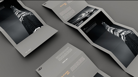
12. Vulture Labs

Designer: Jake Brandford

This brochure for a black-and-white long exposure photography business lets the photos speak for themselves.

Text is kept to a minimum, and the only colors used are gray, white, black, and sparing yellow contrast text. The unfolding of the brochure slowly reveals the stunning photography.

13. TVNZ 7

Designer: Thomas Pavitte

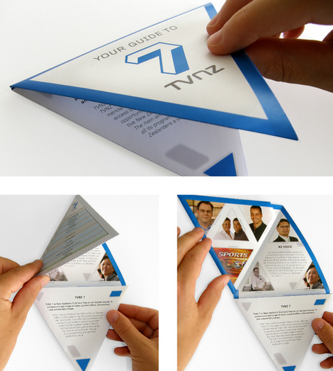
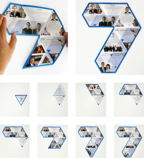
A triangular brochure for a New Zealand TV station folds out into a 7, reminding viewers of the familiar onscreen logo.

The brochure features the channel’s signature blue and triangular photos of station talent. Copy and programming information are kept brief to fit in the document’s distinctive triangles.

Places To Live

14. Spencer’s Crossing

Designer: Jennifer Springman

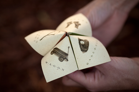
Brochures for a housing development called Spencer’s Crossing fold into a game to show that the neighborhood is for “kids at heart.”

The logo design features the words arranged in an arch over stepping stones to evoke the community’s walking trails.

Photos inside feature youngsters having fun at a pool and in a lush, green yard, to further reinforce the neighborhood as a place for family-friendly leisure.

15. Taj Villas

Designer: Vicom Group

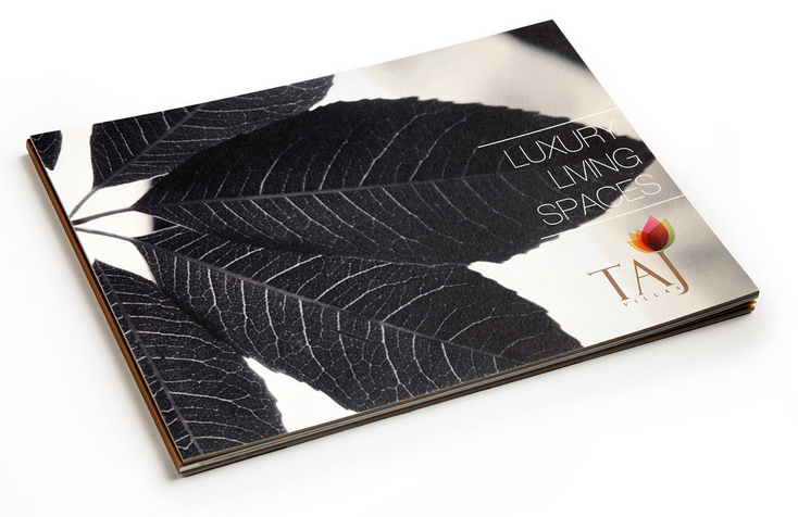
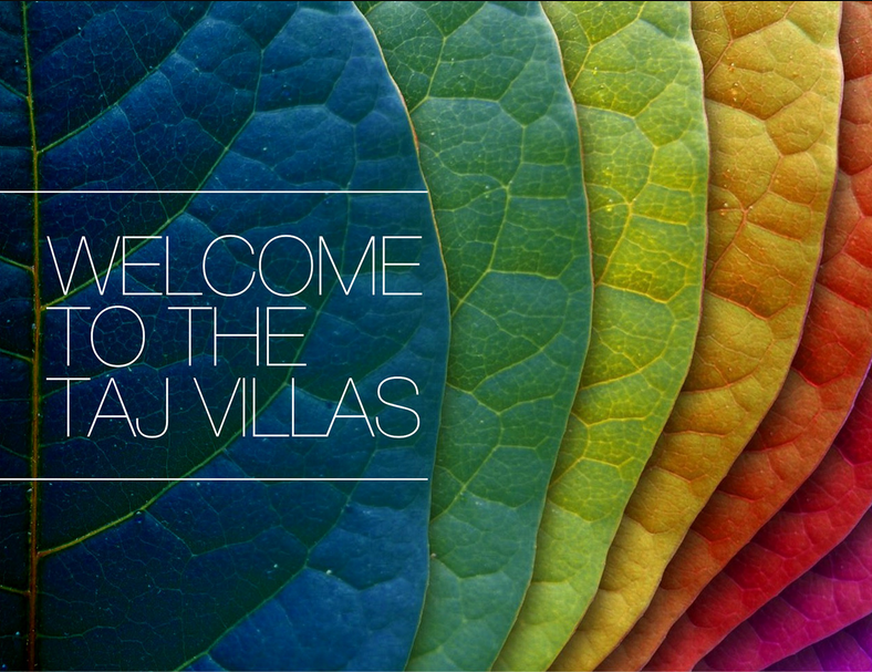
This brochure for luxury villas contrasts black-and-white and colorful leaves both in its logo and its opening pages to evoke the climate in India and the high living available.

The interior contains mainly photographs of the housing, letting the construction speak for itself. A thin sans serif font creates a simple, elegant feel.

12 Great Packaging Designs To Inspire You.

Pure, authentic branding is one of the most powerful things you can do to get your messaging and products to the world. The right packaging design will make your brand identifiable and distinguishable.

Thus, enabling an element of trust within your clients. How people perceive your company is critical in growing a vibrant audience that raves and supports your business.

Developing the “know, like, trust” factor when marketing your products will transform and naturally attract more attention to whatever it is you are marketing.

People enjoy buying from organizations they feel confident in. In the age of e-commerce, product packaging does not only take things from point A to point B, but it is the only physical touch point that brands have with their customers.

Think of your packaging design as your display window. The first impression is the only impression your consumer could potentially have of your work.

The right merchandise design will allow you to stand out and improve your online presence.

Below are 12 innovative ideas that have taken the packaging world by storm. Use these as inspirations to out-design your business competitors and get the audience you crave.

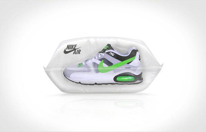
  1. Nike Air

What better way to translate the imagery of the softness and comfortability of air pillow sneakers than by packaging them inside an actual air cushion design?

It is an aesthetically pleasing way to highlight the benefit of the sneaker. The language is clear; these sneakers will make you feel like you’re walking on air. The effectiveness of this esthetic heightens the marketing.

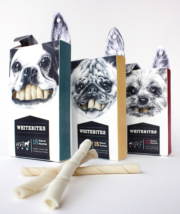
  1. WhiteBites

If you want your brand to be discernible from a sea of online content, your product packaging needs to be striking. An effective way to strategize this is to make your design memorable. Whitebites illustrates this brilliantly.

Your product packaging should communicate the messaging of your brand in a way that is unique and attracts attention.

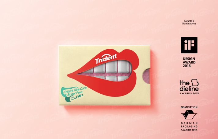
  1. Trident Gum

Creativity is a highly desirable quality. In the design of your product packaging, you can incorporate a level of innovation to engage your potential consumer to purchase your product.

Trident gum is a fantastic example of design packaging executed excellently and with originality. Speaking to your audience’s emotions and innate creativity is a surefire way to convert them to buying customers.

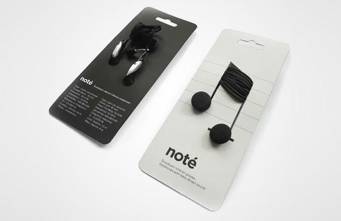
  1. Note Headphones

Your consumer’s purchasing decision is dependent on how well connected they feel to your brand. Designing your product package with this in mind will help you convert more customers.

An instance of this approach implemented creatively is note headphones. Clever ways to aesthetically express the value of your product will entice your target audience.

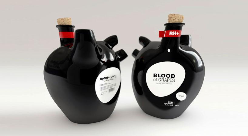
  1. Blood Of Grapes Wine Bottles

Constantin Bolimond developed a concept that synchronized brilliantly with its product name, Blood of grapes wine bottles. The style was created and themed after the shape of a heart.

It’s a striking visual representation. It is mesmerizing because it’s unexpected, a fantastic way to grab your audience’s attention. The product design is not yet available for retail.

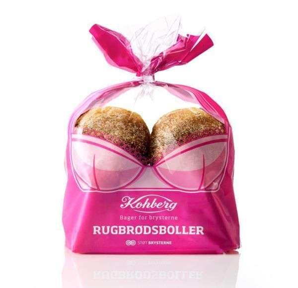
  1. Kohberg Bakery Group

The largest bread manufacturer knows a thing about appealing to their ideal consumers. Their sketch attracts attention to the fight against breast cancer. The visual image is vibrant and innovative.

Appeals to emotion are an effective way to persuade and influence potential consumers. We make decisions based on our intuitive and emotional responses. Speaking to emotions is a compelling way to move people to action.

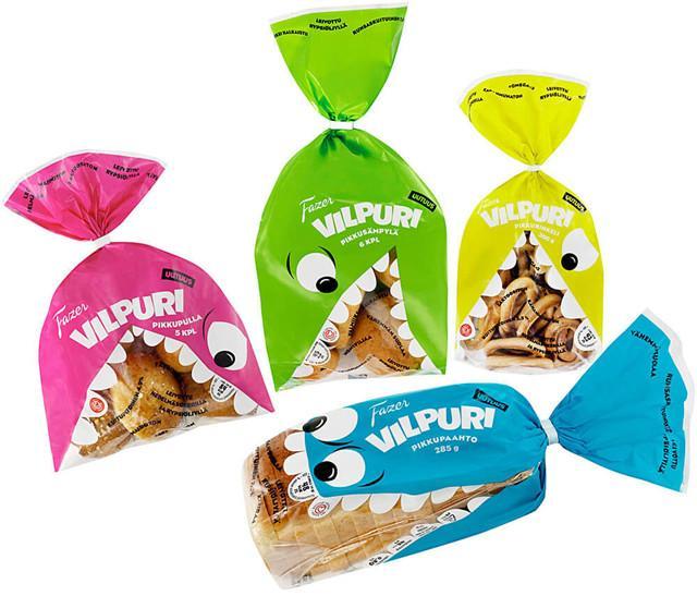
  1. Big Mouth Monster Self-Adhesive Treat Bag

What better way to intensify your consumer’s natural urge for candy than by strategically placing a mouth on the product packaging design? Triggering a consumer’s impulse buying is an effective marketing strategy.

And a great way to increase your revenue and create brand loyalty. Fazer Vilpuri cookies and breadrolls is an example of this technique executed excellently.

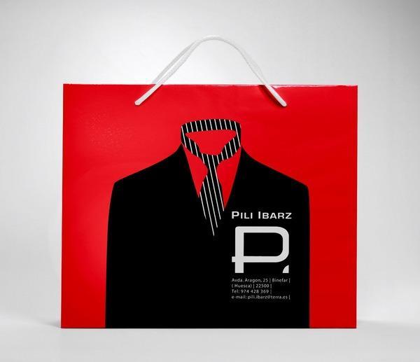
  1. Creatives Wall

Design packaging does not need to be complex. You do not need to recreate the wheel.

All you have to do is put your creative spin on what is already working in your market. For example, you can add a clever design to a simple paper bag.

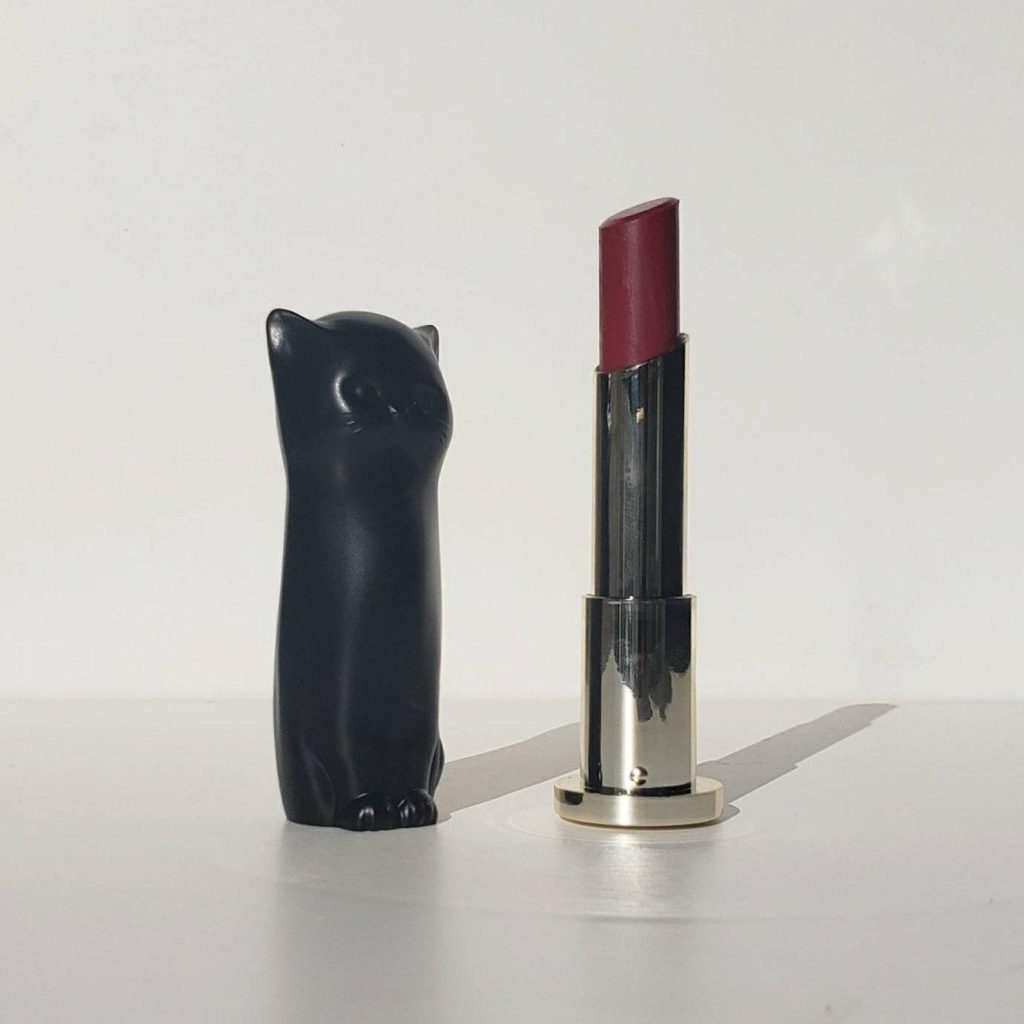
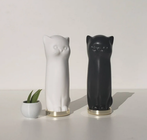
9. Puppy Skincare

Puppy skincare created a beautiful package for their lipstick product. The vintage cat visual directly speaks to the messaging of the brand.

Their brand’s emblematic consistencies create an ambiance of loyalty and dedication amongst their audience.

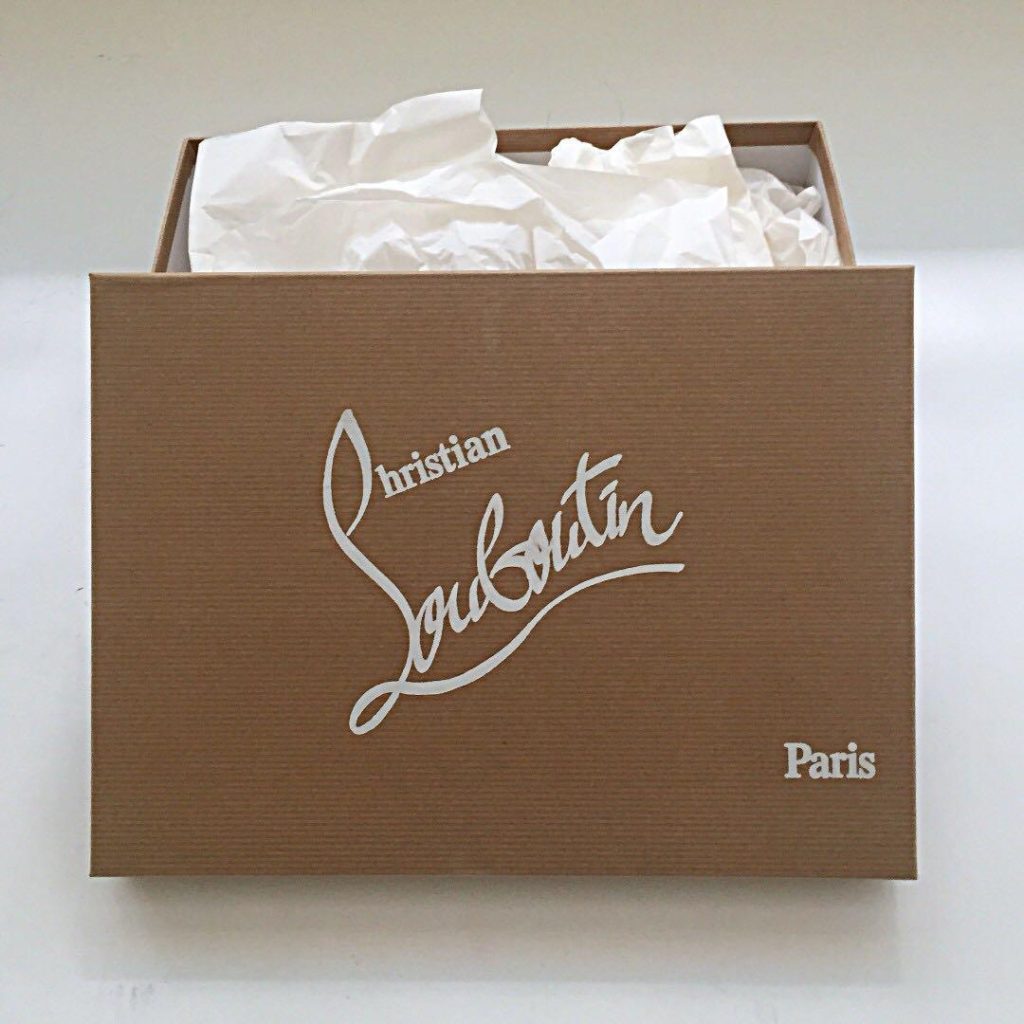
10. Louboutin

Louboutin is one of the most recognizable and distinguishable brands in the market.

Its packaging designs have an air of sleek minimalism that speaks directly to the high-end quality of its products.

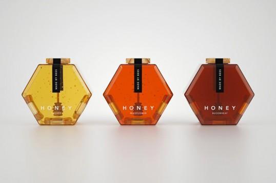
11. Hexagon Honey

The hexagon honey bottle design stands out from the blend of sameness most honey jars have. A true example of what it means to make your brand packaging exceptional.

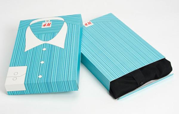
12. H&M Box Packaging

This fun and eccentric box packaging is a fantastic way to grab your consumer’s attention. The design gives a sense of whimsicalness and joy.

Wrapping Up

When designing your product packaging, don’t try to reinvent the wheel. Learn from what has survived the test of time. And remember to add your individual brand’s uniqueness and core messaging. Make your consumer’s first impression a lasting one.

Bi-Weekly Resource Round Up Vol 21

Featured Flocksy Team Member Design Of The Month:

Here is a custom flyer graphic mockup created for a client by Flocksy team member Eman.

All custom illustrations/brand designs/marketing materials on Flocksy are created completely from scratch by one of our extremely talented graphic design creatives.

Start a graphic design project today and see results in just hours!

Revamp or Rebuild? What to Do With Your Old Website

    by Flocksy writer Rachel
  With web technology changing and improving constantly, it’s easy for websites to look out- of-date even within a few years of creation. You may be wondering whether you need a whole new website or merely a facelift. Here’s what to keep I mind when making that decision. continue

How to Improve Your Email Open Rate

by Flocksy writer Matt.
One question many marketers ask themselves is “how can I get my emails opened?” While there are plenty tricks out there, we recommend a thoughtful approach that focuses on communicating with those subscribed and giving them something valuable or tangible from the beginning so it pays off at the end.   continue    

How Are Your Media Relations? Give Them A Boost With These 5 Tips

by Flocksy writer Kasey.
    In the digital age, a relationship with the media is crucial to getting your business out in the public eye. The process of building this relationship is the core of media relations. Not only does this build a valuable connection with people who can improve your reputation in the community, it’s a way to get some free marketing. continue

12 Great TV Logos To Inspire You

by Flocksy Writer Danielle. 
  With so many great shows, marketing teams need to develop great logos that fans can remember and recognize. These 12 great television logos are memorable, effective, and creative. continue

12 Design Tips For Amazing Ads And Marketing Materials

Nobody likes ads…until they do. The right ad can make your potential customers laugh, nod their heads, or come down with a case of FOMO. When done well, ads start a conversation with your audience.

So, how can you capture consumers’ attention and speak to their desires in one simple ad? It all comes down to the visuals. Design is a powerful communication tool. Here’s how to cut through the noise and make a lasting impact with just a few words!

#1 Make Your Fonts Legible

Your audience does not sit down to consume ads. They are an interruptive form of marketing, one that pops up throughout people’s daily lives. To catch their eye, you need to make your ad as legible as possible.

The first place to start is the typeface. While fancy cursive or funky headline fonts may be fine for a wedding invitation or album cover, ads’ typefaces should be clean, simple, and highly legible.

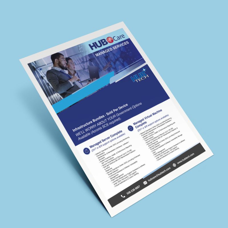
For example, this ad design features too many different typefaces, several of which are tightly kerned or heavy cursive. There is also way too much text on the design. Much of it could be illustrated visually!

#2 Limit The Text

In addition to having great copy on your ad, you must keep it short. Most people can read short snippets of text in mere seconds. But once you start putting paragraphs on your ad, you’ll quickly lose them.

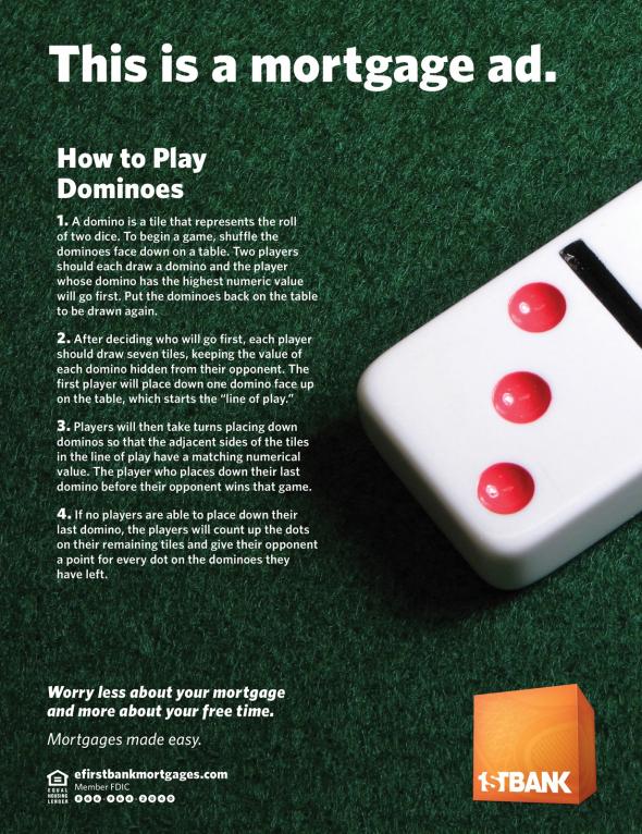
For example, this ad design started with a great concept (“we make mortgages easy so you have more free time”) but got weighed down by its long paragraphs.

Also, each bit of text should have a font size proportionate to its importance. Obviously, key heading and calls to action should be the biggest! That’s not the case in this design.

So, keep your ad copy short and sweet. It’s best to use active language and simple phrasing. Remember, you want people to read it as easily as possible. Bonus points if you can make it funny!

#3 Embrace The F Pattern

People tend to process visual information from left to right across the top, then down the left side and across. This “F pattern” describes how most viewers direct their focus.

Therefore, important elements should be at the top and left of your ad design.

#4 Mix It Up

Sameness is the enemy of attention. The more similar your ads’ visual elements, the less likely it is that viewers will parse critical information. Your most impactful graphic should outweigh the others.

Also, headings and other key messages should be significantly larger than the other text.

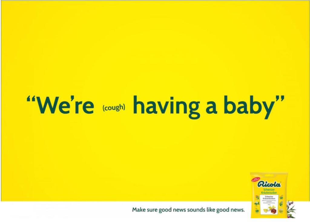
You can play with font sizes to further express your message. Consider how this Ricola ad illustrates how a small cough can intrude upon a conversation.

Also, each graphic should be sized appropriately to capture attention and balance the other elements. This is especially important if you have lots of images in your design!

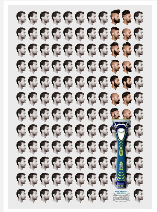
Notice how this ad design balances the size of the razor against the grid of portraits. The razor is placed in the lower third, which gives the overall layout a dynamic feel.

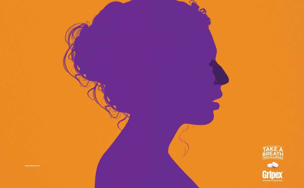
#5 Get Suggestive

Let’s face it: the most provocative ads are often the most effective. Tantalizing or tricking the audience definitely gets their attention!

To make this design approach work for you, consider how you can tease something taboo or uncomfortable. Then, let the viewer fill in the gaps.

#6 Optimize Your Use Of Color

Your ad’s color scheme has more of an impact than you might imagine. First, colors play a huge role in how people perceive and process your design. Intentional color choices help express your values while engaging your audience.

Second, colors can clarify your key message. See how this ad uses color contrast to draw attention to the most important visual elements.

#7 Leverage Color Psychology

Following from tip #7, consider how different colors evoke different emotions. Color psychology is a well established set of principles that guide how people perceive visuals.

For example, purple suggests power, yellow connotes friendliness, and so on.

This L.L. Bean ad uses a friendly yellow to complement its central image of an adorable golden retriever. Combined with a witty, benefit driven headline, the overall design creates feelings of comfort and happiness.

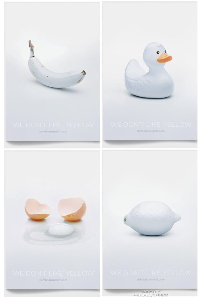
By the same token, a deliberately “wrong” color choice will turn viewers’ heads and get them to pay more attention. That’s because our brains want to reconcile any incongruous information.

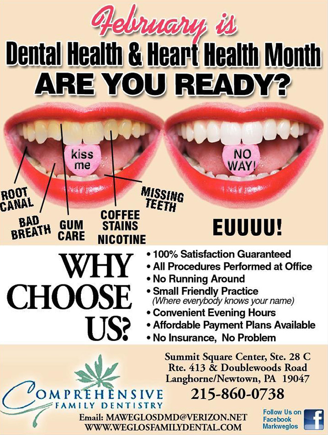
Take a look at how this series of dentist ads portrays famously yellow objects as pearly white to promote their services.

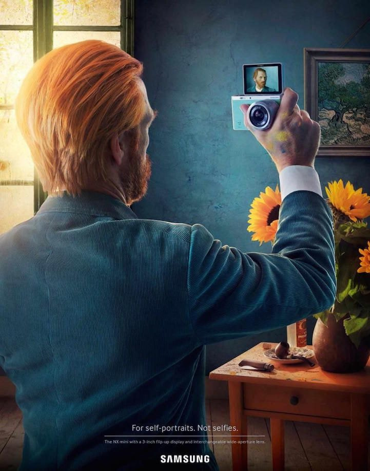
#8 Incorporate Iconic Figures And Places

Our brains are wired to pay more attention to what we already know. That’s why recognition is so critical to advertising success. You want people to instantly recognize the elements of your ad.

If they don’t recognize your brand itself, use something they will definitely find familiar.

#9 Focus On Concept, Not Content

Ad designs don’t need to be highly literal. For example, it may seem obvious to depict a lawnmower for a lawn care business. However, is that unique enough to be eye catching?

Remember, the key to effective marketing is to emphasize your benefits over your features. Try using visuals to illustrate a concept rather than merely describing what you do.

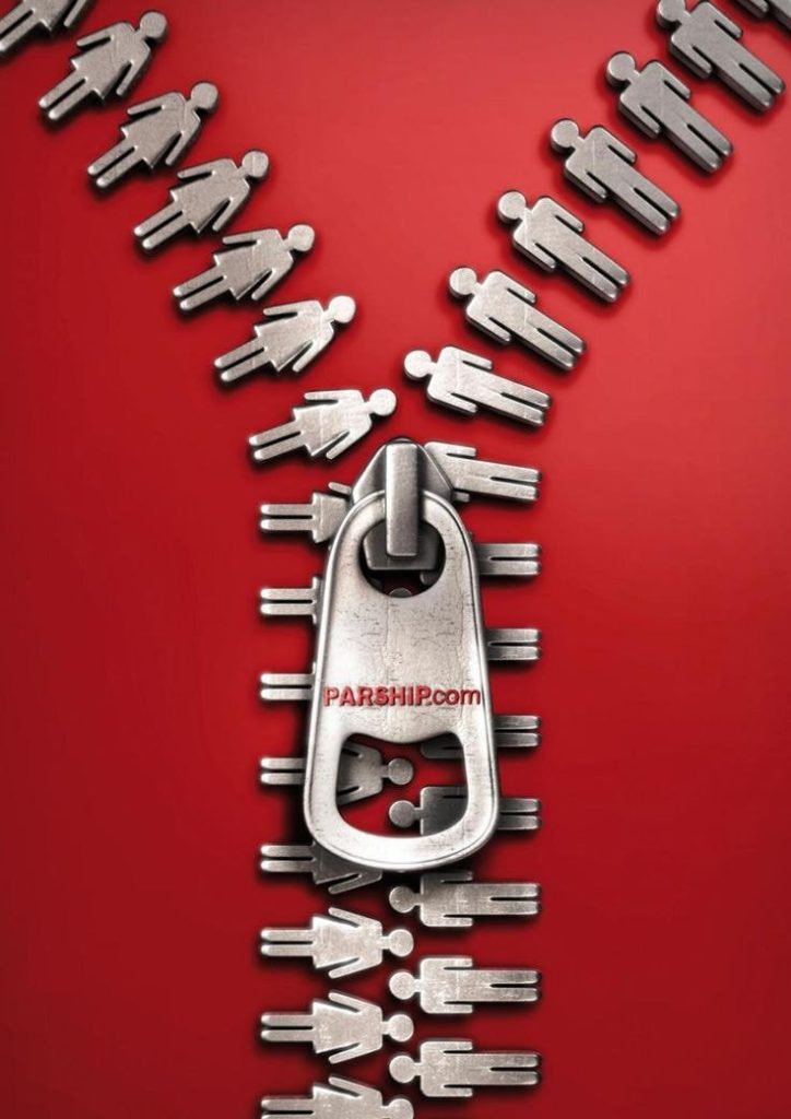
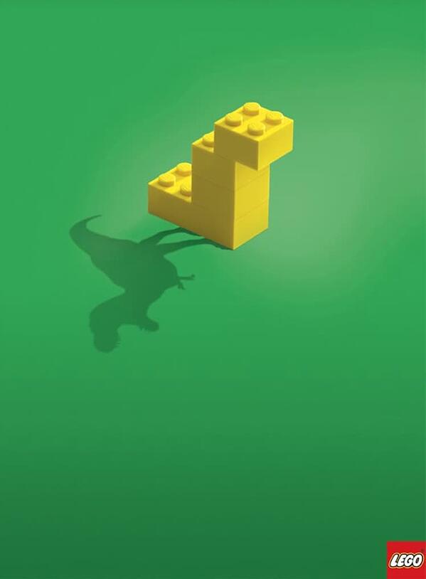
For example, can you guess what’s being advertised by this design?

If you guessed “matchmaking service,” you would be correct!

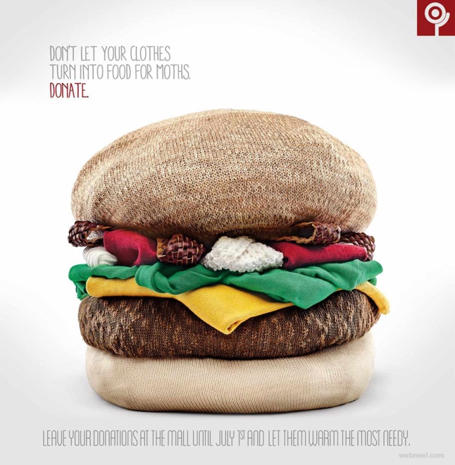
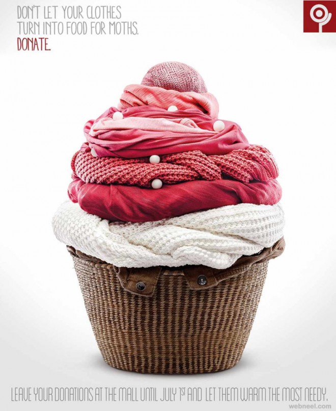
Here’s another example that illustrates the key pain point the brand wants to resolve: getting old, moth eaten clothing out of your home.

#10 Choose A Strong Image

The most impactful ads are rarely complex assortments of words and pictures. A single, compelling image grabs your viewers’ attention. If you can send a clear message with one image, do it!

As the saying goes, a picture is worth a thousand words. An iconic image for your ad might be worth a million.

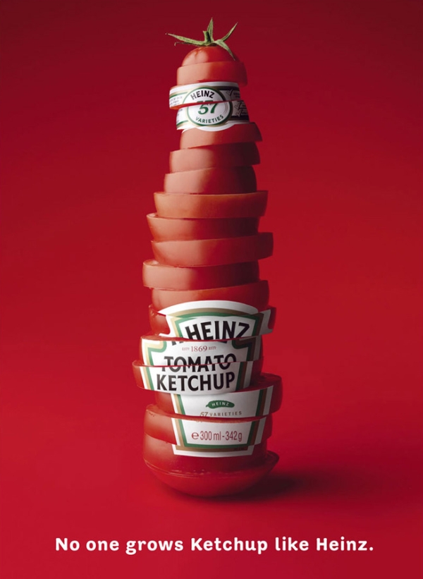
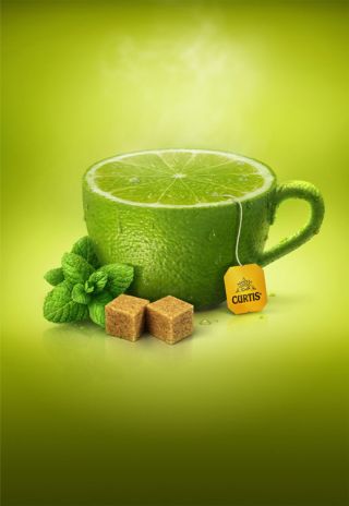
#11 Use Visual Mimicry

Ad design is an opportunity to get creative with your images. Rather than visually depicting your product’s benefit, illustrate it with an imitation.

Portraying a well known object as your audience’s desire (or even their pain point) engages their interest with few words.

A refreshing lime or dragonfruit infused tea? Coming right up!

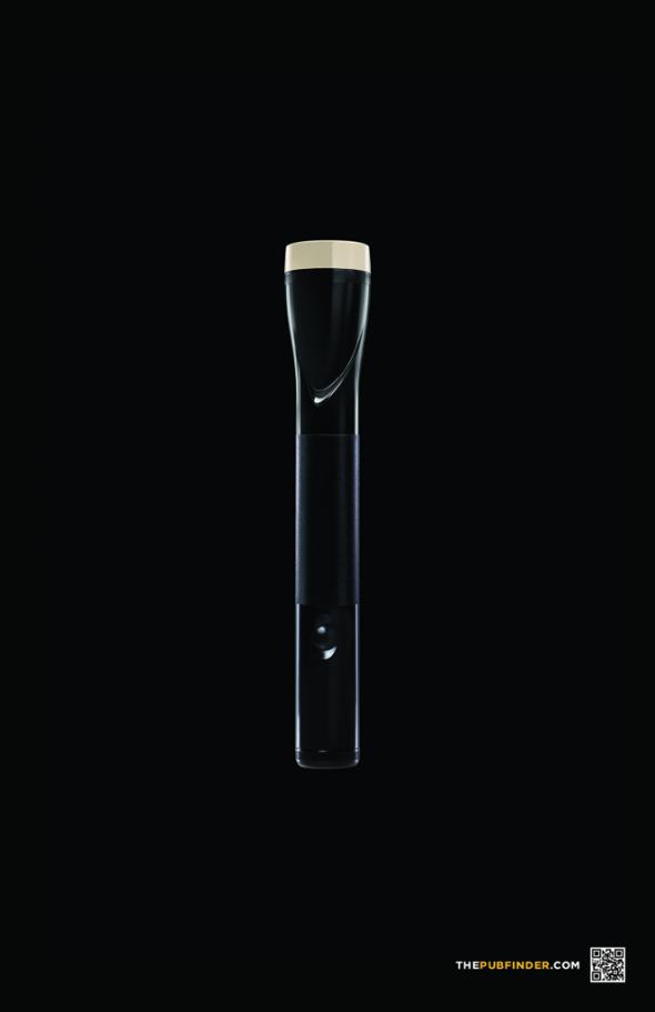
When taking this approach, be sure that you differentiate the image from what it’s mimicking!

For example, this ad for PubFinder.com is comparing a flashlight to a pint of beer, but at first glance, it looks too much like the former.

#12 Lead With Symbolism

As we discussed above, shorter is better for your ad’s text content. You want to catch people’s eyes without forcing them to read too much.

But what if you could share your message without making them read at all? A symbolic design can say much more than words alone. More importantly, symbolic images resonate more strongly with audiences.

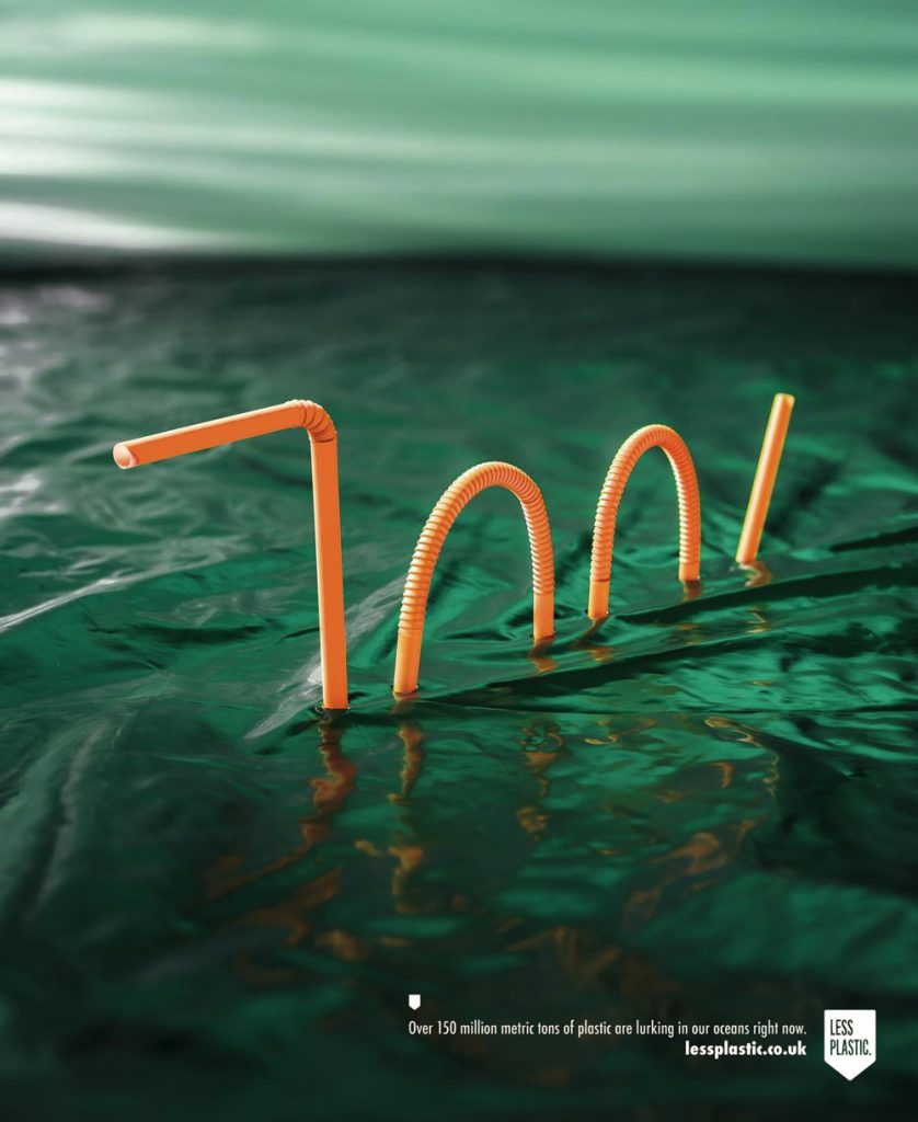
Tap into visual metaphors to express deeper themes in your ad design. These can include images with certain connotations as well as altering graphics to deliver your message.

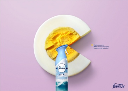
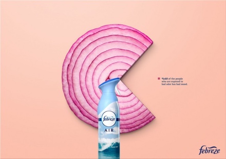
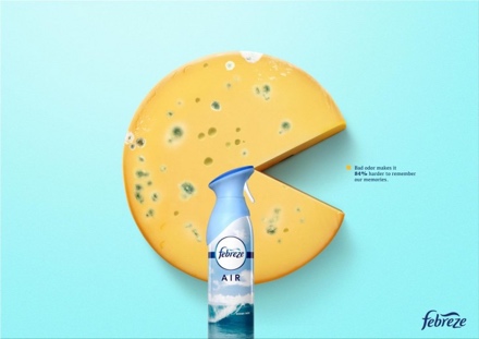
For example, check out this Febreze campaign that depicts well known smelly foods as pie graphs.

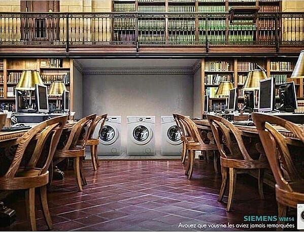
And this design portrays typically noisy objects (washing machines) in a typically quiet place (a library).

The clear message, discernible with minimal copy, is that these washers are much quieter than their competitors.

Wrapping Up

There are definitely some time honored principles for great design … but innovation is crucial for standing out in today’s information overload!

Consider your target audience’s interests, psychology, and pain points, then get creative with your visuals.

Keep the text short and sweet, and swap out copy for strong imagery whenever possible.

Remember: you have just a few seconds to captivate your potential customers. Make them count!

6 Proven Ways To Conquer Your Creative Block

Everyone struggles with creative blocks, not just writers and artists. Regardless of your industry, or whether you’re a professional or a hobbyist, sometimes those creative juices need squeezing before they start to flow.

Maybe your inspiration from the day before has run dry, or the deadline you thought was miles away is right around the corner, and the stress is preventing anything else from entering your brain.

Whatever the reason, there are plenty of evidence-backed methods to get to the other side of your creative block. Take a look at the tips below and get to creating.
Go Outside And Stretch Your Legs

Since whatever you’re working on most likely requires you to sit still indoors, a surefire way to free up some mental space is to take a stroll outside. Whatever your surroundings, a busy city or lush woods, try to let them guide you away from distracting work thoughts.

Don’t look at your phone or put on a podcast, just let your mind clear as you put one foot in front of the other. Some light exercise while breathing in fresh air can do wonders for your creativity, and leave you feeling refreshed when you sit back down to work.
Write Down All Your “Bad” Ideas

Have you ever gotten a song stuck in your head that just won’t come out until you listen to it? The same applies to all of the different ideas swirling around your brain when you’re thinking of how to approach a new project. You might think an idea doesn’t work and discount it before you’ve given yourself the opportunity to explore it.
Writing down those “bad” ideas can be an eye-opening experience. Maybe you will decide to scrap the idea after all, but you could also end up seeing it in a different light and following through to success.

Do Something (Else) Creative

Creativity begets creativity, which means that any type of creating can bring you back into the zone for your current endeavor. If you’re stuck on a particularly tricky paragraph, put on some music or strum a few chords on the guitar. If you’re looking for a new angle to a presentation, doodle the first 5 images that come to mind in your notebook.

You’ll be surprised what can come from seemingly unrelated practices of creativity. An extra tip – if you don’t have it in you to create something yourself, looking at the work of other artists can work just as well in a pinch.

Pretend To Be Someone Else

Are you used to being a certain type of thinker? Teams working collaboratively on a project often consist of all kinds of personalities: dreamers, realists, creatives, sticklers, and so on. Sometimes falling into a familiar role can limit your creativity, so a good exercise can be approaching your task from someone else’s perspective.

Ask yourself, what wouldn’t I do? Think of what your first step would ordinarily be and then do the opposite. For instance, if you’re the organized type who needs to list out all of your options ahead of time, try going with your gut and the first thing that comes to mind. Don’t worry, with brainstorming there are no wrong answers!

Quiet Your Mind

When you’re feeling blocked creatively, it can be tempting to start clicking and fall into a hole of internet research, opening tabs leading from one thing to another. But often, overloading your mind is the opposite of what you need to unblock your inspiration.

Try instead to close the laptop, turn off the phone, and sit quietly with your thoughts. Just ten minutes of meditation makes a lasting impact and might just be the key to unlocking some hidden creativity. Even if it doesn’t solve your creative block, it’s proven to boost your mood and reduce stress.

Sleep On It

Sometimes no matter what you do, you’re going to stay stuck. That’s when the best thing to do is walk away and rest. Give yourself a break, leave the mental strain behind and start fresh the next day. Everyone can benefit from getting a better night’s sleep; it’s shown to increase mental health, strengthen your immunity, and generally improve your mood.

In terms of a creative block, focusing on something intently and then stepping away allows your subconscious to take over and do some work on your behalf. When you wake up, the answer may just have found you.

Tips for Boosting Creativity and Innovation Within Your Business Team

With being a business owner, there are a lot of hats that you may have to wear. The constant struggle of trying to thrive within entrepreneurship can be taxing. You don’t have to do this alone, though.

To have a successful company means that you need your entire team on-board for the ride. However, many employees, if not encouraged properly, end up afraid to truly tap into their creative side. This is where the test of your leadership abilities comes through.

As a leader, you must take steps to motivate people to think outside the box and find ways for you and your team to make an impact with your business.

Below are just a few tips that you can do to foster creativity and innovation within your business for your team, and yourself.

Believe In Your Business

The first step to creating innovation in your business is by believing in it, yourself. Whether you have a team of 1 person or 1,000 people, this is the most important step.

Set the tone for your company. Try new things, even if they fail, you’ll never know if you don’t try and make that leap.

Stand behind your values, creativity and your company’s product. When the person at the top truly believes in their organization’s deliverables and communicates their vision clearly, then it is easier for this mindset to travel down to the employees.

A hallmark of a great leader is the ability to be humble and seek varying perspectives outside of your own to solve and utilize helpful techniques, such as constructive brainstorming, to prompt more diverse ideas. Make sure you are holding meetings where employees can feel free to brainstorm ideas and have their input heard within the company.

Encourage Your Employees To Speak Up

When people know that they have a voice at their job, it makes them more comfortable to vocalize any concerns or changes that they’d like to see. Encourage your teams to develop a habit of being vocal about any new innovations that they’d like to see within the business. Now, asking your team to consistently tap into their creative juices may take time, commitment and most of all trust (from all of you). Consider doing trust building exercises with your team at least once a week. If you keep at it, the return on investment is sure to be incredibly long term.

Have patience and trust in your team to get there.

Enable Workers to Try New Things

This ties into the above point of encouraging your employees to have more of a say regarding new innovations in the company. As a leader, you must take steps to motivate people to think outside the box. For one, it’s hard for someone to think outside of the norm when they do the same things, see the same people and are stuck in the same environments every day all day.

For example, let your people spend time in various parts of the business and in numerous job roles so that they get a better overall idea of what their fellow coworkers do on a daily basis. Not to mention, this gives teams a glimpse into how the company works as a whole.

Also, combining multiple teams together for a few days gives varying influence, strengths and viewpoints toward a project. They may come up with even better innovative ideas when they have diverse, new perspectives to pull from.

You can take it a step further and bring in outside help whenever you think it will be beneficial. Hire motivational speakers and consultants who are experts in niche areas or even in creativity itself to aid in your team’s creativity process.

Provide Resources

The appropriate technology can mean the world when it comes to bringing innovative ideas to a business. Software tools like Adobe Acrobat, Illustrator and Photoshop can be helpful to your teams to create quality products to quip your customer’s interest and thus lead to sales.

Furthermore, web design programs, digital animation, and video editing software will add quirky marketing devices for your products and often guarantees more exposure. The more resources you provide, the more you set your company up for success.

Reward Innovation

Positive reinforcement toward your employees when they give you their creative ideas is a must. After all, what do they receive once they’ve worked hard to come up with a really great creative or marketing innovation for you and the company?

Reward people with gifts or special perks when developing and sharing cool ideas or innovative solutions. Keep in mind, rewards often come in the form of bonuses, money or even gift cards, but it doesn’t necessarily always have to be financial.

For example, stock up on helpful USBs, personalized water bottles, cool notebooks and specialty bottles of fine wine. You can even do monthly rewards for the person who comes up with the cleverest, most innovative ideas each month, such as an extra day off work, tickets to sporting or local events or free lunches for a week.

Setting up an awards system that acknowledges your employees work within the company sets a light, collaborative tone and reminds people to see how valued creative thinking is.

Breaking Through A Creative Block

Your deadline is coming up and you haven’t even started yet. You feel nervous, anxious, and maybe even a little bit defeated already. You’re starting to wonder if you’ll ever finish the project and if you’re even in the right career.

When you suffer from a creative block, it can feel like everything is stacked against you. But there is good news: you’re not alone. Many professionals (and beginners) in creative fields have suffered, and eventually broken through, creative blocks.

It’s important to be productive, but it’s also essential that you stay true to yourself as a creative. We’ve gathered five tips that have helped others break through creative blocks while maintaining their authenticity, and we hope these tips will help you, too!

Fix Your Space

You might already have office space, whether it’s at home, in a coworking building, or at a company office. No matter where your workspace is, take a look at your desk. Do you have all the supplies you need? Do you have the space to sketch or write when you do get that flash of inspiration?


If your desk is overloaded with papers, you’ll need to clear them off first. You can even stack them on the floor if you need to; just get them out of the way of your creation space.

If your walls are lackluster and bare, consider hanging prints, paintings, or photographs that inspire you. On the other hand, if you find visuals distracting, keep your walls empty.

To break through a creative block, you need to take stock of your environment. What’s bothering you? What’s distracting you? Find out and fix your space issues before you move on.

Set Your Schedule

Having a schedule is critically important. Research has proven that routines are necessary for success. Your brain knows that “this is creating time” if you sit down in the same spot at the same time every day.

Your brain is prepared to help you get in the right mindset and avoid distractions. When you don’t have a schedule, you have to force your brain into that mindset every single time you need to work.

If you need to break through a creative block, take a good look at your schedule.

Do you have one? Do you dedicate mornings to research and afternoons to writing, for example? Or mornings to sketching and afternoons to fine tuning? Do you have a plan or a process for how to approach projects, such as brainstorm, sketch, revise?

Write down a schedule for yourself and stick to it. You should also look at your big-picture schedule closely. If you have lots of projects due around the same time, you’ll need to set aside time each day to work on different projects. Think about when you work best and what will conflict with your personal life, and then, design your schedule.

But Be Flexible, Too

On the other hand, if you become too attached to your schedule, you might end up making your creative block even worse. Sometimes people might “go through the motions” of sitting down at the same spot and opening the same programs on their computer without actually putting any thought or heart behind their actions.

If this is the case, consider taking a break. You can take a quick 10 minute walk outside. Watching a 10 minute YouTube video about relaxation or meditation might help you as well. If it’s later in the day and you think it could help, consider taking a quick 20 minute cat nap.

Flexibility is important. When you’re stuck in a rut, take a break from what you do every other day and see if it helps!

Try Different Exercises

If you have a good space and schedule, and you’re also being flexible, but you’re still not making progress with your project, then you should look at different exercises.


We’re not necessarily talking about physical exercises (although physical exercise can definitely help you with a mental reset, too!). We mean exercises for your brain that can help you look at a problem from a new perspective.

For example, you can do a word association exercise when you look at a list and write down the first word you think of for each item on the list. You can open the calendar and put your finger on a specific day, then try to write down all your memories from that day. You can challenge yourself to draw something that you’ve always hated drawing before.

You can find many other mental exercises online to try out if you think that none of those will work for you. No matter what exercise you try, it should help you come to your work with a fresh set of eyes and a different attitude.

Motivate Yourself With Small Rewards

At the end of the day, work is all about reward. If you meet your goals, you’ll be rewarded with income by your client. But sometimes, you have to reward yourself to break through a creative block.

Tell yourself that as soon as you finish the first draft, then you can take yourself out for a latte. Then act on that promise. Or, tell yourself that when you finish your sketch of the logo design, you can spend 20 minutes texting friends or playing games.

Give yourself little rewards along the way for making progress, no matter how small that progress might be. Remind yourself that each step you take will help you get the big reward at the end!

Wrapping It Up…

When you fix your space, set a schedule, embrace flexibility, try different exercises, and motivate yourself with small rewards, you’ll find yourself on the way to breaking through creative block. Keep your eye on the prize, but also take time for yourself. You’ll need to balance what you’re capable of with what your client needs. At the end of the day, breaking through creative block means doing what’s best for you.

Freelancing: A Better Way To Work And Why

Think about the last desk job you ever had. Maybe you’re sitting at a desk right now, pushing paper from one place to another, watching the hours drag by and wishing for an escape. Desk jobs don’t have to be a requirement to advance your career or the way you live your life. The answer to your boring desk job is freelancing.

The life of a freelancer is one of flexibility and opportunity. Freelancers have the benefit of a deep pool of job opportunities, all of which help advance their career. Along with being a great opportunity to have the life you always dreamed of, it’s an incredibly lucrative industry.

To top it off, with every project you take on, your knowledge of the world grows. As a freelancer, you get a free education about a wide range of topics, all from the comfort of your own home.

There are tons of benefits to choosing the freelancer life and there are many ways to begin your freelancer journey. Here are a few reasons to consider making the leap into freelancing.

Work From Anywhere

Imagine waking up near a tropical, sandy beach with the ocean air gently moving and the smell of paradise surrounding you. This could be your office. Or if you’d prefer, you can go right from your cozy bed to your home office.

You can work absolutely anywhere with an internet connection when you freelance. The world is your office and this allows you so much freedom to explore it or to stay comfortably close to home. Either way, it’s a convenient and pleasant way to work.

Advance Your Career

One of the biggest perks to freelancing is that every effort you put forth is rewarded. Gone are the days where you put forth every ounce of yourself only to have those efforts overlooked or go unacknowledged. With freelancing, you choose the work you do and the clients you work with, allowing you to advance your career as fast as you’d like. Along the way, you’ll earn more and have more potential for income as you advance.

More Opportunity And Better Job Security

Being your own boss is one of the most commonly appreciated parts of freelancing. With that comes the chance to take on bigger and better projects. There is no shortage of companies looking for freelancers so putting forth even a minimal effort can open up a world of opportunity.

And you don’t have to worry about getting fired when your supervisor is yourself. One reason freelancers are so bulletproof is because they are generally multitasking, taking on multiple projects and contracts at a time. Doing so will keep you bringing in money, even when the economy turns.

More Freedom And Control

As a freelancer, you make the rules for yourself. There’s no more office politics to deal with or people to answer to other than yourself and your clients. You control how much work you take on and you control how dynamic your work life is.

If you wanted to, you can focus on a niche area and become a master. Conversely, you can take on many projects from a variety of areas and gain a broad base of knowledge. You control how exciting every day is.

Flexibility

Ever part of freelancing is flexibility: your hours, your dress code, your office, your projects, your workload. Along with that flexibility, you can create your ideal work day easily. You choose the projects you work on and that determines how much money you bring in.

You decide what works best for you as far as your work hours. You get the freedom to dress how you’d like and to have a life outside your job. It’s an entire world of flexibility waiting to be tailored by you for you.

Learning Opportunities

A lesser-appreciated aspect of freelancing is the chance to learn. With every project, you learn a little more. Because you will likely take projects from many different types of businesses and industries, you’ll start to gain an insight into a huge variety of areas.

This will of course make you a more interesting cocktail party guest, but it will also improve you as a person. Where else can you get such a broad education and get paid for it?

The Takeaway

Freelancing isn’t for everyone, but it might be for you. If you can be disciplined with your time, you can have the workplace and work life of your dreams. With a ton of flexibility and freedom, you will earn more and be happier.

Choosing the Right Font: Sans Serif vs. Serif

Whether you’re developing the brand identity for a new company or you’re re-working an existing company’s brand, you have plenty of important decisions to make. Not only do you have to decide on the colors, logos, graphics, and messaging, but you also have to make a decision about one of the most important components of the brand guide, a choice that will be seen all over your website and emails: your font.

Choosing a font requires a lot of thought and attention to detail. Before you choose your specific font, take a step back and look at the big picture. There are two main categories of fonts: serif and sans serif. How do you know which one will be the right fit for the brand?

What Is A Serif?

First, you need to know what exactly a serif is. Simply put, a serif is a small, decorative curved stroke. It is added on to the end of a letter stem, either at the top, on the sides, or at the the foot of the letter

So, serif fonts have serifs, which are extra decorative lines. The word “sans” is French for “without.” A sans serif font is without, or does not have, these small extra decorative lines. (See image below, left is serif, right is san serif)

Choosing a font that has serifs will impact how customers perceive your brand.

When To Use A Serif Font

Serifs were first used in typefaces in the 1700s. Because they’ve been in use for hundreds of years, they are, first and foremost, considered traditional. Serif fonts are very useful for when a company wants to be perceived as trustworthy, reliable, and established.

Businesses that typically choose to use serif fonts in their branding include newspapers, like The New York Times, law firms, banks, and other long-established institutions who want to cultivate a sense of trust.

The most commonly-used serif font is Times New Roman. Many organizations (like the Modern Language Association, the Chicago Manual of Style, and the American Psychological Association) prefer submitted works to be formatted using Times New Roman.

Teachers and professors want to prepare their students for the high standards of these organizations, and therefore require their students to turn in papers formatted in these fonts from a young age.

Because they want to also hold themselves up to these high standards, and because they want to be perceived as trustworthy, schools and universities often use serif fonts in their branding.

Serif fonts are an excellent choice for companies and organizations who want to inspire confidence and trust. If you want a brand to be perceived this way, choose a serif font as part of the brand identity.

When To Use A Sans Serif Font

Sans serif fonts do not feature the small, decorative strokes at the end of their letters and are characterized by their absence. Sans serif fonts have become extremely popular in the last 30 years. When a company wants to be perceived as modern and accessible, they choose a serif font.

One important reason for this choice is that sans serif fonts are more readable than sans serif fonts. The way they render on a screen makes them easier to read.

Companies who want to be perceived as forward-thinking and “with it” often choose sans serif fonts for their brand identities. Google, Hulu, Netflix, and many more tech companies feature sans serif fonts across their platforms; in fact, sans serif fonts are the default for the tech industry. Adidas, Uber, and Airbnb are other companies that choose to use serif fonts.

Very popular sans serif fonts include Arial, Helvetica, Open Sans, and Proxima Nova.

If you want to establish a brand as modern, approachable, and friendly, choose a sans serif font.

To Sum It All Up

Ultimately, serif fonts send a message that the company or organization is trustworthy and well-established in their field, while serif fonts sent a message of modern approachability.

It’s up to the marketing team to determine what font best reflects the brand’s values and will make the intended impression. To do this, test out several fonts and decide which one best matches the brand’s vision.

At the end of the day, there are no hard and fast rules for what font choice will be best. Try out a serif, sans serif, or a combination of these two font styles, and survey plenty of people about how each font represents the brand before you come to a final decision.