The fascination with logos. What is about them? Maybe it’s the fact that they say a lot about a brand without even needing text. Perhaps it’s the fact that they can be so unique and stand out from the sea of other designs.
No matter what it is, we know that logos play an important part in not only design but in business.
Different logos can have their own style, and that’s never more than when it comes to gaming logos. Have you ever stopped to think about what makes Call of Duty so easily recognizable? Yup. It’s the logo. A good logo says a lot about the brand, and a good gaming logo is especially important since it needs to stand out from all the competition.
Here is a collection of some of the best gaming logos that we found.
1. Fortnite
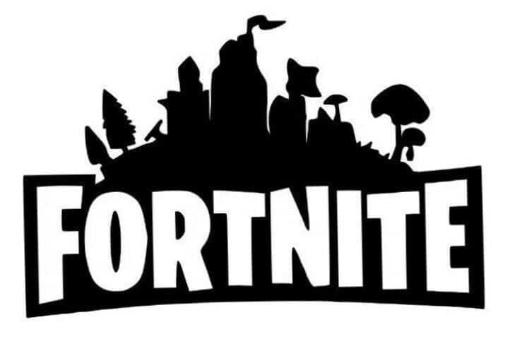
This logo stands out, and not because of its color but lack of it. The silhouettes draw focus to the design, but not in an obvious way, allowing users to learn more about the game from a simple glance at the packaging.
2. League of Legends
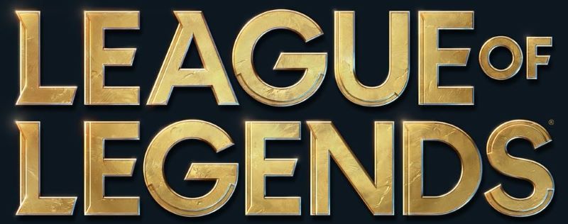
A popular e-sports game, League of Legends has an elegant design. The gold rim and lack of design (with basically only the lettering) make it a statement logo design.
3. Mortal Kombat 11

The 11th installment of a widely popular fighting game, this simple design says everything that needs to be known. The combination of the 11 with the text is especially unique.
4. Magic: The Gathering Arena
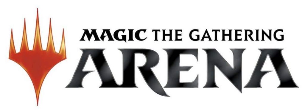
It never hurts to draw a little attention to a very basic design. While the typography is rather unique and bold in style, it’s the flaming bit of fire to the side that is the real eye-catcher in this design.
5. Warcraft III: Reign of Chaos
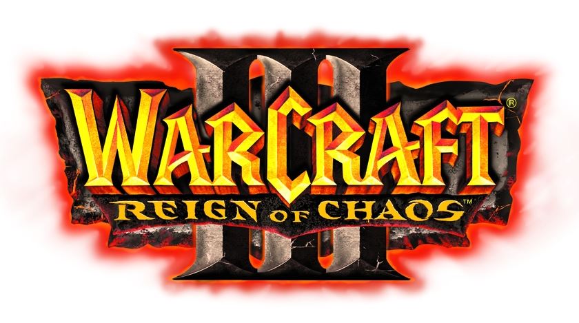
A fun and incredibly popular fantasy game, this design is any but plain. Its chaotic, colorful, and busy design somehow works well and is not in any way unpleasant. In fact, is rather intriguing and attractive.
6. Starcraft
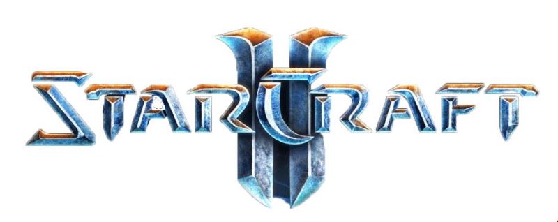
What makes this logo unique is the design. The blue haze with the extra effect of the blue “lightning” makes it subtly stand out. The added hint of a steel “look” in the typography makes this entire design pop.
7. Call of Duty
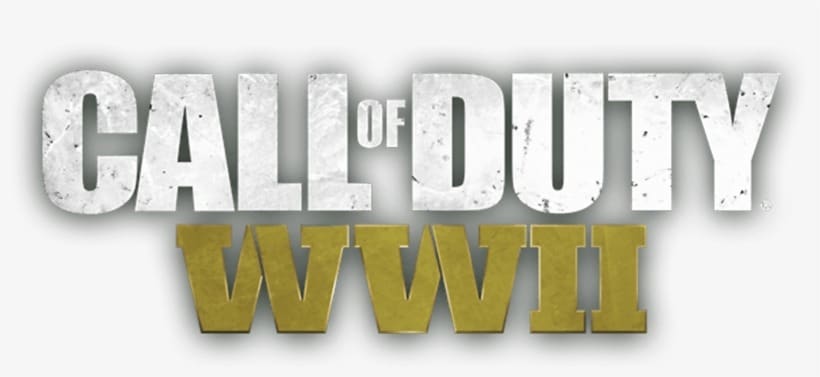
We talked about it a little up above, but we can again. What makes Call of Duty’s logo so unique? We venture to think that it’s that glowing green. That, combined with the grayish, metal tint makes one instantly think of rugged camo, and war.
8. Dragon’s Dogma: Dark Arisen

Everything about this action role-playing video game screams wild fantasy adventure. The typography, as well as the fiery dragon, make this easy to identify and know what it is (roughly) about.
9. Counter-Strike: Global Offensive

A well-known gaming empire, Counter Strike’s logo is easily recognizable. What makes the Global Offensive design eye-catching is the soldier silhouette and the blue and gold color combination.
10. Overwatch

Another example of how the most simple of designs draw the most attention. While the entire color scheme and typography is attractive, what is really the eye-catcher on this design is the triangular orange shapes under the “A” and above the “V”.
