ga('send', 'pageview');

Announcing New Features at Flocksy

We’ve reimagined how easy it can be to start & manage projects with Flocksy.

Have you ever wished that expressing exactly what you want was easier when creating project briefs? Our innovative platform updates, released today, make it easier than ever to ensure your creative team delivers picture-perfect content for your brand every time. 

At Flocksy, the pages you use to create and manage projects are the most important to us. 

That’s why we’re so excited to announce these new features! Without further ado, let’s get into the details!

1. The dashboard looks incredible & is easier to use than ever!
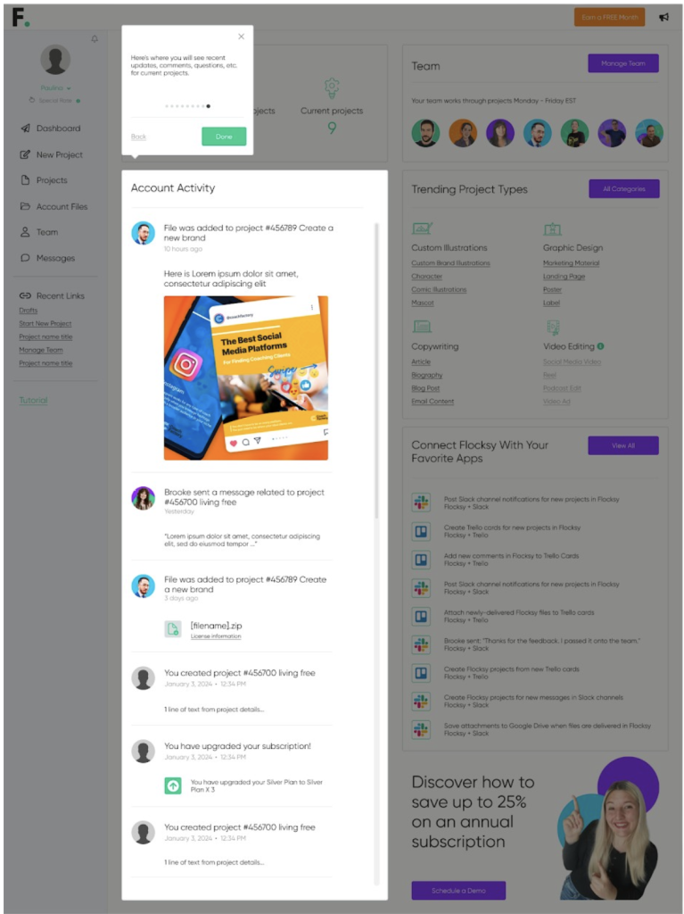
We made the user portal even more appealing to look at and intuitive to use. The updated look should make you feel more comfortable and you’ll be able to navigate through all our amazing features with ease!

It’s easier than ever to:

  • See where your projects are
  • Contact your project manager or creative team
  • Start a project
  • And more! 

2. Introducing AI Assist for Creating Project Briefs
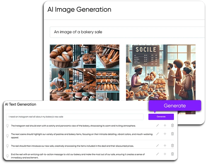
When you are staring at that empty page for project briefs, it can feel intimidating. That’s why we’re introducing our AI Assist feature for Gold and Platinum Plan members! This totally optional feature helps you with text generation and image generation. You don’t have to use technical jargon to explain what you’re looking for — include as much or as little detail as you wish, and we’ll take it from there!

  • For text generation, you can type a phrase or idea into the box, and our AI generator will help you turn these ideas into actionable instructions. You can also type straight into the brief text box if you don’t need AI Assist’s help. 
  • For image generation, you can help your creatives get a better idea of what you envision by typing a few keywords into the image generator form. All selected AI images will be included in the file section for the creative, with an “AI” badge on them. You can also simply upload your own reference images to the brief directly! 

3. Drag-and-Drop Queue Ordering
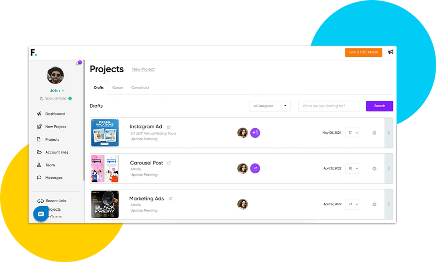
Introducing a smoother, more flexible way to stay on top of your projects with Flocksy! This intuitive enhancement allows you to easily prioritize your tasks, ensuring your workflow stays organized and efficient. Whether you’re juggling multiple projects or need to adjust your priorities quickly, our drag-and-drop functionality makes managing your workload simpler than ever. 

4. New Project Brief Options
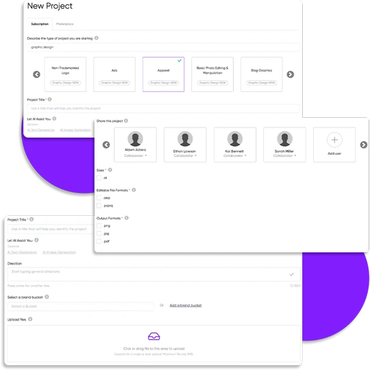
If you’re a fan of copying a Flocksy project brief to create a new project, it now has a new advantage: You can now change the project type of the copied brief! Want to copy a brief from a social media post design project and use the content for a webpage design project? Now you can. This will make it faster and easier for Flocksy clients to create project briefs with pinpoint precision and get one step closer to project delivery! 

Important note: Everybody will have to create new briefs with the updated platform to be able to use the copy brief feature, but once you’ve started one with the new portal, you can take advantage of this new feature. 

5. Finalizing a Project is Faster & Easier

If you want to close a project quickly, we’ve got you! Now, you can finalize a project with just one click. You can still leave feedback or adjust your team after you close that project out. 

6. Share Projects With One Click

Are we excited about this streamlining move with our portal? You bet! This time-saving feature is one of our favorites. Now, when you create a project on the platform, you can automatically share it with a sub-user when doing so! No more copying and pasting to email or Slack messages. 

7. Suggested Sizing for Briefs

Not sure what size you need a project to be? Now, the project brief contains suggested sizes for the majority of projects! We’ve included the most-used sizes for everything from web images to email templates. This will help prevent any confusion between you and your creative team and ensure all projects are picture-perfect and ready to post!

8. Stay Updated with the New Account Activity Feed

If you’ve ever felt like you need a minute to catch up on what’s happening with your Flocksy projects, this feature is especially for you. Our new account activity feed keeps you updated on everything that’s happening throughout your account. 

If you have any questions, please feel free to check out our How It Works pages or our Resource Center! Still stumped? Schedule a call with a Flocksy rep or send a message to your project manager. We’re here to help! 

We Reimagined What Flocksy Can Do For You!
At Flocksy, we love helping our clients succeed. That’s why we’re always looking for ways to improve our services. Recently, we gave our website a makeover and launched our new Virtual Assistants service. But our site redesign is more than just a fresh new look — it’s now even more user-friendly and packed with brand-new features.

Introducing Flocksy’s Virtual Assistants

Flocksy Sofia virtual assistant photo

Flocksy’s Virtual Assistants (VAs) can do all sorts of things for your company, from scheduling appointments to managing social media to tedious research tasks you don’t have the time to complete.

The best part? Our virtual assistants are the creatives and copywriters you already know and trust at Flocksy. Not only are our VAs amazing digital artists and writers, but they can also help power through your to-do lists in no time. Our virtual assistants can help you with a wide range of tasks, including:

  • Writing emails
  • Organizing data
  • Proofreading long documents
  • Managing social media accounts
  • Scheduling appointments
  • Researching topics
  • And much more!

You Can Request AI Services to Speed Up Projects

Flocksy VA photo

We’re excited to announce that we’ve begun using AI tools like Midjourney and ChatGPT to speed up projects when requested by clients. These programs can generate text, translate languages, and create images faster than ever before.

For example, if a client would like to speed up our already record-breaking turnaround time — they can request that their creative team use programs like Midjourney or Playground to generate graphics for websites or high-quality assets for videos and ads.

Not only that, but we prioritize staying on top of all the latest technologies at Flocksy by building AI learning time into our work week. This means our staff can use cutting-edge programs like Replicate and the newest AI features in Photoshop and Adobe to craft your content. Learning how to use AI programs to their fullest extent is time-consuming, but not to worry— our team has become experts on how to create prompts across technologies that will get you the final product you’re searching for.

If you’re looking for even faster turnaround times, you can request that your creative team use programs such as:

Flocksy Victor photo
  • Capcut and Opus to animate subtitles and captions
  • Veed to create audiograms and voiceovers
  • ChatGPT to create scripts, social media captions, or complete research quickly
  • LeiaPix to animate images
  • Recraft to create vector graphics
  • Generative fill on Photoshop to make super-fast edits on images
  • Ideogram for exciting typography 
  • And so much more!

While AI is incredible at most tasks, our Flocksy team will always review and edit all AI-generated content we create to give it a “human touch.” We can assure you that any AI-requested materials will be reviewed and edited to ensure they are perfectly aligned with your brand and mission every time.

Why We Redesigned Flocksy.com

Flocksy Maria Graphic Design Photo

Our main goal was to create a new website that fully encompassed everything our creative team offers. Because we have SO many creative services, we wanted to make it even easier for clients to find the information they needed about our wide array of creative options and affordable unlimited creative service subscription plans

Our new website also makes it even easier for visitors to schedule a demo call with one of our sales managers. Our sales managers and project managers are there to help you choose the right subscription plan AND make the most of our services.

Mockup Graphic Design Book Cover Art

Our Mindblowing New Portfolio

Flocksy’s new portfolio features a variety of projects, including landing pages, animated explainers, and even billboard ads! Now you can get inspired for your next Flocksy project while browsing our latest and greatest work. You can also read real client testimonials and watch our client’s case study videos to hear about how they collaborate with their hand-picked Flocksy creative team to create incredible on-brand content.

We’re proud of the work that we do, and we’re excited to share it with our current and potential clients. We encourage you to visit our portfolio and case studies pages to see for yourself just how talented Team Flocksy really is.

Our Entire Team Came Together to Make It Happen

Flocksy Sohil photo

Our recent website redesign and the launch of our new services resulted from the hard work and dedication of our entire team, and we mean the ENTIRE team.

Our designers and digital artists worked tirelessly to create a visually appealing website, and our developers built a fast and reliable platform. Everyone from our copywriters to the marketing team had a hand in making Flocksy.com the fantastic website it is today

We’re grateful for the contributions of our entire team. These changes would not have been possible without their hard work and dedication. Now, Flocksy.com is a vast testimonial of what we can do (everything).

Check It Out

We’re excited to help our clients succeed, and we believe these new services and our innovative website will help us do that even better. Now, go forth and explore

P.S. We're not responsible for any lost productivity due to excessive browsing of our new website. You've been warned!

Bi-Weekly Resource Round Up Vol 20

Featured Flocksy Team Member Design Of The Month:

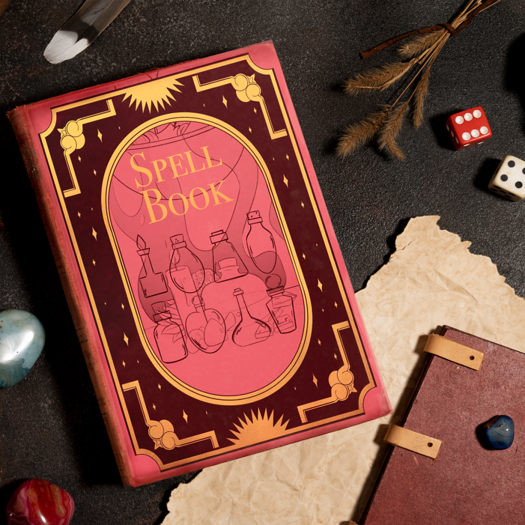
Here is a custom flyer graphic mockup created for a client by Flocksy team member Amanda.

All custom illustrations/brand designs/marketing materials on Flocksy are created completely from scratch by one of our extremely talented graphic design creatives.

Start a graphic design project today and see results in just hours!  

How To Write a Project Brief

    by Flocksy writer Rachel
To request your first creative project on Flocksy, you’ll need to fill out a project brief. Doing so ensures that the creatives who are added to your project will have the information and assets they need to deliver what you want.

Here’s how to go through our project request process, as well as some pointers on what to include in your brief.  continue

How to Write Better Headlines

by Flocksy writer Matt.  
There are many principles and foundations to adhere to when crafting a great headline; here are some of the top tips to follow when crafting headlines of your own.  continue    

Why Google Hates AI, And Why Your Business Needs Flocksy’s Amazing Copywriting Services

by Flocksy writer Janelle.
  Regardless of how AI is used, website and blog owners using GPT-3 and other AI content generators to pump out their content are risking penalties if detected by Google’s algorithm. continue

12 Great Movie Studio Logos To Inspire You

by Flocksy Writer Matt G.
  These Movie Studio logos are incredibly creative and convey information with just a few simple artistic building blocks.    continue

15 Great Circular Logos To Inspire You

We see circles a lot in branding. Why is this? Circles are a symbol of trust and unity, while squares symbolize rigidity and structure. When starting a new company, logos can be a key factor in its success. Here we will look at 15 circular logos, from both large and small companies, and see why they work for marketing.

Green Giant

Why this works: The Green Giant stood out above other food brands when it first appeared in 1925 because of its unique mascot.

Fun fact: Is bigger better? Part of the company’s fame came after they grew a particularly large pea variety, hence the name and the green giant’s deep voice when he says “ho ho ho”.

Chrome

Why this works: Given that circles tend to be perceived as trustworthy, it’s no coincidence that some of Chrome’s biggest competitors: Apple Safari and Mozilla Firefox, also have circles for their logos. Internet browsers take users’ information to better their platforms, so users want to know that their information is being used responsibly.

The interesting note is that internet explorer, which hasn’t done as well in the market recently, emulates a circle but is not a circle. Got to be something to it!

Fun fact: Chrome services more than 2.65 billion internet users.

Grammarly

Why this works: Grammarly is a great software for professional and student writers. The software helps you edit as you work and streamlines the final drafting process. By making their logo look like the first letter of the word and keeping a distinct shade of green, they were able to stand out with minimalism.

Fun fact: When you download Grammarly for free, the arrow spins every time you fix an error in your paper which creates a great dopamine reward for writers during an otherwise tedious process.

Starbucks

Why this works: This gorgeous female mascot is almost perfectly symmetrical.

Fun fact: Starbucks sources their coffee from Arabica coffee beans in Brazil.

Trubify

Why this works: Just 3 elements: a music note, a sound wave, and a circle. This is a smaller company but with a catchy name similar to its competitor Spotify and fairer rules for musicians, it looks like it’s going to gain more traction in the future.

Fun fact: According to their biography on the Appstore, Trubify lets artists earn 2 cents per viewer when they go live for concerts, which is a lot more than what Spotify can give artists per stream on their platform, even after artists have paid them to showcase their music.

NASA

Why this works: This logo ventures a little outside the lines, which is something astronomers have to do all the time to make new advancements in technology. With few edits, this image has stood the test of time.

Fun fact: When John F. Kennedy ordered NASA to send a man to the moon, his intentions weren’t just about dreams and honor. At the time, Russia was also sending men into space and Kennedy wanted to beat them out. Thus, it was a lot more of a political agenda than initially thought by the public.

Ubisoft

Why this works: The contrast between dark and light makes this especially appealing for gamers at night.

Usually, in their ads, the screen will be dark and the logo dramatically fades into view for an awakening effect. If it’s fitting for your brand, you can use this strategy in your advertisement videos.

Fun fact: Known for producing fantastic PlayStation games from the masculine Assassin’s Creed to feminine Just Dance 2022, this company never misses a beat in that you can easily find games for the whole family.

Target

Why this works: Target’s logo matches its motto very well. A simple marketing term, targeting refers to learning more about your customers so you can give them what they need.

Fun Fact: Something a friend and I noticed recently was that Target is having competitively low prices but generally has higher quality clothing that lasts longer than the clothes at Walmart.

The department store doesn’t have the most organized vibe but during the change of seasons, they get a lot of new stock and new deals that are worth a look.

AT & T

Why this works: This circle utilizes a 3D optical illusion to make it appear like a sphere to represent the brand’s global reach.

Fun Fact: For the pre-paid plans, there is no credit check and free shipping.

BMW

Why this works: The iconic checkerboard pattern is reminiscent of 50s diners. In their dealerships, you see this cool style decorated throughout the showrooms. It gives a fun identity for a car brand.

Fun Fact: Known for their Mini Coopers in addition to more expensive models, their used cars can go for under $10,000 while still giving you top-notch service you would normally get with a luxury car.

Mobil

Why this works: The Pegasus is a unique mystical animal and isn’t typically shown in red, white, and blue. What nontraditional colors look good on your logo?

Fun fact: Mobil has been updating this image on their website to not include the circle, but their gas stations still showcase this older version on the side of the buildings.

Pinterest

Why this works: Similar to the Target and Grammarly logos, Pinterest uses a red and white color scheme with just the capital letter for the company.

Fun fact: Just over 77% of Pinterest audiences are female, but ages range pretty evenly between ages 18-64.

Shazam

Why this works: This also contains the capital letter of the brand but it’s turned on its side.

Fun fact: This logo has an interactive spinning animation when you press record to identify a song.

Unicef

Why this works: This graphic is family-oriented so it caters to Unicef’s target audience.

Fun fact: This nonprofit is currently sending support to children and families in Ukraine.

CBS

Why it works: In studies, eye symbols have been shown to attract attention due to a biological response in humans. It’s fitting for a TV network.

Fun fact: CBS is currently showcasing the comedic Late Late Show with James Corden.

12 Great Beer Logos To Inspire You

Logos tell their own story. In fact, they are often the first opportunity a company has to market to a customer. A great logo is essential for consumer products because it is what faces customers on the shelves.

The logos collected here attempt to share the stories of these beer companies. With some big and small brands, every beer logo has a story to tell.

Guinness

The Guinness logo has seen a great deal of evolution since its conception in 1759. However, the logo first appeared with the harp in roughly 1862.

This imagery dates back to King Brian Boru, the first ruler to unite all of Ireland. As the story goes, he had a golden harp, so its appearance here represents the unity of Ireland.

Yuengling

As it says right on its logo, Yuengling is America’s oldest brewery, established in 1829 by David G. Yuengling.

The logo, therefore, has a significant symbol for American freedom on the logo: an eagle. In the Yuengling logo, the eagle appears over a barrel (presumably of beer).

This logo, along with its classic script font, is elegant and classy and feels like a call back to America’s roots. 

Hofbräu

Over 500 years ago, the Reinheitsgebot or “The Purity Law” was decreed by Duke Wilhelm IV and Duke Ludwig X. The Reinheitsgebot stated that only barley, hops, and water be used to brew beer.

The unfortunate part was that they didn’t realize yeast was important as well, so it was added later. Bavarian beers tend to follow the Reinheitsgebot, even today.

In 1589, Duke Wilhelm V founded the Hofbrauhaus to bring quality beer to Bavaria. In the logo, the crown atop the HB represents regality, beer purity, and the crown (foam) atop a beer.

Trappist Westvleteren 12

Trappist Westvleteren 12 is one of the most exclusive beers in the world. Sold only to private customers, Trappist Westvleteren 12 dates back to 1839 when the Saint-Sixtus Abbey began brewing beer.

The bottle cap is the only place on the bottle where the logo appears. The writing itself is older-looking, appearing as though it hasn’t changed since 1839 with the first beers.

They are the quintessential no-frills brewery, so the logo follows suit. For a beer so beloved, the discrepancy between the minimalist design and the popularity of the beer is striking.

Asahi

Bret Syfert, also known as Hyde’s Lovelies, designed the logo for Asahi. He studied and graduated from the University of Arts in London and created the design for the text from nothing, relying on no other font types to create this text.

Kirin Ichiban

The Kirin is a mythological East Asian creature, and it is said to bring good luck. So the Kirin appears on the logo of Kirin Ichiban as a way to bring good luck to the drinker.

It’s like cheers from the drink itself! It also makes the label appealing to those who recognize the Kirin. 

Budweiser

For many Americans, the word “beer” is synonymous with Budweiser, and the logo perpetuates this. The bright red backdrop, with crisp writing and logo, stands out and screams recognition.

The script font in front of the bowtie outline also aims for sophistication. Their slogan is “The King of Beers,” and while the logo had a crown on it for some time, it no longer bears that imagery. 

Newcastle

Inside the oval (or sometimes circle) logo is a blue star. This blue star became part of the logo in 1928, only a year after this beer was born. Each of the points on the star represents one of the five original founding breweries of Newcastle. 

Carlyle Brewing Co.

Carlyle Brewing Co. is a small, beloved brewpub in Rockford, Illinois. Its primary logo is that of a regal-looking chalice. With the slogan “blessed is he who drinks beer,” this chalice alludes to the Holy Grail. 

Goose Island

Goose Island has a very simple, elegant logo. One of the best parts of this logo is that it pays homage to the original logo while also gaining a recent refresh.

The designers also intended to create a logo with a bold, timeless font that would transfer well to merchandise and work in many different ways.

Pig Minds

Pig Minds is the very first vegan brewery in the United States. They attack this niche market with a quirky twist that is a little different but with on-point messaging.

Their logo contains a bold typeface that is clean while also being a little messy, as though caught in the bramble of hops that hang from the sides of the logo.

Heineken

Heineken is often synonymous with the color green. In fact, this modern color is known as “Heineken Green” and is meant to reflect the color of their bottles.

This green color also exudes trust and the natural world. The bright red star represents the tradition of brewing.

12 Great TV Logos To Inspire You

Great television is one of the blessings of the television age. With so many great shows, marketing teams need to develop great logos that fans can remember and recognize. These 12 great television logos are memorable, effective, and creative.

The best logos communicate the ideas behind a television show and seamlessly integrate them into the television show itself. Great logos also depict the themes, symbols, and concepts throughout a television show itself.

Unique for their own reasons, some of these logos are simple and others are complicated, but they are all memorable and take the logo game to the next level.

The Office

The logo for the funny, quirky workplace comedy The Office is relatively simple. In all lowercase letters, regardless of the their appropriate capitalization, this logo appears as though it has been typed on a typewriter. This, of course, is an appropriate look for a show that takes place in an office space.

The other benefit of this logo is that it is easily transferable. The letters can be any color marketing teams need because the lettering and logo are so simple. This, too, makes sense for a show with a sweet, simple idea.

Lizzie McGuire

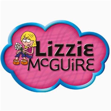
Lizzie McGuire is a coming-of-age show that follows the titular heroine, Lizzie McGuire, as she navigates her middle school years. Alongside her adventures, as a cartoon reflection, viewers meet the cartoon version of Lizzie.

In the Lizzie McGuire logo, this cartoon version appears alongside a fun and funky font with the show’s name. Between the bright colors and the youthful font, this logo screams childlike fun and joy, two qualities the show represents.

Parks and Recreation

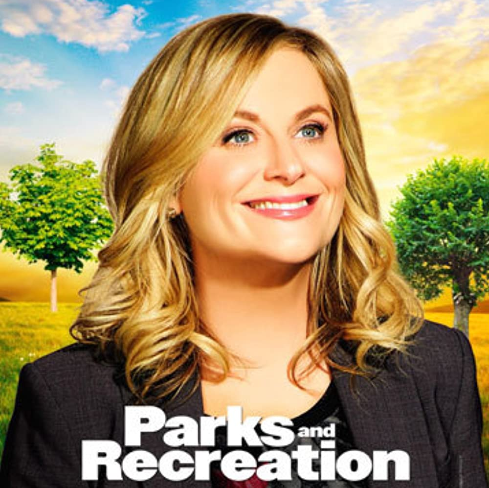
Like The Office logo, the Parks and Recreation logo is nothing too fancy. Instead, it simply reflects the show’s main action, which surrounds a park department in a small town.

The main character, Leslie Knope, is committed to making her small town the best place it can be and is absolutely in love with public service. Most people consider such a passion dull and exhausting, but Leslie is the complete opposite. Therefore, the logo for this show acts in opposition to the type of character Leslie is.

The juxtaposition between the excitable, passionate Leslie and the rather dull logo for the television show is what makes this logo so interesting.

Game of Thrones

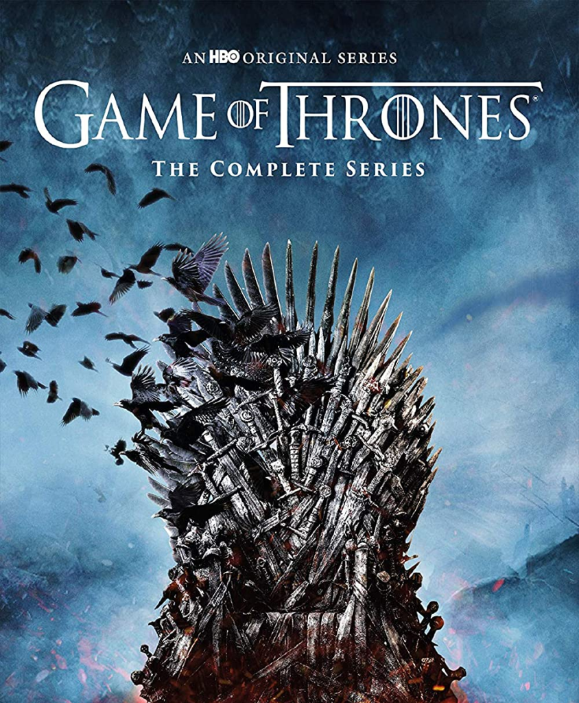
The Game of Thrones television show is rich with imagery and invokes intense feelings for viewers. The logo is quite similar. The text for the logo appears to be quite regal, and with the towering T, pieces of it even feel intimidating.

Like the iron throne, a prominent symbol in the show and its marketing, these letters also feel sturdy and heavy, perhaps even ancient.

The Brady Bunch

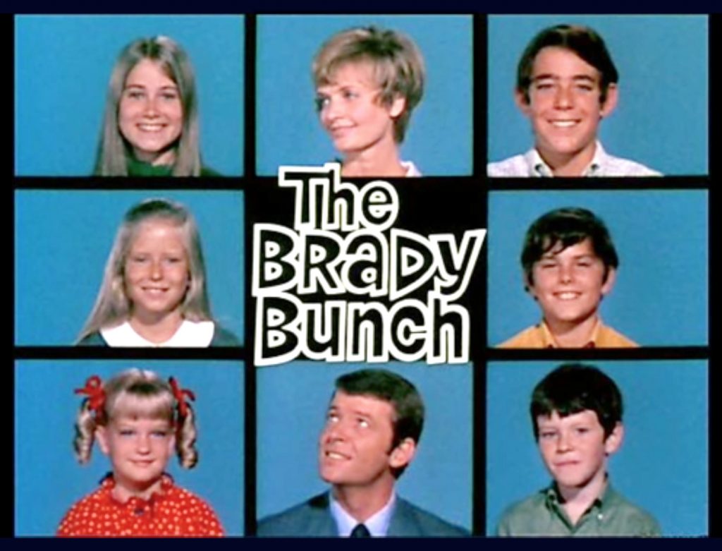
The Brady Bunch is the story of two people who bring their respective children together to form a large family. Together, they become “The Brady Bunch.” The whole family is featured in the opening sequence, which was so popular that it is widely considered the logo for the television show.

In the center of these squares, viewers see a funky bit of writing that gives the show’s title. This font is absolute perfection for the time period portrayed in the show.

Rugrats

There’s almost nothing more iconically 90’s kid than a love for the Rugrats logo. Simple in its idea, the logo reflects the playful and imaginative stories of the show’s main characters.

Primarily purple font, the splotches of yellow, red, and green throughout represent the silliness (and often messy nature) of childhood play.

Friends

Written in all uppercase letters, the Friends logo is iconic because it is memorable and unique. Like the Rugrats logo, it features blue, red, and yellow dots, but these dots do not represent childlike play for this show.

Instead, they represent the vibrancy of the slow itself. Known for its colorful sets and exciting characters, this imperfectly perfect logo expresses the joys and frustrations of becoming an adult in the city.

Orange Is the New Black

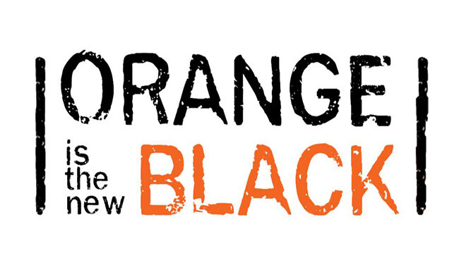
Orange Is the New Black follows a straight-laced character who finds herself in jail for a crime she committed many years before. The sentence throws her into a life she thought she had left and interrupts her new life, and the logo represents this intersection of her new life and what life was like before.

The bright orange word that spells out “Black” represents Piper, as someone who stands out from the crowd. The black bars on either side of the logo represent the literal bars of the jail in which the characters are kept. The letters are all unfinished to show the growth that all humans go through, whether they are in jail or on the outside.

Full House

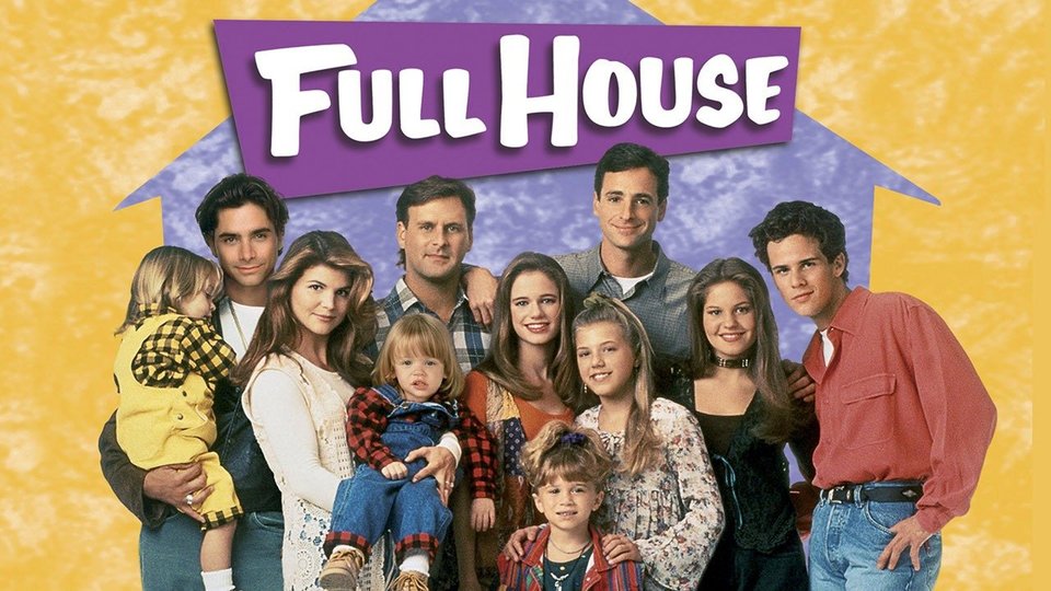
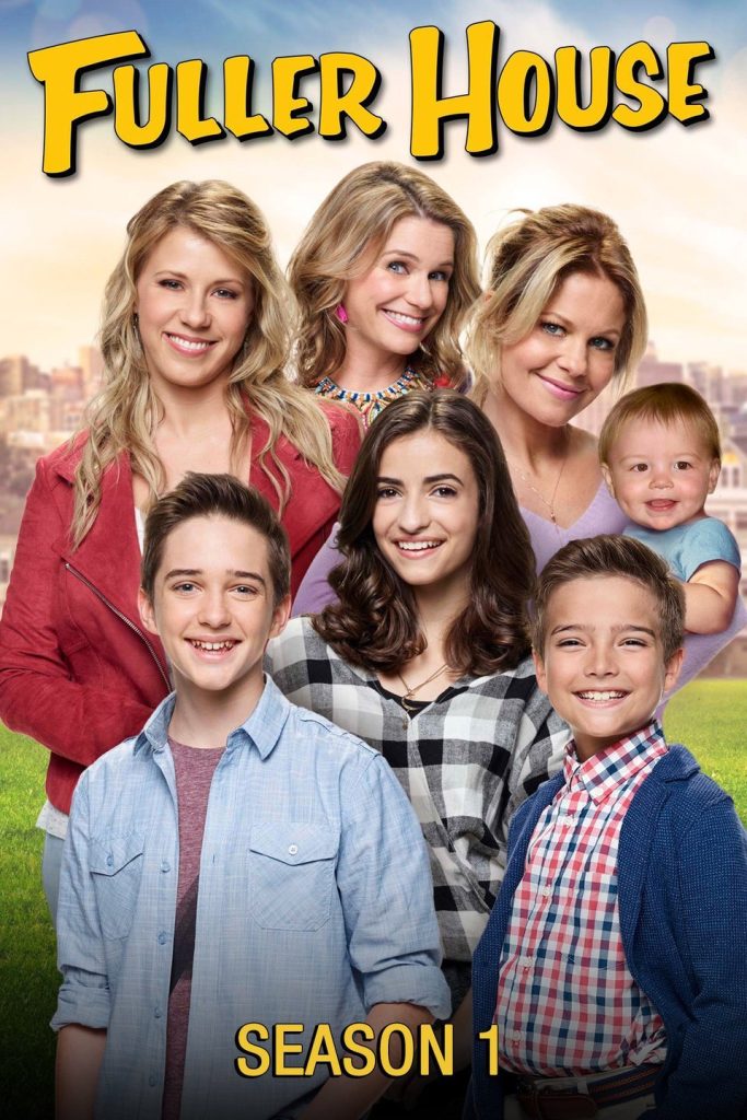
Like Rugrats, the sitcom Full House Is an absolute mainstay of the 90s. The logo for this one is quite simple, appearing in all uppercase lettering, but written in a handwriting font to appear more wholesome. This font style is so synonymous with the show and its characters that the spinoff, Fuller House, used the same font for its logo.

Breaking Bad

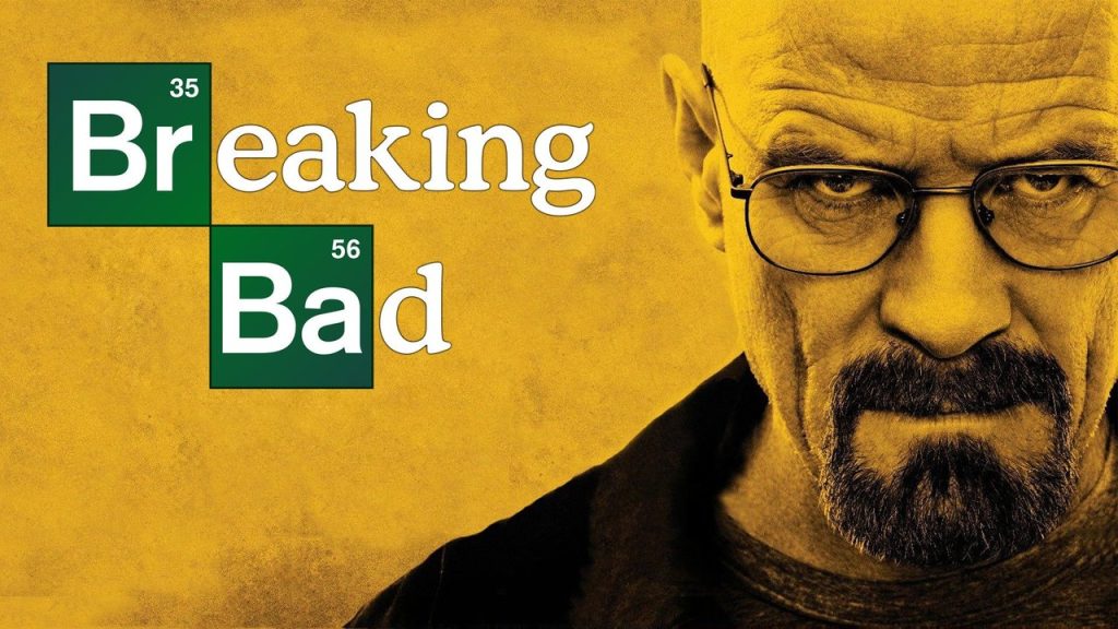
This gritty, intense, exciting, and disturbing show follows a chemistry teacher who becomes a methamphetamine dealer to help pay for his cancer treatment.

This logo highlights the importance Chemistry plays in the show by highlighting the elements of bromine and barium (respectively, Br and Ba) in the television show’s title. It’s memorable for the chemical element and how it is featured in the title.

Mad Men

The iconic logo for Man Men is the silhouette of a man’s back as he smokes a cigarette. It is a callback to the era of advertising that glorified smoking and Joe Camel. Besides that, the logo feels very tight and orderly, which is the very image the main character, Don Draper, aims to project to the world.

Survivor

As the only reality show on this list, the Survivor logo is truly iconic because it changes with every season to reflect the new contestants and location. One thing that does remain the same, however, is the Survivor name in the middle of the logo.

Always designed with an eye to graphic design, these logos always feature a font that is imperfect and a little jagged, meant to represent the type of places contestants compete.

The best logos communicate the ideas behind a television show and seamlessly integrate them into the television show itself. Great logos also depict the themes, symbols, and concepts throughout a television show itself.

Unique for their own reasons, some of these logos are simple and others are complicated, but they are all memorable and take the logo game to the next level.

12 Great Airline Company Logos To Inspire You

If you’re having a creative blockage, the best course of action usually is to be inspired by the work of those around you. There are plenty of sources of inspiration to turn to, but one of the most under looked are airlines.

Airline logos are usually sleek and minimalist, incorporating the feel of the country and tradition that the airline is associated with. Here’s a list of twelve great airline logos to help you in times of creative crisis.

American Airlines

One of the largest and most venerable airlines in the United States, American Airlines has seen their logo go through a few different changes over the years.

The new logo keeps with the minimalism of the current artistic period, but their most famous and creative is their 1967 rendition.

This is an angular, bold, and flashy design that promises swiftness and safety to customers. It also makes great use of American colors and a smattering of negative space.

Lufthansa

Actually the world’s oldest airline, Lufthansa has also seen a change of the guard frequently in regards to its logo. This choice is its 1963 version, a sleek and minimalist logo that’s ahead of the curb when it comes to design trends.

The bird depicted is actually a crane, which would later be colored yellow in order for the brand to stand out from competitors.

KLM

This Dutch airline is the oldest to retain its original name, and infrequently changes its logo. It’s easy to see why, as this crown design is bold and denotes royalty and good travels.

The simple but evocative design crown is meant to symbolize the name “Royal Dutch Airlines” that the company represents. This logo is one of the most famous in the world, recognized by many countries in the western hemisphere.

EgyptAir

This logo is of Horus, the Egyptian god of the sun and sky. Horus was often depicted as having a falcon’s head, which the logo also depicts.

It’s clever in that only a few lines and some curves can evoke a specific ancient god immediately. The bold, dark blue is also descriptive and rarely used in other airline logos, which usually opt for a lighter, “airier” blue.

Observe the curiosity and imagination Horus displays on this stunning logo.

Sri Lankan Airlines

Many airlines use symbols of their country to display the mood and experience their passengers will feel when flying, and Sri Lankan Airlines does this better than most.

They depict a colorful, shimmering peacock, pointed straight up at the sky in flight. You feel the wings about to unfurl as the bird takes flight, hurtling toward its destination.

The font and colors are colorful and wavy as well, adding a sense of fun and adventure.

Hawaiian Airlines

One of the most pleasant and comforting images on the list, Hawaiian airlines uses a friendly face to ease passengers. The face is of a typical but beautiful island girl, Pualani.

The setting sun and flowery headwear perfectly describe, in visual terms, the beauty and fun customers will have when they reach their destination.

This logo was designed by Lindon Leader in 2001 and is one of a precious handful of airline logos to depict a persona, rather than an animal or wing.

AeroMexico

Here’s another of that precious handful. AeroMexico features a stoic and reserved Aztec eagle warrior. He wears a traditional headwear of eagle to symbolize the sun.

This logo works on so many levels because it pays homage to the past of its country while evoking the spirit of its ancestors and rich traditions. The blue also helps the planes and company stand out from a crowd.

Iran Air

Iran National Airline was registered as a national company and changed its name to Iran Air. Shortly after, in 1961, a competition was held to select a new logo for the country.

The result is this beautiful depiction of a griffin. While the color and size of the logo is typical for airlines, what is atypical is the intricacy of the design.

Unlike many logos which are just a few lines, this is a full drawing, a careful depiction of a griffin in modest detail.

Azul Brazilian Airlines

This is a fantastic logo because it represents the togetherness and unity of the region. There are two parts to the logo; the word “Azul” on the left was tweaked by TRIP Linhas Aereas when they acquired the company, changing the color of the “U”.

The logo on the right is a pastiche of many different regions, all working together to form the beautiful country of Brazil. The colors are fierce and bright and their unity speaks volumes about the message and mindset of the company.

Gulf Air

Unlike many airlines, the Gulf Air eagle brings feelings of luxury and exclusivity because of the fantastically rich colors and detail.

This Bahraini airline holds a place of elegance and dignity in the airline industry, a place which they’ve immaculately captured with their golden eagle.

In addition to the color, and much like Iran Air, the logo is splendidly detailed and shows swift and sudden movement. It also represents the values of traditional Arabs and functions as a bridge between the old and modern. Just perfect.

Qatar Airways

This is another nationally owned airline. Although many mistake the animal presented as an elk, it’s actually an oryx, which is the national animal of Qatar.

The oryx blends into the background and is ensconced in maroon, a symbol of national pride and resolve. The Arabic letters cleverly spell out “Al Qataria” which is the English name of the airline.

The entire logo is incredibly dignified and presents an image of grace and magnitude.

Qantas

Qantas is the largest airline in Australia and it unfurled its first logo in 1994. Of course, as the largest airline in the country, it’s only natural that Qantas’ logo is a minimalistic kangaroo, hopping through a field of red and white.

This is an especially sleek and modern logo, one which conveys speed and efficiently, qualities often looked for in an airline of Qantas’ size and reputation. This logo is great because of its simplicity and streamlined nature.

Bi-Weekly Resource Roundup Vol 19

Featured Flocksy Team Member Design Of The Month:

Here is a custom Facebook/ social media marketing graphic mockup created for a client by Flocksy team member Dave.

All custom illustrations/brand designs/marketing materials on Flocksy are created completely from scratch by one of our extremely talented graphic design creatives.

Start a graphic design project today and see results in just hours!  

5 Simple Steps to a Compelling One-Page Website Design

    by Flocksy writer Rachel.
Whether you’re creating a landing page for your latest campaign, designing a portfolio site, or just want to keep it simple, a one-page website can be just as effective as a multi-page site — or perhaps more so… continue

How To Write An Effective Business Blog

by Flocksy writer Matt.  
Business blogs are a simple and fun way to spread the message of your brand, increase identification, and create intimacy with both your current customer base and potential customers.  continue    

The 5 Secrets of Top-Performing E-Commerce Sites

by Flocksy writer Rachel.
  Selling anything requires an understanding of your target audience and a compelling sales presentation. Your e-commerce site has to pull triple duty: It has to attract traffic, convert leads, and keep customers coming back. Here are the five secrets for e-commerce success.   continue

10 Famous Motorcycle Logos That Make a Statement

by Flocksy writer Mark.
  Motorcycles come in many different shapes and sizes, from the chopper, to café style racing bikes, to the one we all know, the Harley Davidson. The identifier that sets these apart has to be unique, and as you will see from our list, there are almost zero similarities between the brands.    continue

12 Great Movie Studio Logos To Inspire You

If you’re into designing or creating, whether professionally or just as a hobby, you know what it’s like to hit a creative snag. There are some times where you just can’t think and the ideas won’t flow. One way to alleviate this creative block is to look at the creative projects from others.

There are thousands of examples you can turn to, but some not thought of often are movie studio logos. These logos are incredibly creative and convey information with just a few simple artistic building blocks. The next time you’re stuck, take a look through these creative examples.

MGM

Starting off with one of the most iconic logos and studios, the MGM lion has been around for nearly one hundred years. The logo was made by filming a real lion in-studio and cutting out a hole from the rest of the logo to put the lion into.

MGM was one of the largest players when movies started to gain popularity, and they’ll forever have one of the most famous and iconic logos.

Janus Films

Pivoting to a lesser-known studio, Janus Films owns the rights to thousands of foreign and arthouse films throughout the 40s, 50s, and 60s. Their logo is simple but effective, a two-sided head known as “the Janus head” imposed on a stark black background.

This is a great logo because it fits many of the films it precedes, which are stark and minimalist tales from old school directors.

Pathe

Pathe is actually one of the oldest film studios in the world. Their logo has been designed and redesigned many times to keep up with the changing world and the newest version of the logo is a colorful and marionette-inspired interpretation.

The French company has overseen the production of films nearly since the inception of cinema itself.

Mill Creek

Mill Creek is actually a studio known for producing incredibly low-quality films, but they have one of the more creative and colorful logos in the film world.

Unlike other studios who have the money and time to make their logos epic an expansive, the Mill Creek logo is an understated and simple image of natural fortitude and old-time vibes.

The logo fits in with the low-budget and simple fare they provide viewers.

Pixar

One of the most beloved logos in the film world, the Pixar lamp has delighted viewers for more than two decades.

This logo is clever and creative when viewed static, but it really comes to life when given movement, as the lamp hops up and down on the “I” in Pixar, only to crush and turn to the camera like a self-aware puppy.

The beauty of the logo is bringing an inanimate object to life, a feat Pixar is known for in their films

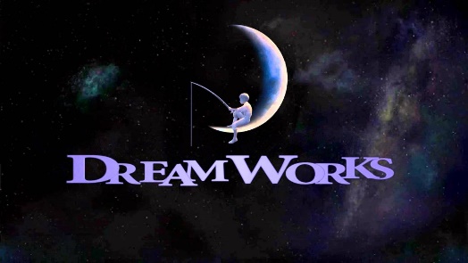
Dreamworks

Rivaling the creative simplicity and wonder of the Pixar logo is Dreamworks. Their iconic “fishing moon boy” sits and relaxes on a crescent moon, fishing in the lake below.

This image conveys feelings of relaxation and, appropriately, a dreamlike quality that anything is possible. The color palate also fits in nicely, a subdued blue and white in preparation for the colorful films to come.

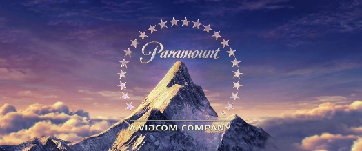
Paramount

Another iconic logo from film’s pre-golden days, the Paramount logo has survived, virtually unchanged, for one hundred years.

The iconic mountain peak and the stars around it symbolize the star-studded and grand fair audiences can see when they see a Paramount film.

This is applicable because Paramount was, in the 20s and 30s, home to foreign stars and directors, like Eric von Stroheim and Ernst Lubitsch.

The mountain peak and stars were a call to audiences that anything was possible on a global scale.

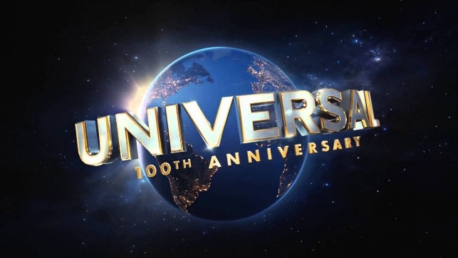
Universal

While Universal hasn’t always been the dominant power it is right now, their famous globe logo has also remained virtually unchanged since its inception.

Their logo is literal; they offer universal entertainment, starting with their roots as purveyors of audience-pleasing monster movies like Frankenstein, Dracula, and The Mummy in the 20s and 30s.

Since their birth, Universal has strived for crowd-pleasing hits. Their logo has also been made epic over the years, showcasing the Earth in HD glory nowadays.

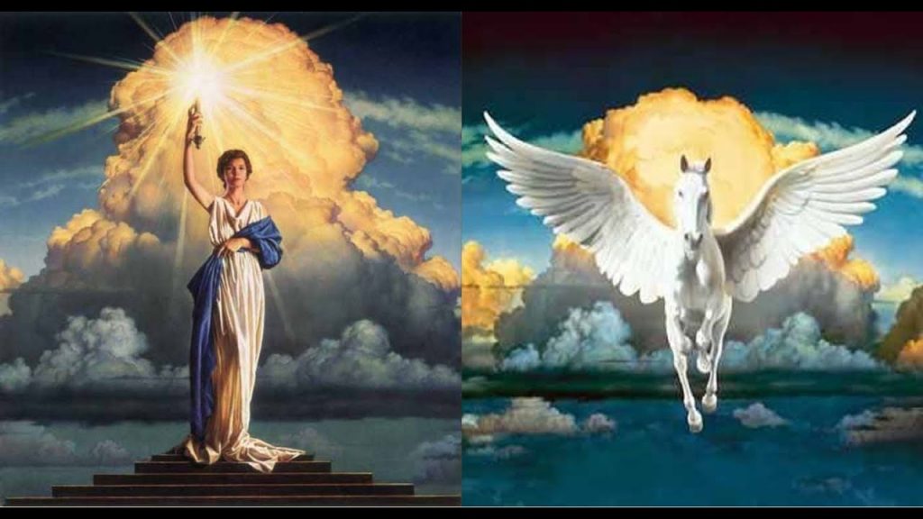
Tristar/Colombia

Joined at the hip, Tristar and Colombia have similar logos. Tristar features a Pegasus coming in through the clouds and Colombia features a womanly symbol of freedom and creativity.

Both logos feel epic and grand, stationed among the clouds and appearing from nowhere, a siren call to enjoy the proceeding film. The relaxed oranges and sky blues put viewers into a state of relaxation and anticipation.

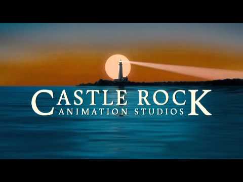
Castle Rock

Founded by Rob Reiner, Castle Rock has made many projects of extraordinary depth and emotional intelligence, including hit sitcom Seinfeld.

The logo is an image of childhood wonder, a lighthouse guiding in the tendencies of creativity and artistic expression.

The logo boasts a stark black background and incredibly warm violets and reds, giving viewers a final image of peace after the films end.

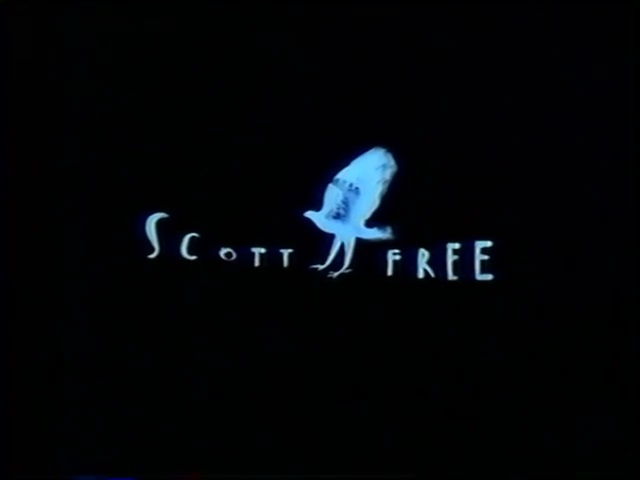
Scott Free

A logo which boasts the incredible and meticulous creativity of its founder, Ridley Scott free is a wonderful logo which elicits stop motion animation and painterly strokes.

The logo itself is a falcon in flight, but the in-theater animation sees a man transform into this bird as he runs out of a cage, evoking the Platonian thought of the man in the cave.

It’s a logo only Ridley Scott could conceive and execute with such grace.

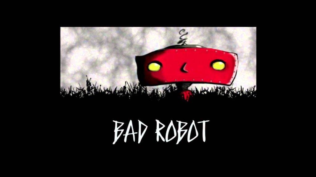
Bad Robot

The final logo on this list comes compliments of J.J. Abrams, director of Star Trek and The Force Awakens. This logo is enigmatic and points to something greater, much like Abrams’ films.

The robot in the logo is seemingly mischievous and rambunctious, though we don’t know how or why. His movements are off-putting as well, as he moves from side to side and confronts the viewer during the animation.

Bi-Weekly Resource Roundup Vol 18

Hi Everyone!

We have recently added Flocksy to the Zapier Marketplace!

This means that you can now use Slack, Trello, Jira and more to manage all your projects.

Click here to view it on the marketplace.

UPCOMING EVENT: How to use Flocksy with Zapier, adding video feedback and more

Sam Ryan the co-founder and CEO of Flocksy will walk you through how using Zapier with Flocksy can boost your productivity, as well as answering any questions you have and talking about some exciting new features

Join Sam on April, 27th @ 11am EST – The link is here

Don’t miss this opportunity to learn more!

Cheers,

Team Flocksy

Featured Flocksy Team Member Design Of The Month:

Here is a custom Facebook/ social media marketing graphic mockup created for a client by Flocksy team member Sourish.

All custom illustrations/brand designs/marketing materials on Flocksy are created completely from scratch by one of our extremely talented graphic design creatives.

Start a graphic design project today and see results in just hours!  

Should You Outsource Your Graphic Design Work?

by Flocksy writer Ana.  
Now more than ever, companies must rely on the impact of their ads and marketing; and nothing increases visibility and engagement like visual media… continue

Avoiding Creative Isolation

by Flocksy writer Lauren.
For an artist, painting, sculpting, or designing is simply a way of releasing dreams, energy, and passion. However, without human interaction, creativity is stifled.   continue  

Operating A Successful Small Business

by Flocksy writer Matt G.
  Starting any business is difficult and it takes careful planning and forethought to beat out your competition and keep your business running smoothly. Here are the most important marketing keys and methods to keep in mind while running your business.  continue

What Are Motion Graphics, And Are They Different From Animation?

by Flocksy writer Valentine.
      Distinguishing motion graphics from animation can be a challenge. Some clients are unsure which one is suitable for their business needs because they think of these terms interchangeably.   continue