A tri-fold brochure has been a staple of the print marketing world for what seems like forever. Their usefulness hasn’t diminished over the many years they’ve been around. They can display relevant educational or sales information in a small area, avoiding the issue of taking up a lot of space as a booklet or guide might.
What’s more, because they are smaller and less thick, they take less paper and ink to create, making them an affordable option as well.
When you need to convey your message quickly and in a visually appealing way, the tri-fold brochure is a classic choice that can be tailored to your unique needs.
Let’s talk more about how the tri-fold brochure can work for your brand.
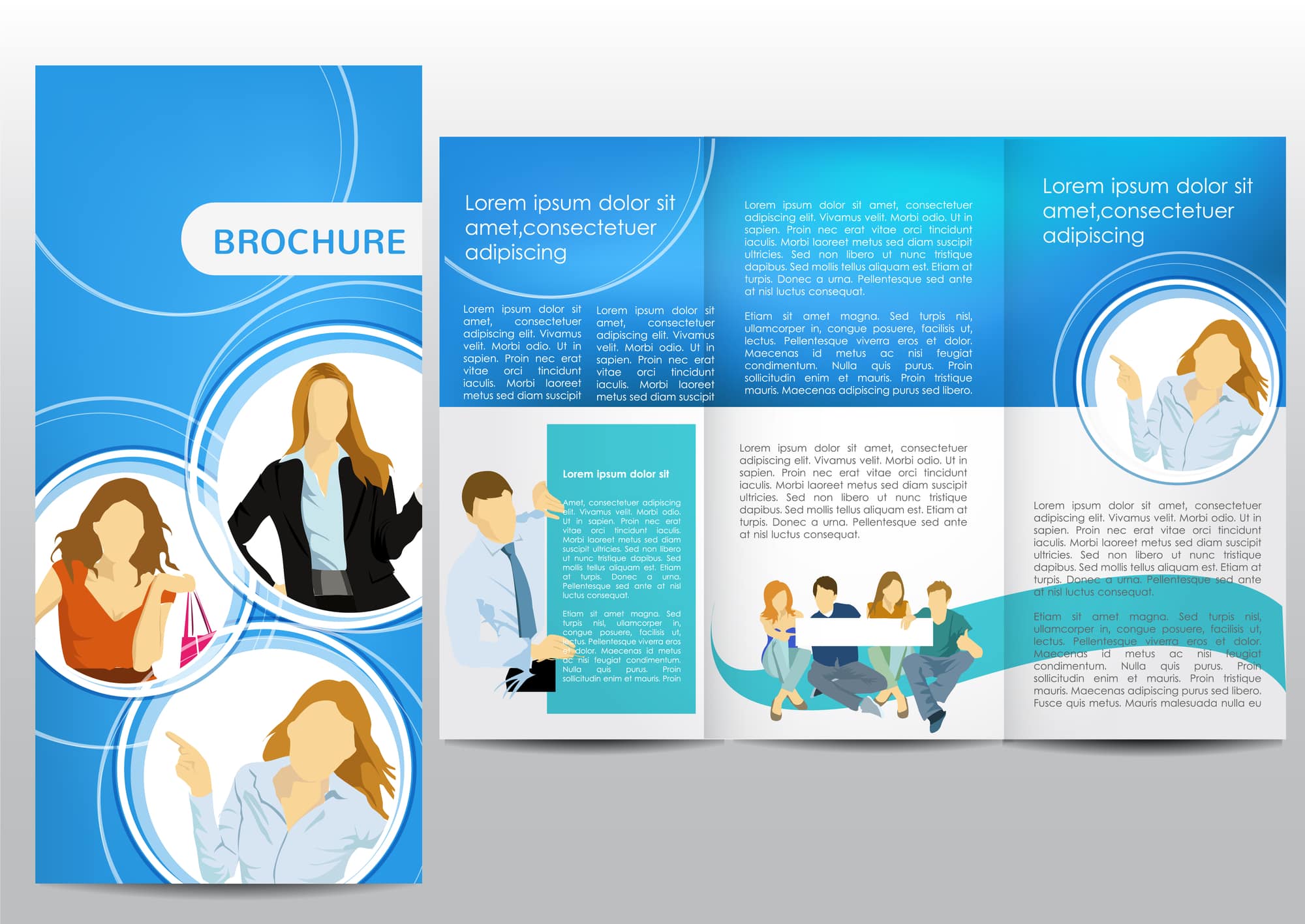
What Are Tri-Fold Brochures Used For?
Tri-fold brochures can do a lot of things very well. Their primary purpose is to guide and inform.
Reach Potential Customers
The primary purpose of a tri-fold brochure is to educate potential clients, customers, backers, or partners about your offerings, whether that’s products, services, education, or employment. For example, you could detail your product packages, describe what your school/college can provide to students, list out new updates and product launches, give the low down on real estate projects, and more.
Offer Valuable Information About Your Brand Or Company
To drive inquiries about your brand or company, you can use a professional tri-fold brochure to spark interest by providing intriguing details about your product, service, or program. These can work well no matter what industry you’re in, which makes them particularly useful.
Tri-fold brochures can easily replace most (or all) of your current brochures inventory. The larger size is perfect for information-dense educational brochures, and sales brochures for prospective clients. The folded design offers a natural organization to the design. Print a different topic on each folded section or, print all over detail.
Here are some tips for using brochures effectively.
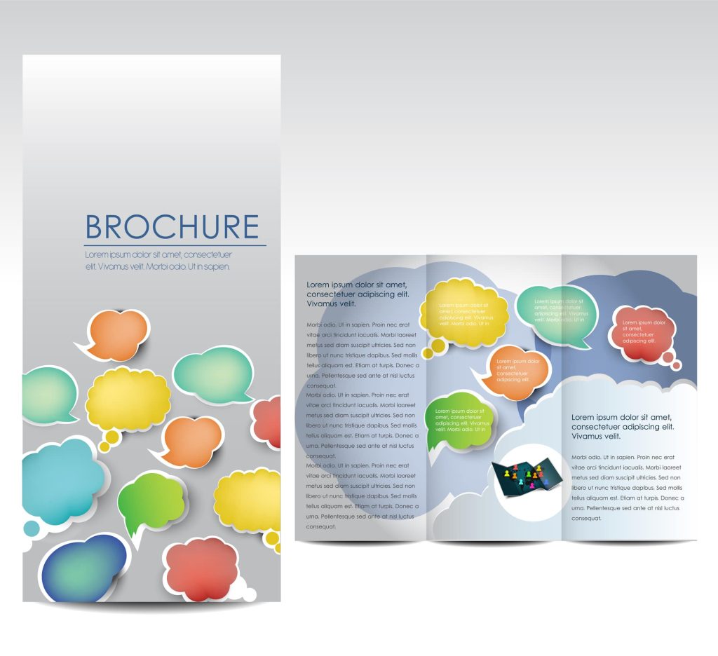
Here Are Some Tips For Using Brochures Effectively.
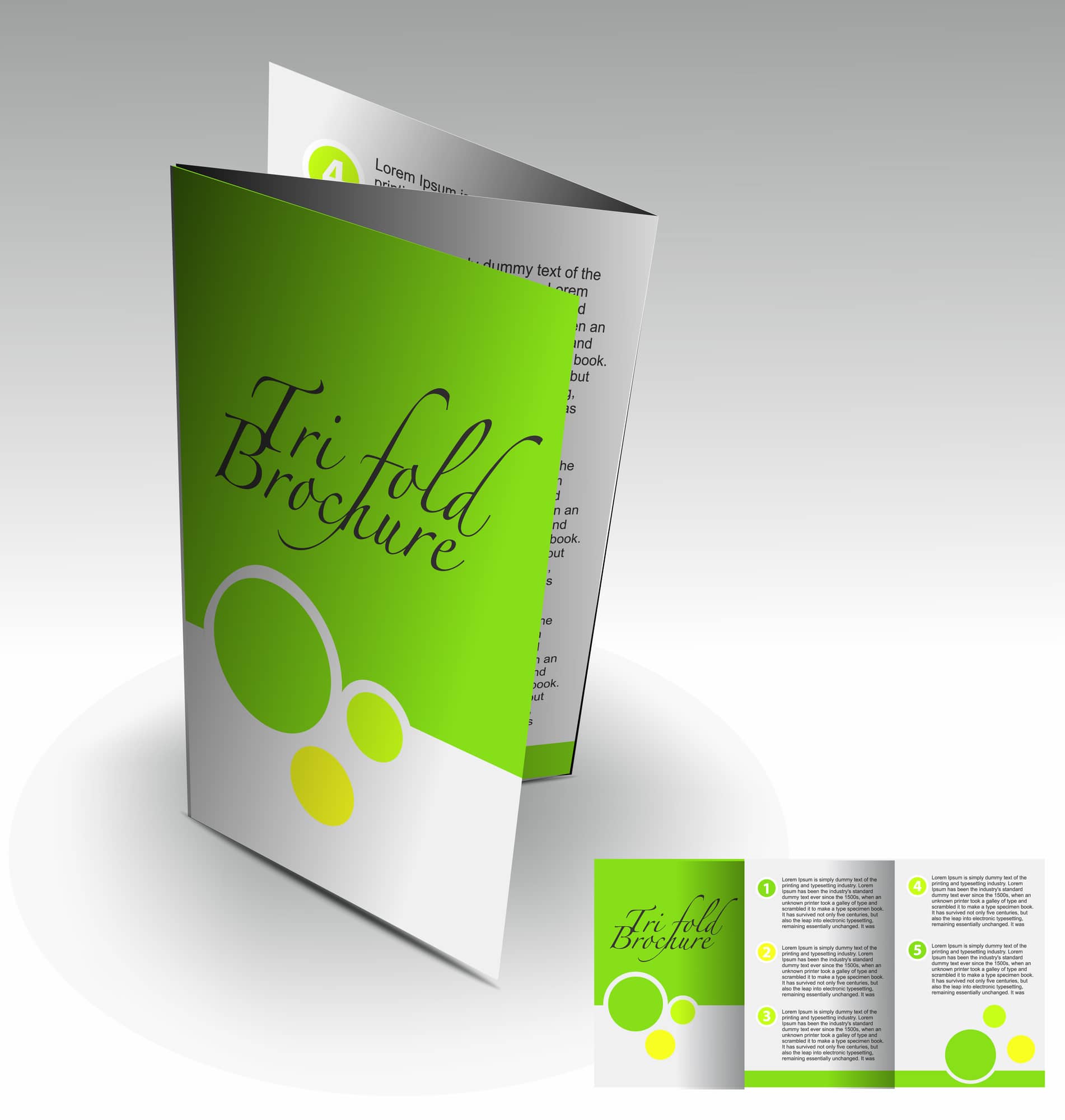
Because of the tri-fold nature, you’ll have six panels to fill with information and images. It can be tempting to stuff content into every available spot. But, a little design restraint and balanced space will net will take you far with this brochure and ensure that your brochure content is easy to read.
Here are a few suggestions that can help ensure your brochure is easy to digest and looks great:
- Try to stick to just two or three fonts/typefaces.
- You can offer clients a couple of different header fonts/designs to provide visual interest, and a third incorporated into the body text to break up any large chunks of words
- Fonts should be legible and not too small.
- We strongly recommend making liberal use of high-quality graphics, illustrations, or photographs throughout the brochure
- Display your most vital data in bulleted or numbered list to make it easy for viewers to see the most information at a glance
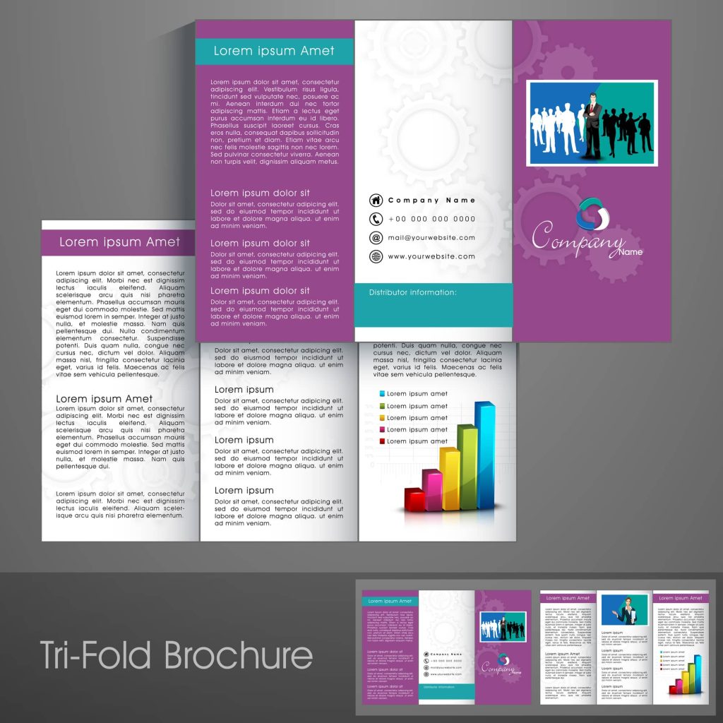
Pro Tip: Always Check The Folds After Printing
The complexity of the formatting and the design of the tri-fold brochure can cause occasional printing mishaps to occur. If you are using a high-quality design and printing service you are not as likely to have problems but it is a good idea to develop the habit of doing a test fold before you leave the printer with a fresh box of brochures. Simply take one brochure out of the new box, and fold it as you would for distribution. Pay close attention to how the design fits in each section of the folded brochure. There should be even padding, and the design shouldn’t overlay any creases.
The Natural Order Of Panels
Brochures like this tend to have a typical layout and order. Text and design should be used sparingly on the front and back panels. Keeping these panels free of excessive content will give your folded brochure a clean, professional appearance.
Typically, the interior panels offer ample space to print all of the important information about your products, program, or service, whereas the front and back panels offer just a quick title and contact information respectively. Try to concentrate your most vital details on the two left-most interior panels, as people tend to stop reading before that last panel.
Back Panel Design Consideration
It is perfectly acceptable to leave the back panel completely blank, it is actually fairly standard practice for tri-fold brochures. The back panel can also be the perfect place for quick data, in the form of a small contact text block with your business address, phone number, etc. Add a clever call to action and your social media page links to finish off this page.
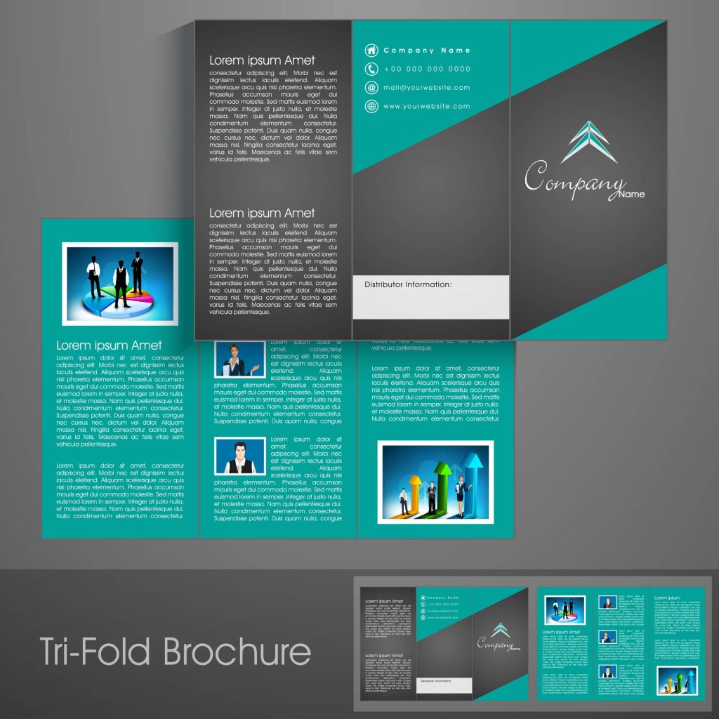
Interior Panels: Alternative Design Options
Rather than using the three interior panels as three columns of your most important information, you could instead use them as a story reading from left to right. Start your title page on the inner, left-most panel, and continue with the body content moving across the panels to the right. Imagery blending across two or three panels can also create a striking look that enhances the visual appeal.
How To Get Tri-Fold Brochure Designs For Your Brand

Getting brochure design services for your brand can be a challenge when you’re a smaller business, entrepreneur, or startup because graphic design services can very well be outside your budget. Large companies often hire in-house artists, but that’s not always possible for smaller brands and organizations.
Brochures can be such a useful tool that you’ll want to take advantage of them, but if the design is poor, they do just as much harm as good for your brand appeal. Resolution, format, and size are all important considerations, and crafting something that meets your requirements while still being nice to look at is a balancing act. So, doing it yourself usually won’t be a great option, and templated designs lack personality.
Freelance marketplaces offer artists who can work on your brochures, but vetting quality and turnaround times are usually areas where a lot of users experience consistent frustration. Also, if you need several different brochure designs or develop a need for them down the line, ensuring that they’re all consistent can be a challenge with the interchanging freelancers you’ll work with.
Another big issue with using marketplaces is the limited number of revisions. Getting more than the allotted revisions can cost a fair amount, and settling for work you don’t love is unacceptable.
The good news is that you can get professional tri-fold brochures designed and formatted, as well as many other graphic and content assets, by subscribing to Flocksy’s monthly no-contract service.
We provide a team of talented creative services professionals who can design all the assets you need for consistent, high-quality marketing materials, including brochure designs, social media posts, business cards, flyers, posters, ads, logo designs, web page design, copywriting, video editing, web development, and much more.
All in one place.
For a flat monthly fee that doesn’t yo-yo up and down, we’ll handle your creative projects, so you can focus on running your business. The team will always be available through the Flocksy dashboard, and you’ll have a project manager to guide you and help with each project you run.
And did we mention a 24 to 48-hour turnaround time on most projects? Oh, yeah.
Getting Tri-Fold Brochures Designed By Flocksy
Starting a tri-fold brochure project is easy. First, go to the intuitive dashboard to request your designs from our graphics team, and then follow the simple steps below.
One, select “Create new project” and pick the “graphic design project” option. This will open the requests page. Two, find “tri-fold brochure design” among the several available options. Three, give us the details about what needs to be in the brochure and what style you like, and click “start project.”
What should you include in the instructions? Provide your brand kit, including things like colors, fonts, etc., and any references you want the artist to use. You’ll also want to provide the necessary details to display, AKA the text, the dimensions and type of paper the designs will go on, and any other important information you feel the artist needs to “get” your brand.
Your designer will create your brochure design and ensure that it looks professional and presents your brand, organization, or business in the best possible light. They can also provide help with designing your brand kit or logo, content writing for the interior, or other printed marketing material designs
You can also work with the same designer over and over again, and thanks to the strong working relationship you’ll create with your artists and creative professionals, your results will be that much better and faster.
Whatever creative assets you need, our team is at the ready to create something that’s beautiful, informative, and engaging.
Start your tri-fold brochure design project now by signing up or visiting the project creation page!
