Is email design worth spending your advertising budget on? To answer that question, let’s look at some of the statistics. As of March 2023, emails generated $36 for every $1 spent (meaning a company’s return on investment was 3600%!). Not only do emails have one of the highest ROI, but they’re also the preferred way your customers would like to be contacted (who answers the phone anymore?). Well-crafted emails can hugely impact your company’s reach, lead generation, and more – sounds like a great investment to me!
That being said, designing a great email takes a lot of skill and experience. Think about all the emails you’ve gotten in your career — some probably stood out with bold graphics, catchy subject lines, and enticing sales. Others … went straight into your trash folder. Flocksy is here to help your company avoid the delete button and explain why the graphic design of your emails is essential to your company’s marketing plan.
Why Email Graphics Are Important
You know what they say — a picture is worth a thousand words. In advertising, this is even more true. According to Nielsen Norman Group researchers, 80% of consumers only scan emails, meaning no one wants to search through paragraphs of text to find the deals or items you’re promoting. On top of that, everyone’s inboxes are often full of work and personal emails. This means it’s even more important that your email is not only eye-catching but direct.
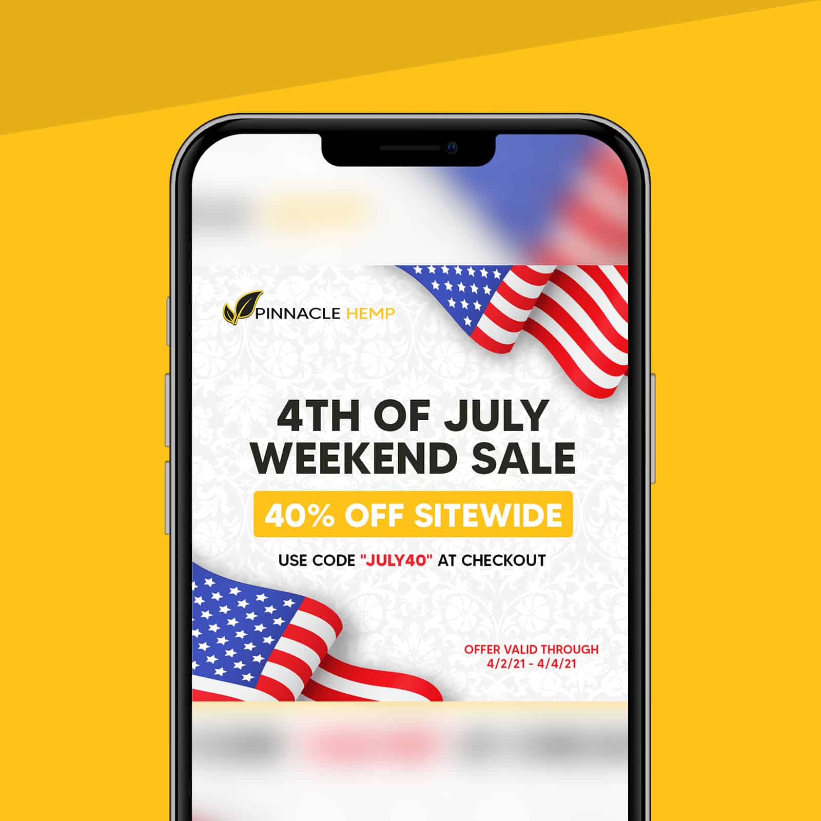
This design piece for Pinnacle Hemp by Flocksy is a perfect example of a great advertising design. Your eye is immediately drawn to the sale listed front and center in the graphic. Once consumers see the promotion, they can find the checkout code and dates in bold and colorful text against a simple but beautiful background.
Your email design should also highlight what is important while including the necessary information. There is a fine line between eye-catching and overly complicated. Luckily – our graphic designers at Flocksy walk that line well.
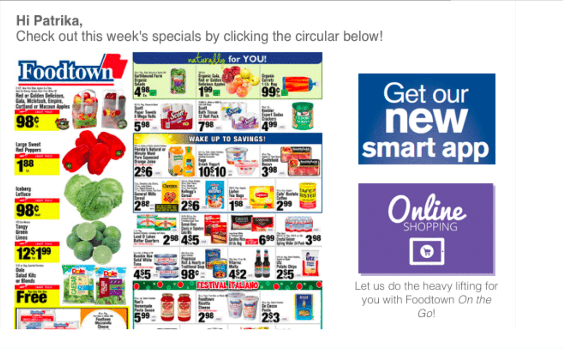
This next image is an example of poor email design. This grocery store ad has contrasting colors, too much information, and very small text. Looking at this for too long even feels overwhelming. There are also multiple buttons to click, confusing and frustrating customers simply looking to get to their main site. While it’s important to let your consumers know what products you offer and which sales you have — including too much information or too many images is sure to send your consumers straight to the “unsubscribe” button.
Email Design Best Practices
Great email design is sure to grab your consumer’s attention. But once you have their attention, you only have a few seconds to promote your business. Your email’s layout and overall design can keep customers interested or cause them to click out. Even small details like the colors and font can impact a reader’s emotions and interpretation of your message. Here are Flocksy’s best practices for great email design.
1. Emphasize Your Brand Identity
When designing your email, ensure you utilize your brand’s distinct tone, identity, and overall style. Graphic design elements such as colorful graphics, bold fonts, and GIFs guarantee each email reflects and reinforces your company’s core brand values. Matching the branding from your other marketing initiatives, such as blogs or social media posts, will further strengthen brand awareness.
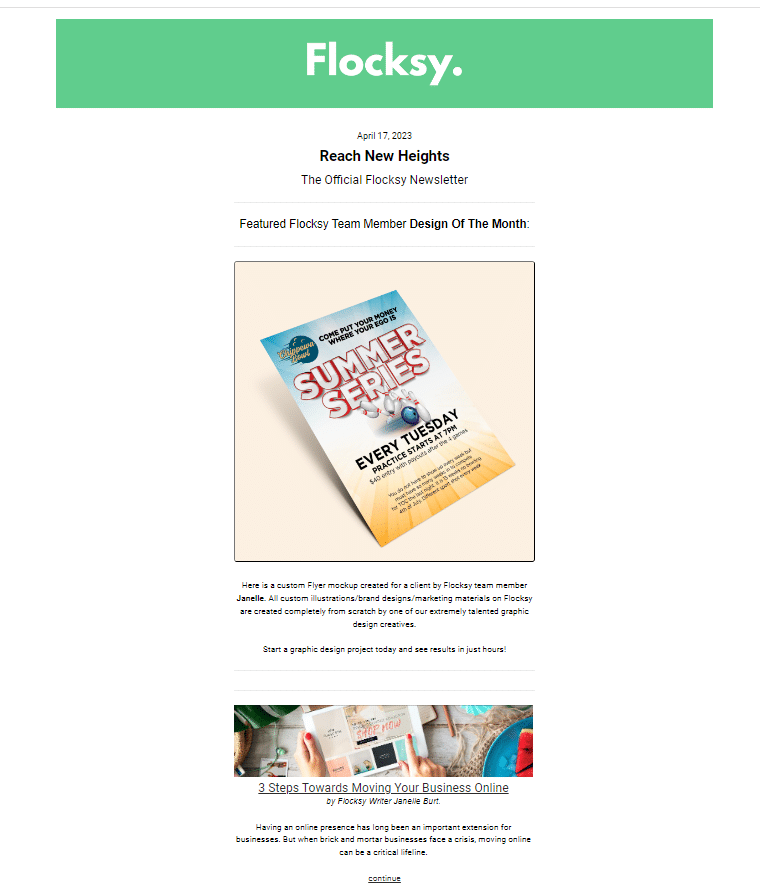
Flocksy’s subscriber emails follow the same color theme represented on their social media accounts but with additional secondary colors that complement and add variety to the messages.
Consistency is key in brand recognition, and emails are a cost-effective way to reinforce your brand aesthetics and values. Inconsistent branding leads to consumer distrust, making graphically designed emails a wonderful tool to build customer trust while promoting your company.
2. Choose Email Safe Fonts
While sticking to brand themes and fonts is important, it’s also crucial that your emails look professional. Some fonts don’t display properly with certain email providers or devices, so you must ensure your font conveys your message clearly. The more bold and minimal your text is, the better your consumers can read your message.
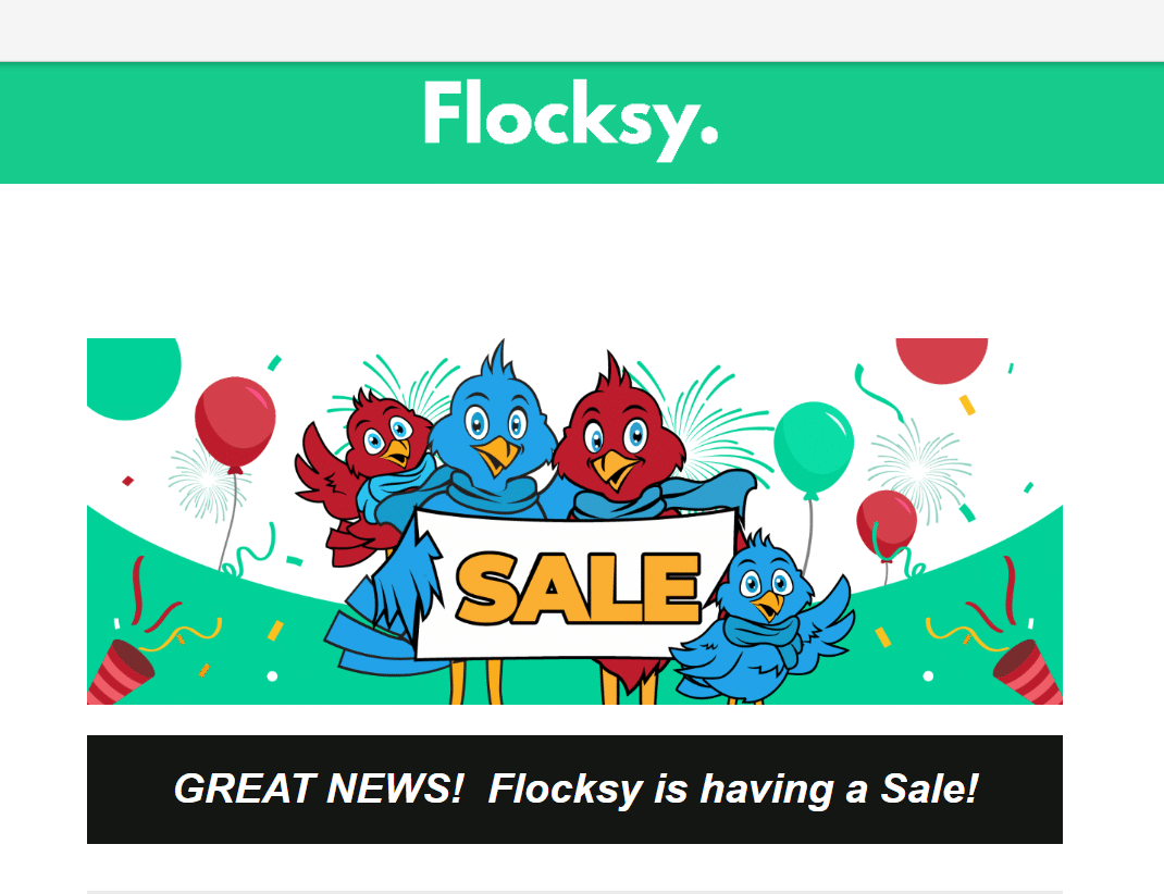
The fonts in this Flocksy email can be read clearly across user devices and mobile. The sizing is also important, using size 14 font is a safe bet, but varying the font size throughout the email keeps the reader engaged.
Avoiding cursive, overly decorative, and fonts with little room between letters is typically good practice and will keep customers reading your emails.
3. Use Graphics To Highlight CTAs
The first step to creating a successful marketing email is to decide what your overall campaign goals are. Are you trying to bring in new customers? Sell more products? Bring more consumers to your blog?
Once you know your campaign goal, use your design to highlight the CTA. For example, your graphic design could encourage subscribers to click a button to shop or sign up for your newsletter. Keeping your email design simple ensures your graphics complement other email elements like copy and CTAs.
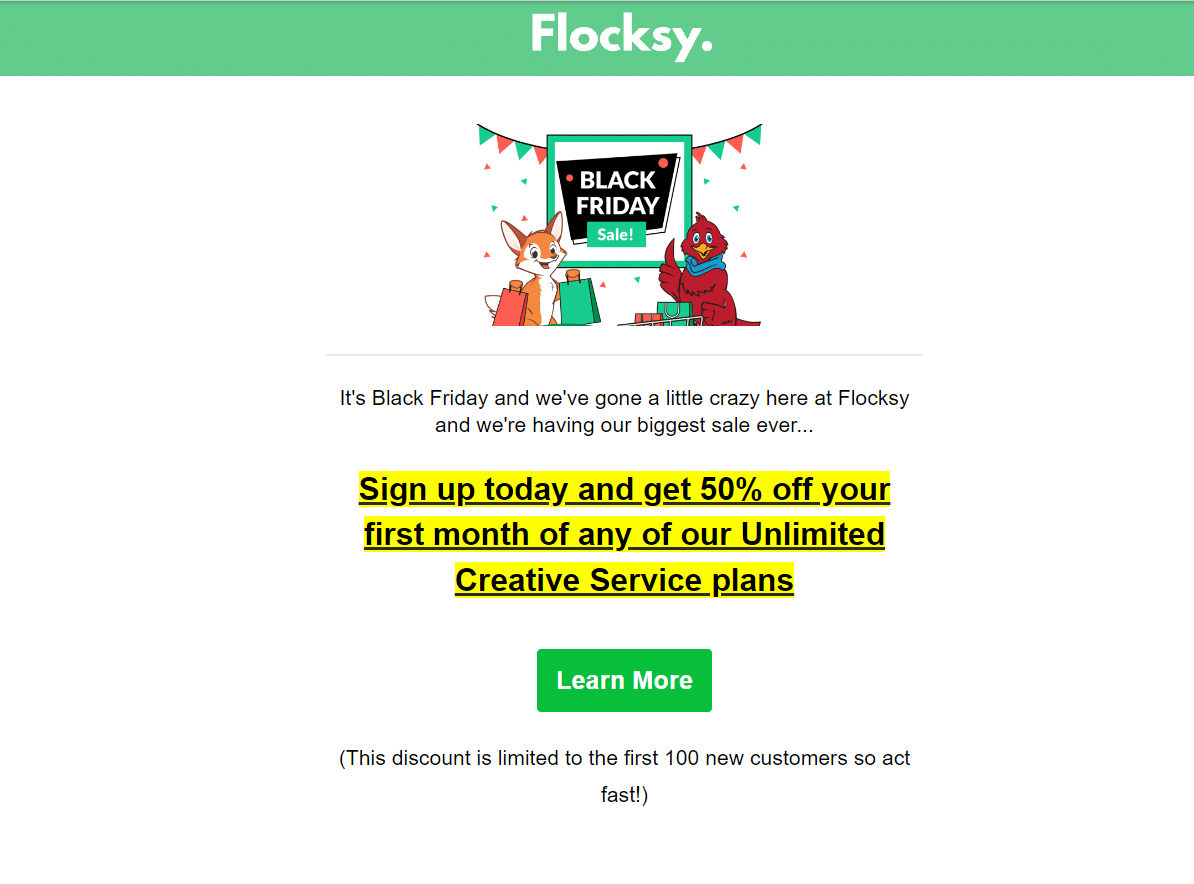
This CTA seen here is emphasized by the use of exciting graphics, colorful bolded text, and highlighted action phrases to call the reader’s attention to the button to GET THE DEAL!
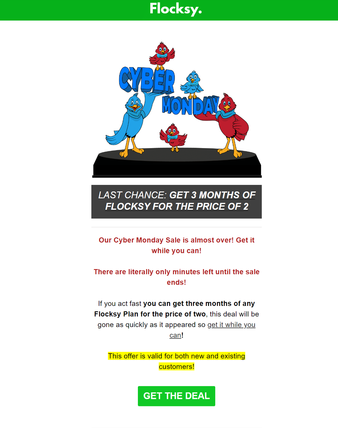
You can incorporate CTAs directly into email graphics such as text CTAs, buttons, or links for more interactive emails.
4. Use High-Quality Images
These days, your subscribers will most likely have high expectations regarding the visual quality of your emails. With most companies hiring advertising agencies to design and send out their marketing emails, inboxes have been flooded with designer images and professional graphics. The pictures and illustrations you choose can help your company make great first impressions and lead consumers to see your brand as professional and high-quality.
Not only is the quality of your images important, but the graphics you use must also present well and fit together. No one wants to open an email where the graphics are cut off or off-center, so they must be sized appropriately for mobile and desktop.
Our graphic designers at Flocksy can transform your images into eye-catching graphics — seen here in our most recent subscriber email:
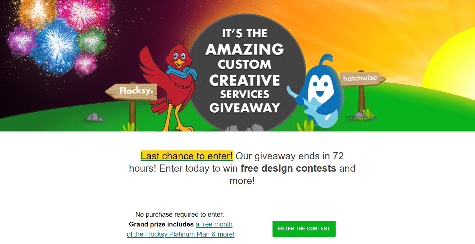
High-Quality product images and illustrations like those seen above can help inspire purchases and connect your consumers to your brand.
How Flocksy’s Email Graphic Design Can Help Boost Clicks
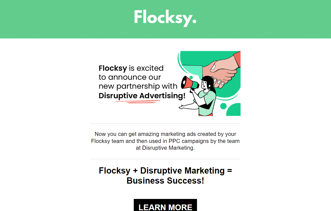
Most people read emails on their smartphones or tablet devices, so responsive design is crucial to subscriber emails. Responsive emails should format properly no matter where or how they’re opened. This is where our professional graphic designers come in.
Our designers at Flocksy can take your brand image and campaign goals and create beautiful, perfectly formatted emails. We can also create animations, GIFs, or interactive buttons to highlight CTAs and bring more consumers to your site pages.
Creating an email design with Flocksy is simple — sign up in seconds, choose “Graphic Design” on the project page, then the subheading “Email,” and simply upload your CTA and other relevant information. Within 24-48 hours, you’ll have impressive email graphics that’ll increase viewer engagement and brand awareness.
To see more of our work, check out our portfolio here and read more about our services (including unlimited graphic design for one flat fee) on our site today!
