

One of the best things about being in graphic design, is that we get to see all kinds of companies start getting rid of their old logos and, in place, giving their logos a new and fresh look. We watch as businesses large or small either update their logo and make small changes or they’ll give their entire brand a redesign.
Regardless of the size of the change, seeing redesigns that Iconic companies make are also always a fun adventure and the public is very quick to judge whether it was a success or not.
- Logo redesigns are both exciting and interesting to see every year as businesses update or completely redesign their brand
- Throughout time there have been many iconic redesigns that have surprised the world and had the public go crazy
- In this article, we talk about some the most iconic redesigns of famous brands and why they’re important
Here are some examples of famous brands, and their logo redesigns:
Burger King
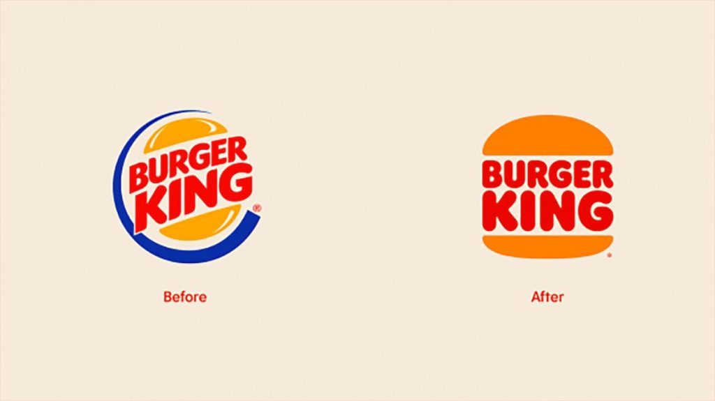
Image sourced here
This has probably been one of the more memorable redesigns of recent times. Early 2021 Burger King redesigned not only their logo but other areas of their brand as well. The new logo embraced both nostalgia from the past and a modern look. This new redesign was widely popular and the updated brand was very popular with customers.
Slack

Image sourced here
In 2019 Slack updated its logo and gave it a much-needed refresh. Before their redesign, Slack wasn’t very consistent across its platforms with their mobile app icon different than their website. After the rebrand, Slack made sure that its branding was more consistent across its platforms.
Popeyes
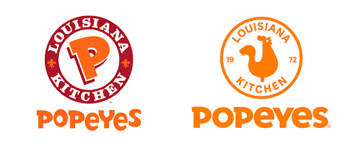
Image sourced here
Before Popeyes expanded their stores internationally they decided that it was time to rethink their branding. The logo redesign was the biggest part of the company’s rebranding, giving the logo a new and modern look. The goal with this redesign was to make their logo more appealing when it was shown digitally.
TGIFridays
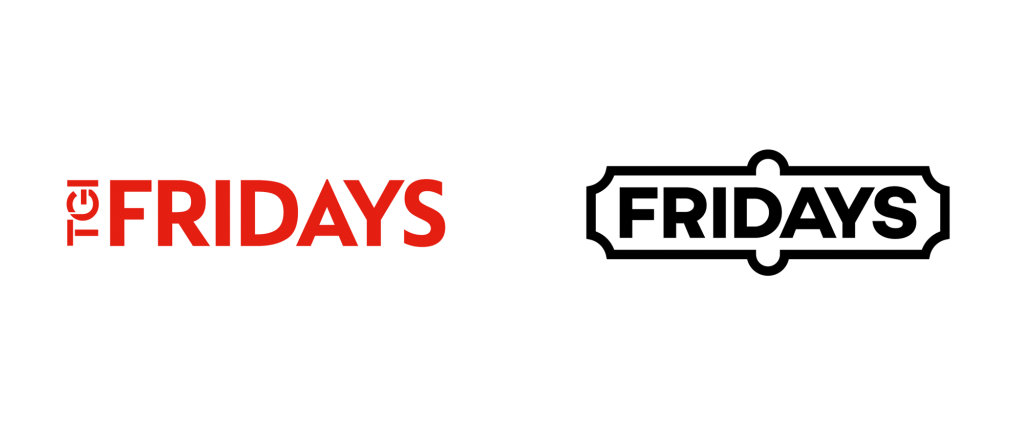
Image sourced here
This was one redesign that left people shocked when they saw it, one of the brand’s largest updates that they’d ever made. They opted to remove “Thank God It’s Friday” from the logo and instead change their name to simply “Fridays”. This name had been with them since 1965 so it was a bold step for the company. It seems that in 2021 they have changed their minds since this redesign, and the websites have gone back to the previous designs and combined the old with the new and with TGI added once again.
Fisher-Price
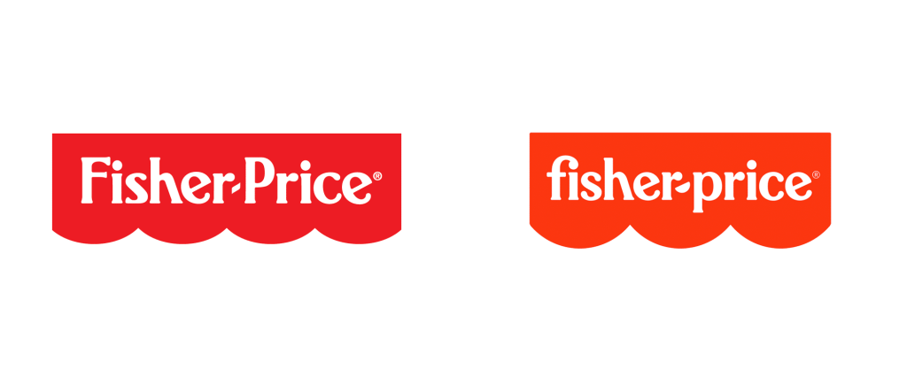
Image sourced here
Although perhaps not the biggest redesign that we’ve ever seen, Fisher-Price gave us an updated logo that brought smiles to faces. Their new logo was everything that the company says they are; joyful, fun, and bring laughter to people. Although the basic concept was kept the same, small changes opted for a new feel and look to the logo.
Paramount
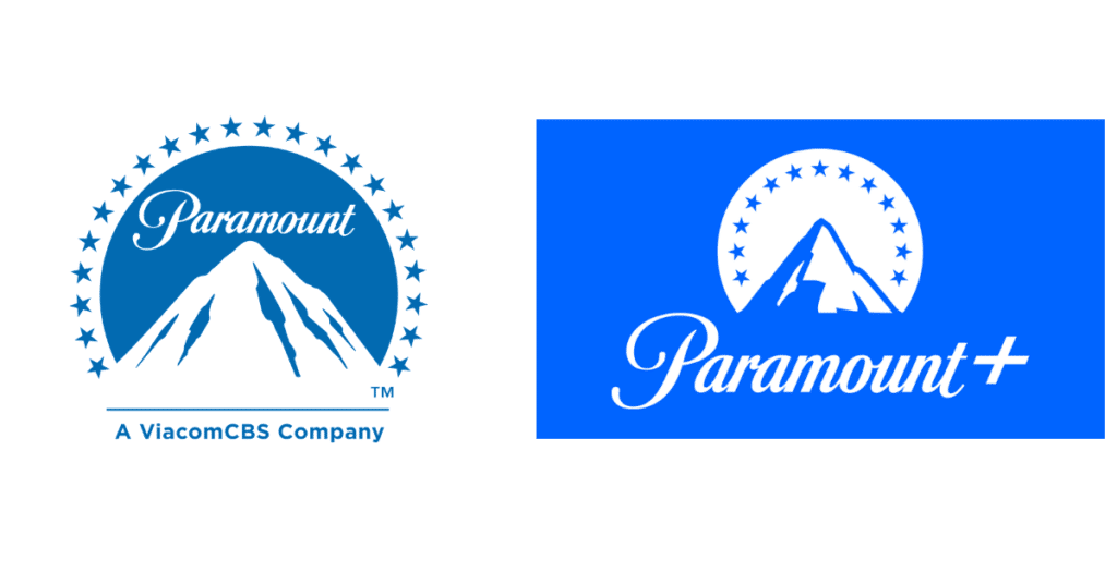
Image sourced here
Paramount is just one of many companies that have redesigned their logos to appear modern while still being vintage at the same time. The logo was modern while still looking retro and adventurous. The entertainment company was due for a redesign and this was the perfect one.
Smuckers
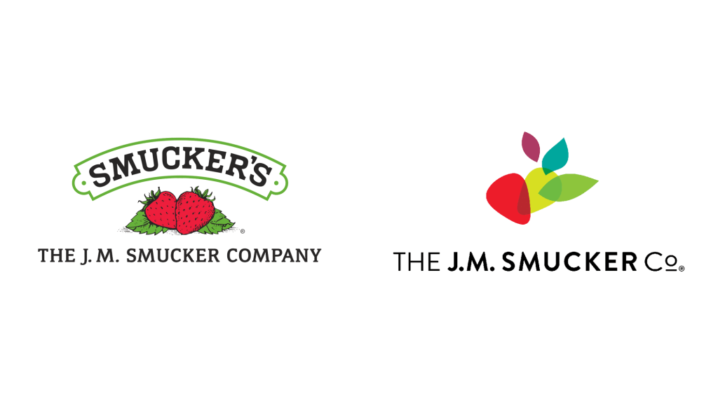
Image sourced here
Smuckers started as a company that just sold jam, but they soon realized that wasn’t the only product they were selling anymore. The new logo wanted to emphasize where they are today, but they didn’t entirely want to forget their past. Although their new logo was modern and fresh, it still had elements of the old logo that kept it familiar to customers.
Adobe
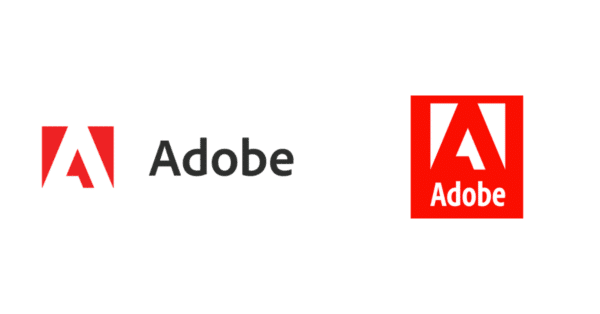
Image sourced here
Adobe Creative Cloud is the famous graphic design software that’s used by hundreds of graphic designers around the globe. Adobe said that they needed to update not only their logo but other brand elements as well to suit their quickly expanding community of users. Although the redesign wasn’t anything drastic it still affected users and what they thought of the company.
Kia
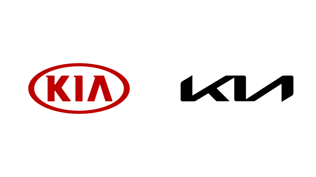
Image sourced here
In January 2021 Kia revealed their new logo in a firework display along with revamping nearly all other areas of their business. The new symbol is the promise that Kia makes to customers and what the future holds for them.
BMW
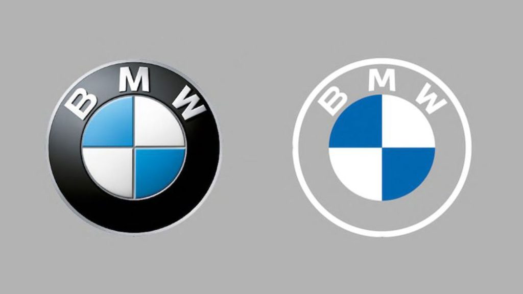
Image sourced here
BMW decided to give their logo a redesign when they realized that it needed to be more appropriate for digital formats so that it would look good across all platforms. It’s mainly used online and in print design.
Tripadvisor

Image sourced here
Although the logo was kept almost the same for the review website, they flattened the colors and gave the name a capital ‘T’. Instead of completely removing the parts of their brand that made it iconic and symbolic, instead, they did a great job of giving their brand exactly what they needed with a fresh lift.
Toyota
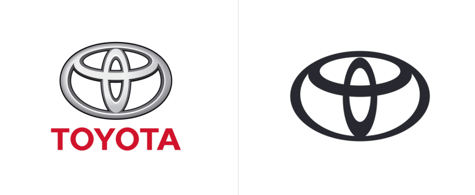
Image sourced here
In a now digital world, it’s only a matter of time before brands like BMW and Toyota start to completely modernize their logo. Toyota decided to opt for a symbol-only logo and took away the wordmark, keeping the logo simple and making it appear well digitally. We think this was certainly a redesign that was needed!