Resources · Graphic Design
Top 6 Color Palettes of 2020
By Rachel Wayne
June 2, 2020 · Updated June 2, 2020 · 2 min read

- Throwback palettes embrace a vintage aesthetic in 2020.
- Dark Mode has inspired a new wave of color trends.
- Classic hues remain the height of sophistication in design.
There’s a reason that Oz is portrayed as a land of brilliant color in the film The Wizard of Oz. Color is able to communicate deep meaning and vast amounts of information. Our perception of color is quite advanced compared to animals’, and color helps shape our experience of the world. A skilled graphic designer can leverage our appreciation of color to tell us a story and inspire us towards action. And in 2020, some thrilling color trends are taking over the design world. Let’s take a look.
Dark Mode
Over the past couple of years, many apps and operating systems have rolled out “Dark Mode,” which swaps out the light-colored windows and dialogs for black and dark shades of grey. Designers have followed suit, using vivid colors in a dark setting to bring a mysterious, sophisticated vibe to their creations.
Neons
To many people, the 80s never left, and in 2020, we’re seeing a new fondness for the decade’s distinctive color palette. Inspired by the era’s ultra-colorful clothing, many designers have rolled out bright greens, pinks, and yellows in their color palettes. Often, these colors are paired with lighter hues to give the impression of a glowing neon sign. Neon palettes give a fun throwback vibe to any design.
Vintage Palettes
Speaking of throwback palettes, the 20s are back. Many designers are embracing vintage color palettes in which subdued colors are paired with elegant gold touches or natural hues. Other variations include muted primary colors or earthy shades to give an antique look.
Transparent Pastels
Pastels have been popular for years, but in 2020, they’re getting a mystical twist. Designers are layering pastels and pairing them with darker hues. The contrast in these palettes gives designs a rich, mysterious look — and it works well in Dark Mode as well.
Futuristic Brights
Sci-fi is very popular right now, and 2020 color palettes reflect this trend. In keeping with the throwback aesthetic of this year, many people are drawing inspiration from classic sci-fi novels and films of the mid- to late-20th century. By pairing bold complementary colors with oversaturated hues, designers are bringing a futuristic, psychedelic vibe to their designs.
Monochromatic
Even as vivid colors dominate 2020 designs, the classics remain important. Indeed, Pantone named its Classic Blue (19-4052) Color of the Year. Shades such as this ultra-appealing blue often feature in monochromatic palettes. In this simple, accessible approach, designers play with different shades of a main color. Monochromatic palettes look classy and elegant.
Wrapping Up
2020 has a range of color palette options that rivals those of the wonderful land of Oz. It is a year of both innovative design and appreciation for what’s come before. From vintage aesthetics to Dark Mode-friendly themes, designers are embracing the full variety of colors available to us.
From the studio
Want this handled for you?
A dedicated designer, video editor, motion editor, and illustrator who learn your brand and ship work every business day. Flat monthly rate. Banked hours roll over for 30 days. Cancel anytime.
Keep reading
All resources →
Graphic Design
Why Every Business Needs a Logo (and How to Get One That Defines Your Brand)
Graphic Design
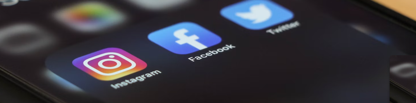
Benefits of Good Graphics for Social Media

Graphic Design
Unlimited Custom Illustrations: A Smarter Way to Stand Out Visually
Graphic Design