Graphic design doesn’t have to be intimidating!
Whether you’re jazzing up your social media feed, making posters, or designing your dream business logo, these creative hacks will have you designing like a pro in no time.
Let’s dive in and turn those ideas into pixel-perfect Magic.
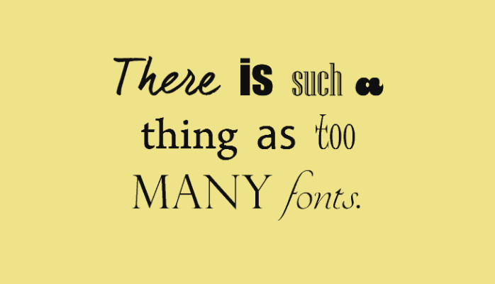
- Stick to Two Fonts, Tops!
Imagine your fonts throwing a wild party—too many, and chaos breaks loose. Keep it classy with one bold font for headlines and a clean, simple font for body text. It’s like PB&J for design.
- Think Big—Literally!
Want something to stand out? Blow it up! Big fonts, bold images, and oversized icons scream for attention. Ensure they fit within your layout and don’t make the scene manageable.
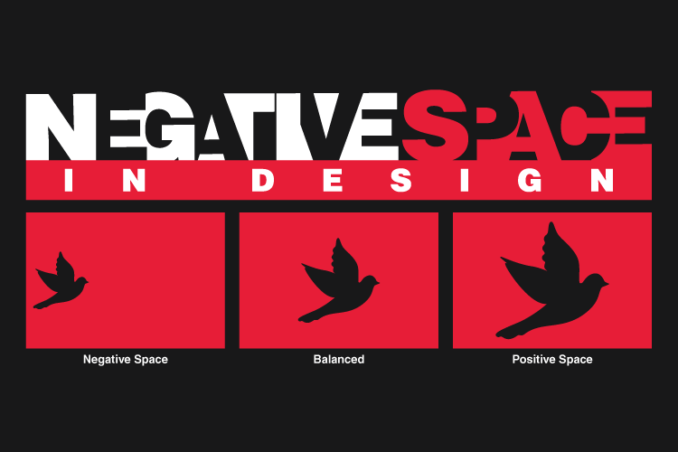
- Negative Space = Positive Vibes
Give your design room to breathe. Empty areas (aka white Space) make everything look sleeker and help key elements pop. Think of it as a comfy couch for your content to chill on.
- Dare to Go Minimalist
Less is more! Strip it back to the essentials and let simplicity do the talking. Fewer elements mean more focus on what matters most.
- Colors Are Your Superpower
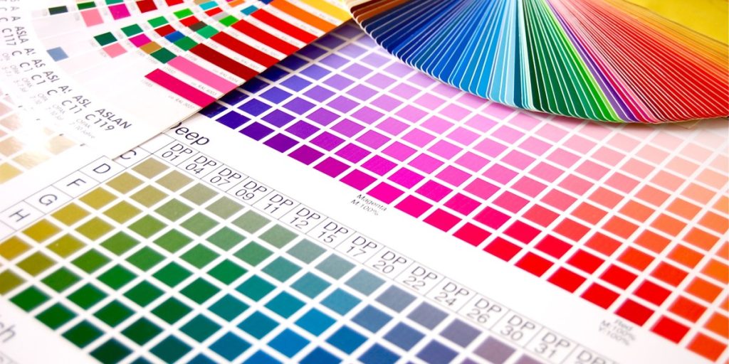
Pick a palette with purpose. Use three to five shades max—two primary colors and some accents to spice things up. Test your combos on a free tool like Coolors or Canvas color picker.
- Match Your Font to the Mood
Words can look as severe or fun as they sound. Go playful with rounded fonts, professional with sharp sans-serifs, or timeless with elegant serifs.
- Play with Layers
Overlap shapes, images, or text to create depth. Shadows and transparency effects can take your design from flat to fab.

- Create a Visual Hierarchy
Decide who is the star of your design (big, bold, and colorful) and who is in the supporting cast (smaller and subtler). Let the viewer know where to look first.
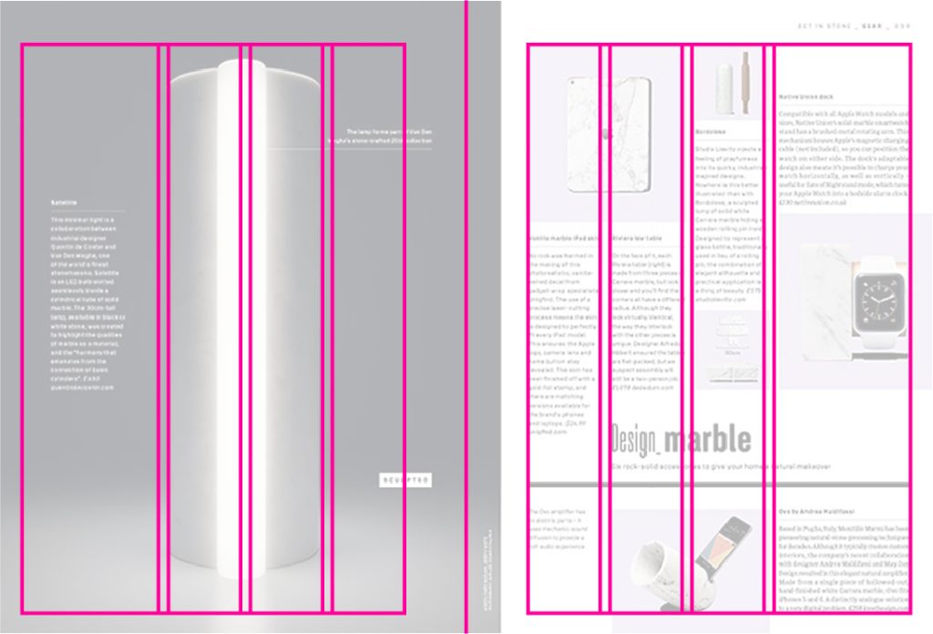
- Grids Are Your Best Friend
Use grids to keep everything aligned and polished. Think of them as the rulers that help your content walk straight.
- Consistency Is Key
Every slide, page, or post should look like it’s from the same family. Match fonts, colors, and layouts to build a solid visual identity.
- Don’t Fear Contrast
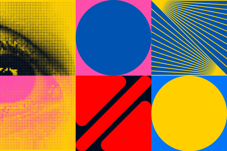
Contrast isn’t just about colors—it’s also about sizes, shapes, and textures—pair light with dark, big with small, and bold with delicate for extra drama.
- Find Your Muse
Explore Pinterest, Behance, or Instagram for inspiration. But don’t copy—put your unique twist on what you find.
- Break the Rules (Sometimes)
Design “rules” are more like friendly guidelines. Once you’ve mastered the basics, feel free to bend, twist, or break them to create something totally you.
- Never Let an Image Go Naked
Frame your photos! Use a funky border, a drop shadow, or a collage effect to keep your images from floating aimlessly.
- Invest in Icons
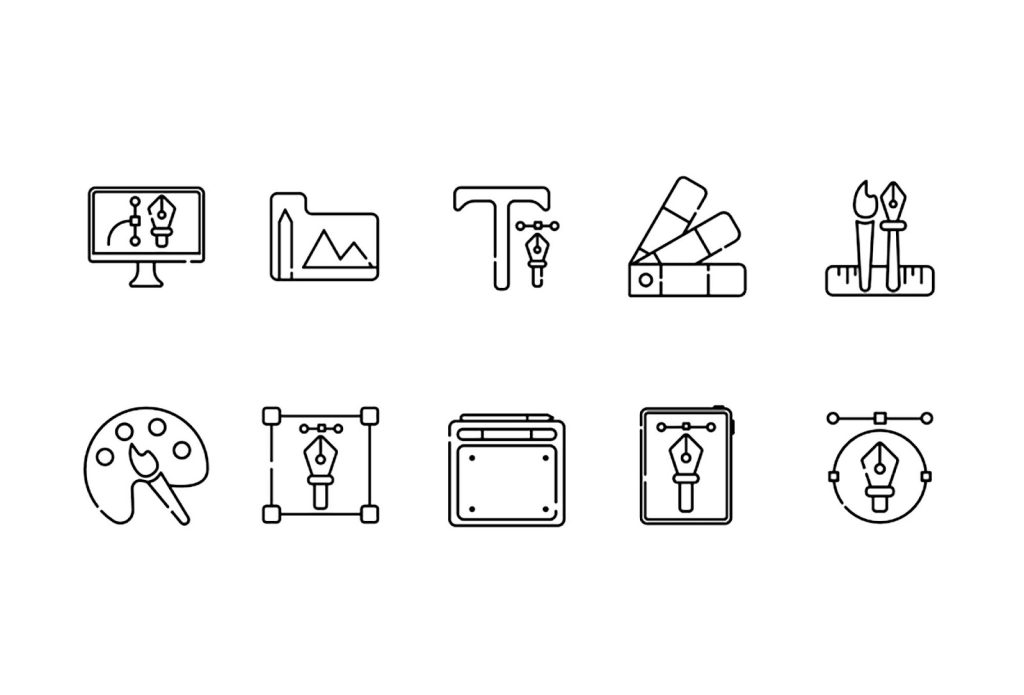
Icons are mini lifesavers! Use them to replace boring bullet points or illustrate your ideas with flair. Free tools like Noun Project or FlatIcon are gold mines.
- Let Your Designs Rest
Take a break before finalizing your design. Fresh eyes often spot things you missed the first time around.
- Keep It Centered—Or Don’t
Center alignment is safe and clean, but left- or right-aligned layouts can feel modern and edgy. Play around to see what feels right.
- Say No to Overcrowding
Your design isn’t a clown car. Don’t cram in too many elements—less clutter equals more clarity.
- Embrace Texture
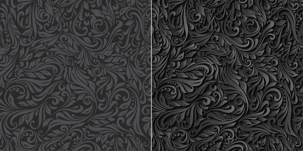
Flat is fine, but a little texture can add richness to your designs. Think grainy backgrounds, paper effects, or brush strokes.
- Test Your Typography Skills
Pair a bold, chunky headline font with a delicate, thin body font. The contrast is eye-catching and oh-so-stylish.
- Mood Boards = Magic.
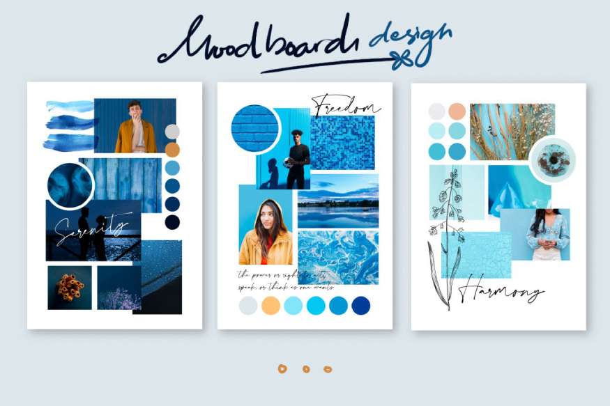
Collect inspiration in one place—a mood board of colors, images, and fonts can guide your design. Tools like Canva or Milanote make it easy.
- Recycle Designs You Love
Have you created something amazing? Remix it! Switch out the colors, tweak the fonts, and reuse your best work with new content.
- Sketch Before You Design
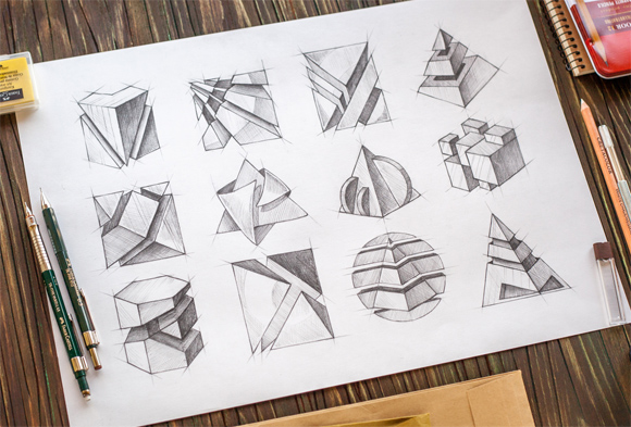
Doodle your ideas on paper before hopping onto a design tool. It’s like building a roadmap for your creative journey.
- Mistakes Are Part of the Process
Do you need to be happier with a design? No worries! Design is trial and error, so don’t be afraid to experiment or hit “undo.”
- Keep It Fun!
Design should be enjoyable. Bring your personality into your work and let your creativity shine.
- Symmetry = Sweet Satisfaction
Think of symmetry as your design’s BFF—it keeps everything chill and perfectly balanced. Whether it’s text, images, or wild icons, symmetry prevents your layout from looking like it partied too hard.
- Glow Up with Gradients
Flat colors are so last season. Give your design that “main character” energy by blending colors into a smooth gradient. Sunset vibes? Neon dreams? The possibilities are endless!

- Drop Shadows = Insta Depth.
A flat design is excellent, but shadows? That’s where the magic happens. A sneaky drop shadow under your text or icons can take your design from “meh” to “whoa!” Just don’t go too heavy—you want chic, not spooky.
- Move It to Groove It
Static is okay, but animation? That’s where the razzle-dazzle is! A bounce here, a fade there, and suddenly your design isn’t just seen—it’s felt. Simple tools like Canva or Adobe Spark can add motion without giving you motion sickness.
And there you have it—your cheat code to slaying graphic design like the creative genius you are!
Whether you’re tweaking fonts, mastering symmetry, or dropping shadows like it’s hot, remember: design is about expressing yourself. Don’t stress perfection; embrace the messy, creative process that leads to greatness. Play with colors, break the rules, and, most importantly, have fun. Because when you love what you’re creating, it shows—and the world won’t be able to look away.
Now, turn those ideas into design magic! ✨🎨
