

Studies have shown us that the average American spends around 5 hours each day interacting with the apps on their smartphone, and US citizens certainly aren’t alone in our obsession with our phones. Whether it’s messaging, checking out the latest social posts, or gaming, these devices and the information, and entertainment they deliver have become a significant facet of modern life all over the globe.
It makes sense that so many people have felt inspired to try their hands at developing the next awesome app. Who wouldn’t want to create a product marketed to a global audience of entranced users? Of course, this means that competition is incredibly fierce in this corner of the development world. The opportunity to see an app you created move into the trending and featured app categories is certainly an outcome worth striving for.
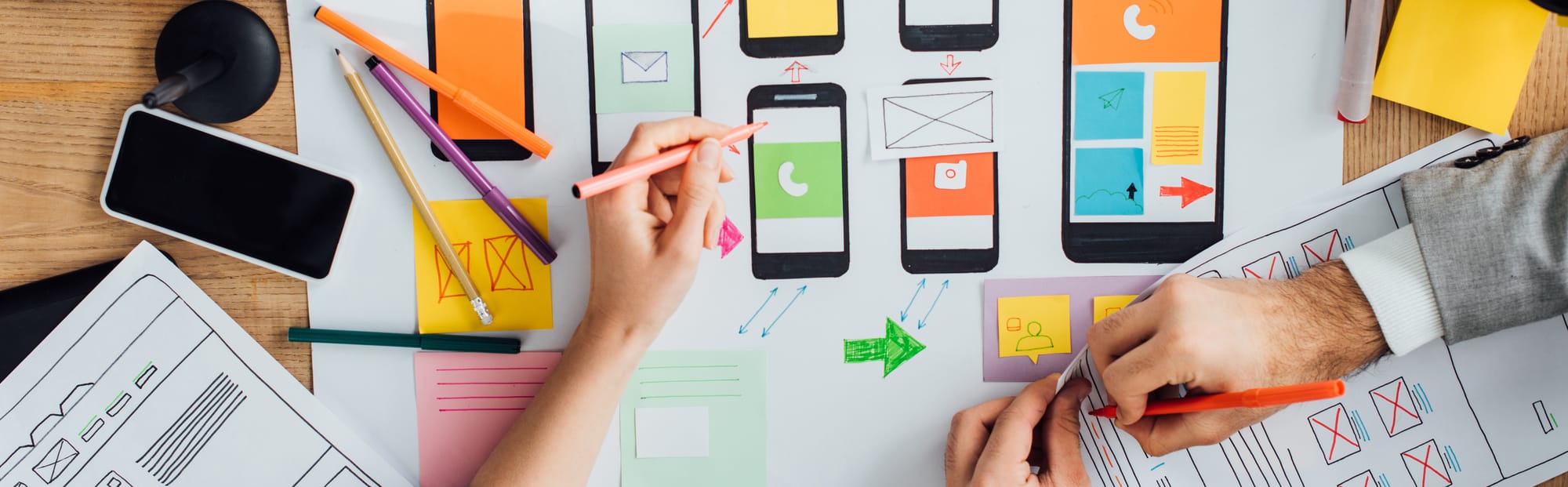
If you want to find your way into that winner’s circle you are going to have to go the extra mile to ensure that every aspect of your app looks as great as it functions. You will need to find a surefire way to make certain that everyone gets a chance to see your vision the way that you see it. That means you are going to have to do more than simply create an awesome app, you will need to find a way to make sure that your app clearly stands out from the dozens of similar apps in the App Store or Playstore.
This means spending some time focusing on your app design to ensure that your app looks as good as it functions. Poor app design has been the downfall of countless awesome apps. App developers naturally want to focus intensely on making sure the core function of their app is solid, but this often leads them to neglect the design aspects of the project. Often, the rationalization behind this common mistake is a belief that the app’s function is so awesome that nobody will care what the app looks like.
The truth is, it won’t matter how innovative and cool your app’s features are if nobody ever gets a chance to use them, and a poorly designed home screen and menus are enough to keep users from ever seeing what your app is capable of.
Smartphones are often operated while we are out and on the move, or distracted by the events happening around us. That means that mobile apps need to be easy to operate on the go. A poorly designed menu screen can easily be enough to have the user uninstalling the app without ever seeing its greatness.
Success takes more than just a massive surge of post-launch downloads, you will need people to use your app, fall in love with it, and tell all their friends that they have to have it. If the initial “new app” hype fades into frustration with an awkward layout and a confusing home screen, you are going to lose out on a lot of this second stage.
Now that we have shown how the aesthetics of your app can make or break its success, what can you do to be certain that your app design won’t get in the way of success?
We just happen to have a sure-fire way to create an app design that blends seamlessly with your app’s functions. Let’s get started.
What Is The Purpose Of Your App?
Before you start looking at wireframe tools or sketching out a look, it’s important to understand why you’re making the app in the first place. What is the purpose of the app, and what are you trying to accomplish?
This sounds like a deep philosophical question at first, but we promise it is really pretty simple. In fact, all you need to do is sit down and jot down your answers to a few questions. Your answers to these questions will illuminate the direction you need to go with your design, based on the way you hope to make your users feel when they try your app.
- What does your app do? This one should be easy to answer, after all, it is why you made the app in the first place.
- What problem or feeling does your app improve for the user?
- How exactly does your app solve the problem you identified above?
- Why is your app’s solution better than other apps that were designed for similar reasons?
- Name at least one specific factor that makes your app different from other similar apps. This should be a distinct benefit or positive feature that the other apps lack.
Answering these questions thoughtfully helps you to develop a clear concept of what your app is, and what makes it special, with this in mind it will be much easier for you to make design choices because you will know what you want your user to experience when using your app.
Make A Plan
Before you head over to the computer or digital tool, you’ve got a bit more planning to do. This next bit of homework is going to help create a tangible connection between the answers that you expressed in words, and what those answers mean for the design of your app.
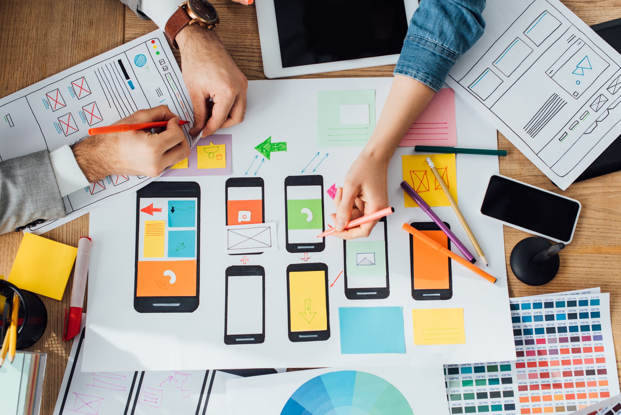
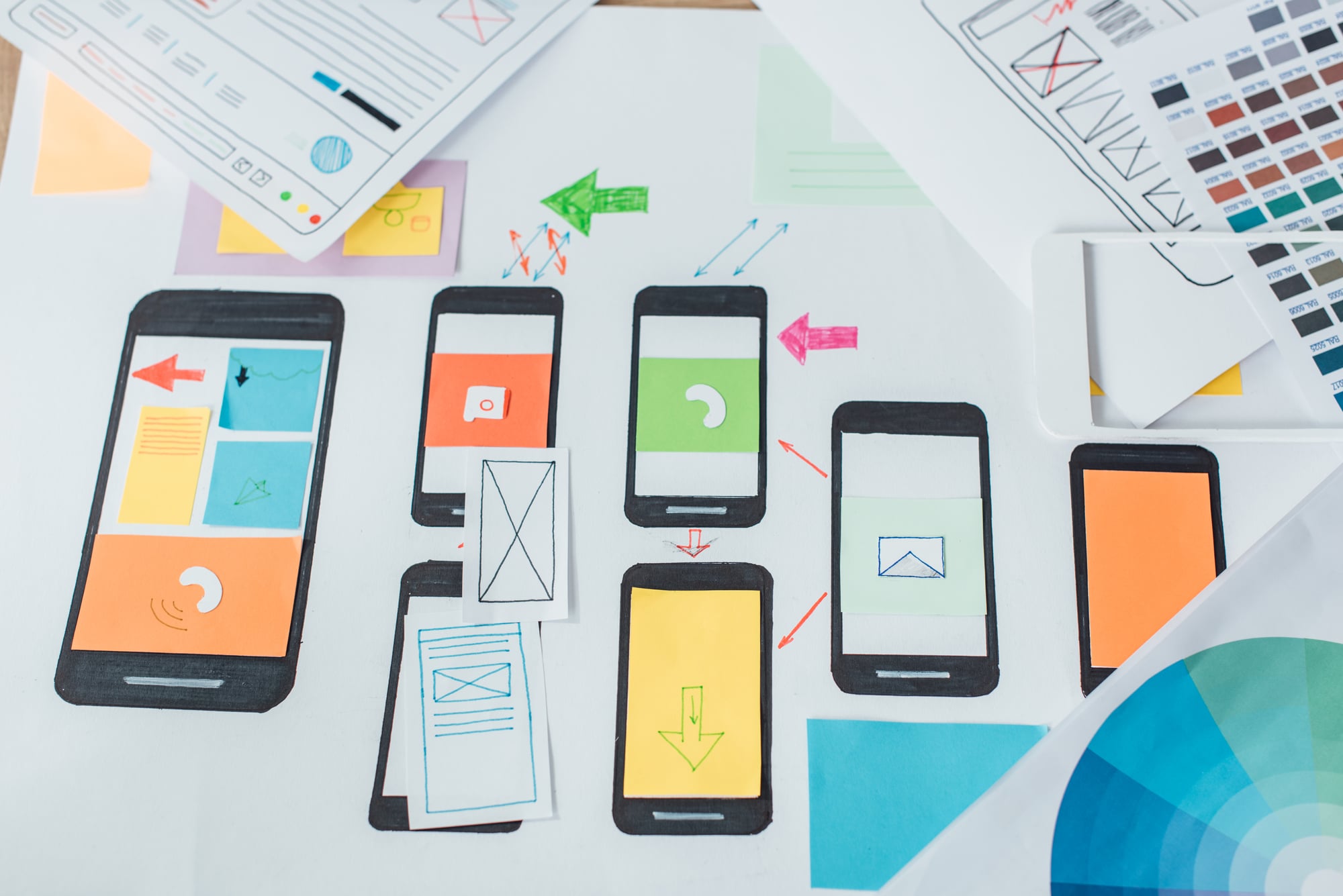
While those answers are fresh in your mind, take a moment to create a rough sketch of the various functions you will want your app to perform and what you envision the screen, menus, buttons, and other details looking like. Try to be as thorough as possible, now, while the vision is still clear in your mind. This simple exercise creates a visual pathway leading from your abstract concepts to the practical manifestation in the real world.
Know Your Niche & Competitors
Now, it’s time to hit the web to start scoping out how you stack up with the competition. The professional term for this important activity is “conducting market research”, but the details are the same. The goal is to immerse yourself into the virtual conversations taking place among members of your target audience in order to fully understand their challenges, what they like, what they loathe, and any other insight you are able to glean.
In a selling environment as crowded as the app stores, a deep understanding of your target audience’s needs and wants, can be a game-changer.
The best way you can differentiate yourself from the competition is by demonstrating your understanding of the challenges that your audience struggles with the most, and positioning you app as a positive antidote to those problems, even if it is only in the form of entertainment and temporary escape.
You’ll also want to look at consumer reviews. What do people using the currently available apps like? What do they hate? How will your app present a better experience?
Take this information back to your sketched-out plan and update it accordingly. Maybe little will need to be adjusted, or you may have to do some serious overhaul to get your app going in the right direction.
Flesh Out Your App Design Plan
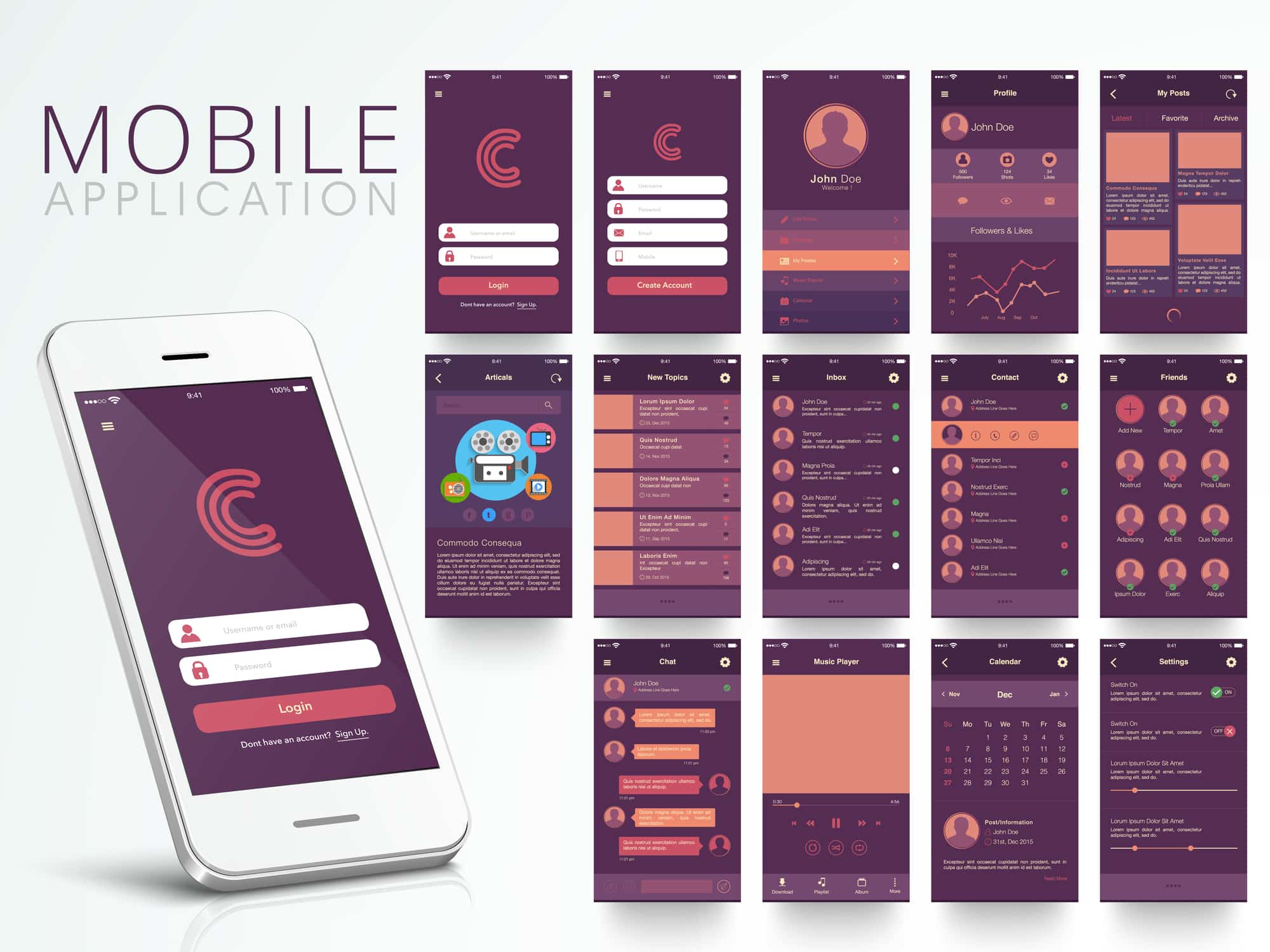
At this stage, you should have most of what you need to begin pulling it all together into a mockup design that will allow you to make any eleventh-hour adjustments if something doesn’t turn out quite as you imagined. This is a crucial step and it is the last opportunity that you will likely have to make any significant changes. Take your time and examine every detail of every page on your app. You want to discover those blindingly obvious errors now, while they can be fixed quickly, rather than the day after launch when your messenger boxes are flooded with frustrated users.
You will need to make any final decisions regarding your color palette, fonts, and use of other design elements during this stage as well. By now you should be able to see the finish line, but there are still a few more details to consider.
App Design Tips – Things To Consider During The App Design Process
It can be tempting to tackle the design process yourself, but this final step requires an expert eye for fine details, and if you don’t have those credentials, it is best to leave this type of project to professional graphic designers with the know-how to handle it.
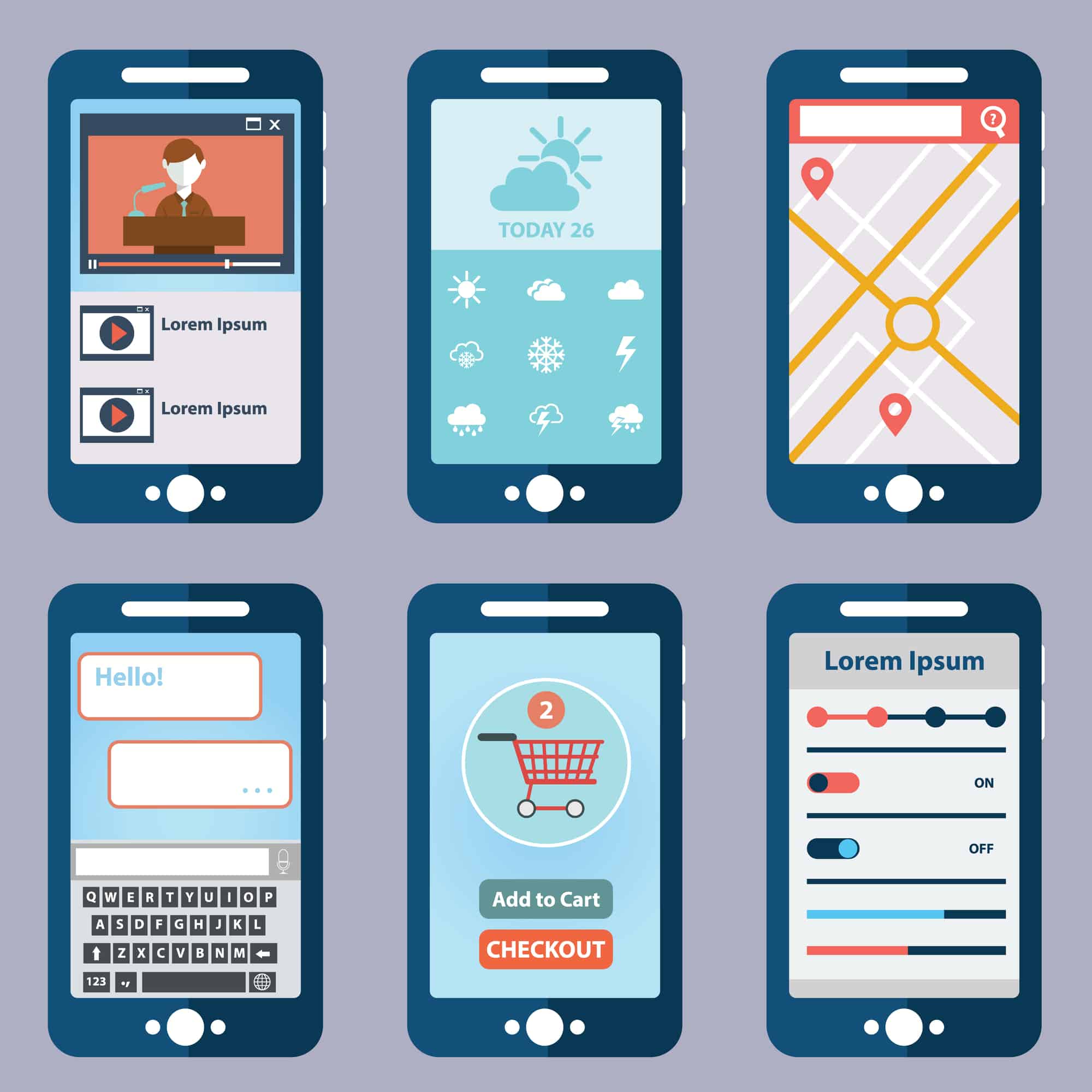
Easy Navigation
Unless your app is easy to navigate, it doesn’t matter how pretty it is. Navigation is crucial. It is foolish to imagine that your user will sit down, free up both of their hands to securely maneuver the smartphone, and devote their full focus to determining the series of steps needed to gain access to your app when they need to use it. That is simply not how we use smartphones. Your app should be able to be opened and used by someone who is attempting to open the app with the thumb of one hand whilst holding a fresh, hot Starbucks coffee in the other. That is a common scenario that we witness (or play the leading role) in every day. Keep this in mind when determining how users will navigate your app.
Familiar Native-Style Icons
The navigation drawer is especially important when designing for Android. To ensure a seamless user experience, it needs to be easy to find. Learning how to use a new app, even if it is a fun interactive app, can spark frustration quickly, especially if we are engaged in another activity or conversation at the same time.
Providing an always visible, familiar control can help to subconsciously dial down the anxiety. This small button is instantly recognizable and while the rest of the app may be complex, your user will have one button with a predictable function. While the inclusion of the navigation tab is the most vital, you should try to use familiar Android or iOS-themed icons and buttons when possible.
You’ll also want to ensure the design is finger-friendly. If buttons and links are too small, people won’t be able to use them, and navigation will come to a halt.
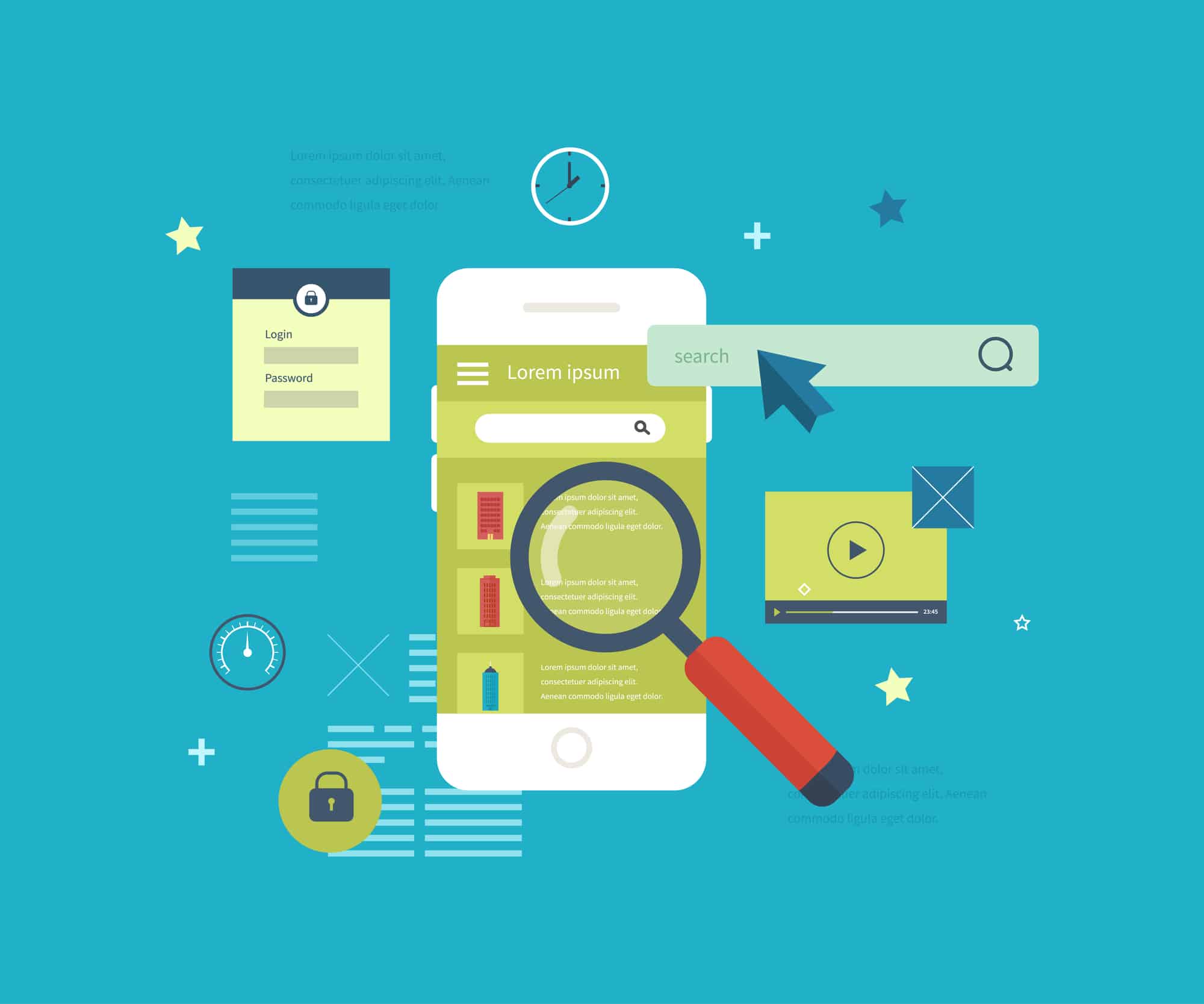
Minimalist Simplicity
Minimalist design and a crisp white background provide the ideal viewing conditions for your users. Our minds are already conditioned to focus on contrasting words against the unobtrusive white pages of a book. A simple layout pared down to only what is needed. Additionally, much like the navigation bar above, it is not a bad idea to opt for a typography similar to the device default and use similar labels on tools and icons.
Color Palettes & Fonts
If you have already created a brand logo, or if you have an established brand guide then this section will be easy, you would ideally want to feature your brand colors as much as possible, and then use complimentary colors where needed. This helps users immediately associate the new app with your brand right from the start.
If you do not have a branding guide or logo then you will likely be starting from scratch, so you have no pre-set restrictions. Of course, this also means that if you achieve your goal of creating the next “must-have” app, the color and font choices you make now will be associated with your brand, and would essentially become your brand guide for future projects. With that in mind, make sure that you choose a color palette and font styles that you can see yourself using on future projects as well.
Color can be very subjective, so you should absolutely let your unique personal or professional personality guide this choice. That being said, you will also need to keep your goal in mind when making your selections. After all, you didn’t design this app for yourself. Your goal is to get as many users as possible to get excited about your app. With that goal in mind, you will want to incorporate some of the proven marketing design secrets into your final selection.
For example, marketers often rely on the theory that we have a strong emotional and cognitive reaction to colors, associating each with specific emotions and activities, and feelings. This theory is at play in the common choice to use green shades for companies that want to be seen as “natural” or “organic” and use navy blues and crisp whites for brands that want to be seen as serious and authoritative.

Visual Hierarchy & Weight
Visual hierarchy and visual weight are a pair of fancy design jargon terms that refer to the way in which the core elements of a design are displayed in relation to the secondary or background elements.
A designer creates a visual hierarchy by adjusting the size and perhaps the color, or opacity of their focal element, while simultaneously making secondary elements smaller in comparison, or moving them further back in the scene. These small adjustments make the focus item stand out and appear more substantial than the other elements making it clear where the focus should be directed.
A designer uses the visual weight technique to balance the various elements that appear on the page. Visual weight decisions are similar to those you might make when formatting a report in a document. In the document, you might assign a larger header format to your main headings, and then a smaller size to your sub-headers. The visual weight theory works the same way. The most important elements of your page would be rendered in a larger size than the secondary or lesser objects on each page.
Be Consistent
Design consistency keeps things looking sleek and professional. Consistency in your colors, fonts, and other design elements goes a long way toward creating a smooth and positive user experience.
Mobile apps are made up of many layers of tools, functions, integrations, widgets, buttons, labels, and countless other features that your end user is likely to interact with at some point in their journey.
If you can provide a seamless experience by making the extra effort to build visual and functional consistency into each of these layers, you can make your user feel comfortable right from the start and greatly increase the odds that they will continue using your app.
How To Get Apps Designed For Your Business
Creating an app is a lot of work, you will definitely want to make an honest assessment of your skill level before you get started and make sure you are up for the challenge. If you are feeling confident about the technical aspects of mobile app creation but feel a little out of your comfort zone when it comes to the design aspects, you could consider hiring a graphic designer to collaborate and provide the design end of the equation.
Professional graphic design agencies are the priciest option and are generally out of reach for most fledgling app designers. Freelance marketplaces offer more affordable graphic design services but you will need to take your time and use caution when selecting an artist to work with. There are some amazing artists on these platforms, but there are also a lot of unskilled talent and outright scammers. With so many creatives from all over the world on one platform, there is simply no way to vet quality so you are definitely going to want to have a “buyer beware” mindset.
You do have another alternative to the pricey agencies and risky mega-websites. A monthly unlimited design subscription from Flocksy can cover all of your mobile app design needs and tackle any marketing and promotion needs you might have after your app is launched.
The unlimited service means that you pay one low price and request as many design projects as you want across a range of categories from app design, to web development and video editing, to blog post writing.
You can feel confident handing over the creation of your app design assets to the professional team at Flocksy. You will be able to monitor the status of your project and communicate with your team right from the centralized dashboard. The chat function is built into the dashboard and sends an alert to your designer as soon as you send them a message. During business hours you can expect a reply in less than an hour, usually in a matter of minutes. A dedicated project manager adds an additional layer of support to your account. You can contact your project manager any time you have questions or concerns.
Getting App Design At Flocksy
If you choose to work with Flocksy, you are going to be amazed at how easy the whole process is. You can start your app design project from your account dashboard by clicking the “Create new project” button to open the project request page. Now, select the “graphic design project” option and use the drop-down menu to find the option for “app design.” In the brief, give your designer everything they need to know about what your app is, what its goals are, etc., and you’ll see results in no time.
You can refer back to this post when creating your project brief if you need a reminder of all of the different elements to list. Include any references your designer should use, all the text you want to be displayed, your brand style guide (or the fonts and colors you want), and a detailed description or sketch of what the overall interface should be like.
Your graphic artist will produce a professional app design that you will be able to test to ensure that it looks and functions exactly as you envisioned. If there are some adjustments that need to be made your designer will work with you to revise the design as many times as it takes to make it perfect.
A Flocksy subscription will also give you the ability to work with the same designer on future projects. This is an excellent way to build consistency into any future apps or accessory packs.
Flocksy makes it easy to stop daydreaming about launching the next big mobile app, and just do it! Start your app design project today!