

Designing a logo is an interesting task and can be accomplished in many ways. However, no matter how you go about doing it, getting a logo for your new business or revamping one that’s not performing is extremely important.
Logos are a brand’s first impression, and you have to make a good one if you want to capture your audience’s attention and eventually make the sale or deal.
So, how do you get a high-quality logo for your business? Running a successful logo project with a graphic design company can be exactly what you need. But how do you make sure that your project goes smoothly and that you get the results you want?
In this article, we’ll cover all the ins and outs of what makes a good logo, the importance of great logo design, and getting your perfect logo designed in record time.
In this guide, we’ll cover:
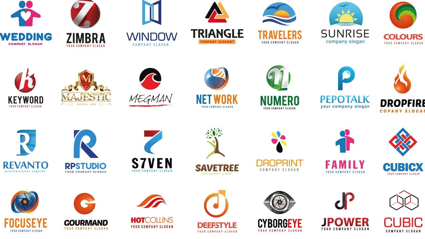
The Principles of a Good Logo
Understanding what your logo needs to do can help you to direct your graphic designer and be open to beneficial suggestions. There are certain principles of good logo design, and keeping them at the forefront of your mind can ensure you get the quality logo you need and avoid making beginner business mistakes. Here are the top seven things that make a successful logo:
1. Simplicity
Your logo should be straightforward and simple to give the viewer an immediate and clear sense of what your brand is and represents. The best logos are clean and uncluttered because, most of the time, less is more. A simple, bold statement is more impactful.
You’ll also be using your logo on different platforms, in several places, and various formats and sizes. So, if you use too small of details, they’ll often be lost, particularly on mobile. A strong logo offers a few key elements that can be easily identified and integral to your message. All in all, if you’re thinking of adding something to a logo design, be sure it’s integral to your message. If not. It’s best to leave it off.
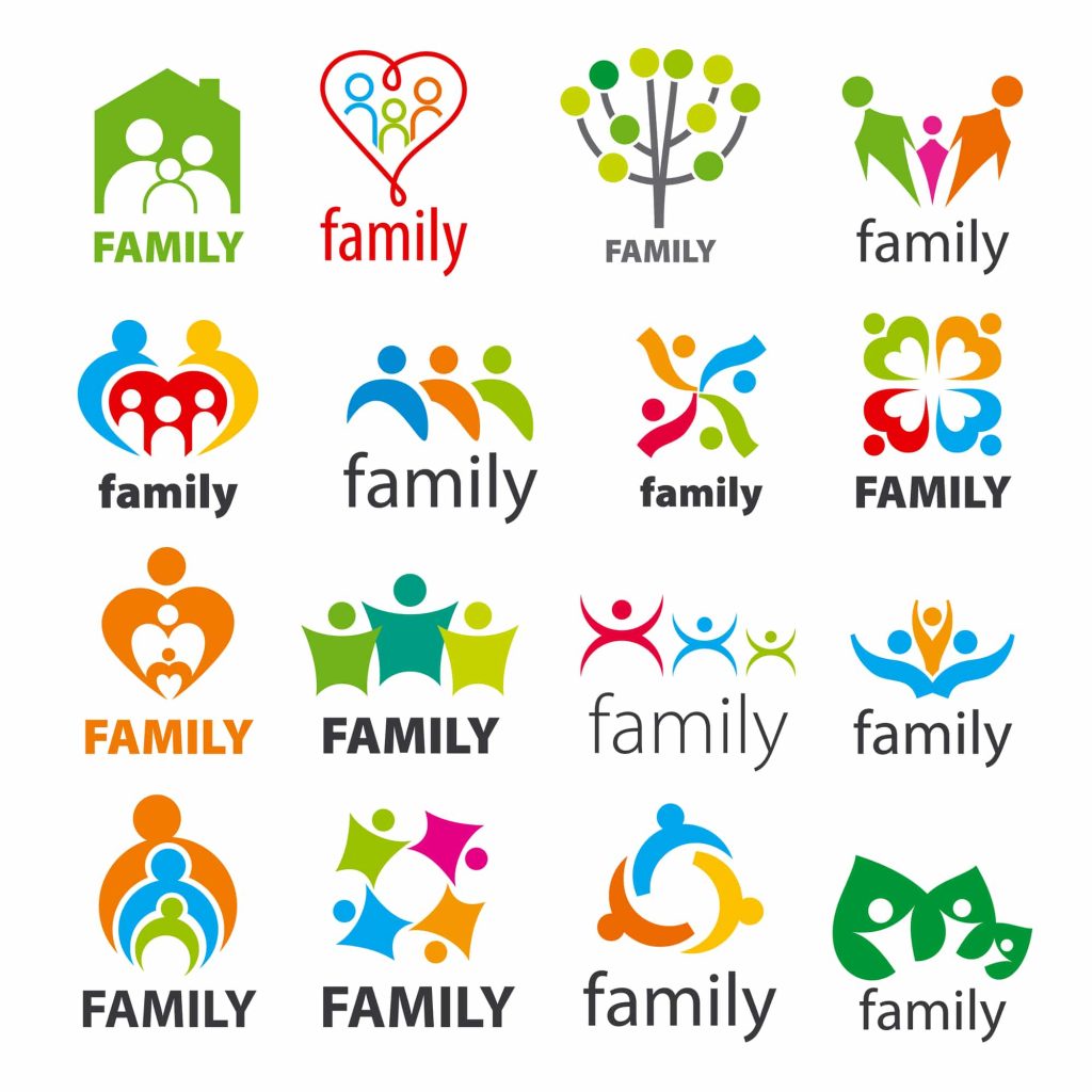
The logo below is far too complex and takes too long to decipher:
2. Memorability
A glance is all your logo can get in most situations, so it must be memorable immediately. This first impression must stick in people’s minds long enough to make an impact.
Essentially, what you want is for a viewer to recall the chief elements of your logo after they’ve seen it for a brief time. As you can guess, this is also where simplicity pays off. A logo that’s too complex or detailed with multiple parts and pieces or one that’s challenging to read will be difficult for the viewer to remember and, consequently, be easy to forget.
3. Originality
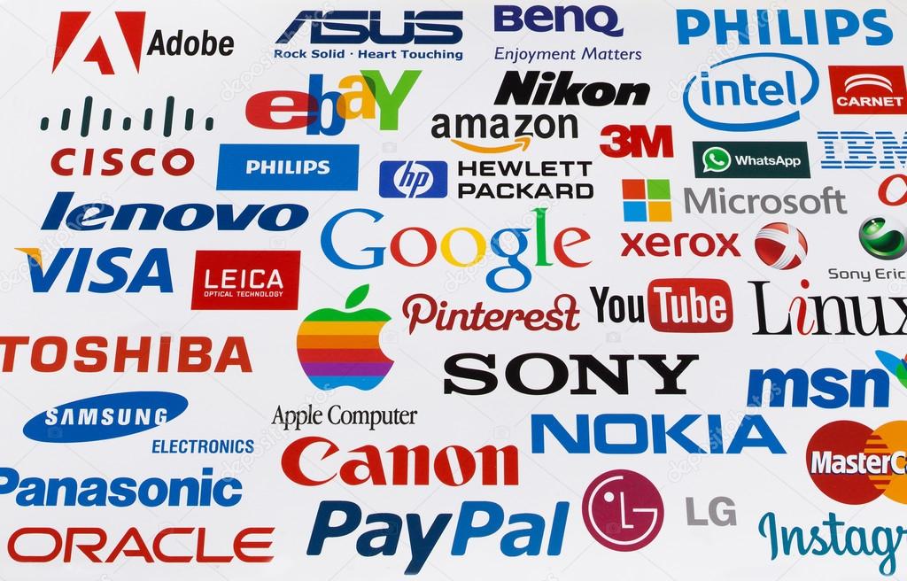
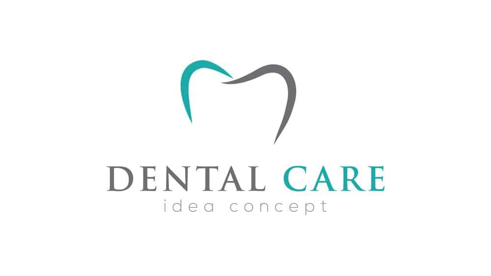
Creating a logo that’s recognizable as a part of an industry is good. Using food in your logo when selling furniture might not line up. However, it’s also important to avoid mimicking something too much. Telecomm is a great example. The industry is filled with logos featuring globes, technology, and electronics. You’ll see a lot of modern, abstract designs. Dentistry is another good example because nearly every logo has teeth or smiles.
While they make sense for the industries, and you can find a clever way to incorporate them, it can be difficult to stand out when you look similar to the competition.
4. Modern Yet Timeless
Modern is a tricky thing to define. While it’s important to look current and match the styles and quality of today’s graphic design standards, it’s also important to avoid looking strange or silly in five years.
Modern is different than trendy. Trends are hot for a moment but quickly lose steam and are forgotten. Modern design focuses on showcasing the most relevant characteristics of the times and the brand without becoming too detailed, flashy, or niche.
When a trend has run its course, you don’t want to be left with a logo that feels outdated and will need to be redesigned. If your logo looks outdated, your audience will think you’re outdated. You’ll lose trustworthiness.
You’ll see several logos that have changed a little over time, tweaking minor details to make them more modern, such as UPS, Starbucks, and Burger King.
5. Balance
Proportion and symmetry are crucial in most types of art, including graphic design and logos. To create an aesthetically pleasing logo, you’ll want to look for balanced sections like a circle with centered text that bisects the image or text that flows in a line that’s the same thickness as the icon to the side.
6. Complementary
A logo’s graphic device and the typeface must work together. We usually call this a lockup. These parts of your design need to enhance one another. If your graphic device is clean and simple, pairing it with a complex or handwritten-style font may not be the best way to go. The two elements should act as one. Though you may use them separately at times, they always need to be able to work together seamlessly.
7. Versatility
You use your logo in several ways and in multiple contexts. Here are just a few:
- On merchandise and promotional items
- On very horizontal or vertical banners
- On both black and white backgrounds, so you’ll want monochrome options that are visible on both.
- In very large and small spaces
- Alongside other company logos
- Online and in print
No matter where or how you use your logo, it must maintain integrity and legibility. A good designer will know this implicitly and create a logo that works regardless of the situation. They’ll also consider your other branding elements, including textures or patterns, that form your brand. They’ll create something complementary and provide the correct files so you can use your logo everywhere.
How to Get Your Perfect Logo
Logo design is an incredible mix of creativity, communication, technical processes, and collaboration. When you’re working with someone to create your logo, as you can here at Flocksy with a graphic design subscription, there’s a basic process you can expect. Additionally, there are ways that you can ensure your designer is absorbing your message, and you can work together to create something amazing.
Here are the seven basic steps to logo development, from concept and research to the final product.
Step 1. Evaluating your brand
First, your designer will want to know everything about your brand and what you represent. An artist can’t design a logo properly unless they have all the information they need about who you are as a company and what you’re trying to do. In your project brief, you’ll want to be sure to provide several examples of your voice, message, brand goals, and company story so that the designer understands exactly what your business is all about.
For example, if you’re a coffee shop, it might not be best to have a logo that is especially harsh and minimalistic. But maybe an ultra-modern design would be perfect for you because that’s the feel of your restaurant. There’s no way for a designer to know unless you tell them.
For a logo to function effectively, it needs to impact the viewer strongly and positively. It needs to make the correct statement. So, you must figure out what you’re trying to say through that logo about your company.
Logos are symbols. They need to tell people what you mean to them and how you want them to interact with your brand because you won’t always be there yourself to do the job.
Evernote, a popular note-taking app, uses an elephant with a dog-earred ear. The common visual of marking a place in a book combined with the elephant’s symbol of memory (after all, an elephant never forgets), the logo perfectly sums up the app’s purpose of keeping lists, images, ideas, etc., safe and sound.
Use what you know makes your company valuable to customers and prospects as communication goals that your logo must live up to.
We understand that it can be difficult to articulate what you want, and maybe you don’t have a great idea yet. It’s important to be as thorough with the information in your brief as possible. A good place to start is how you want your audience to feel when they look at your logo and why. The why is especially crucial.
Here are just a few general questions you can think about when you’re explaining your brand and business:
- Why are you getting a logo designed?
- What problem do you want to solve?
- If your brand were a person, how would you describe them? Clever, sophisticated, trendy?
- What is your brand voice? Will you use formal language or be more casual and use slang?
- What values and beliefs are most important to your brand?
- What is your value proposition? How are it and your business different from your competitors?
- If someone was telling a friend about your company, what would you want them to say?
The first step in the Flocksy logo design process is understanding what your brand represents through the project brief and any follow-up questions that might be necessary.
Evaluating a brand is one of the first steps in our logo design process, and included in the brief because we want to get it right. You’ll have a large section in the brief to include the details, and you can attach reference documents, images, and files for your designer.
It’s in these briefs that you’ll need to do just a bit of heavy lifting to ensure the artist understands what you want.
At the end of this step, your artist will know your brand well and feel comfortable designing a logo that captures your company’s vision and mission. They’ll start the creative gears turning and develop concepts for your unique logo as they research your industry and the types of logos typically used in your niche.
Step 2. Researching the industry
There are industry standards, expectations, and rules. You don’t exist alone, and your brand will be a part of an overall industry. You need to stand out amongst your peers and fit the general vibe of your specific niche.
Your graphic artist will likely research your industry to get a good grip on what you’ll typically see there, the commonalities, and the business that seems to be doing the best regarding memorability and notice. It can be helpful to guide your designer by providing a little about strong competitors and what you do or don’t like about their brand style, logo, and message.
From other logos in your industry, a designer can learn the following:
- The design techniques that work in your industry, such as brand colors or shapes
- Which techniques are overused and have become so widespread that they lack personality and originality
- The logo techniques could use more attention, which could inspire the artist when looking for ways to stand out
- The customers who proliferate your industry
- Who your competitors are targeting with their marketing
Your artist can identify the industry’s popular trends by looking at your competitors. They’ll be able to understand better how to balance standing out and fitting in.
For example, most logos in the tech field use the color blue. It’s incredibly popular. Is there a way to use blue in your new tech company’s logo while still being unique? By looking at your competitors, a designer could determine that nature is rarely paired with tech designs, but you’re a green company, so incorporating it could help you be seen.
With this information, you can work with your designer to determine whether you want to include blue because the data suggests it works or use another color to break the mold. It will depend on how much your want to stand out in your industry, and by providing competitor examples, your designer will be able to help you identify those trends.
A logo should also reflect the company’s target audience. Suppose your audience is middle-aged people who enjoy cooking and regularly watch cooking shows. In that case, your logo will want to appeal to that audience. Maybe you’ll use designs that a whimsical, cozy, and evoke the feeling of eating delicious food.
Understanding the meaning and value, you offer clients or customers can help you pinpoint what type of image you want to create and how you want your audience to view you. If you’re unsure, ask your best customers how they feel about your brand and what types of things they see that currently evoke those feelings.
Based on your product or service, your competitive advantage could be your quick delivery or responses, traditional or ultra-modern craftsmanship, precision, detailed construction or design, brand intelligence, shopping variety, trendiness, green power and innovation, elegance, or one of the thousands of characteristics that make you you.
What you decide on should be important to your prospects and your industry, not exclusively one or the other.
Step 3. Determining where your logo will go
Where your logo will go will also affect your design choices. Although you may not know exactly where you’ll be putting your logo just yet, the earlier you can think of the various places you’ll be using it, the better for logo development. Where you use your logo can affect what file types and formatting are necessary for the design.
For example, if you have a brick-and-mortar business using the logo on large print banners, you’ll need the right types of files. You’ll need a simple, small version if you are using it in the corner of your mobile web store. If you’re active on social media, which we all should be in terms of marketing, you’ll need a logo that sits well in a circular shape or square crop. Animated logos can make your website pop even more, but it will also require the space and file type to support them. If you are doing a variety of these things, your designer will want to know so that they can provide you with the correct files and sizes.
These are some common places you might use your logo design:
- Website icons
- Signs and banners
- Product packaging
- Ads
- Social media posts and banners
- Business cards
- Company stationery and internal communications
- Email marketing campaigns
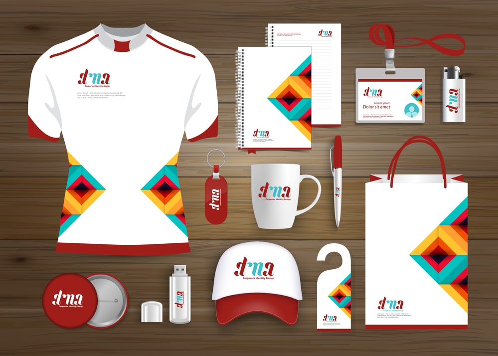
- Promotional swag, such as pens, t-shirts, mugs, stickers, etc.
You’ll also want to include information about your preferred shape and the logo’s most common surroundings. There will be more horizontal space on the top of a letterhead than a small social icon. So knowing where you’ll be putting your logo is essential for creating the right variations.
You may also want to work with your designer to create a responsive design. That way, you always have the right type of logo for any situation. Your designer will work with you to create these variations that all basically look the same so that they feel consistent no matter where you’re using them.
Asking for these variations right away will be very helpful as well. It can be best to plan and design these different versions simultaneously as opposed to designing the main logo and only adapting it when a new situation arises. You’ll save yourself time, and it’ll be less of a hassle for both you and the artist. Creating these variations first ensures you have every possible logo location covered.
Step 4. Look at a variety of logo concepts
Before you start honing in on your final logo design, take some time to look over various ideas, inspirational designs, and prototypes. Working with your designer to see various sketches of potential designs can help you widdle down the options to the final design you love the most.
Often, when you look at several different options, you’ll start to notice certain threads or themes you enjoy seeing and those you don’t. You can mix and match these various elements to create the perfect logo that captures your brand. By asking for several options and providing several resources of inspiration, you’ll give your artist a lot of avenues to try out, helping you to navigate to your dream design that much faster.
Even if you’re almost certain you like one particular idea, take a look at other options and styles that the artist might provide. You could surprise yourself by finding something different that you actually like better. If nothing else, it will give you a library of other pieces to work with in case your initial concept doesn’t perform or is too similar to something else out there.
Once you’ve settled on your preferred concept, take any suggestions the artist might provide about trying different fonts, positioning, etc. Their creative expertise can help you to take something pretty good to absolutely perfect.
Step 5. Ask for vector versions & have the software necessary
From the sketches and concepts you’ve looked at, now you’ll want to choose your final logo design and the few variations you want for its different placements.
You’ll still be able to refine the look, change colors, and move things around when you work with an unlimited graphic design company because they provide unlimited revisions in nearly all cases. This feature ensures you get the perfect design and don’t settle for something you won’t love.
Working with a professional as a part of your monthly flat-rate graphic design service practically guarantees a great result. You’ll be working with someone who understands the design industry and current trends extremely well and can deliver a quality logo customized just for you. One that you’ll be proud to show off.
While logo makers do exist, they just can’t offer the personalization that an artist can. So, when you’ve achieved your dream logo, be sure to ask for the vector files so that you can easily scale them up or down whenever you need.
These file types require special software to open and adjust, so be sure that you have someone on your team with the right software to manipulate them as needed.
Step 6. Refine your logo design with feedback

If you need to refine your logo and make some additional changes to the design, be sure to detail what it is you need changed and exactly what you’d like to see.
It’ll also be important to remember that your designer has worked on the image for at least a few hours and may not see the same things you do when you’re looking at it with a fresh set of eyes. In fact, that’s why the revision stage of any project is actually so useful. Everything benefits from having someone else look it over for small errors or places for adjustment.
Your logo will become something great through feedback and refinement, and your insight into the brand will be invaluable during the process.
Another great way to ensure your logo does what you want it to is to show it to all your friends, family, colleagues, and acquaintances. It’s more than possible for both you and your designer to miss something, and as the saying goes, two heads are better than one, and ten heads are better than two.
The good news is getting feedback on your design is easy.
Ask your team and viewers questions and use your best judgment to determine what feedback should be taken to heart. Your logo’s job is to represent your brand; if you think that a person’s feedback can help it do that better, you should listen. If not, you can be grateful that someone wanted to help and understand that people have different tastes. At the same time, try not to be stubborn about your design or initial concept. Remember that the graphic designer is an expert and may know how to execute something better than you do.
When you are on the hunt for feedback, you can uncover useful insights by administering “the blink test” to unbiased participants. You’ll want to:
- Print your logo on a regular sheet of printer paper. You don’t need to make it big. In fact, it’s better if you don’t. It only needs to be a couple of inches.
- Hand the paper to those who haven’t seen your logo or been a part of conversations about the design. Basically, you want strangers or as close as you can get to them.
- Ask these people briefly examine your logo- just a few seconds.
- Then, take the paper back and have them describe the logo.
If the meaning you wanted was immediately clear to the unbiased person, your logo does its job.
You can also put your logo and a bunch of others on a piece of paper arranged in a grid. You’ll want the logos to be roughly the same size. Have as many people as you can look over the images for a few moments, somewhere between 15 and 30 seconds. Now, take the paper back, and ask viewers to remember and describe as many logos as possible. Was yours among them?
This quick test mimics what your customers and prospects do every day. They get bombarded with logos and marketing and only take it in for a few seconds. They’re all competing with each other for attention, and your viewer determines which ones they’ll stop and take in and which they’ll ignore.
Step 7. Getting the final logo files
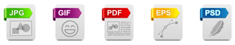
With your logo finalized, you now get your final files. Now that you know you’ll need different files and formats for different situations, you’ll be sure to ask for the right ones. In general, you’ll want to ask for the following:
- Layered source vector files, such as Adobe Illustrator, Photoshop, etc.
- Layered EPS/PDF files (for those who use different vector software)
- High-resolution raster files for use online, including PNGs without backgrounds
- Logo variations, including full color, black, white, and monochrome
You’ll also want to be sure to have the necessary font files used in case you need them for future branding projects. You may need to purchase a commercial license to use a particular font in your logo or marketing.
You may also want to lay out this information, fonts, colors, spacing, etc., in your brand’s style guide. It will ensure your logo will be used correctly no matter who is working with it, including those outside the company.
Smart Logo Development Brings Brands To Life
Great design takes talent and does not happen by accident. They result from critical thinking, collaborating, exploring, and trying new things often.
Each detail of your logo, the colors, fonts, sizes, or shapes, can affect how it makes someone feel and think about your brand. While your logo may not have the effect you want each and every time, by using this helpful list, you’ll be able to ensure the logo design project process goes as smoothly for you as possible.
Running a Successful Logo Design Project on Flocksy
Getting the right design for your business or brand comes down to understanding what you want your logo to do and how you can marry that goal with your brand’s visual identity.
At Flocksy, our designers can help you to create the perfect logo for your unique company, and best of all, we make it simple to communicate to the designer what you want. Our intuitive design briefs guide you through the logo request to ensure you include all the information necessary.
In fact, the intuitive brief and all its parts are essential to complete your project successfully and on time. It’s crucial that you fill out each section thoroughly and to the best of your ability. Will this make starting the project take a bit longer? Yes. Will it cut down on questions and revisions? Yes.
For example, while it might seem obvious that the sizing requirements of necessary to design the logo, the sections about the target audience and the design details from you are equally imperative to the project. The more detail you can provide in these sections, the better the artist will understand your needs. While it might take you a bit longer to fill out the brief as a result, we can assure you that the time you spend on your instructions is well spent. It’s truly worth it to slow down and include every possible detail about your potential design because it can eliminate going back and forth with the designer clarifying the project.
We also provide brand buckets that you can attach to each of your projects, which hold all your references, resources, brand guidelines, colors, and more. With the simple click of a button, you’ll upload your files once, and you’re good to go on all future requests.
One of the most useful parts of our unlimited logo design service is the relationships you’ll build with your artists. The creatives will get to know your brand and style so well that it’ll cut down on completion and revision times, and you’ll be that much happier about the logo design process.
Conclusion
For your logo to do what you need, you must first understand your brand’s value and meaning to your customers and best prospects. Then, by following the design principles that are the foundation of some of the world’s best logos, you’ll be able to create a meaningful logo with the help of an incredible designer. A logo can never represent everything a company is, of course, but a good one will say something unique to your target audience that they can’t forget and compels action.
To get help with creating your logo, check out our unlimited graphic design services. You can check out some of the incredible logos we’ve designed in our Portfolio, and if you have any questions, don’t hesitate to reach out over the phone or by scheduling a demo.